Improve Resources Tab
-
Add income and resource icons to resources tab:
-
@redrum Cool, but how about just having X/Y, instead of X(+Y) (also not showing the +). This can apply in the lower bar too.
like:
0/59
0/33
0/42
120/89
... -
@cernel Just to gain some space, in case of lot of resources, thus needing to expand the side bar less to see everything, not for the look.
-
@cernel I'd rather keep it consistent with the other areas that display resources.
-
I think the "X (+Y)" is very easily and intuitively understood. And we got this elsewhere.
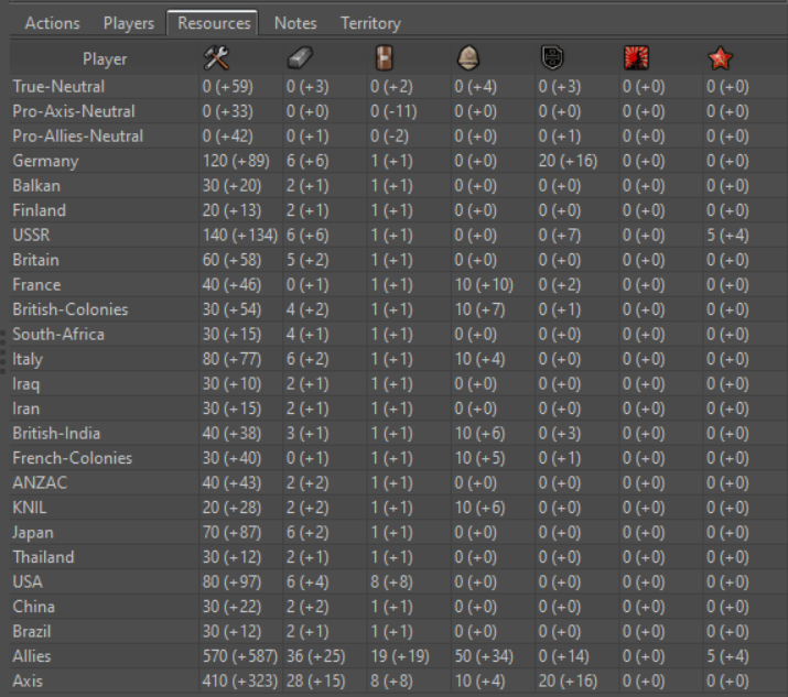
Perhaps Iron War with its many resources is not the best example to show.
 Could you show Dragon War with its four resources? Maybe you have to redownload to get the small resource icons in Dragon War. They don't have any yellowish blur.
 -
@redrum
Like the new display, it seems very clear and easy to read/understand. I like how there is no more 'Stats' and 'Economy' Tabs.Question what is the 'Players' tab? Will it show Technologies, which I presume will not show up under the resources.
Good work!!
Cheers...
-
@wc_sumpton 'Players' is the old stats tab for now just renamed. I want to do some further rework of the tabs but need to think about things across all maps a bit more.
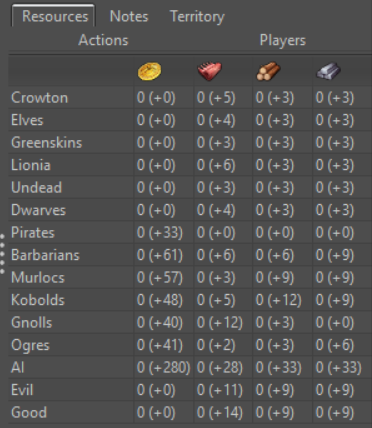
@Frostion Here is Dragon War:
-
PR for these changes: https://github.com/triplea-game/triplea/pull/3329
-
@redrum Not the case here, but I would not display all "(+0)" when no player has any such flux (so they all would have "(+0)").
-
@cernel I mean when there are no flux at all of one resource, for that resource, not necessarily in the whole tab.
-
@cernel Probably not worth the effort. I don't think that situation occurs that often. I guess maybe for some kind of resource like suicideTokens which you only start with and never have any income?
-
@redrum I think the main case would be resources that are given only by triggers etc.. Isn't that the case of the "Tech" of Age of Tribes? There can be many different cases, in theory.
Another case may be intermediate resources, you can only purchase (like there is nothing giving you steel, but you have to purchase it with iron and PUs). Or refining some fuel out of "oil".
A marginal case would be a resource you get at start game only.
I agree that's a marginal refinement. Nothing important. Mostly it would hint what are the "not primary" resouces.
Suicide tokens I would rather give them under some conditions on late game, but yes; that too.
-
@redrum Another case is using resources to enforce a hard cap limit, per turn, like you keep giving and removing resouces with triggers each turn, to enforce the cap, but that's a bit of a hack.
-
@cernel Yeah, most of those scenarios are pretty minimal. I'd say let's try it out as is then if there is some feedback for a few maps that can improve it them we can adjust it.
-
Aren't you bothered by the PUs stock and flux info being present in two different tabs? How about removing the PUs from Players tab, leaving only the Production, there.
Also, if kept in both, I then think the Resources tab should not display at all if the only resource are PUs (already present in the Players tab).
-
Maybe removing both PUs and Production from the Players tab (both given in first column of Resources) and, instead, adding "TUP", meaning "Total Unit Production", that is the sum of the "Unit Production" of all territories. That is actually equal to the Production, in all basic games, and also most not basic ones (thus giving the same info as retaining Production, most of the times, while not being strictly redundant).
I just don't like redundancy, and have always been bothered by the PUs figuring all the same in two different tabs.
-
As a suggestion, does it clean things up at all to hide the zero's? (ie:
0 (+0)) -
@lafayette Maybe, maybe not. Might look cleaner but could cause confusion. This is also a somewhat dynamic panel as the amount/income can changes as you move/purchase/etc so appearing/disappearing numbers might seem strange.
-
Nice. You could try bold font for stockpiled resources (while keeping income regular font), it might make it easier to read, especially when there are many resources.
"For the world is changing: I feel it in the water, I feel it in the earth, and I smell it in the air."
-
@alkexr I feel it a bit distracting too, with many numbers.
Tho, rather than bold, I would suggest having 2 columns per each resource, just like in stats now you have "PUs" and "Production".
So, I mean, having the resource image.
Under that image, you have 2 columns, called S and P ("stock" and "production").
And under S you have what you have and under P you have what you would be getting, without the + before (or maybe with it, if more clarity is preferred; tho in Stats you don't currently have the "+" for the Production values).
Hello! It looks like you're interested in this conversation, but you don't have an account yet.
Getting fed up of having to scroll through the same posts each visit? When you register for an account, you'll always come back to exactly where you were before, and choose to be notified of new replies (either via email, or push notification). You'll also be able to save bookmarks and upvote posts to show your appreciation to other community members.
With your input, this post could be even better 💗
Register Login