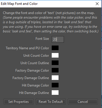
Add Unit Count and Damage Display Outline
-
Last but not least the PR with the changes: https://github.com/triplea-game/triplea/pull/3488
-
Personally I think 12 is nice. Especially since the unit pictures themselves are pretty small. If pictures were bigger, then the text should of course also be set to be bigger.
-
@frostion The colour blind bastd chimes in white is best
") but either are an improvement just my 2 cents
but either are an improvement just my 2 cents -
I'm a little bit shocked that this thing that has been discussed so much turned out to be such an apparently fast thing to do.
Some considerations on my part:
-
I definitely believe 12 font size is absurdly small I cannot believe it is ideal for anyone. I'm on a 27" full HD, not having any relevant visual impairments, and using 24, and know that many are on smaller screens or laptops. I would say default 24, but it should really at very least be 16.
-
It would be good if the "Edit Map Font and Color" are set per map, not generally, as you can prefer different settings per map (maybe a button with "setting all", for all maps) and the mapmaker can set the defaults in map.properties, especially now that a better zoom is being made (I think the most extreme example to date is Conquest of the World, in which you would want to have a much bigger font size than other maps).
-
Currently there is an issue (it can be argued it is a bug) with using Font Size together with name_place.txt: it draws the name from the left, thus their barycentre shift to the right when you increase the font size, making such an option scarcely useful, unless you are drawing images in place of names (see below) (you can test this with Pact of Steel, setting Unit Size at 24: Eastern Europe will be in the middle of itself and Belorussia and most name will overboard to the right, basically obtaining the opposite of what name_place.txt is supposed to be for). If this issue is not solved (in a way to keep the barycentre fixed, even tho the drawing is from the left), and especially if the default is changed, I then advise name_place.txt to be made ineffective in changing position of names not recalling images (meaning still working for 270BC but not anymore for Pact of Steel).
This is also a liability to changing the default font size, as this option works in drawing names from the left, and I assume it has been optimized in current maps having it for font size 12, which is not advisable to keep as reference, if it is changed as default; so I don't really know how this issue can be feasibly solved. Maybe it is just anyway better to reserve the name_place.txt for image based names only (this would need updating pact_of_steel), tho the option itself does have a value, since sometimes the autoplace is not so good, and you may not want to go as far as having images for all names.
A way to solve this issue may be to have a setting for specifying, inside the "name_place.txt", what font size such coordinate are meant for, and having the engine, then, assuring the barycentre stays the same when changing Font Size. In this case, pact_of_steel would need to be updated to specify a value of 12 for it, assuming a new default. If the settings are customizable per map (see the point above), we can, instead, just assume the reference is the setting. In this case, pact_of_steel would need to be updated to specify Font Size 12, generally. -
The Font Size setting defines the dimension of the regular names, but not of those drawn by calling images (it will change the dimensions of the names of World At War, but not of those of 270BC). I guess this is an advisable behaviour, as now, at least, as you can assume that images based names have been tailored for the map closely (so I agree better not having an option for specifically zooming them, also because of the placing issues at the point above), but this is somewhat generally incongruous, so it may be advisable splitting the Font Size setting between "Territory Name and PU Font Size" and "Unit Font Size".
-
"Territory Name and PU Color" is wrong (PU means Production Unit, and identifies resource stocks, not territories productions (your PUs are the money you have, not what you can get)). It should be "Territory Name and Production Color".
-
Are you sure it is still necessary to keep that bug disclaimer at the start? Any chance that bug is not so relevant anymore, after so many years?
-
-
@frostion said in Add Unit Count and Damage Display Outline:
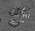
Just outlining the current numbers would be a great improvement! The default white numbers can be hard to see and distinguish on bright territory backgrounds. (Yes, I know that I can change colors... But I don't want to
 )
)I don't want to, either; or rather I don't want to keep changing it each time I change map. That option would have more value if it would be per map.
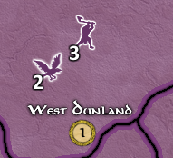
I hope this won't incentive mapmakers to have very bright territories anyways, as there are other reasons not to, beside the inability to read purely white numbers, in my opinion (I don't think we need to revert the colour changes of Italians in "world_at_war", for example).
-
@redrum It all looks so good I can hardly bear it.
As far as a default it hard to say... I normally use between 16 - 24. But now with the outline making the numbers more distinctive I might be inclined to reduce them down.
Having it settable per map would be nice. Not sure whether that is an easy fix or more of getting into an major commitment. One idea would be to be to have it scaled based on the unit size or unit scale settings. (not really sure whether that would make it easier or harder to accomplish).
Either way... just seeing this get resolved this quickly is a much appreciated step in the right direction.
-
I'm leaning towards increasing the font size default to 16 and see if I end up with a revised players rebellion
Ideally, these should be a per map not global setting. That would be a bit more work than I wanted to do at the moment though. Mostly a lot of copy and pasting to create new map properties, remove the global settings, and wire it up. Not difficult but would take a few hours probably. Good feature request and something a new developer to the project could probably tackle.
-
@redrum just wanted to say Nice Work ! Huge Improvement !
Fwiw I use 16 font on the global map. It's no big deal to change but probably look better to new players. Revised is pretty popular though, so yea, don't wanna bum those guys out : )
-
@beelee Nice thing is it's just a default. There is nothing to stop a player to find their own preference.
-
OMG omg omg omg! The new numbers look incredible!
Awesome new addition. This improves the definition and visibility of the numbers immediately.
Stunning work!
-
@hepps just checked it out. Absolutely Outstanding !!! Feels as if I got new glasses : )
-
@beelee Hey relax over there not all of us are blind, deaf, and colour blind like me
-
@prastle You are the Helen Keller of Triple A.
")
-
-
@hepps said in Add Unit Count and Damage Display Outline:
@redrum It all looks so good I can hardly bear it.
As far as a default it hard to say... I normally use between 16 - 24. But now with the outline making the numbers more distinctive I might be inclined to reduce them down.
I've it at 24 most of the time, as I said, and I actually think that after the addition of the outline it is even more opportune to have it at 24 or so. Since the outline has to be 1 pixel, having the size smaller than 24 makes the outline on the number look dirty (to me), in some cases, because of the much too visible pixellated effect.
So, just wanted to say that I like this change, but it surely doesn't push me to use smaller numbers, since the outline evidences the pixelated effect, you inevitably have when getting too small (but 24 looks great).
However, as far as distinctiveness goes, this is an improvement anyways.
Hello! It looks like you're interested in this conversation, but you don't have an account yet.
Getting fed up of having to scroll through the same posts each visit? When you register for an account, you'll always come back to exactly where you were before, and choose to be notified of new replies (either via email, or push notification). You'll also be able to save bookmarks and upvote posts to show your appreciation to other community members.
With your input, this post could be even better 💗
Register Login