Unit Tooltip Improvements & Poll
-
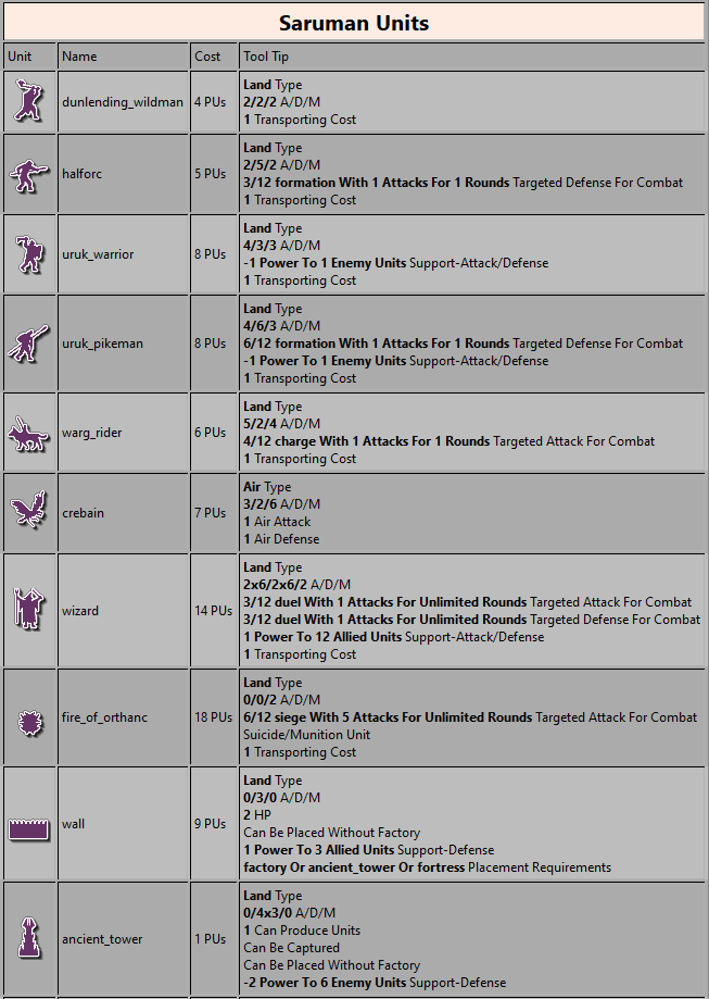
Anyways, here are the two options which aren't 100% complete/perfect but before going much further the option needs to be decided on (and yes things can be tweaked further for either option). I'll try creating a poll in the first post of this thread as well.
Option #1 was selected. Please see this post for examples: https://forums.triplea-game.org/topic/942/unit-tooltip-improvements-poll/44
Added ability to append custom tooltips instead of replacing the tooltip: https://forums.triplea-game.org/topic/942/unit-tooltip-improvements-poll/59
Option #1 - Label: Value
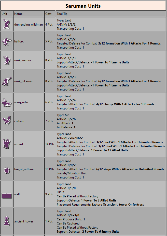
Option #2 - Value Label
Background
Unit tooltips has recently been worked on and enhanced. The newest pre-releases have tooltips automatically pop up when player mouse-over a unit. This is great But here are some suggestions:
-
Add an option to turn off tool tips in the game --> engine settings --> Game. It would be great for people who for some reason or another wanted to turn tooltips off.
-
Would it not be much more practical, user friendly and readable to have unit tooltips display info on several short lines instead of one or two very long lines? It could be more compressed lines than the present. The unit info could be displayed as “2Att/3Def/2Move”, “2A/3D/2M”, “2/3/2” very similar to the purchase screen info. Or the info could be display more in full like in these screenshots to help new players understand.
-
When/if tooltips were made to be displayed in shorter lines, it would be nice if some dubious phrases were rephrased for better understanding.
Envisioned and possible changes:

Original github issue: https://github.com/triplea-game/triplea/issues/3510
PR: https://github.com/triplea-game/triplea/pull/3604 -
-
My initial thoughts on the suggestions:
- Agree and would add that being able to set the hover duration would be great as well.
- Agree. I tend to be in the camp of let's keep it short, simple, and consistent across all areas of the UI.
- Too general to really act on at the moment. Putting together a list of the phrases that are confusing would be a great way to make this actionable and easy for a developer to tackle.
-
-
Agree. Being able to customize the tooltip delay would be nice.
-
Agree. It should be standardized and as brief as possible.
-
Not 100% what you mean. Are you referring to things like negative support? AA type attacks and defenses?
-
-
Should have lines that more clearly refer to support information. For example.
Big Guns
Attack: 1
Defense:2
Movement:2
Transport Cost:2
Power Support-Offense: +1 Power to 1 allied units (type?) when on Attack, @1:1 units
Power Support-Defense: -1 Power to 2 enemy units (type?) when on Defense, @1:2 units
Roll Support-Offense: +1 Rolls to 3 allied units (type?) when on Attack, @1:3 units
Roll Support-Defense: -1 Rolls to 3 enemy units (type?) when on Defense, @1:3 unitsIn addition to your idea of individual lines for all existing information that is. I assume this version would be engine updated too, which would be great. Because current properties files method is not very practical for more complex maps.
-
The format should be more concise of course. Like below while being unit specific. It can be reduced further as well.
Big Guns
Attack: 1
Defense: 2
Movement: 2
Transport Cost: 2
Power Support-Offense: +1 Power to 1 allied (Infantry), @1:1 units
Power Support-Defense: -1 Power to 2 enemy units (Infantry), @1:2 units
Roll Support-Offense: +1 Rolls to 3 allied units (Tanks), @1:3 units
Roll Support-Defense: -1 Rolls to 3 enemy units (Tanks), @1:3 units -
Terrain bonuses and penalties should be listed somewhere too, even if they can be mimicked by fighting units support figures.
-
@general_zod What about
A/D/M 1/2/1
Transport cost 2
etc.
etc.
etc.The Idea here being that if we can standardize the basic combat and movement descriptors (which are essentially basic defining perimeters) it will free up 2 lines within the tool tip display.
Since most basic games have only these elements... it would mean that the tool tip would be quite small and concise, while also reducing the space needed for games with more features/attachments.
-
@general_zod Really like your terminology for the support mechanisms.
-
Yes, the first line contains the common figures. This will be present for most fighting units. I think that's a nice place to save space in a revamped tooltip.
@general_zod What about
A/D/M 1/2/1
Transport cost 2
etc.
etc.
etc. -
Thoughts on format of "number then label/description" (Frostion example) vs "label/description then number" (Zod example)?
-
@redrum I would say the format itself is pretty arbitrary... whether it be # <-> description or description<-> #
Really what it comes down to is having consistency of all rows.
-
-
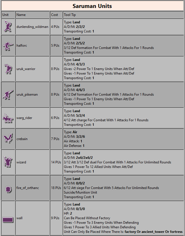
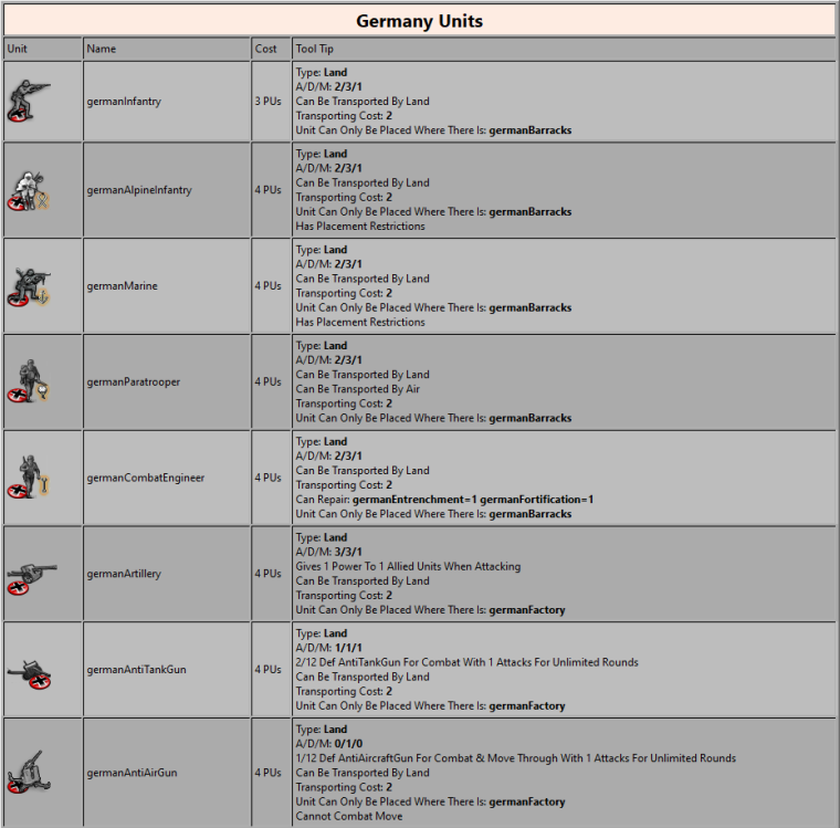
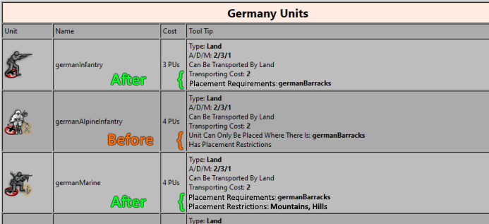
Well here is a start. Still need to go through and standardize AA and support descriptions but did most of the core stuff and easy stuff.
LME
TWW
-
@redrum Already looks much better. I like how the bold punctuates certain important pieces of info. so much more understandable now.
-
@hepps Suggestion... bearing in mind I have no idea if it is possible...
-
@redrum I would not put the movement value together with the combat values, as it is really something different, especially not setting it apart by a slash. Also, I think the initials only it is too much of a cut. And, minor note, not bolding the slash.
So, instead of this:
A/D/M: 2/3/1I would do:
Att/Def: 2/3
Mov: 1or:
2/3 Att/Def
1 MovHaving the number before the description, especially if all or most numbers would be, now, at the start of the line, makes it easier to read, as they would all be sort on the same column; so, once you know where you are reading, it should make it faster reading.
On the other hand, the transport cost can stay in the same line as the movement, as they are conceptually related, and belong to the same phases; so it could be:
2/3 Att/Def
1 Mov, 2 TCSide note, while "Transporting Capacity" is a fine naming, I don't like "Transporting Cost", as I would not have "Cost" used for anything else but the purchase cost. So, if possible, I would change the "Cost" in "Transporting Cost" to something else. For example, "Transporting Encumbrance", if that feels ok for an English speaker (also, if they start with a different letter, they wouldn't both be "TC", when written short).
-
@redrum I agree with @Cernel that movement should not be grouped together with Att/Def values. Properties that I would put in the same line / same general area: type (land, sea, air), movement, fuel cost; and all transport related properties (transport/carrier cost/capacity, land transportability, air transportability etc.)
-
@cernel said in Unit Tooltip Suggestions (Pre-Release Feedback):
@redrum I would not put the movement value together with the combat values, as it is really something different, especially not setting it apart by a slash. Also, I think the initials only it is too much of a cut. And, minor note, not bolding the slash.
So, instead of this:
A/D/M: 2/3/1I would do:
Att/Def: 2/3
Mov: 1or:
2/3 Att/Def
1 MovHaving the number before the description, especially if all or most numbers would be, now, at the start of the line, makes it easier to read, as they would all be sort on the same column; so, once you know where you are reading, it should make it faster reading.
I really think that since so many other things in the tool tip will need to have the definition first followed by a value or defining parameter or colon delimited list, it would far more beneficial to keep things consistent... Descriptor---> value or definition. I really can't see a comprehension issue nor is it any clearer. In fact, it feels kind of backwards to me. If you think about anything in your life you read or do it is always the qualifying thing first followed by the definition or parameter...
Name: John Doe
Rank: Sergent Major
Age: 24To me it seems to enable comprehension. Since the value is useless until you know what it is for. By placing the definition first it enables our minds to interpret the information in a way our brains are wired to do it. A/D/M 1/2/1 reads logically and I don't have to read backwards to understand.... I simply read the line as though it was in sentence form... Attack/Defense/Movement (are respectively) one/two/one.
I also don't really get the column benefit since you are not reading a vertical column of information. The vertical axis is not of any value unless there is some binding factor that makes them significant to be in a column. Which is not a factor here... we are reading lines of information. The vertical axis has no impact on our ability to comprehend the data.
As far as separating the movement... sounds fine. I was simply suggesting a method to conserve space for the basic info that is present for any non-infrastructure unit. But it would make sense to group movement with things like fuel consumption (for games where it is present).
-
@hepps For definitions, like being land or sea, yes. But the numerical values you would say "I have 1 of this, 2 of that...".
Anyways, it can go either ways I suppose. As I said, main reason is that this way all the values are at start of the lines; so you don't have to go search for them so much.
If at the end, which I wouldn't suggest, maybe something like:Att/Def......2/3
Mov.............1
Something...4(not necessarily with points)
-
Yeah, agree with shortening to Placement Requirements and trying to list Placement Restrictions values. I'll take a look at both of those. Good input.
For now, A/D/M will stay together since its displayed like that in other areas (at least purchase screen). We can have a separate thread to discuss updating all of those to a different format.
I'm open to "label: value" or "value label" though my vote is label first (appears @Hepps and @General_Zod would prefer that as well). We can create a poll in this thread if there is enough debate on that.
While I can see not loving Transporting Cost, I'd say Transporting Encumbrance is definitely worse. Maybe something like Transporting Weight?
It would be way to difficult to try to align numbers to the right as some of the properties are much longer than others. Idea is to use bold to make the values easier to read.