Unit Tooltip Improvements & Poll
-
@redrum I hoped you or somebody would have come up with something for that, as "Transporting Cost" is bad also because it rather makes me think something I have to pay to get on the ships, like a fuel cost specifically for that.
How does "Transporting Load" sound?
How does it sound not having Transporting, but just "Capacity" and "Load", or maybe "Encumbrance" sounds ok on its own?
If not cutting, how about "Carrying" instead of "Transporting"?
"Carrying Burden"?
There must be a good word in English for that.
Personally, I'd advise against using "Size" or "Volume", since that is a dimensional thing, while here the limit is usually weight, in case somebody suggests that. Still, I wouldn't use "Weight" or "Mass", either, as too basic. -
@redrum In that case, I at least advise Att/Def/Mov, instead of just A/D/M.
Edit: And, anyways, using the slash as separation doesn't seem correct here, so, even in that case, instead of:
Att/Def/Mov: 1/2/1
or
1/2/1 Att/Def/MovI would prefer:
Att: 1, Def: 2, Mov: 1
or
1 Att, 2 Def, 3 MovAlso, I like and have really no problems with the current:
1 Attack, 2 Defense, 3 Movement
-
@hepps Placement Restrictions is a list of territories not territory effects so unless its very short (4 or less) then the values won't be displayed. As you definitely don't want a list of 100+ territories like it is in TWW. You'd need to have a new unit property based on territory effects.
    <attachment name="unitAttachment" attachTo="germanMarine" javaClass="games.strategy.triplea.attachments.UnitAttachment" type="unitType">
      <option name="movement" value="1"/>
      <option name="attack" value="2"/>
      <option name="defense" value="3"/>
      <option name="transportCost" value="2"/>
      <option name="isLandTransportable" value="true"/>
      <option name="canBeGivenByTerritoryTo" value="Germany"/>
      <option name="requiresUnits" value="germanBarracks"/>
      <option name="unitPlacementOnlyAllowedIn" value="Ontario:Quebec:Northern Central US:Chicago:Detroit:Eastern US:New York:Northeastern US:Washington:Eastern US:Southeastern US:Southern US:Florida Peninsula:Northern Mexico:Northwestern US:Western US:San Francisco:Los Angeles:British Columbia:Alaska:Hawaiian Islands:Eastern Mexico:Panama:Columbia:Venezuela:Rio de Janeiro:Argentina:Chile:Cape Town:Western South Africa:Eastern South Africa:Algeria:Tripolitania:Cairo:Turkey:Western Turkey:Ireland:Scotland:Central Britain:Southern Britain:London:Northern Spain:Western France:Northern France:Vichy France:Low Countries:Northern Germany:Denmark:Eastern Germany:Poland:Leningrad:Eastern Finland:Finland:Northern Finland:Northern Sweden:Sweden:Southern Sweden:Norway:Central Norway:Archangel:Northern Italy:Rome:Sardinia:Sicily:Southern Italy:Northern Yugoslavia:Southern Yugoslavia:Greece:Bulgaria:Romania:Eastern Ukraine:Caucasus:Southern Caucasus:Astrakhan:Western Kazahk:Northern Saudi Arabia:Southern Saudi Arabia:Bombay:Western Madras:Calcutta:Rangoon:Malay:Southern Thailand:Thailand:Saigon:French Indochina:Kwangtung:Hong Kong:Shanghai:Shantung:Peking:Manchuria:Korea:Eastern Manchuria:Vladivostok:Soviet Far East:Hokkaido:Japan:Tokyo:Kyushu Shikoku:Luzon:Phillippines:Brunei:Borneo:Sumatra:Java:Celebes:Dutch East Indies:Dutch New Guinea:Caroline Islands:Wake Island:Southwestern Australia:Southern Australia:Queensland:New South Wales:New Zealand"/>
    </attachment>
TripleA Developer with a Passion for AI: https://forums.triplea-game.org/topic/105/ai-development-discussion-and-feedback
-
@redrum The thing about placement restrictions is I didn't look to see what can be imposed as a restriction.
Off the top of my head it can be the: PU value of a territory, a terrain, Original ownership of a territory.
I have never really looked at it all that closely to see what else this can be used with, so I don't know how hard it will be.
-
@redrum Of course, having a possibly infinite list is not acceptable. Having no list at all is not a solution. Setting some arbitrary cap over which you don't get the list is lame, and not a solution, either, once you hit it.
In any case of listing, meaning something affecting a series of specific items, the info needs to be on the targets themselves, as this is the only viable and effective solution.
If a unit can be placed in a number of territories, you should find in the territory tab that such a unit is allowed there, while the unit itself should have just the info that cannot be placed but in territories that specifically allow it. I would keep the info about what territories only in case the territory is only 1, but still giving the info in the territory too.
If a unit can support a number of units, you should find in those units tooltips that those units can be supported by this unit, while the unit itself should have just the info that it can support some units. I would keep the info about what units only in case the unit is only 1, but still giving the info in the supportable unit too.
-
I see there is a lot of interest in how info is displayed in tooltips
 That's great. Sorry for me joining in kind of late.
I think we must recognize that the way a unit att/def/move is displayed in the purchase screen is very simple and works well. It is my impression that even though there is no explanation people quickly learn what the three numbers mean.
Still I think the tooltip should at least give a bit more info, so that it helps new players.
But I fear that if the info displayed in tooltips was to be "A/D/M 3/2/1" or similar, many people would get really irritated really fast on the "A/D/M" part because they are forced to always eye-scan over this part before getting to the info they actually want. I strongly recommend sparing us all from this and instead list the stats "3/2/1 (A/D/M)", "3/2/1 Att/Def/Move" or something similar.
I see little reason to split movement stats away from the two other basic stats. As I see it, the three stats are the basic and minimum stats of all A&A units, something one would know units must have, even if 0. All other stats are special abilities and would need their own lines.
Likewise I would recommend all stats be as easy to read/spot/identify as possible. And for this stats would be best off having the number first followed by the explanation. Like for example:
3 Attack
2 Defense
1 Movement
(Not that attack, defense and move should have their own lines. More like Tranport Cost, Hit Points etc.) The reason this way is the most easily read is that people actually don't read, they scan letters and make educated guesses about what word they are looking at. They skip as many letters as possible and when they have a pretty good idea about what follows they move on to the next word. This is basic knowledge in the educational system. In the above example it would mean that a player will (and I would guess you guys already did it while reading my example) only decipher something like 3 At.. 2 De.. 1 M... and then move to next line.Hope it makes sense.
-
I agree with all @Frostion said. Also, let's not forget that the primary place of tooltips is the purchase window, where you already see the basic stats as X/Y/Z; so the whole point of having it in the tooltip is to have it in a significantly more descriptive format, otherwise it is just redundant.
Also the tooltips should be optimized for helping experienced players learning new maps, rather than for noobs learning the tooltips. -
@frostion said in Unit Tooltip Suggestions (Pre-Release Feedback):
The reason this way is the most easily read is that people actually don't read, they scan letters and make educated guesses about what word they are looking at. They skip as many letters as possible and when they have a pretty good idea about what follows they move on to the next word. This is basic knowledge in the educational system. In the above example it would mean that a player will (and I would guess you guys already did it while reading my example) only decipher something like 3 At.. 2 De.. 1 M... and then move to next line.
Hope it makes sense.
Yeah, you don't actually read words letter after letter till the end, except when you meet a word you don't know.
Atlclauy, the way you look at wrdos is mialny by rdieang the frsit and the lsat lteetr, and gttneig the wrod by waht lteerts are in bweeetn of tsohe two, wtih ltltie cnorcen to tehir psotioin.
-
@cernel
LoL for those of us that are dyslectic that last line was very easy to read...Cheers...
-
Tooltips appear to be a very passionate topic...
Anyways, here are the two options which aren't 100% complete/perfect but before going much further the option needs to be decided on (and yes things can be tweaked further for either option). I'll try creating a poll in the first post of this thread as well.
Option #1 - Label: Value
Option #2 - Value Label

-
@redrum Voted 2, but those parentheses should have really been removed. I think it is obvious that something like:
1 (Transporting Cost)
or
1 (Can Produce Units)
doesn't make sense and it is wholly unnecessary, especially since the number is bolded.
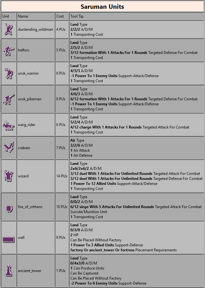
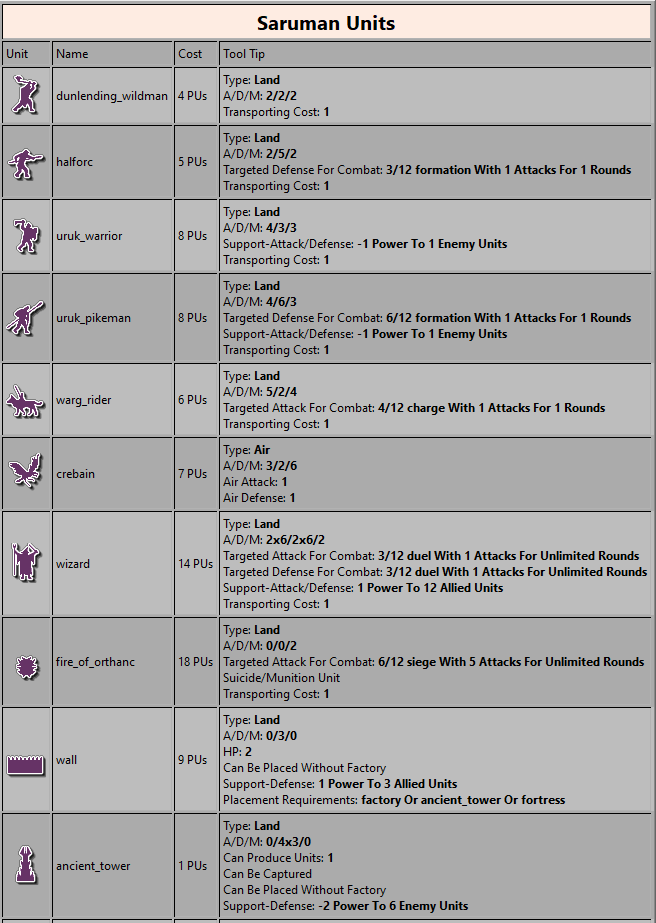
Anyways, I would rewrite the second one like:Land Unit
2/5/2 Offense/Defense/Movement
3/12 formation Preemptive Defensive Roll before first Combat Round
1 Transporting Load**Just trying another suggestion; no idea if it sounds good.
Also the fact that the dice side is given as "/12", which makes sense, is another reason for not using slashes otherwise.
-
@redrum In your example 2 / version 2, why all the ( ) signs?
Would "1 Transport Capacity" not be better understood and more correct than "1 (Transport Capacity)"? The ( ) signs have no function here, as they would normally hold info that explained a preceding word, expression, concept etc.
I know the signs are also used like that in the displaying of (A/D/M), but in that position their function is to say "this here is an elaboration of what the / / / is all about." and not explaining what a number is.
It could be potentially confusing for people to see all the ( ) signs.
But I have to say, the new tooltip display will be a great improvement however the first outcome. This is great work by the dev team


-
Lol hadn't read @Cernel s post
 It's like an ecco.
 -
-
@redrum said in Unit Tooltip Improvements & Poll:
@hepps Placement Restrictions is a list of territories not territory effects so unless its very short (4 or less) then the values won't be displayed. As you definitely don't want a list of 100+ territories like it is in TWW. You'd need to have a new unit property based on territory effects.
    <attachment name="unitAttachment" attachTo="germanMarine" javaClass="games.strategy.triplea.attachments.UnitAttachment" type="unitType">
      <option name="movement" value="1"/>
      <option name="attack" value="2"/>
      <option name="defense" value="3"/>
      <option name="transportCost" value="2"/>
      <option name="isLandTransportable" value="true"/>
      <option name="canBeGivenByTerritoryTo" value="Germany"/>
      <option name="requiresUnits" value="germanBarracks"/>
      <option name="unitPlacementOnlyAllowedIn" value="Ontario:Quebec:Northern Central US:Chicago:Detroit:Eastern US:New York:Northeastern US:Washington:Eastern US:Southeastern US:Southern US:Florida Peninsula:Northern Mexico:Northwestern US:Western US:San Francisco:Los Angeles:British Columbia:Alaska:Hawaiian Islands:Eastern Mexico:Panama:Columbia:Venezuela:Rio de Janeiro:Argentina:Chile:Cape Town:Western South Africa:Eastern South Africa:Algeria:Tripolitania:Cairo:Turkey:Western Turkey:Ireland:Scotland:Central Britain:Southern Britain:London:Northern Spain:Western France:Northern France:Vichy France:Low Countries:Northern Germany:Denmark:Eastern Germany:Poland:Leningrad:Eastern Finland:Finland:Northern Finland:Northern Sweden:Sweden:Southern Sweden:Norway:Central Norway:Archangel:Northern Italy:Rome:Sardinia:Sicily:Southern Italy:Northern Yugoslavia:Southern Yugoslavia:Greece:Bulgaria:Romania:Eastern Ukraine:Caucasus:Southern Caucasus:Astrakhan:Western Kazahk:Northern Saudi Arabia:Southern Saudi Arabia:Bombay:Western Madras:Calcutta:Rangoon:Malay:Southern Thailand:Thailand:Saigon:French Indochina:Kwangtung:Hong Kong:Shanghai:Shantung:Peking:Manchuria:Korea:Eastern Manchuria:Vladivostok:Soviet Far East:Hokkaido:Japan:Tokyo:Kyushu Shikoku:Luzon:Phillippines:Brunei:Borneo:Sumatra:Java:Celebes:Dutch East Indies:Dutch New Guinea:Caroline Islands:Wake Island:Southwestern Australia:Southern Australia:Queensland:New South Wales:New Zealand"/>
    </attachment>
Yeah. I had forgotten how we had achieved the restrictions in the XML (which is far more complex then the end resulting restrictions). Based on that it would be impossible to effectively display this.
-
I think was mentioned earlier by @Cernel .
Having the "/" as the division between different individual values is not ideal when we also have #/# as a method of displaying the chances for a hit.
Perhaps using the vertical "|" for the divisions between independent values... eg. A|D|M 1|2|1.
Seems it might be clearer to newbs... since we know anyone with any Triple A experience is not likely to be confused.
-
@hepps said in Unit Tooltip Improvements & Poll:
Perhaps using the vertical "|" for the divisions between independent values... eg. A|D|M 1|2|1.
I think "A-D-M 1-2-1" is processed faster by the brain than "A|D|M 1|2|1".
"For the world is changing: I feel it in the water, I feel it in the earth, and I smell it in the air."
-
The voting seems like a tight race.
 Maybe it's not the best way to decide stuff ... But then again it reminds me of what Churchill said about democracy
 I hope people are aware that the current descriptions favour option 1:
"Can produce units: 1:"
makes more sense than
"1 Can produce units" displayed in the example.Be aware that the descriptions can ofcours be rephrased to fit the format we end up with. GO VOTE!
Map maker of: Star Wars: Galactic War + Star Wars: Tatooine War + Caribbean Trade War + Dragon War + Age of Tribes + Star Trek: Dilithium War + Iron War + Iron War: Europe + Warcraft: War Heroes
-
-
@alkexr The only reason I went with the vertical is because we will have certain areas where there will be negative values. So again for clarity... I was suggesting something that cannot be mistaken for meaning something else. I was just offering another option.
Hello! It looks like you're interested in this conversation, but you don't have an account yet.
Getting fed up of having to scroll through the same posts each visit? When you register for an account, you'll always come back to exactly where you were before, and choose to be notified of new replies (either via email, or push notification). You'll also be able to save bookmarks and upvote posts to show your appreciation to other community members.
With your input, this post could be even better 💗
Register Login