Global Dominance
-
@hepps Guessing the potato/rock looking things indicate desert (if so, any info on what desert will do)? What do the port symbol with the 'D' mean?
-
@redrum The desert terrain is still a work in progress. As far as its functionality.... you'll just have to wait.
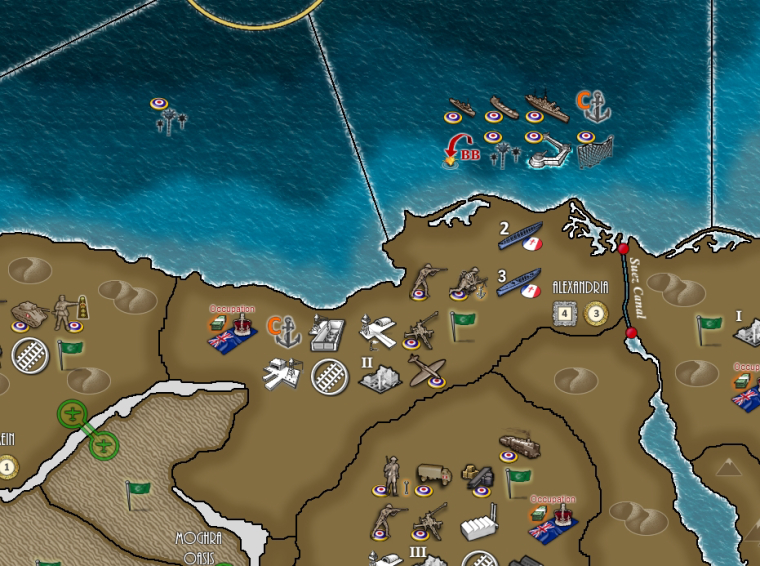
Ports permit loading and unloading of specific vessels that can only load/unload during the Noncombat movement phase. Ports also allow the construction of the Harbour Defenses and Sub Nets.
-
@hepps
Maybe you should think about having terrain symbols be displayed in the transparent territory name png? It already seems to have resource symbols, so you could add a similar seized symbol to the row of symbols below the territory names? I did this in the Dargon War map.Another thing. The territory control unit flags seems kind of pale? Are they semi transparent or something? They don’t seem so sharp in the colors as the player/country roundels.
-
@frostion The original flag icons I am using are just copied from the original TWW. They were muted down for that map because of how the map was designed. If I change them it will be a long way of yet.
-
Much happier with the second attempt. I can live with this one for now to go with the other simplified terrain icons.
This time a little more view of the heart of the British defenses of the Med.

-
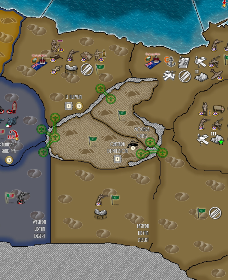
@hepps Definitely better. Interested in how Moghra Oasis functions? Guessing its maybe air units only.
-
No the Moghra Oasis is in the North End of the Qattara Depression. Since the cliffs that make up the north face of the depression are hundreds of meters high. No land units may move into the Depression other than via Alexandria or the Eastern Libyan Desert. All other connections are closed to land units. But since air is not affected by the cliffs they may move freely into the depression via any one of the other 4 territories adjacent to it.
Also due to the terrain inside the depression no mechanical units may enter the territory.
-
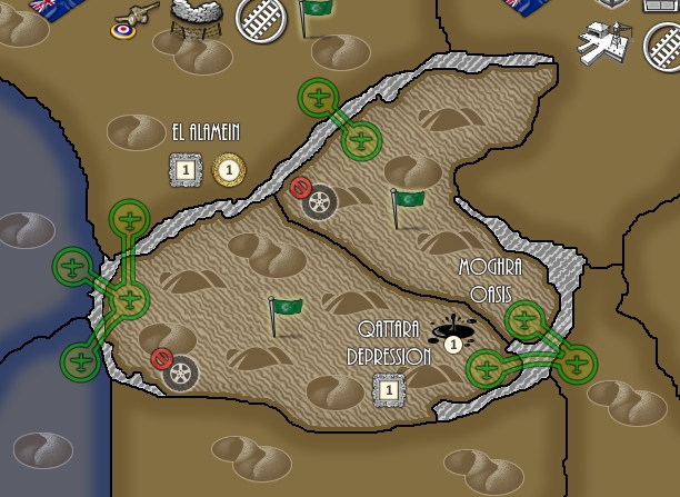
@redrum Here is a better look at the depression and its surrounds.

And before anyone decides to point out the A-historic placement of an oil deposit inside the depression.... I am fully aware that oil deposits were not discovered until some time in the 60's. This has been done to give strategic importance to the region and add a little fun. Since developing this into an oil producing territory will be fraught with challenges (between the movement limitations and its proximity to the front as well as its inherent vulnerability to strategic bombing).
-
@hepps this will make it interesting nice ideas! Thumbs up!
-
@hepps I'm liking it. Also definitely prefer the gray shading over the white in the previous screenshot for the cliffs. Looks to make things interesting as moving south does have a number of desert territories with little to no value. Might be a good idea to have some kind of symbol indicating the mechanical units can't enter the 2 depression territories (maybe like a red mech units with an X or something) as I really like the green symbols for the air unit connections.
-
@redrum Yes I thought about that... but now I am looking a how many other places are going to have movement limitations....
Like several of the Mountain territories of the Hindu Kush separating India and China
The Owen Stanley Range in New Guinea
Pinsk Marshes
And a few more I am thinking of.
-
@hepps Interesting. Its definitely not high priority, just a suggestion. I just really prefer when the map is self-explanatory so I don't need to try and memorize or lookup the territories.
-
@redrum Something like this?

-
@hepps Not bad. I was thinking maybe a little more similar to the green air connections symbols. Something like a red circle with some mech symbol inside and possibly a slash across it.
-
@redrum Went a bit of a different direction...

-
Maybe just make the cliffs with some red diagonal lines within it. Which gets players attention and at same time, conveys to player, can't go this way. Or make some traffic arrows similar to the green air symbols but on the areas where the land units can pass. Or a combination of both. Looks great btw!
-
@redrum Yes, similar looks and size as the plane symbol; but red instead of green. Any movement restrictions or enablement should try to be simular, so that the players intuitively can understand the meaning.
This game development sure looks good!
-
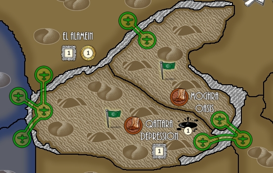
Yah, I think the final design will be boots on the ground.

-
I don't know if it's just me but this particular boot symbol design is very ambiguous. I wasn't sure if this was a boot at 1st look. Even then had to get real close to my screen to see 2 boots.
-
@hepps I probably like the red boots better than the tire symbol. I think the one thing I don't like is that at a glance I wouldn't be sure if that meant infantry can or can't enter. If you prefer going the route of showing what can move into the territories rather than what can't then green would probably be better than red.
From a personal preference standpoint, if you want to go the boot route than I'd be interested to see a more 2D version of the boots since that would be a little more similar to the plane symbol. Something like this maybe: https://image.shutterstock.com/z/stock-vector-boot-vector-icon-shoes-symbol-modern-simple-flat-vector-illus-723313138.jpg