The Grand War
-
The Grand War
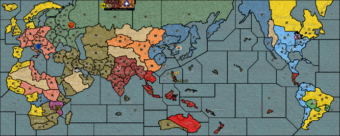
Now downloadable via the "Experimental" section on TripleA.This is an alternate history World War 2 scenario based on a roleplaying game I wrote early in 2018. It may be somewhat unbalanced as is, and not all features may function properly with AI. Virtually everything unique about this game is explained in the game notes, so be sure to read them. Many base units from TripleA are changed slightly as well, so be sure to read up on those too. If you have any questions, comments, or suggestions, please share them with me!
Features:
11 playable factions
15 researchable technologies
6 unlockable tech units
1 unique unit per faction
5 terrain types
unit upkeep and fuel costs
a free-for-all scenarioChange Log
v1:
initial release
v2:
modified map aesthetic for clarity on terrain and canals
v3:
modified relief tiles to make territory names blend in better
updated naval unit graphics to be larger and better looking
reduced fighter from 4def to 3def -
@elreigh Seems like a cool map especially impressive given its your first one! Nice work! The unique units, terrain, unit upkeep, tech, and fuel really give it some flavor/depth. The back stories for the nations in the notes help out as well. Are the nations based on anything in particular or did you come up with them from scratch?
Feedback
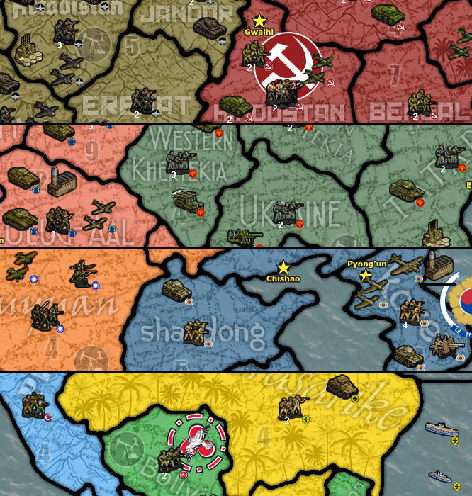
Resources and terrain are both a bit difficult to see on the map. I think its mostly because you have a textured background for the land territories so they don't really jump out at you (especially Tundra).There appear to be a few canals but there isn't any indication on the map of them (also not listed in the notes).I don't really understand the point of NonAligned?- I would think the AI does alright on the map. Its limitations would mostly be around fuel, research, and air battles.
- My initial reaction is that air units are OP for their cost especially with the 1PU maintenance cost for units.
If anyone is interested in setting up a game to give it a spin let me know.
-
@redrum The scenario is based on a nation-states roleplaying game I ran with some friends of mine earlier this year. Most of the nations in the scenario are their creations.
I wanted to make the terrain effects and resources more subtle, but that's mostly a design/style choice of my own taste. I can understand if you don't like it, and if it provides too much of a challenge on the eyes I can maybe look into changing it.
Canals I should definitely add an indicator for; it just slipped my mind to do so earlier. I'll work on that today.
NonAligned is in partly from scenario canon, and partly to make south America an interesting continent with more options for expansion. Bolivia and Avalon were originally going to be impassable territories, but then I decided to add them in as neutrals so Grands or Meijou could fight over them for a few extra resources. And then I decided to make them a full-fledged faction just on a whim. In the base scenario they should be set to "Do Nothing" and function like neutrals anyway. But they do work as a playable faction in the free-for-all scenario.
Regarding air units, in early testing of the game I found that they were overpowered (as base-game TripleA has them) and I decided to lower their attack values and purchase cost, rather than give them a higher upkeep cost.
-
Fun design, being both creative and interesting.
I agree with @redrum regarding distinguishing the oil and terrain from the back ground design is a bit challenging. I like the Sun icon for desert, very clear and distinctive.
Neat design. Well done.
Giant Crab and Crablings...
")
-
@Hepps Aha, I see you found the easter egg. That's in reference to one of my players, who would always genetically engineer giant crab soldiers toward the end game when tech was available to do it. A bit of an inside joke! The units aren't accessible except through edit mode, so they're not really in the scenario.
I'll try some things with the terrain effects and oil icons to make them more distinctive.
-
@elreigh I really like the reduced production out of the factories when they are damaged. Good innovation.
-
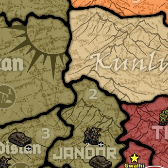
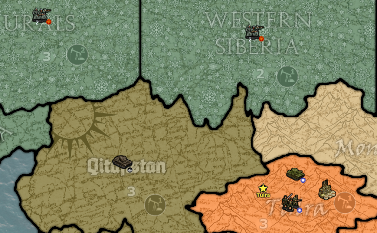
Here's a sample from the map of what I've done today, to make the map look clearer. I inverted the color on tundra to make it stick out more, and i removed relief tile effects from behind PU numbers and oil counters, so they stick out more. Let me know what you think before I add it to the repository.
By the by, this change will require an edit to the version number in the yaml file, right?
-
@elreigh I might even suggest increasing the transparency of the map relief in the back ground. If the map outline silhouette was slightly more transparent the terrain images might pop a little more, but its all a matter of taste.
-
@elreigh Definitely seems like a step in the right direction to me. And yeah you just need to update your map repo then increment the version in the yaml file from 1 to 2 so that players that already have the map can download the updated version.
-
@Hepps You mean something like this?
-
@elreigh Looks good.
-
@elreigh Yeah, that looks much better.
-
Version 2 Update
I have updated the repository with new relief graphics for clarity on terrain. Also, graphical indicators have been added to canals in the form of blue arrows wherever there is a canal connection. -
@elreigh Just updated to the new version and things look much better. And there are definitely a few more canals than I even realized
") Updated my initial feedback post to cross most of them off the list as I think you hit 3 of the points fairly well already. Nice work!
Updated my initial feedback post to cross most of them off the list as I think you hit 3 of the points fairly well already. Nice work! -
@elreigh Looks great. Canal markers are great.
-
@Elreigh This map looks interesting and colorful
I would like to give my first impression, based on what I see only. I have not played a game yet.
Map Version: I have downloaded v2.0 and the map is version v1.0, even though I think you have updated it since your first release. You should begin giving your map a new and higher version number each time you release a new version. It is possible to name map versions something like v1.1 or v1.0.1.
Territory graphics: They are very nice! I think the territory effect type, PU and Oil information is well done. It is both visible if you look for the info and discrete in the background if you are only looking at the units.
Territory name graphics: This could maybe be fine tuned a bit, if you ask me. Some territories have names printed that fall well into the background and become discreet, but others are very light/bright and stand out a bit too much. The worst cases are probably the Arabia/Turkestan font territories and the India names. I don’t know if it is possible, but maybe you could try darkening the names a bit so that they stand out less?
Denmark: Why is this territory so distorted compared to real world? (I am Danish, so I have to ask
") )
)Player and Water colors: It is always hard to make a full set of water and player colors that fit together. I think you have done a great job!
Units graphics: I really like the land units and buildings. They look like they belong together and they share the same “style”. I think the naval units are not in the same league. If you keep the current ship graphics, you should try to at least give the ships a tiny thin black color outline. My guess is that they would stand out more on the map, and also make them look more a part of the same unit set as the land units. Alternatively, you could go looking for new ship graphics, and if you do, maybe try a bit larger ship graphics. The current are tiny.
So, this concludes my pre-play review
 I hope to play a single player game soon.
 -
@frostion I'd second the thoughts on naval units not really fitting in or being as nice looking as land/air.
-
@Frostion I am not sure why you would have version 1. Do I have to also update the version number in the xml? I haven't done that, I figured it was only necessary to do so for the yaml.
Regarding the territory names, I think that might be because of how thick those two fonts are that they stand out so much. Ironicly, it was my belief that all the other fonts looked bad because they are too thin! Doing something to the territory names like that could be tricky, since the relief map has the fonts and names incorporated into it. But I'll try a few things and see how it turns out.
Denmark is distorted because of a style choice while making the map, wherein I connected all of the islands in many provinces (like Ireland/Britain, Japan, Borneo/Sulawesi, etc.). Denmark came out as a blob as a result.
Unit graphics were not my own design, they were drawn by Fairline on the CivFanatics forum. (Link below.) Most of his naval units look like this, but I could potentially find alternative artists to borrow pixel art from. Early on I had wanted separate styles of naval units for each faction, but I couldn't find a nice looking way to differentiate them and I just settled for that. I'll revisit them though, and see what can be done about that.
https://forums.civfanatics.com/threads/ww2-unit-graphics.409277/
-
@elreigh The version in the XML is the 'real' map version that players would reference and such to version changes you make. The yaml version is just a way so the engine knows for players that already have the map that there is a new version that it should allow them to download.
-
@Elreigh
I was thinking about what to do if you would like to make the territory names stand out less. I have made this little test picture for you to see.
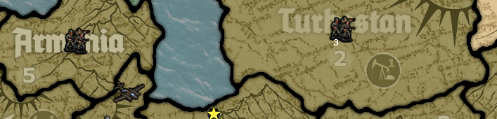
The territory name file Turkestan is reduced from 100% opacity (your original file) to 50% opacity in Photoshop. The “2” PUs marker is reduced from 100% to 75%.
I don’t know if this is a way you want to go. If you are satisfied with the current name and PU pictures, then forget this proposal"Do I have to also update the version number in the xml?" - Yes, and it does not have to correspond with the version in the yaml file.
Hello! It looks like you're interested in this conversation, but you don't have an account yet.
Getting fed up of having to scroll through the same posts each visit? When you register for an account, you'll always come back to exactly where you were before, and choose to be notified of new replies (either via email, or push notification). You'll also be able to save bookmarks and upvote posts to show your appreciation to other community members.
With your input, this post could be even better 💗
Register Login