Dyeing/Colorizing Unit Images
-
@Cernel For now, it would probably be just like nation territory ownership colors where users can edit the map.properties to override the defaults but it could potentially be added as an in-game option eventually. While it might look a bit unpolished for people the are color blind or maps with many nations, being able to see the units is probably more important then them being perfect.
Given the history of map makers and many of the existing maps we have, people must find it harder than you think to colorize images as we have lots of maps with units that don't match well or appear to be hacked up. Even look at Dom 1914 NML, where I took a recent pass to clean some of it up but before that it was kind of a disaster and that's a relatively popular map. Some of this feature is to help novice map makers, but its also to give players flexibility to override unit color defaults in map.properties.
-
@redrum I dunno. It just feels not sensible to me that you have a bunch of colourized units that are used only by one player and you also have a (mapmaker/powerusers only) setting that recolourize those already colourized units for that one same player, while you could open a graphic program and imput those same settings there, to get the units right. I don't know if maybe it would be feasible and sensible adding a mapmaking utility for recolourizing units, with the ability to select them specifically or a whole folder (I would still use GIMP). That could stay beside the utility for making the smallMap, I guess.
-
@redrum I'm not really suggesting this, as it might be too much, but it would be also possible to have an alliance subfolder in units. So, for example, the program would look for the unit in "Germans", if not there it will look for the unit in "Axis", if not there it will look for the unit in the units folder, if not there will repeat the above while looking at the program's assets. This would work in a definitive way for the game currently, as there is no way to trigger changes to the alliances during the game (something that it may be good to have).
-
@Cernel I considered that as well but didn't think it was worth adding this go around (maybe a phase 2). If lots of people start putting units directly in the units folder to share and there is a lot of interest in having alliance folders to share units just across an alliance then we should be able to add it in later on.
-
@redrum In the TripleA assets, all those units that are the same for all players should probably be moved in main folder. I might eventually post a new zip of the assets remanaged that way, after the stable is out. That should probably be at least 100 units less. It's actually kinda amazing that this possibility has never existed so far, and we instead kept adding the same factory etc. in every single folder.
Another thing I tried in the past, but didn't work, is to have aliases for all those images that are the same for all or a number of players, but I tested TripleA was not seeing them. Not asking for this addition, as I'm not sure how good would it be now, as being able to share for all is probably the main item.
-
@LaFayette said in Dyeing/Colorizing Unit Images:
Just to mention, two more really great uses for this:
- help people that are colorblind. If the unit colors look similar, an option to adjust per-country hue so they can be visible would be excellent. Flags would help this, I'm sure using colors that look physically different would be even better.
- building on maps that have many nations. If for example someone wanted to mod a map that has many nations, like NWO, or anything with 10 nations+, adding a new unit is a bit of a nightmare. You have to use color-picker very well to match the existing hue and it's hard to say if the new units will still look cohesive. For example, add cavalry and heavy cavalry, that is perhaps 20 units images and for each you need to do a really great match of existing hue for it not to look just hacked on.
@Cernel I suspect the usage of this feature would be opt-in per map, or could be used as a fallback when unit images are missing. It wouldn't be the case that we'd go through all existing maps an delete units images to leave just the auto-colorized ones.
This would I think end up being the primary use of the feature. If it helps map makers in the process that's great, but I saw it as something that the average end user would find useful, either as a visual aid (if they are colorblind or are having difficulty distinguishing units for whatever reason) or just purely based on aesthetic preference. Maybe someone wants to sub out purple units for some other color, using this system you could do it on the fly. Currently its very easy to modify a nation's territory color via hex code in the map properties file, but if you wanted to change the associated units, that is more laborious and requires an outside image editing application like Gimp or PS. This might be easy for a map maker, but rather more involved for the average user.
Instead of trying to arbitrate people's individual tastes by coming up with a default unit set that everyone must adopt, this gives players the freedom to color the map/units in a way that suites their personal preferences, without requiring much legwork or stepping on anyone else's toes while you're at it, since it'd basically be a local setting.
-
@redrum was wondering if it would be possible to flip the colored unit by 180 degrees so that they would face in different directions? ie… Axis would face left and Allies would face right.
Cheers...
-
@wc_sumpton gd idea
-
@wc_sumpton Yeah, I was thinking about that too, when I considered sides only subfolders. Tho, theorically, if you can flip left-right you should also be able to flip up-down. I know it's very rare, but TripleA supports both X and Y wrapping.
-
@wc_sumpton Not a bad idea and I don't think it would be too difficult. Though starting to get beyond what I had originally intended
 I'll try to take a look at it and if it doesn't get included in this initial update then can always consider it in the future.
 -
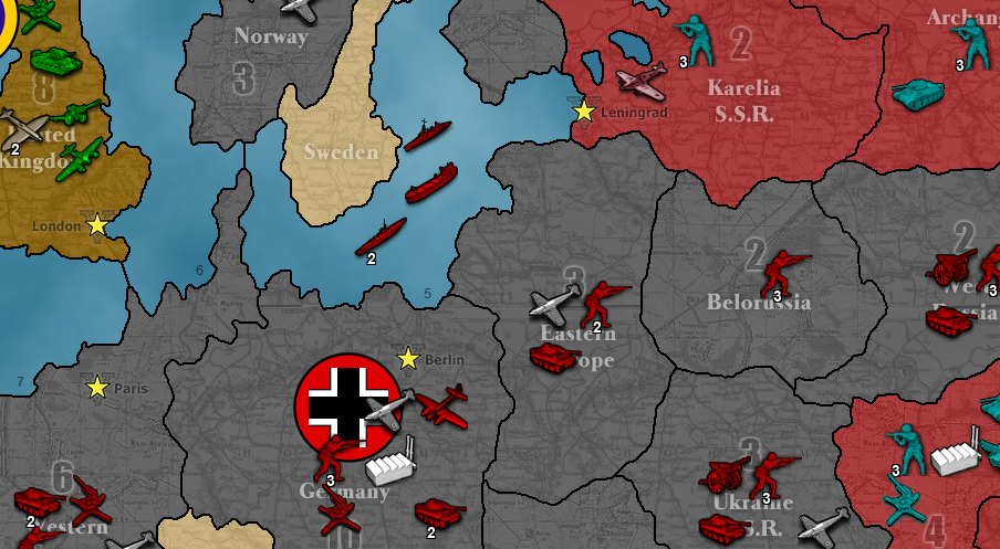
Alright so here is an initial example of:
- German color to red
- British color to green
- Russian HSB to light blue with increased brightness
- Ignore coloring of factories and fighters
Properties
units.color.Germans=FF0000
units.color.British=00FF00
units.color.hsb.Russians=180,100,25
units.color.ignore=factory,fighter
Result
-
@redrum Why brightness instead of lightness. Anyways, I'd skip either. Also, I would never increase the brightness without also increasing the contrast; that just make for an opaque result.
-
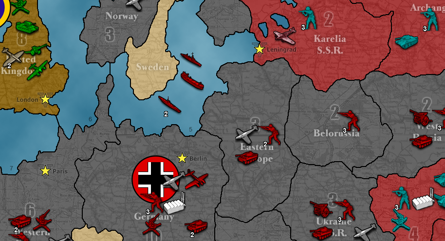
And now the Germans are fleeing! (flipped)
Properties
units.color.Germans=FF0000
units.color.British=00FF00
units.color.hsb.Russians=180,100,25
units.color.flip.Germans=true
units.color.ignore=factory,fighter
Result
-
And for those technically inclined here is the PR: https://github.com/triplea-game/triplea/pull/5192
-
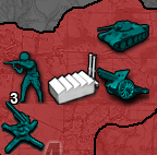
So I have a properties proposal that I'm hoping to get some input on. While the main use case of this feature is to specify a color and the engine apply the hue and saturation from it to colorize unit images, I'm also allowing users to specify changing the brightness as well. This could be done with a separate brightness property or could be done by allowing users to specify HSB values instead of color code. Here are 2 equivalent examples of changing the Russian units to a light blue and brightening (+25) them:
Option #1
units.color.hsb.Russians=180,100,25Option #2
units.color.Russians=00BBBB
units.color.brightness.Russians=25
Examples of Adjusting Brightness
No Change (0)
Increase (+25)
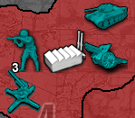
Decrease (-25)
-
@redrum Sorry for leaving your proposal aside, but I still surely suggest not offering the brightness option. That is something that should be fixed on the image itself only, if wanted. Fixing, or anyways changing, it on the program's display instead of on the source would really make little sense (in my mind), and if a mapmaker can manage to do it via TripleA, it should be smart enough to do it via an image editor, and vice versa. This option is also going to be confusing, as, in the moment you see in a map a unit with a brightness level you don't like, you'll have also to wonder if that comes from the image itself or from the settings.
On top of that, I see that you have added this element: "It also ignores any pixels that are close to black (brightness < 10%) as especially if increasing brightness these get faded and make images look less sharp.".
That feels really patchy and definitely arbitrary, and also inconsistent, in the moment the opposite doesn't happen if you lower the brightness (I know that doesn't really matter). Rather, if you really want to avoid that phenomenon on a consistent basis, I suggest you have the contrast increasing of the same amount for any absolute variations of brightness. Meaning that if you increase the brightness by 25, then the contrast gets increased by 25 too (on the same scale). On the other hand, if you decrease the brightness by 25, the contrast would get increased (not decreased) by 25.
With this said, now that, at least with that patch you are adding, I start understanding what you are getting at (I see you don't really want to make the objects generally brighter, like if they are glowing), I guess I have the right answer for that, if you can do it. This answer is the "gamma": just use the "gamma", instead of the "brightness" (and, of course, getting rid of that 10% always black thing, as well), in what you are doing, and you'll probably see results very much in line with what I guess you want.
If you are not sure about what the gamma is, you can open an image with GIMP and follow these instructions, for testing:
https://docs.gimp.org/2.10/de/gimp-tool-levels.html
(the gamma is the upper middle slider, when you have the channel on "value", after opening Colours/Levels)Also, regarding the brightness or whatever, please make clear if we are dealing with a percentage or a 0-255 scale. Maybe you have said it somewhere I overlooked, but point is everything must be very clear to the maker (just saying it eventually when this will be documented in pos2; haven't checked if it already is).
I, of course, agree applying only hue and saturation for colourizing via colour code, but that doesn't seem right as a process, as you are inputting something having a number of information implied, and using only some of those information. This means that there are a (big) number of such values giving the exact same result, in term of hue and saturation. However, since the ownerships colours are defined that way, I see a reason for it, but I would rather have a boolean option for simply setting the units at the hue and saturation defined for the ownership colour of the same player.
Also, anyways, if you are not going to remove that option too (as I suggest), can you please confirm me that inputting a color code value will give exactly the same result as setting the HSB with hue and saturation only at the values implied by that colour code, right?
Also, in any cases, can you please clarify whether the results of these options are going to work alike to complete colourization or alike to Hue-Saturation changes (in GIMP term, are we doing Colours/Colourize or Colours/Hue-Saturation (for example, the first one would colourize a factory, the second one wouldn't (as I said, I suggest the second one)))? Practically, are these options going to add saturation (colour) to an image like the factory or not?
-
@redrum I'm inclined to say option 1
-
I vote for option 0. I don't now anything so whatever you do is fine with me!
-
@redrum If option 1 gets rid of that thing of using the colour code to specify hue and saturation only, then I prefer that one. Can the matter be detailed? I assume that all the pixels of the image will be set at the defined hue. What will happen, instead, for each pixel with the saturation and the brightness (I assume the brightness just changes the value), relatively to their starting values? Maybe it should be rather called "HSV", instead?
-
I'd advocate for option 1.
Looking at an existing maps.properties files, there are already RGB codes:
#Color settings for the map
#values must be a 6 digit hex number
color.British=8B4513
color.Americans=488214
color.Russians=36648B
color.French=0000EE
color.Austrians=FFB00F
color.Ottomans=CD0000
color.Germans=999999
color.Italians=006400
color.Neutral=dd5500
color.Impassable=D2B48C

#default unit scale
#value must be one of the menu options
units.scale=0.8333

#does the map have relief images
map.hasRelief=true
Keeping RGB for unit colors would stay consistent.
Second, I find it hard to work with HS unless you're using a color picker. For example, a HS of 180,30 or HS of 240,100, I could not tell you what those colors are.
Third, IMO RGB is intrinsically simpler. HSB is comma delimited vs a value that can be parsed directly in java compared to being split. The range of values of HSB depend on the position, while RGB is consistent hex codes, each 0-F, while HSB is 0-360 or 0-100.
I personally think humans deal better with RGB. Notably it's the de-facto standard on the web. HSB OTOH is really good for image editting, I've used it there. Having the control to only change saturation or brightness is powerful as you can make colors more 'intense' by adjusting a single slider rather than increasing RGB values while maintaining a specific ratio