Proposal: Always-shown "Purchased Units" panel
-
@LaFayette That's not a bad idea, although there is a bit of complexity involved. First, the unit scroller is only shown on the unit movement screen, whereas the intention of this panel is to be shown during all phases after purchase. So if we have a new set of tabs, then we'd want to only have an active unit scroller during a certain phase, and inactive otherwise. We also need to have logic of when to show this tabbed pane at all - for example, we could show it only if there are tabs to show, and not show otherwise. Or we can show always and just keep tabs empty/disabled when in the wrong phase. And we may want to persist the user's preference about their last active tab there, so that it will be remembered.
Anyways, stepping back a bit, let me summarize the options:
- Panel is unconditionally shown after purchase, with no way to hide.
- An option in the View menu is added to hide/show the panel.
- It's instead a normal Tab along other tabs. This doesn't allow it to always be shown without user action.
- There's a split pane component, which allows easily minimizing the panel.
- There's a new tabbed pane at the bottom right corner with tabs for Unit Scroller and Purchased Units.
- A combination of the previous two ideas could be to have the new tabbed pane be insider a split pane, so it could be hidden altogether.
There's also additional open questions:
- Does it work well on all maps, especially with a lot of units? I welcome suggestions on which to test - or when we get a prerelease build out with this change, people can try it out too.
- How does it work with large unit icons? Something to also try out once we have a prerelease build with it.
Finally, I believe that everyone is in agreement that it would be good to have this be visible for opponents moves. This can be supported with any of the UI options.
-
We have a prerelease to try with this feature implemented:
https://github.com/triplea-game/triplea/releases/tag/2.0.16238To enable this, set "Show Beta Features" to "True" under "Engine Settings" -> "Testing".
Please try it out and play with it and let me know how it feels. Thanks!
-
@Alexei-Svitkine said in Proposal: Always-shown "Purchased Units" panel:
We have a prerelease to try with this feature implemented:
https://github.com/triplea-game/triplea/releases/tag/2.0.16238To enable this, set "Show Beta Features" to "True" under "Engine Settings" -> "Testing".
Please try it out and play with it and let me know how it feels. Thanks!
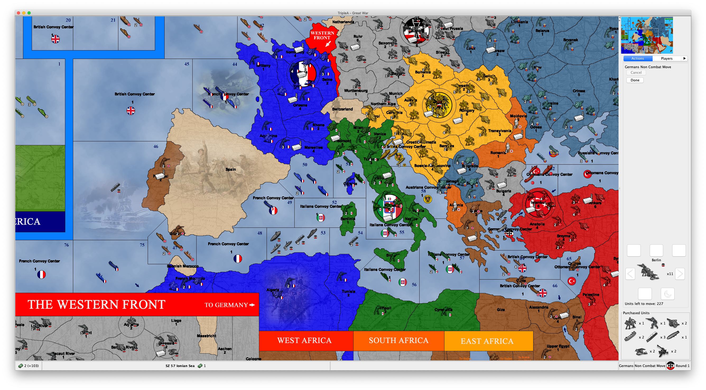
This feature is not working for me. In all games I tested it, it just shows an empty "Purchased Units" thing at the bottor of the action tab.
Also, if the "Purchased Units" is showing any unplaced units that you have, not only those that you purchased, it should be called otherwise (I get that in all the standard games you can only have unplaced units if you purchased them, but, even in this case, strictly speaking any units that you didn't start with is purchased, no matter if also placed). It also feels weird and wrong to me to see an empty "Purchased Units" thing at the bottom of the action tab, while you are in the placement phase.
-
@Cernel Can you provide a screenshot? Which maps?
-
@Alexei-Svitkine Any games I tried that is available in download list. The situation is just as I pictured.
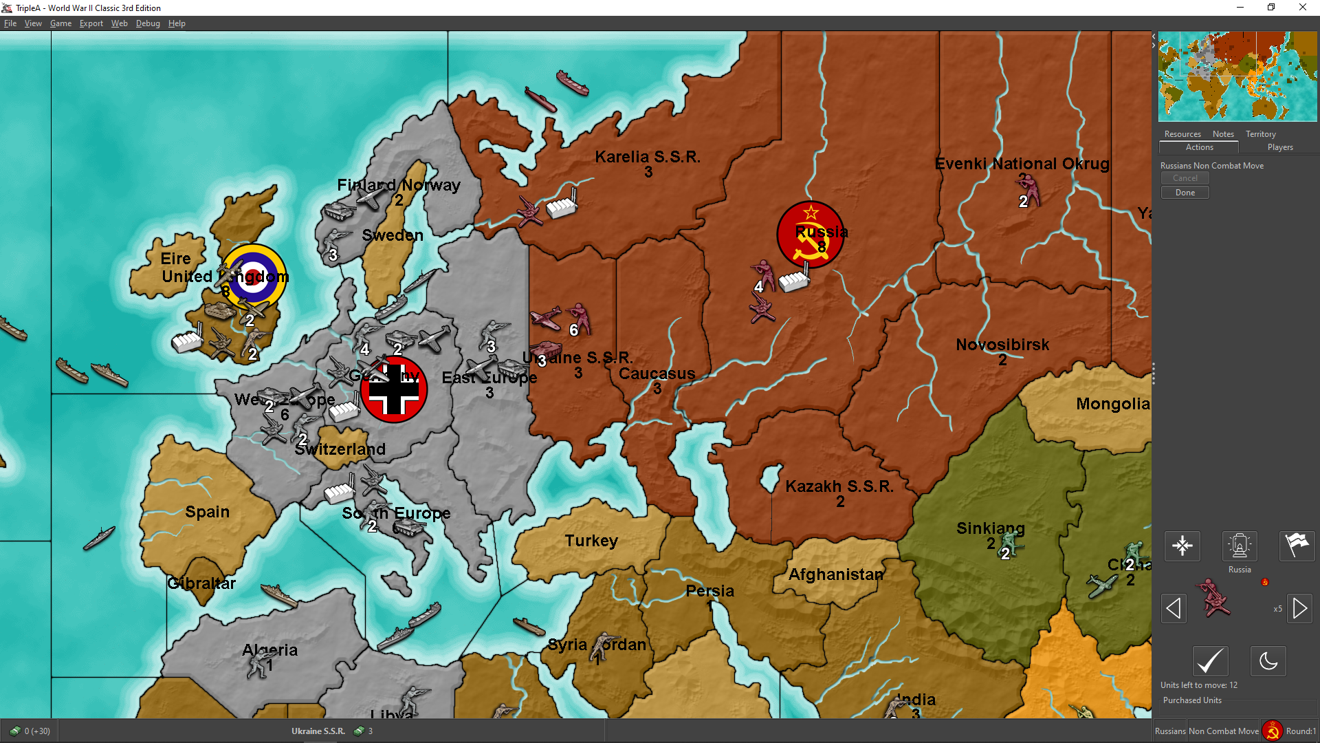
(I purchased 3 infantries and 3 armours) -
Thinking over it, I see "unplaced units" as a resource you have, thus conceptually similar to displaying resources. This is so especially if you consider that in a game like WW2v3 Chinese will get directly infantry; so, for such a player, receiving infantry units to place is substantially like for everyone else collecting production units (PUs).
Or you can even have games in which you always and only "collect" new units (like Risk, or likely most games in which you have only 1 unit type), for example (albeit unavailable):
https://github.com/triplea-maps/conquest_of_the_world/archive/master.zip
Thus you could have all unplaced units you have displayed in the bottom bar, next to the resources you have, but with a divide in between (not to confuse resources stock with unplaced units stock). However, this would present the challenge that usually the bottom bar is thinner than what would be needed to fully display the units (for example, in the TripleA assets the normal flags are 32 pixels high, while the units are 48 pixels high). -
@Alexei-Svitkine said in Proposal: Always-shown "Purchased Units" panel:
There's also additional open questions:
- Does it work well on all maps, especially with a lot of units? I welcome suggestions on which to test - or when we get a prerelease build out with this change, people can try it out too.
- How does it work with large unit icons? Something to also try out once we have a prerelease build with it.
I already suggested this, did you try it?
@Cernel said in Proposal: Always-shown "Purchased Units" panel:
p.s.: You can use this map (not available in download list) to test with a unit much bigger than the usual 48x48 pixels.
https://github.com/triplea-maps/conquest_of_the_worldIt shouldn't be an issue here, as you don't purchase, but place right when you get the units (I assume you know Risk), but it may give you an idea, or should I say I've no idea how this feature would display, as all the space is already filled with only 1 move.
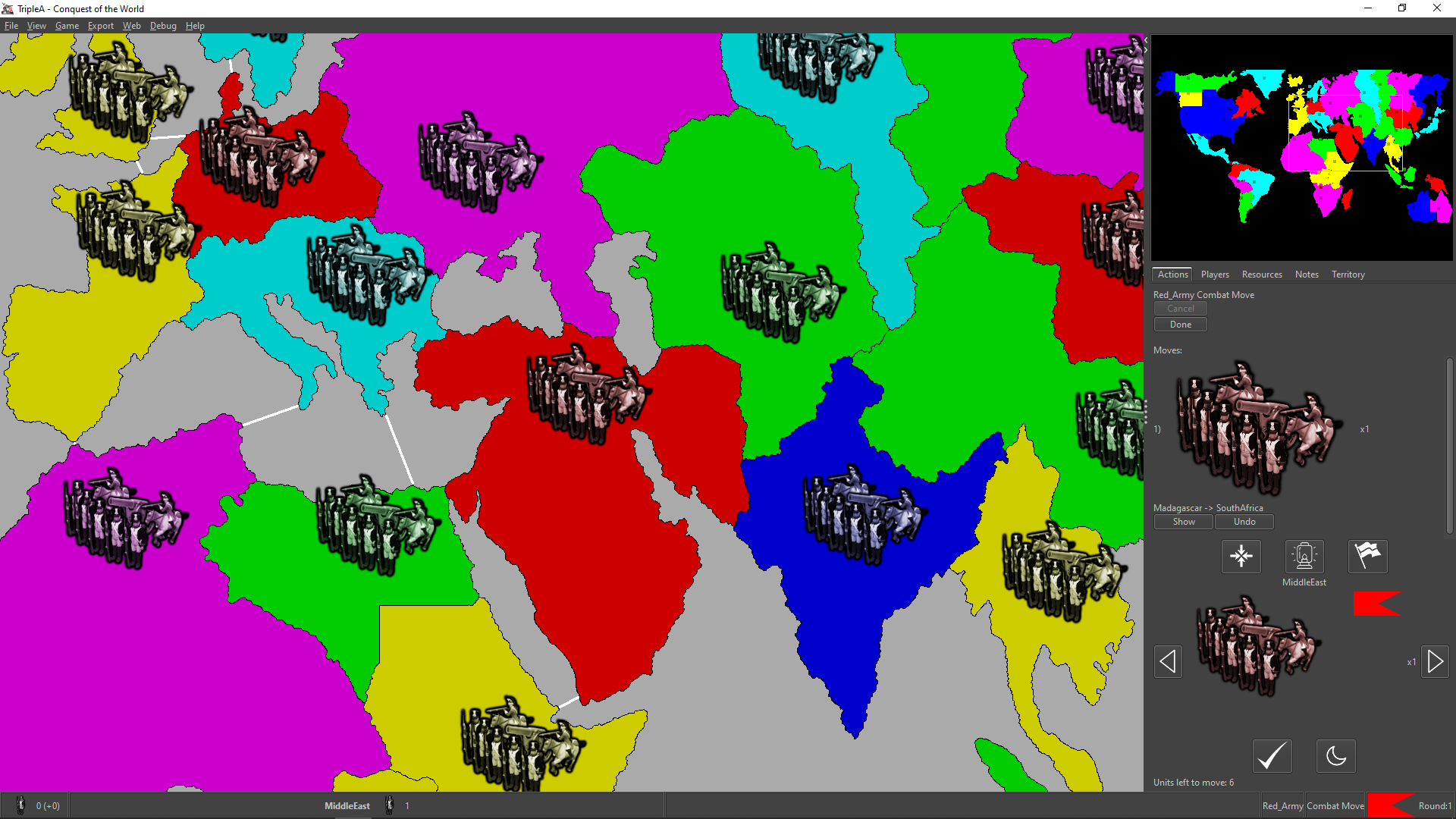
Anyways, I suppose you can test by changing (modding) the game as to not destroying unplaced units, then just skipping placement, if I'm guessing correctly that by "purchased units" you actually mean "unplaced units".
-
@Cernel said in Proposal: Always-shown "Purchased Units" panel:
@Alexei-Svitkine Any games I tried that is available in download list. The situation is just as I pictured.
(I purchased 3 infantries and 3 armours)That's very strange. It's not supposed to be empty. What version of Java are you using?
After enabling beta features, did you restart triplea?
-
@Alexei-Svitkine said in Proposal: Always-shown "Purchased Units" panel:
What version of Java are you using?
It says 11.0.4.
After enabling beta features, did you restart triplea?
I had it already enabled.
-
Hmm, very strange. I wonder if it's some platform-specific difference.
Has anyone else had a chance to test it? Does it work for other people on Windows?
EDIT: Hmm, I had a chance to try it on Windows and am seeing the same thing. Ugh.
-
@Alexei-Svitkine Yeah, I immediately guessed it was because I'm on Windows and you are on Macintosh, but, then, I've been a little dubious since nobody else said anything or anyways confirmed the bug.
-
Actually, looks like I can reproduce the issue on Mac if I change the look and feel to Subspace, which is what TripleA uses on Windows. So I should be able to debug.
-
I figured out what's wrong and will be sending a fix. Stay tuned - I'll post an update when we have a prerelease build with the fix.
-
@Cernel said in Proposal: Always-shown "Purchased Units" panel:
@Alexei-Svitkine said in Proposal: Always-shown "Purchased Units" panel:
- How does it work with large unit icons? Something to also try out once we have a prerelease build with it.
I already suggested this, did you try it?
I didn't before, but I did now. The panel doesn't show up because as you say, there's no purchase. (I did get an exception with the UnitScroller on it, but this seems unrelated to my change.)
-
@Alexei-Svitkine Well, anyways what I said is that I believe it should not be called "Purchased Units". Like you could have a game that gives you whatever units based on something, also already having some at start game, that you'll place at some point. The matter is not that the units may be purchased, but that you have them still unplaced.
-
@Cernel said in Proposal: Always-shown "Purchased Units" panel:
@Alexei-Svitkine Well, anyways what I said is that I believe it should not be called "Purchased Units". Like you could have a game that gives you whatever units based on something, also already having some at start game, that you'll place at some point. The matter is not that the units may be purchased, but that you have them still unplaced.
Sorry I didn't reply to this. I agree that naming it something different like "Units to Place" would be better - and China on WW2v3 is a good example of this. Feedback noted and will keep it in mind when I iterate on the UI.
Still hoping to get the first UI out for people to try before I go about changing it.
-
@Alexei-Svitkine I think it can be just "To Place", as not like you can place something else but units (besides, also PUs (the main "resource" in the game) are nominally "units", as the meaning is "Production Units").
Alternatives to "To Place" may be "Unplaced", "Under Production", "Mobilizing", "Held" ("heldUnits" is the xml way of calling units in a player's inventory).
-
Okay, so I think we have a prerelease out with the fix here:
https://github.com/triplea-game/triplea/releases/tag/2.0.16244Please try it out, thanks! Sorry for the fact the previous one did not work right on Windows.
-
@Alexei-Svitkine Works for me, but this additional feature rates as an additional problem, in my tracker.
I guess here it is being generally assumed that TripleA maps are all maps with 48x48 pixel units. If so, I hope that is a wrong assumption.
Not a map available anywhere, but an example of what you may get with 64x64 pixels units images on Full HD:
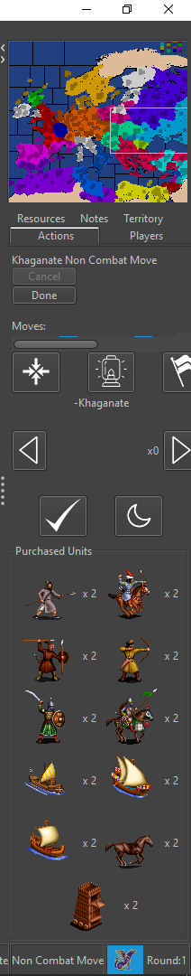
This image confirms my expectations, based on what I already explained.
Here, I cannot even acces the actual actions tab, meaning I'm unable to even undo the single move I made, unless I expand the right bar, of course (actually, I can also do it if I go in Settings/Testing and set Show Beta Features = False, then save and reload the game).
I suggest deleting this feature (if not moving it out of the "Actions" tab). Otherwise, at least assuring the actual actions space is never cut so much as being impossible to undo any or all of them (rather cutting the purchased units space).
-
Scrollbars look like a must. IMO we'd always probably want to see at least 4 of the purchased units, more than that behind scrollbars perhaps (largely need to account for cases where as @Cernel has tested there are a pretty decent number of different units pruchased. Some maps could get more extreme and we'd need to handle it)
IIRC the unit scroller was a bit debatable for taking up too much space. Unit scroller is move related, so it makes sense. We could try to cut down the space it takes, though I'm not sure if there is an obvious solution.
The fly-out tab I still think is the ultimate solution, until we get there moving the purchase panel is probably 2nd rate but at least gets the feature in. The 'resources' tab could make sense to have it. We could help the navigation issue between tabs by ensuring there are hotkeys to the tabs and that the hotkey is displayed on hover. Potentially and in addition to that, we could explore if there is a way to get tabs to show in rows on Mac so that they are all always visible.
Hello! It looks like you're interested in this conversation, but you don't have an account yet.
Getting fed up of having to scroll through the same posts each visit? When you register for an account, you'll always come back to exactly where you were before, and choose to be notified of new replies (either via email, or push notification). You'll also be able to save bookmarks and upvote posts to show your appreciation to other community members.
With your input, this post could be even better 💗
Register Login