Screen centering/cycling around map UI idea
-
Terminology
@Cernel had a lot of points against the sleep terminology. Civ uses 'sentry', and I suppose we've ruled that out. 'Station' being a real world term, "A garrison is stationed in the city" is a positive. I'm not necessarily going for military realism, but we want to create analogies and mappings for concepts to be made more obvious, using a real term helps that.
For example: "3 druids and 2 bears are asleep in Gondor". "3 druids and 2 bears are stationed in Gondor". I think 'station' might actually be a better fitting term in the more generic sense. The definition of the word 'station' fits what we want really well:
station 4. the place where someone or something stands or is placed on military or other duty.
I'm really concerned we are stuck in our initial positions and have hit a point of bikeshedding. Let's put a pin in the terminology for a few days. Please everyone play test the new buttons, try to get used to the new terminology, and let's see if we all still feel the same after a few days.
Spacing
@Cernel I agree more space for the map is better. Though, does 30px really make a difference to you? Does the unit history getting cut-off not bother you?
Can we have more opinions on this as well. I'm not a fan of the gap between the mini-map and the right hand edge. I also think though that the minimap size was never made standard and the Napoleonic Wars is an anomaly and was just made too small. The unit history getting cut-off looks bad IMO.
If we seek to make the unit scroller buttons even more narrow, they do not look as good. At this point I think the right answer is to make the minimap slightly larger on that one map. Trading the aesthetic of the unit scroller controls to not look good on every map is a bad trade-off IMO compared to fixing the one map where the minimap is extra small. The unit history being cut-off is significant, the tabs being put to 3 rows instead of 2 is cluttery, the player table being that narrow makes that unusable without resizing.
Sun Icon
@Frostion indeed, sun+moon being false antonyms was a problem. Looking at it, the 'sun' is not quite right. An artificial light source is probably better representative as we shining a spotlight on the unmoved units. @Frostion if you could propose a light bulb, or a lantern, flashlight, search light, something similar that would make a good icon, that would be really appreciated.
-
@LaFayette If "station", maybe the skip one can be called "stay". So, one would have the stay/station alternative as temporary/definitive.
Maybe @redrum just meant he didn't like the "shield" symbol, not really the term station itself. While I like "station", I have to say the shield symbol is surely less clear than the moon one (coming from somebody doesn't actually like that).
-
@LaFayette OK ... Here is a new version of the set. All icons are 37x37 px, so a bit smaller than 39x39. Here are exmales and the zip.
I also want you to know that, even if we are not in total agreement in regards to all aspects, I think we all agree that this feature is 100% thumps up and great
") I apreciate the work! Keep it going!
I apreciate the work! Keep it going! 
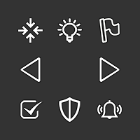
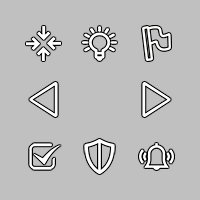
The set is a SET meaning they have all the same treatment and are not as the others I have uploaded before. These are a bit more “sharp” in the outline and less shadow.If you like them different or smaller, like 32x32 then let me know and I will make them.
-
@LaFayette I don't think there should be a minimum, or the minimum should be so small to assure to be purely theorical (like a minimum at 100 pixel wide minimap). Then, the default can be whatever it is preferred generally by the developers, but, after starting the game, one should be able to manually reduce the wideness of the sidebar as low as the minimum fitting the minimap. Once you reduce the space so much that the unit scroller doesn't fit anymore, it should disappear, and there should be an option for having it disappear, as well (if someone prefers not having it, maybe to have more space for action display).
Regarding guessing what the assumed miniMap wideness may be, for a predetermined default wideness we can refer to the history tab, and consider that it would make the most sense for two bars on the left and the right of the screen to be preferably of the same wideness. If I load World War II Classic with 2.0.16492 and click on game/show history, the left side bar is exactly 158 pixels wide. Then taking out 10 pixels on the left and 4 pixels on the right of the smallMap, that would give a smallMap of 144 pixels wide, if you want to have the right bar as wide as what you get default for the left bar.
Based on the above, I would say that the standard wideness of the smallMap, currently, should be 144 pixels, but I realize that this is actually much under any average you may derive by looking at the repository maps.
Since TripleA is in the weird condition of not actually having an official main referring game, an alternative way is looking at the smallMaps of world_war_ii_classic (being the first and default game that ever existed for TripleA), of big_world (having been for many years the default game offered by TripleA), and of the_pact_of_steel (being the fist truly custom yet official game of TripleA and having a mod serving as tutorial for mapmakers). The wideness are the following, in pixels:
world_war_ii_classic: 233
big_world: 243
the_pact_of_steel: 233 -
Thanks for the response
@Cernel have you considered the implication for unit move history and the stats table? A unit move history of 150px might cut-off the first unit moved, let alone cutting off on the second.
Once you reduce the space so much that the unit scroller doesn't fit anymore, it should disappear, and there should be an option for having it disappear
We have a "full-screen" mode, the entire right hand edge can be shrunk. Having just the unit scroller disappear is not trivial. A feature to have the right hand edge disappear independent of the mini-map would seem to serve that goal well.
My biggest concern without having a minimum, focusing "too" much on allocating space for the map, is that the unit history and stats tables suffer. It has been a long running annoyance to have to scale the stats table to be able to see the values. It's a particular problem on WaW where many values go beyond the expected 2 digits and are 3 or 4 digits.
-
As another perspective, the minimap sets a minimum sizing (due to the UI framework). So there is a minimum. We are talking about a mere 15px increase of this minimum.
If we disappear elements that do not fit, it's then a difference of 15 px for when the smallest of minimaps and unit scroller would disappear. In other cases, the minimap would disappear before the unit scroller. It's a bit moot as I don't know/think offhand that could be done cleanly.
We certainly could consider having a similar 'hide' button for the unit scroller. It would require some additional space, which maybe is not a good choice. I certainly would like more opinions and feedback before we demo that.
-
@LaFayette if the behaviour of the skip button, beside skipping, is to move to the same next unit you would move by clicking on the right arrow, then it should better stay right under such arrow. However, since there is not an intuitive reason why the skip button should also have a right/left behaviour, it may be advisable that, after you click it, you keep the territory in the scroller, but with no units in it, so that you have to, then, use the left/right arrow to move to either units group presented beside the one you just skipped or stationed.
Station has also the advantage that you can say "I stationed these units", but you cannot say "I slept these units", but you'll need to say "I put these units to sleep", so the term would be actually "put to sleep", not just "sleep".
-
@Cernel "put to sleep" has connotations : )
It's usually used in animal shelters.Skip does advance to the next unit so that we avoid an "empty unit" selection. If you hold space bar, you can skip all units. It seems clunky if you have to alternate between pressing space and 'n' to do that. Alternatively, every time you press 'space' to skip, you'd need to press 'n' to go to the next unit. It's much nicer to be able to skip and go to next without having to do those as two separate actions. The intended use-case for the 'unit-scroller' is to 'scroll' or 'cycle' through all available units.
-
@LaFayette Then, maybe, to keep it coherent the most, we should not have a left/right couple of specular arrows, but just a right arrow (or whatever is working when you click on skip too), while the other arrow should be absent or only working until getting back to the initial unit group displayed, but not any further "back", and displaying a symbol that hints this is only going back on what previously already displayed.
-
while the other arrow should be absent or only working until getting back to the initial unit group displayed
What's the intended benefit? If I want to go back to the last 'selected' unit, why should I have to scroll all the way through first?
-
Outstanding items:
1.Agreement adding 15px to minimum size of action panel is not a deal breaker (thank you Cernel for measuring minimap sizes)
2. Sleep vs Station Terminology (on hold to see if we can get used to 'station' before making final decision)
3. Unit sortingUnit Sorting
I investigated using the same sort as the battle calculator and am thinking we may want to use a slight variant. Namely the battle calc and unit avatar panel are different enough that the same rules may not be actually what we want.
For example, if we go with battle calc sort, then the following:
[ infantry, marine, elite infantry, tank, fighter, AA]Would sort to:
[infantry, marine, elite infantry]That would be three images that are essentially the same. I think we probably want [inf, tank, fig]
Another example (B): [infantry, tank, figher, AA]
Right now it displays as [tank, infantry, fighter]. I think we want [inf, tank, fig]
I'll give a number of more examples of what seems to be what we want for the unit avatar:
[inf, tank, fig] -> [inf, tank, fig]
[inf, tank, fig, aa] -> [inf, tank, fig]
[inf, marine, tank, fig, aa] -> [inf, tank, fig]
[inf, marine, tank, aa] -> [inf, tank, aa]
[inf, arty, marine, tank, aa] -> [inf, tank, aa]
[inf, arty, fig, bomber] -> [inf, arty, fig]
[tank, fig, bomber, aa] -> [tank, fighter, aa]Any thoughts to the above sort orderings? Would anyone choose differently?
-
@LaFayette My suggestion is to display the maximum number of units that the current wideness of the right bar allows, down to a minimum of 1 (I guess that would allow small smallMaps to fit too). However, if there are more types than can be displayed, display none (just give the total number).
That way, if you see units, you are sure that you are seeing each an all unit types you can move from there. If you see no units, you should know that you must either look at the territory or expand the wideness of the bar until they display.
In this case, the units can be displayed on a horizontal, rather than diagonal, line (that is not necessarily preferable, anyways; for example, with the naval units facing rightward you have in assets you may actually maximize the overlapping with a diagonal lining-up).
Otherwise, you can always display all of them and lining them up vertically (so that increasing their number will not impact on wideness constraints, but just expand the bar space taken vertically), but, in this case, it would be certainly necessary having the ability to hide this function (in case the user would feel it is taking too much space).
-
Is there a way to click on "Done" without using the mouse and, in particular, playing while keeping the right side bar hidden constantly?
I mean like making your moves, then clicking on something to confirm them, and go to the next phase, without having to reopen the right side bar all the time you need to end a phase?
-
@Cernel said in Screen centering/cycling around map UI idea:
Is there a way to click on "Done" without using the mouse and, in particular, playing while keeping the right side bar hidden constantly?
This is slightly off-topic, but yes. There is a hover text on buttons informing "shift-d" will do the job.
-
@Cernel Rendering space is a problem, it's pretty common to have more than 3 units. The 'count' of units is meant to be the thing to tell you there are more units than you are seeing.
I'm skeptical it would be visually clean or really convey useful information to have a count of the number of types of units and also a count of how many individual units there. After the first two rounds, when most unit groups are clumped, having more than 3 types of units will be a common-case. It's a bit late as well to drastically revisit such fundamental aspects of the feature, this topic needs to get settled and put to bed. Let's please focus on the 3 open items.
-
@LaFayette Ok, but I'm just trying it and I see that if you have more than 1 battle you have to open the right bar to start any of those. So I suppose playing with the right bar always closed is not really possible.
-
@LaFayette But isn't the count the total units, while the units images in the scroller displaying a number of types of them? I don't think there is a way to tell if there are other units types than what I'm seeing, unless the total count is equal to the number of different unit images I'm seeing or I'm under the maximum types that can be displayed (and I know what that maximum is).
-
But isn't the count the total units
@Cernel , Yes
while the units images in the scroller displaying a number of types of them?
Yes, up to three different types are displayed. The question about sort is for which ordering to display them in and which ones to prefer to show vs not. There is not nearly enough space to show all types. While trying to make things narrow, the unit images were moved to be more squashed together to a maximum extent possible and still have it look okay.
I don't think there is a way to tell if there are other units types than what I'm seeing, unless the total count is equal to the number of different unit images
If equal, then you are seeing all the units. In part the unit count was there to make it more clear there can be more units than displayed. There is not enough space in the avatar area to actually see a thumbnail of each unit, the stacking of 3 units is meant to convey that there are more, it hopefully does not take someone very long to realize that if there 7 units and you see only 3 types out of 4, that there are more types. It's also not meant to be the authoritative source to see every individual unit in the stack either.
-
@LaFayette Then I don't think it will really matter what units images are being displayed. It can even be only one, I don't think it will make a difference, since you would refer to the board only anyways. I still think it would be more intuitive not to display any images if there are more unit types that the maximum that can be displayed in the scroller, as that at least will immediately tell you that if you are seeing anything at all there, that's it (for the types).
-
@Cernel In general I think this is how it works for informative lists. For example, currently, when in the automated tooltips you get the list of all units that can receive support either you get the full list or, if the list is deemed to be too long, you get nothing. That way, at least, if you have a list at all, you know that list is reliable. Of course, this can be done also by displaying somehow that the list have been truncated, and there is more, but I don't see much point in that.
Hello! It looks like you're interested in this conversation, but you don't have an account yet.
Getting fed up of having to scroll through the same posts each visit? When you register for an account, you'll always come back to exactly where you were before, and choose to be notified of new replies (either via email, or push notification). You'll also be able to save bookmarks and upvote posts to show your appreciation to other community members.
With your input, this post could be even better 💗
Register Login