Game of Thrones & A Song of Ice and Fire - Official Thread
-
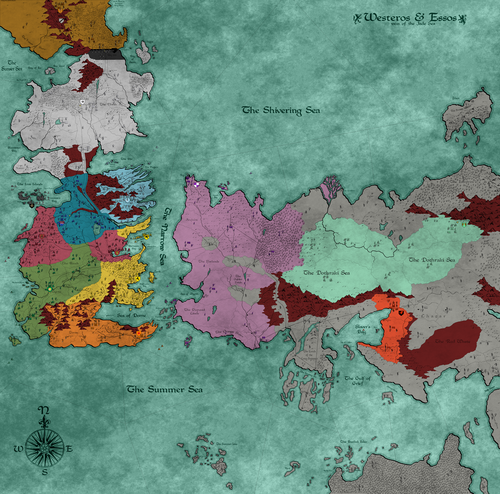
My main focus is on improving the units. I feel that they are too drab and their stats could be improved. I wish to include elements such as support and targeted attack/defense as well.
-
@Greg-Anderson This is a great initiative: this map needs some love and TripleA needs some more good FFA! This map is abandoned and, in my opinion, not really playable, at its current state, so not much risk in changing it (I have never played it, and I don't think I'm even trying to play it, at its current state). But I'm totally down playtesting, if any efforts on it are made.
Be sure to read my review, if you intend to fix the map also from a gameplay standpoint:
Game of Thrones & A Song of Ice and Fire - Official ThreadAnd you can also take a look at this video made by @Götterdämmerung:
https://www.youtube.com/watch?v=VvuFic41FxMI'd suggest not to make it much more complex, however (supports and targeted attacks are interesting features, but add complexity).
In my opinion, the biggest issue, currently, is the excessive production of units, that would inevitably result in huge stacks, especially under FFA dynamics (conserving your TUV is very important), which means slowing down the game to no advantage (over a rather low limit, having more units doesn't really increase your strategic options).
Of course, one also needs to decide how the map is going to be played at all, to start with (I don't think it is realistic to assume you get as many human players as the total number of powers and, anyway, some powers like "Others" and "NightsWatch" appears to be intended for AI gameplay only, but, if so, this should be clarified).
-
My suggestion is having it working like Feudal Japan, where each player takes one power and the rest are given to the AI, except that "Others" and "NightsWatch" are AI only. However, this is very challenging on balance (you would need to define a set of balanced powers per each number of participants).
-
@Cernel I just read your review and I found your ideas fascinating. I will try to apply at least some of your ideas while improving the map.
I had tried playing this map about a week ago and I also found it virtually unplayable. I would like it to be similar to Frostion's map Middle Earth Battle for Arda, which is the best fantasy map in my opinion.
I'll post my updates here as I progress in the map overhaul.
-
@Greg-Anderson Sounds good. I know Cernel will disagree with me but I really think the best direction to take the map is create a 2 sided rather than FFA version. That would make it more playable given the large number of nations and avoid needing lots of AI players. And I agree that Battle for Arda is one of if not the best fantasy map (though its not Frostion's).
-
@redrum Sorry, I often get confused as to who created what map since some maps have several creators.
I'll take your ideas into consideration as well.
-
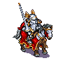
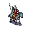
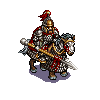
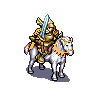
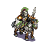
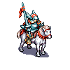
@Cernel @redrum I just wanted to post an update with some of the unit art I plan on using. Let me know what you think.
The base unit art is from units in Battle of Wesnoth, but I have modified them to fit the chosen powers.
Here are the planned infantry/cavalry units for House Greyjoy. I will probably keep the siege and naval unit art the same.


-
Here is what I'm currently planning as a first step to making the map playable.
- Finish the unit art for all the powers.
- Rebalance all the unit stats.
- Add targeting and support for some units.
- Balance unit cost.
- Regenerate unit placement.
After that, the map should be partially playable.
Then, there would be part 2:
- Review national objectives and decide whether they should be kept.
- Make Nights Watch and Others AI only.
Now what could be done but I'm not good at:
- Improve the borders.
- Maybe simplify the current map skin to avoid confusion.
If I have forgotten something, please let me know.
-
@Greg-Anderson Personally (and this is just an opinion from someone that has nothing to do with this map), I have no major problems with the units art, actually, but yours look very good (and this is just an opinion from someone that know next to nothing about how the units should look). However, I'm not seeing such different styles mixing well with each other, if you plan to keep the current images for part of the units.
-
@Cernel I will try to make sure the unit art clashes as little as possible. I think I may have a solution for the naval unit art. My main problem is with the siege unit art, which I might have to keep unless I find a solution.
My main problem with the original unit art is that it was so drab. I feel that good unit art is important to make a map popular.
-
Currently, I'm working on the unit art for the Lannisters, Free Cities, Dothraki, and Martells.
I plan on having 7 cavalry/infantry units per power. Each power will have around 1 leader-type unit with leadership support. There will also be 2 cheap fodder units, 2 mid-ranged units, and 2 elite units per power.
I took the Morder power from Battle for Arda into consideration when planning the number of infantry/cavalry units per power.
The Mordor power had the Snaga skirmishers and orc marauders as cheap fodder units. Then, the mid-ranged units were the Uruk warrior and Uruk pikeman, which both had some support and targeting abilities.
There were also the spider and Olog hai, which were both elite units that were very useful but also expensive. Then, there was the winged Nazgul, which was the leader unit.
As always, I am open to all suggestions and feedback.
-
The unit art is almost finished. I'm just finishing the recoloring and rescaling the units.
I'll post them all once they are finished.
-
-
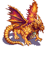
Here are the units for each power. I am listing based on the pictures I just showed.
Greyjoy
Bowman-Reaver-Crossbowman-Raider-Horseman-IronLord-SwordsmanLannister
Bowman-LionLord-GoldCloak-Horseman-GrandKnight-Pikeman-KingsguardTully
Horseman-Swordsman-Pikeman-Sellsword-RiverLord-Halberdier-RiverArcherArryn
ValeGuard-Bowman-Swordsman-EliteWarrior-General-Knight-MountainClansmanDothraki
Arakhman-Slave-Scout-Bloodrider-HorseArcher-Khal-HorsemanFree Folk
Pikeman-BearRider-Giant-Swordsman-Axeman-Bowman-WildlingChiefBaratheon
Kingsguard-HammerWarrior-Swordsman-StagRider-Spearman-Crossbowman-PrinceStark
Watchman-Axeman-Bowman-Horseman-Direwolf-Swordsman-WardenTyrell
MasterWarrior-Bowman-Pikeman-General-Horseman-CityGuard-ShockTrooperMartell
General-DuneRanger-Spearmaster-Spearman-HorseArcher-SpearThrower-BowmanTargaryen
Dragon-Bowman-Unsullied-Pitfighter-Knight-Arakhman-QueensguardFree Cities
Horseman-FacelessMan-Sellsword-Slave-WaterDancer-SeaLord-UnsulliedOthers
WhiteWalker-StrongWight-WeakWightNeutrals
Swordsman-Sellsword-Spearman-Horseman-Pikeman-Giant-BowmanNOTE: Each power (except neutral) has three unique units.
-
@Greg-Anderson Looking good. FYI, the Martell Bowman is missing a shadow. You'll also want to consider how you want to indicate player ownership. You can just recommend players set the unit flags on in the game. Some games also actually dye the units a color or use some form of built in roundel/flag (Total World War) for example.
-
@redrum I will find a replacement for the Martell Bowman. Thanks for pointing out the mistake.
I don't want to fully color the units, as I believe it would remove some of the detail. I already recolored the clothing of each unit to match their power's color.
As for indicating ownership, I was planning on just keeping the small flag that appears in the bottom right corner of each unit. I believe that is enough to tell ownership.
Please let me know if I am wrong.
-
@Greg-Anderson That's fine. You'll just want to mention in the notes that its recommended to make sure unit flags are turned on.
-
@redrum Alright. Thanks for pointing that out.
The next step will be to rework the stats. I'll post more updates soon.
-
@Greg-Anderson The unit art is very nice, some considerations:
Why are the Greyjoy so smaller than the rest? If that is because those were the one made first, then you switched to a bigger dimension, I agree with the choice you made, there, but, then, I think you should redo the Greyjoy, about as big as the rest.
While it would be great if you could have that big dragon image take the space it needs, and the rest distributing in the available area, none of this exists in TripleA. In TripleA all images are drawn from top left coordinates (generated by a very bad autofinder or via an extremely time consuming manual picking). So, while it is just unthinkable to have huge dimensional differences, like in the case of the dragon (in theory, you could use all images as they are, comprising the dragon, but this would imply that, to avoid eccessive overlapping or even making units invisible or unclickable, you would need to space the unit as much as needed, which would be a very inefficient use of space). Beside the extreme case of the dragon, I still suggest against having dimensional differences at all, because, all images being drawn from top left, the bigger ones would likely overlap all to the right and bottom, then. Having some measure of dimensional differentiation in TripleA is possible, but my suggestion is doing it by having the images files all of the same dimensions, no matter how small or big the picture itself is (in your case, I suggest having them all 80x80 pixels), leaving as much blank space as needed for the ones not filling the space, centring the actual picture. 80x80 pixels images will be cut here and there (the battle window and so on), and will give huge scroll bars in the territory tab, but the map should be still fairly playable, and save most of your concept (it's a compromise, of course).
Also, then, you can have the images overlapping a tad, to use the space more efficiently, especially when having a lot of blank space in them. In case you go with all 80x80 pixels images, as I suggested, you can do so by actually generating placements at 64x64 pixels, then putting all your place coordinates into an excel sheet and decrease them all by 8 (so, a
0,0coordinate will become-8,-8and a12,57coordinate will become4,49, for example), that way having a set of sequences of placements optimized for 80x80 pixels images, that would overlap each other of up to 16 pixels on either axis.Since the units are unique, thus you don't strictly need flags, it makes sense just to go with the switchable flags the TripleA program itself provides. Maybe a developer will eventually make it as a map setting, so that each map can decide whether to have them default on or off... If wanted to have flags always showing, which would be reasonable, as well, I advice against drawing any flags in the images themselves, but rather using "unitIcons", for that (you would define those as always displaying, in the "unit_icons" property file).
-
@Cernel Thanks for the advice.
I just wanted to mention that all the units apart from the units of House Greyjoy have not been scaled yet. Each unit will be scaled to a dimension of 50x50, as that is the size of the original units.
I simply wanted to show what the units will look like before scaling. The original unit images apart from the dragon are 72x72, which is too large for the map and causes overlapping. I already tested to find the appropriate size.
Hello! It looks like you're interested in this conversation, but you don't have an account yet.
Getting fed up of having to scroll through the same posts each visit? When you register for an account, you'll always come back to exactly where you were before, and choose to be notified of new replies (either via email, or push notification). You'll also be able to save bookmarks and upvote posts to show your appreciation to other community members.
With your input, this post could be even better 💗
Register Login