JavaFX Update of Staging Screens
-
Open discussion regarding rewrite of staging UI screens with JavaFX.
First topic, it seems we have two top-level navigations, ie:
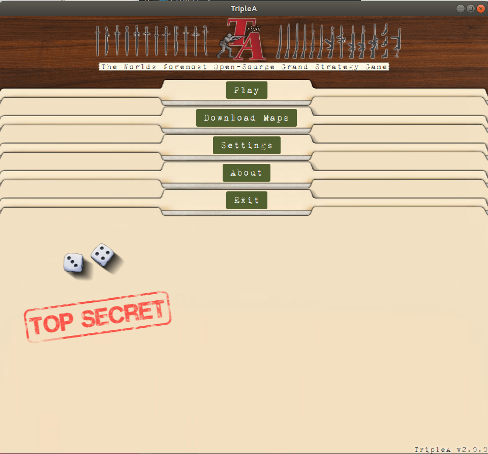
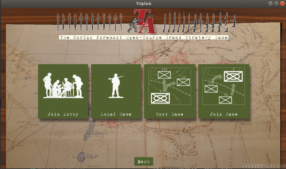
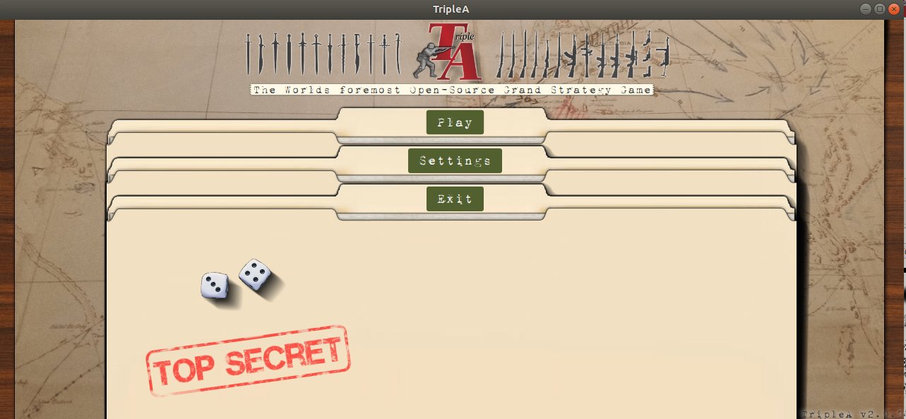
Basically, the main controls are presented both as folder and then as green buttons. The 'play' nesting seems to require a click that ideally is not one click deep (preferably zero clicks).
There is not that much extra on the play screen not present on the main screen. We could add a settings and about button, and change the 'back' to an exit, and we'd have the same information density.
I tend to like the green buttons better as they have visual indicators and force less reading. I think we should create buttons for settings and add it to that screen. Perhaps we can leave an about off for now.
'Download' maps I think should be moved deeper into the system. It's usually not a top-level concern for someone. They do not open the game and think "Oh, I opened this game so I can download maps!". Whenever a player selects maps, I think that is a good place to place pretty prominently a 'download maps' button.
cc: / @RoiEX
-
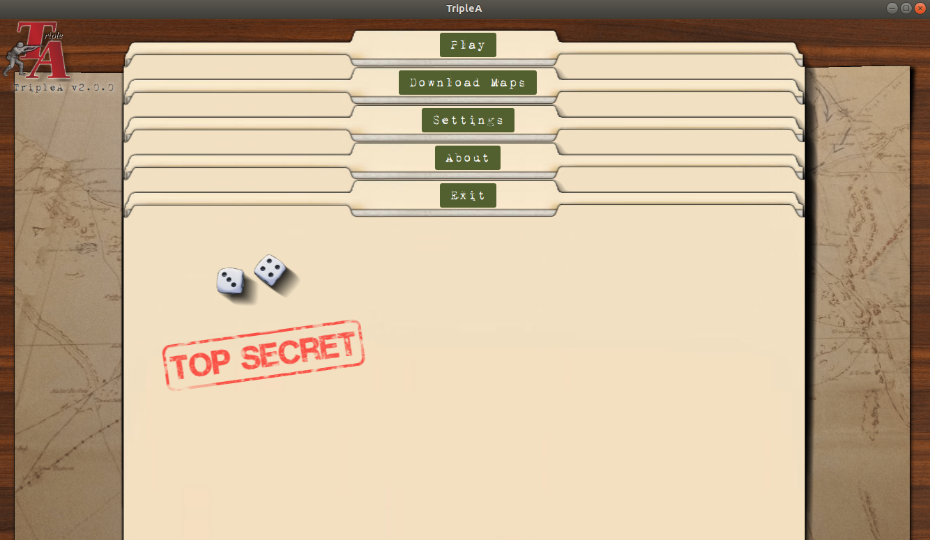
I also think the background on the green button screen is more interesting. The manila folders are cool, but less interesting IMO (perhaps why we spiced them up with some dice).
-
The 'play' nesting seems to require a click that ideally is not one click deep (preferably zero clicks).
This is actually done on Purpose. I've been playing a lot of well Known games in the past years, and I realized that almost none have their game modes listed on the main Page.
To name a few:- League of Legends
If you open the Game, you'll land on an "Overview Page" with all the latest news and events:
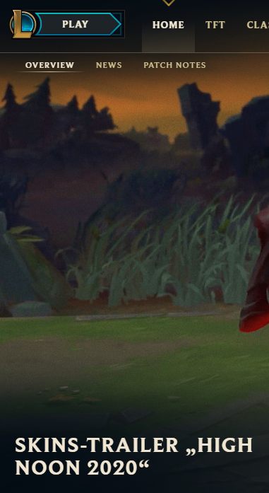
The game Expects you to click on the "Play" in the upper left corner button where you can then choose your game mode, and invite your friends afterwards - Valorant
This one is similar, you get an "overview Page" with a big "Play" (Spielen on german) button on the top of the screen:
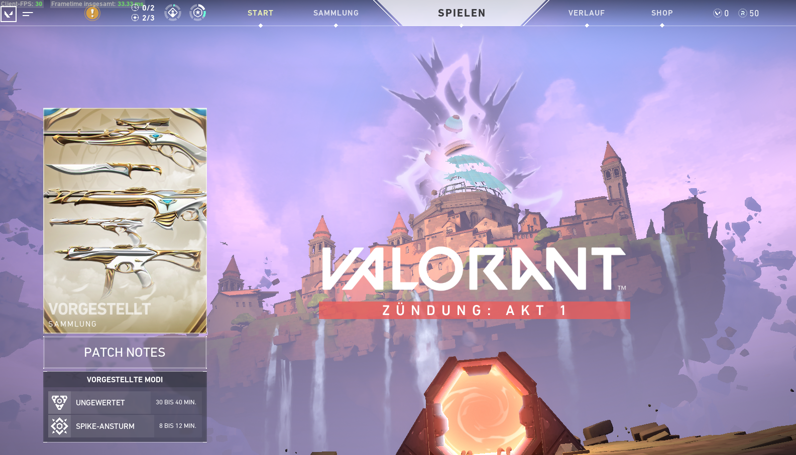
Once you click that it defaults to the most common of the 3 "game modes" that exist so far and allows you to invite your friends. - Overwatch
This is actually the Game which was the main design inspiration:
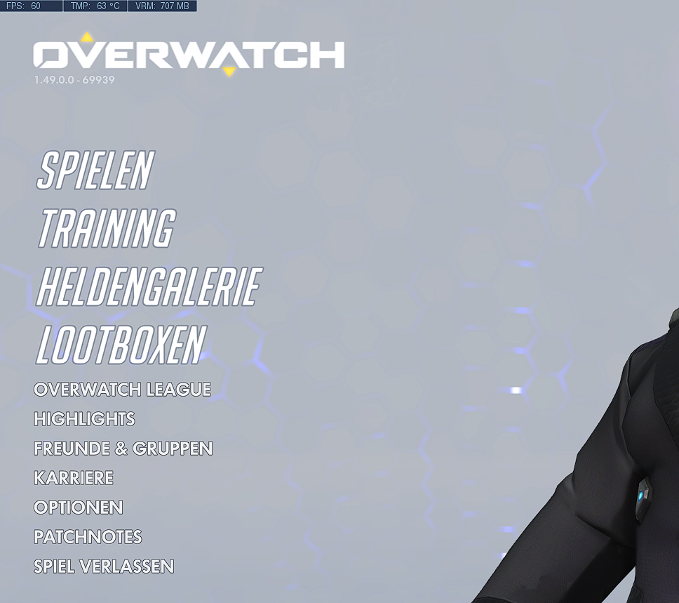
As you can see here as well, we get a sort of overview page, where you have to click on "Play" to get all of the online gameplay (where you'll be asked to choose a mode that is one of quickplay, ranked, arcade, custom etc.), only the "training" button is for local-only singleplayer games where you don't actually play a real game.
Whenever a player selects maps, I think that is a good place to place pretty prominently a 'download maps' button.
Yeah I think ideally we should provide an on-demand map download. However because of the way maps are currently working this is hard to impossible to do. We'd have to create an inverse index of maps and their download location and keep it up to date somehow
- League of Legends
-
@RoiEX the nesting being for the benefit of one button seems overkill.
It also feels jarring to go from one style of selection to another. If the folders opened up after selection, it would be cohesive.
-
One difference between us and the other games, they've more non-play features.
Meanwhile our play screen is due to be unbalanced with PBF, PBEM.
Do we need icons for those game modes, or loop the play modes into the single player screen?
Perhaps we should emulate the existing game a bit more and focus on technology change. Or are we going for fundamental overhaul??
-
Re: download maps
Perhaps going back to the old style is fine. With new, we still depend on button text labels. Many maps share the exact same map. Because of the indistinguishable maps, icons either are going to be too custom to be identifiable (if they are just whatever), or too similar. For example, a V3 variant of a map vs V2.
I don't think tile selection is the way to go. There are further problems rendering potentially 100 large images on a single page beyond usability. The maps do have thumbnails, some of them, I've noticed a number are really large.. requiring a thumbnail will be a new constraint to make map making more difficult.
-
Re: staging screen
For reference on an earlier proposed layout update:
-
Re: main launch screen
Some more points to fix or reasons to remove the screen:
- The buttons do not move with the folders. If we are creating an analogy to file folder, the label is stuck to the file folder, it should move with the file folder
- The dossiers have a white line in them representing some papers. One would expect opening this up to see that paper in some manner, some sort of callback to the folder concept
- We need to make sure we avoid 'magic hover spots'. There is technical complexity here we perhaps could avoid. Demo: magic-hover-location.zip
-
Toying around a bit, made the logo just a logo, moved that and version to the top left. I think this gives more prominence to the UI controls and reduces the visual "noise".
I think it'd be even nicer if the logo were part of the background map image. Here is what this experimentation looks like:
-
cc: @Hepps I think you'd be interested in this conversation thread. Curious what you think of the manila folders screen.
With the 'about' and 'download maps' removed, here is what that looks like:
-
We need to make sure we avoid 'magic hover spots'.
This exactly the reason the buttons don't move. No idea why certain locations still act this way
-
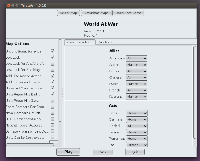
@LaFayette The "Map Options" should be renamed as "Game Options". It would be also good if the program would somehow high-light all the options that are not set as default, so that you can glance at all the options and easily see if and what has been changed in the game's settings, without having to know the standard setting of each of them (ideally, all options should be off as default, so all the ticked ones would be the ones that have been chosen, but this is not how it works in TripleA, necessarily, at least). Moreover, since normally any option must be agreed by all participants, all users to each of whom one or more players have been assigned should be informed and prompted with accepting any "options" changes, the game failing to launch if any one refuses.
-
Having the changed game options is well worth having the UI highlight those.
Having all players agree, I'm not sure offhand, it might introduce an unnecessary delay (you can leave after-all, I'm assuming that we can make any non-defaults very obvious).
We probably should have a discussion of map vs game terminology, though not in this thread.
-
@LaFayette Alternatively, the options would be finalized as soon as the hosting user opens to one or more other users the possibility to select any player, with such users being able to visualize all such settings before self-assigning any player. In this case, the hoster may be still able to change any options while one or more players are assigned to any other user, but, in doing so, all such users would be unassigned instantly (so, they would need to self-assign again, under the new settings).
All this in keeping with the TripleA asymmetry where you have 1 hoster and any number of hosted users, of course. In a boardgame, such "primacy" doesn't really exist, as it's not like only one of the participants has the right to propose any options ("primacy" that TripleA actually handles as "supremacy", in the moment the hoster can set the options without asking consent and even after anyone has self-assigned any player).
Otherwise, one could argue that the options should be chosen upon selecting the game, before the game is actually selected (there is really not a substantial difference between two games and a same game with different settings selected). Thus, when you select the game, and before such selection is realized, you would be instantly prompted with all the settings for the game, that you have to define to actually select the game itself, then you can change any of them only by reselecting the game (which already unassigns everyone else). This would also get rid of the button for the settings, as you would click on such a button by clicking on the game you want to select.
Currently choosing options is particularly a mess for automated hosts (bots), really, where anyone can singularly change any options, and you just get what it is in the moment the game starts, that automatically happens some time after all players have been selected.
you can leave after-all
This is not necessarily a solution, as you may have games with chance triggers firing right after the game starts, or games with AI players rolling dice soon after the game starts, or someone may be very fast at starting rolling dice (also fly-overs), while you are looking at the options (which may take a very long time if there are a lot of options and you are not very familiar with the game). In any case, it doesn't look like a solution to me, as if you quit after the game is started that means you lose the game, doesn't it?
However, I would agree that nothing of this is important. I'm just nit picking on the fact that TripleA doesn't really fully handle the options selection process, unless you are playing a boardgame in which someone (the hoster) is supposed to have the exclusive right to decide all the settings (which I think is not the case, ever, as normally optional rules are supposed to be used only with full agreement).
-
Good thoughts though. It is a problem for which we currently, really, do not have it solved.
I'm thinking any changes settings can be highlighted in red. Since only host can change options, I'm not sure if there is value in 'locking' the options or forcing players to agree. In theory they agree to the rules when they take a seat.I get your point though if you've taken a seat, and the rules change, you should know. Perhaps we can make a 'status' box somewhere or create a toast message that informs the user that the rules have changed.
We could also consider doing an agreement on game state, something that says "these rules changed since you took your seat". I think that might be a PITA though.
As yet another idea, we could do a 30 second count-down timer to confirm the list of rules after the host has clicked start to abort the launch.
For bots, I'm not sure if there is going to be a really good solution beyond moderating away the bad actors.
-
@LaFayette I can say it has sometimes happened to me that someone would put some settings on without telling. Especially if you miss to spot it right after the game is started, it is then annoying, as you are practically faced with the option to surrender or quit the game blaming the other side for the settings changes (so, who won, is it a draw or what?). On top of this, in the moment the players have to handle, likely by chatting, what TripleA fails to handle, there is always the risk of misunderstanding.
-
-
What is a "magic hover spot", exactly? I watched the mp4, the pointer is between labels yet apparently clicking activated the bottom selection? Is that the issue, that mouse pointer location and clicking isn't intuitive? Or is it that clicking started a loop of clicking that the user couldn't break out of? Or something else?
-
Been a while since I used TripleA (at least a few months, was grey with text buttons, not all nice with the folders and buttons). I forget how it works exactly, but room host sets rules (okay). And in lobby, you can see the options are for the game if I remember right? BUT
-
can the host change game settings after the lobby is created? If so, then I'd agree with Cernel that all players would need to confirm before game start - have it so the default for joining players is "okay, start" if the game rules haven't been changed since the lobby was created, and "don't start" if the game rules have been changed since the lobby was created. And if the game rules change at any point, all players switch to "don't start" and need to click to change to "okay, start".
-
For games with a load of game rule options, the list in the lobby could be 1) confusing, especially if acronyms are used, I take it there's a link or something to the ruleset for each of the maps that also lists rule options and acronyms? I mean I don't think there was last time I looked so much (at least not for acronyms), but might be good for future, 2) a long list that exceeds the area allotted to listing options (a user can expand the window but they could miss it).
-
-
As to splitting by PBEM and PBF - I know it's awkward, but maybe it would be best to have a "Play" button for each of email, or forum, or live play (or whatever) with different pictures for each, and have arrow selectors to cycle through different "Play" options - and have "user preferences" that set the default for each button.
It's a mix between - once the game is created, do we want users to have to keep going through setup for PBEM or PBF or whatever, selecting it for every game? Or do we want a top-level navigation where players choose PBEM or PBF or whatever, drill down into another layer to select play game? Or do we have a not so intuitive control scheme that though awkward minimizes player clicks and time? Eh. -
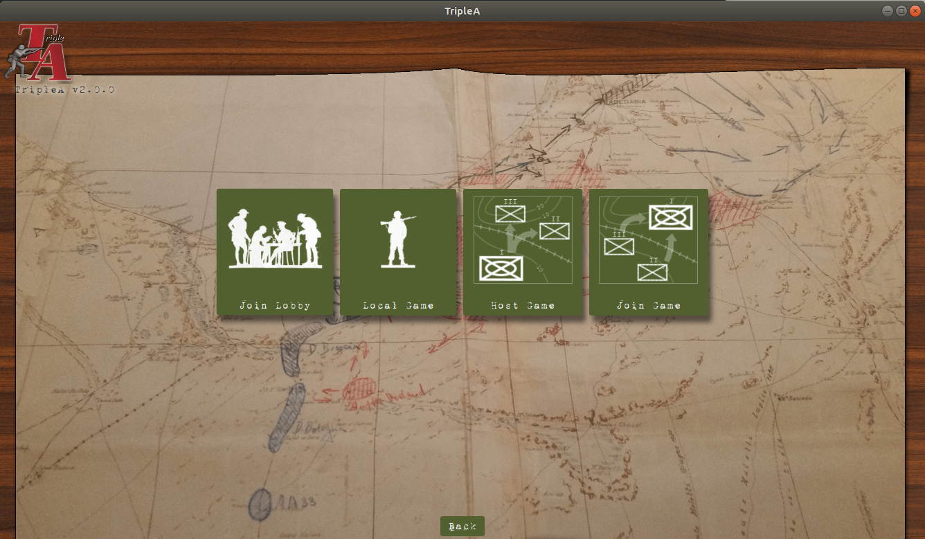
Iconography - the "Join Lobby" button and the "Local Game" button are really elegant and thematic. If icons are introduced as suggested in 3), maybe there could be a backdrop of an email icon, or forum icon, or whatever.
-
For Host and Join Game buttons, though it's quite thematic, they don't look particularly visually distinct to me. Rather than using three boxes and two arrows for both, I suggest four boxes and three arrows for "Host", and two boxes and one arrow for "Join", with the "big box" at the top center for host, and the "small box" at the top center for join, with the movement arrows pointing downwards.
-
-
What is a "magic hover spot", exactly?
@LaFayette is referring to this special location, where you can put your mouse where it flickers between 2 animation states, which doesn't look nice, nor is it intentional.
was grey with text buttons, not all nice with the folders and buttons
It still is that way, this thread is discussing future UI improvements.
Hello! It looks like you're interested in this conversation, but you don't have an account yet.
Getting fed up of having to scroll through the same posts each visit? When you register for an account, you'll always come back to exactly where you were before, and choose to be notified of new replies (either via email, or push notification). You'll also be able to save bookmarks and upvote posts to show your appreciation to other community members.
With your input, this post could be even better 💗
Register Login