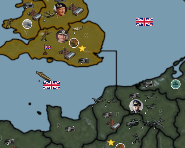
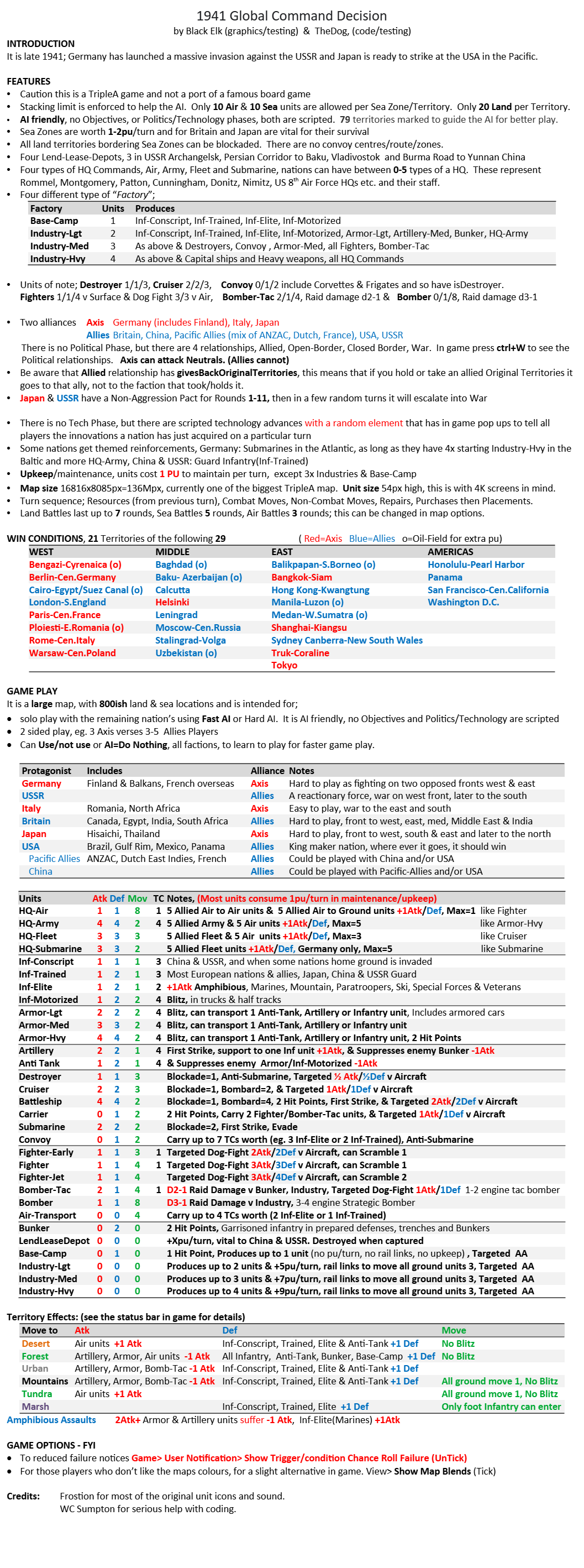
💥 1941 Global Command Decision - Official Thread
-
Very interesting developments !
I too have been wondering about all those Italians in Crimea…
But I’m still wondering why air units are not allowed to attack neutrals. Is this by design or to discourage players from operating in neutral territories.
-
But I’m still wondering why air units are not allowed to attack neutrals. Is this by design or to discourage players from operating in neutral territories.
It was by design and yes to discourage Players & AI from operating in neutral territories.
This will change in the August release, so please be impatient.

-
Very nice to hear that. Thank you. And I’m ever patient

-
@black_elk said in
 1941 Global Command Decision - Official Thread:
The Eastern Front I think should just follow whatever line for the month of the start date, since G opens the game, just to hit the beats, like having those TTs change hands.
I think a good reference may be this map (even though I cannot vouch for its correctness)
, grey for Germans and green for Sovietics.I don't know what is the dating for this map, but I assume that it has to be anywhen from mid September to the end of the month (not sure though).
-
Latest version 175 ready for download
August has come early
 well for this release
In TripleA
Click Download Maps Button
Click Installed tab
Click 1941 Global Command Decision
Click Remove Button
Click Yes button to remove
Click Ok button (Successfully removed)
Click Close (To force the map list to refresh)
Click Download Maps Button
Find & Click 1941 Global Command Decision
Click Install button
Enjoy!You will also need to upgrade TripleA, as it reduces errors, from here
https://github.com/triplea-game/triplea/releases
.
MAJOR CHANGES
WEST- German Eastern front realigned and forces moved ((thanks Cernel) (Due to TripleA map distortion it is approximate, but more accurate for the time period, late 41)
- Germany gained 4 territories in the north of Russia and lost 2 in the south
- Italy gained 1 territory of Germanys in the Russian South, lost 3 to Russia
- Germany gained a few bombers and more uBoats in the North Atlantic
.
EAST- Japan homeland lost 12pu from Territories as Industry is linked to Territories so lost another 12pu
- Japan owned 2x SZ and 2x TT gain +1 PU, overall Japan has lost 20pu per turn
- Gain extra units mainly in Shanghai-Kiangsu & Convoy in 6C Sea Zone
- Main reason for the change was that compared to Britain, Japan homeland industrially looked too good, had 6x Industry-Hvy, now has 3, Britain has 4 Industry-Hvy
- As the game progressess Japan gets weaker compared to the previous release (but still has a chance to win in its area of influence
- Lend-Lease-Depot units placed in Fars:Lorestan:Tehran:Gilan & N.Burma so Players know which TT need to be held/taken
.
MAP- Axis Players & USSR can attack neutrals with Aircraft (thanks johnnycat)
- AI Axis & USSR 1:3 chance to Attack neutrals with Aircraft or 2:3 chance not to attack neutrals with aircraft, this is to help the AI concentrate on the Player factions.
- HQ-Army now has isMarine -1, was missing
- map.properties unit width & height increased (overall units display better)
- Manual updated
- Tool Tip Industries have “rail links” and can move land units upto 3 territories, depending on terrain effects.
Sometimes this produces inconsistancies in move 2 units like armor over mountains, where they cannot move 3, so work around it. (thanks johnnycat) - Transport cost of Armor-Lgt now 4, was 3 (thanks johnnycat)
- Tool Tip Inf-Conscript expanded, have no AA attack/defence (thanks johnnycat)
- Tool Tip Nuclear-Bomber expanded, including Can only be targeted by air units in a Dog-Fight & AA from a Strategic Bombing Run on Industry/Base-Camp (thanks johnnycat)
.
Link to 1st post that has the Google Drive download link and to get the latest TripleA version
https://forums.triplea-game.org/topic/3326/1941-global-command-decision-official-thread -
Looks cool!
I haven't had a chance to play in what feels like ages, just dungeon delving mostly of late, but I like that newer sweep more cause it feels 41 to me. Obviously kinda tricky cause the vibe is sorta timeline catching up to Pearl by the time we get to the Pacific side of the board in the turn order sequence, but since G opens it makes more sense to me that things would be a bit less fuzzy in the opener. Also for TT divisions, like if we did the splits by where the front line was in any given month/year that can make it sorta tricky to go back and forth for alt start dates using the same board or whatever, so a bit of a compromise. Sometimes it felt like it made sense to have an anachronism going more like 1937-39 or 1940 political boundaries, other times 1941 or more like high water mark 1942, especially in coastal China or Eastern Front where all the TTs sorta have to go by the later lines just to fit enough units sometimes. I think the tiles are generally small enough that you can also get a 1945 or even post war thing going, but every choice has some give and take like that.
I think it's cool if on G1/2 they sorta coalesce into the right spots with the big 3 groups. For the HQs graphics, there are a few more in the UHD package but I could probably dig it up again or try some alt mugs. Colorizing the images can be sorta tedius, like I don't have the chops really for that Hearts of Iron look hehe. I think Ebbe mentioned an idea for how to do em sorta more like the shogun General pucks so that might work as well. I think it can be kinda tricky for the Allies, especially USSR and USA since they don't have any at the outset, but then get a bunch at once which is a big power shift. Might make sense where every faction has 1 at the start just so they can see how they play, and then a few more when the officer scale up thing happens. The Air HQ might make sense just with like the theme of WW2 being pretty the air war hehe.
Anyhow, makes sense to me, more air wings is probably entertaining. For the spelling checks, I'd probably just defer to Cernel. Since sometimes my eyes blur there with rogue Rs. Probably just needs the center/poly name switch for whatever goof I might have let slide. Hopefully nothing too major.
Again, great work gang! Keep it hummin
-
@thedog said in
 1941 Global Command Decision - Official Thread:
map.properties unit width & height increased (overall units display better)
This is real interesting. Would you expand on what you did here ? You don't have to do anything to the images themselves ? Just the map.properties ?
Edit
Ahh I see you have some different stuff than i do. This your old one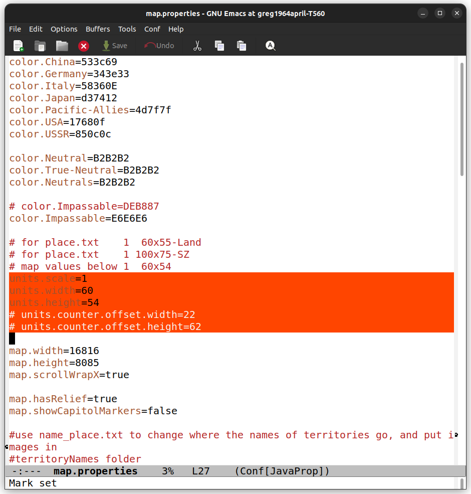
Mine
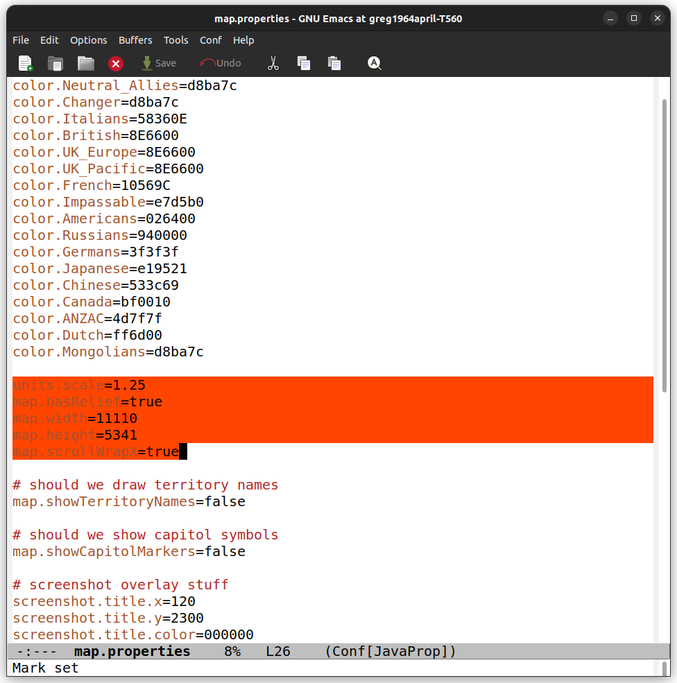
Does the width and height change how they place on the map ? I don't want to mess that up, as I've crunched every TTy to maximum lol
I guess I should just try it

-
@beelee
No change to the images and no change to the place.txt images.It fixes the truncation of units, especially on the territory move panel.
Its more important for the allies, as the ships face the opposite way, so you can tell the difference between a Battleship & Cruiser.
The HQs 66x66px and Capital ships 96x54 used to get truncated, now they dont.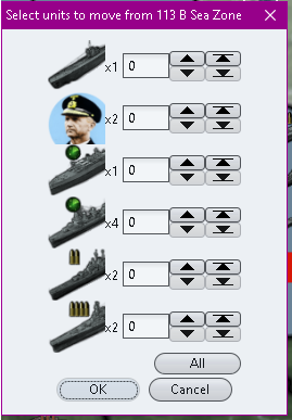

.
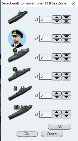
However there is a downside, overflow spacing uses this same value, so TripleA gives with hand and takes with another.

-
Cool That still seems an overall improvement though. Probably why you did it

I'm not sure what to set the dimensions to. I guess I'll start by trying yours. I'm pretty sure we use the same Frostion units for the most part.
Hmm ... i can't quite remember what Elk and I used for sizes during place. I guess I should probably try that too.
Maybe that doesn't matter though. It's just so the the stuff doesn't crop as much.
Well, I'll mess with it. Thanks for sharing this

-
There is a problem with TripleA version
2.6.14806In the Battle Calculator/Ctrl+B it duplicates some units and might have unintended combat results.
For those on 2.6.14806 or any 2.6 version higher, please upgrade to the latest 2.7 version, yes 2.7 here.
https://github.com/triplea-game/triplea/releases -
CRASH
I downloaded the new TripleA and the New 1941 GCD
And The new mods LOOKS GREAT!!!
But my first game went barely 2 moves before crashing so here is that file. Please let me know what you think.
CheersCRASH.tsvg
-
@black_elk To summarize what I said previously, the following ones are some suggestions for the HQ images.
"Ettore Bastico" for the Italian land HQ.
"Rino Corso Fougier" for the Italian air HQ.
"Angelo Jachino" for the Italian sea HQ.
"Moritz Albrecht Franz Friedrich Fedor von Bock" or "Fritz Erich Georg Eduard von Manstein" for the German land HQ.
-
Launched a bombing raid with 4 bombers into Rostov, along with attacking with another 3 tac-bombers and a air-transport with 1 infantry. Nice!!
Don't know whether it messed with the AI, because it said it was intercepting the 2ed air-battle, or the order of battle with 2 air-battles in a single territory.
Still, it was a nice move!!
 :astonished_face:
Cheers...
-
@wc_sumpton Nice move or not though, I sure am hoping I can help track down bugs. I often find myself customizing scenarios significantly so I tend to end up with battles that the devs probably never had reasons to test... Again ALL PRAISE to the creators of this one! I mean no offense.
So who would take this file and actually figure out the fix for this? I am curious because I started a software company years back and have a Ph.D. in Computer Science but now find myself wanting to get back into the latest and greatest software tools.
-Johnny
-
@cernel I think I remembered doing Manstein. Might be buried in one of the sub folders or in the UHD one. I can't remember where he ended. Here's a Bock if you want, just from a wiki photo cropped into the circular motif. If it's from a painting or a color photograph tends to look alright. I did them mostly at 68 px for those

For the others if it's from BW photographs it's possible to do a recolor, like I did in a couple cases. Here's an example with the wiki for the suggested sea HQ. Basically just like a quick duo tone similar to what I did with some of the inf units. So like if you take one section of the image around the face with the lasso tool and give that a tone, then maybe like dominant color of the uniform (in this case navy blue) and then another color for the background. Sorta holds up alright if they're not too large.

-
@black_elk Well, it is up to @TheDog to make any such changes, but surely I advice to substitute Rommel with Bock and Badoglio with Jachino.
-
If I get some time over the weekend I can just bang out a few more probably. For the main 5 nations coming from Classic I supplied the generals that were used in Iron Blitz mostly, then a couple others to hit 6. But since Italy wasn't around for that game just kinda randomly chose some. I thought it would be cool to have a few for something, but didn't really know how they might be used. Might be possible to have a couple Land types perhaps, like one face on the eastern front another in the west or North Africa, but then purchase screen might be kinda hard to parse I think was the issue. Still kind of a placeholder faceholder here, cause trying to create a unit design I just couldn't come up with anything better. Could probably shrink them slightly and use a colored ring or something to match the national tints perhaps, but then when I tried that the first time around using the HEX colors somehow looked kinda weird. Probably needs another pass I'd wager.
-
@black_elk
The problem with a ring is that it uses pixels up that could display the face, also the ring is lost if the HQ is on its own land territory and/or map is zoomed out to about 50%.So on balance, for me no ring around the HQ gives the best results.
Also please dont tint the face/hat.
If you really wanted to, tint the HQ background.The current style looked good for me.

-
@johnnycat
From my side nothing appears out, so I will raise this with a Dev on GitHub.
Thanks for the saved game, as these really help.From your saved game, I notice that your Resource Modifiers values are less than previous, you are getting better!
The AI plays a mean game


EDIT: Raised on GitHub
-
That was my sense as well. I recall trying to do rings and just never being particularly happy with the results. Like it would look ok, but then units get resized and the interpolation/blur would change the look of the color, or like you mention the color would appear to change depending on the HEX color of the tile or the blue used for the ocean. For the tinted 'WW2 in color' type thing, it just depends on the quality of the source image or how much time one wants to spend noodling around. Like probably more than the few minutes that I gave it yesterday lol. I already used that approach for a couple HQs, mainly for Japan since the image quality there was kinda rough. Some figures were on the cover of magazines or used for national propaganda by one side or the other. You know what I mean, like if they were on the cover of TIME or some equivalent, or had their portrait painted professionally after the war or whatever, those tend to look cleaner. There's a reason why figures like Rommel made it into the mags and the movies, basically cause the Allies found it useful during the war to lionize some generals, or after the war to propagate the myth of 'the good german' or to ennoble the enemy as a way of accounting for victories or losses on the field, things like that. I feel like people who died during the war were easier to retcon in the postwar period so you see that happen a fair bit. Other approach is to stylize everything in the same way, like the Hearts of Iron method, but one kinda needs a real artist for that I'd think. Even then though, we run into some issues probably, like 'is this really the guy we want to be staring at for the next several hours?' probably very similar to the dilemma about who to put on the box cover illustrations for the A&A boards, where the choice there might be fraught. Why I felt fine about the Iron Blitz dudes, but less confident with some of the others. Battling my own laziness is probably the real trick on this one heheh.
Anyhow, just let me know. I'm mostly still just playing BG3 these days lol. Catch ya next round!
Hello! It looks like you're interested in this conversation, but you don't have an account yet.
Getting fed up of having to scroll through the same posts each visit? When you register for an account, you'll always come back to exactly where you were before, and choose to be notified of new replies (either via email, or push notification). You'll also be able to save bookmarks and upvote posts to show your appreciation to other community members.
With your input, this post could be even better 💗
Register Login