Screen centering/cycling around map UI idea
-
while the other arrow should be absent or only working until getting back to the initial unit group displayed
What's the intended benefit? If I want to go back to the last 'selected' unit, why should I have to scroll all the way through first?
-
Outstanding items:
1.Agreement adding 15px to minimum size of action panel is not a deal breaker (thank you Cernel for measuring minimap sizes)
2. Sleep vs Station Terminology (on hold to see if we can get used to 'station' before making final decision)
3. Unit sortingUnit Sorting
I investigated using the same sort as the battle calculator and am thinking we may want to use a slight variant. Namely the battle calc and unit avatar panel are different enough that the same rules may not be actually what we want.
For example, if we go with battle calc sort, then the following:
[ infantry, marine, elite infantry, tank, fighter, AA]Would sort to:
[infantry, marine, elite infantry]That would be three images that are essentially the same. I think we probably want [inf, tank, fig]
Another example (B): [infantry, tank, figher, AA]
Right now it displays as [tank, infantry, fighter]. I think we want [inf, tank, fig]
I'll give a number of more examples of what seems to be what we want for the unit avatar:
[inf, tank, fig] -> [inf, tank, fig]
[inf, tank, fig, aa] -> [inf, tank, fig]
[inf, marine, tank, fig, aa] -> [inf, tank, fig]
[inf, marine, tank, aa] -> [inf, tank, aa]
[inf, arty, marine, tank, aa] -> [inf, tank, aa]
[inf, arty, fig, bomber] -> [inf, arty, fig]
[tank, fig, bomber, aa] -> [tank, fighter, aa]Any thoughts to the above sort orderings? Would anyone choose differently?
-
@LaFayette My suggestion is to display the maximum number of units that the current wideness of the right bar allows, down to a minimum of 1 (I guess that would allow small smallMaps to fit too). However, if there are more types than can be displayed, display none (just give the total number).
That way, if you see units, you are sure that you are seeing each an all unit types you can move from there. If you see no units, you should know that you must either look at the territory or expand the wideness of the bar until they display.
In this case, the units can be displayed on a horizontal, rather than diagonal, line (that is not necessarily preferable, anyways; for example, with the naval units facing rightward you have in assets you may actually maximize the overlapping with a diagonal lining-up).
Otherwise, you can always display all of them and lining them up vertically (so that increasing their number will not impact on wideness constraints, but just expand the bar space taken vertically), but, in this case, it would be certainly necessary having the ability to hide this function (in case the user would feel it is taking too much space).
-
Is there a way to click on "Done" without using the mouse and, in particular, playing while keeping the right side bar hidden constantly?
I mean like making your moves, then clicking on something to confirm them, and go to the next phase, without having to reopen the right side bar all the time you need to end a phase?
-
@Cernel said in Screen centering/cycling around map UI idea:
Is there a way to click on "Done" without using the mouse and, in particular, playing while keeping the right side bar hidden constantly?
This is slightly off-topic, but yes. There is a hover text on buttons informing "shift-d" will do the job.
-
@Cernel Rendering space is a problem, it's pretty common to have more than 3 units. The 'count' of units is meant to be the thing to tell you there are more units than you are seeing.
I'm skeptical it would be visually clean or really convey useful information to have a count of the number of types of units and also a count of how many individual units there. After the first two rounds, when most unit groups are clumped, having more than 3 types of units will be a common-case. It's a bit late as well to drastically revisit such fundamental aspects of the feature, this topic needs to get settled and put to bed. Let's please focus on the 3 open items.
-
@LaFayette Ok, but I'm just trying it and I see that if you have more than 1 battle you have to open the right bar to start any of those. So I suppose playing with the right bar always closed is not really possible.
-
@LaFayette But isn't the count the total units, while the units images in the scroller displaying a number of types of them? I don't think there is a way to tell if there are other units types than what I'm seeing, unless the total count is equal to the number of different unit images I'm seeing or I'm under the maximum types that can be displayed (and I know what that maximum is).
-
But isn't the count the total units
@Cernel , Yes
while the units images in the scroller displaying a number of types of them?
Yes, up to three different types are displayed. The question about sort is for which ordering to display them in and which ones to prefer to show vs not. There is not nearly enough space to show all types. While trying to make things narrow, the unit images were moved to be more squashed together to a maximum extent possible and still have it look okay.
I don't think there is a way to tell if there are other units types than what I'm seeing, unless the total count is equal to the number of different unit images
If equal, then you are seeing all the units. In part the unit count was there to make it more clear there can be more units than displayed. There is not enough space in the avatar area to actually see a thumbnail of each unit, the stacking of 3 units is meant to convey that there are more, it hopefully does not take someone very long to realize that if there 7 units and you see only 3 types out of 4, that there are more types. It's also not meant to be the authoritative source to see every individual unit in the stack either.
-
@LaFayette Then I don't think it will really matter what units images are being displayed. It can even be only one, I don't think it will make a difference, since you would refer to the board only anyways. I still think it would be more intuitive not to display any images if there are more unit types that the maximum that can be displayed in the scroller, as that at least will immediately tell you that if you are seeing anything at all there, that's it (for the types).
-
@Cernel In general I think this is how it works for informative lists. For example, currently, when in the automated tooltips you get the list of all units that can receive support either you get the full list or, if the list is deemed to be too long, you get nothing. That way, at least, if you have a list at all, you know that list is reliable. Of course, this can be done also by displaying somehow that the list have been truncated, and there is more, but I don't see much point in that.
-
I would think it would be relevant to at least have 1 of the 3 units displayed be the unit type most represented. Like if there were 5 medieval type units and "Swordsmen" were the most represented, then they should surely be display.
Plus the strongest (attack-wise) land unit should be displayed also, as this is probably a unit the player feels is important when moving.
And then the third spot could be reserved for:
Most expensive unit (PUs or "tuv")
Most represented air unit
Strongest air unit
Most represented land transport
Strongest landtransport.
Whatever unit in the territory, not already displayed, picked from the XML's unit list sorting order.Mapmakers would normally have a unit list starting with the weakest and cheapest units. Followed by units stronger, more expensive and more special.
PS: This feature shouldn't be rushed and don't expect everyone to give feedback asap. At least some of us are testing it out even though we have not given much feedback yet. But I am almost certain everyone has opinion, if they start using it. Speaking for my self, I already allways use it. So I would surely want to give some feedback when I got the the time and more experienced with it.
One thing I can already give feedback on is the new unplaced units display. It it OK if this information is shown throughout the players steps and other phases than placement. But when the player has his placement phase, I feel very annoyed having to look down in the buttom right corner of the screen to see what I still need to place. On this tab/during this step I would prefer unplaced unit be displayed where it used to, above already finished placements. The reason is, that unplaced units are during this step the most important info and player eyes would like it to be near minimap, "done" buttons. Anyone else have experiences, feelings and opinions on this?
-
@Frostion, for unit placement, this is the thread: (cc/ @Alexei-Svitkine )
https://forums.triplea-game.org/topic/1602/proposal-always-shown-purchased-units-panel/65
I've come to find the same. When placing, my eyes/attention are in the top right of the action panel, below the mini-map. It almost seems that the panel should move to be below the minimap on placement, or maybe disappear and go back to the old treatment. Regardless, let's move that topic to the right thread.
Re: rushing
We're trying to finalize 2.0 and get it out. Time has just more or less run out. But, it's not the end of the story, we can push compatible releases with updates and keep iterating.
Speaking for my self, I already allways use it.
Yay

I hope the feature will make live games go faster even and reduce mistakes. I can't mention how much time I've spent checking that I've moved everything, and double checking, and triple checking, before clicking 'done'. Even then, when you click 'done', you always wonder "did I forget to move something?" In close games, one or two mistakes are game-changing, not moving units is huge.Re: sort ordering
@Frostion those are some good ideas. Getting cost is a bit difficult, I'd rather avoid that if we can. Going by unit count makes sense. I don't know if it's then necessary to incorporate attack strength.
For example, we first pick the most numerous land unit. Then for third spot we pick the most numerous air unit. For the second spot, we look for the most numerous land unit that has a higher movement rate, if none, then we look for the second most numerous land unit with the same move rate, and if none, the most numerous air unit becomes the 2nd spot and 3rd is the second most numerous air unit.
-
@Frostion said in Screen centering/cycling around map UI idea:
One thing I can already give feedback on is the new unplaced units display. It it OK if this information is shown throughout the players steps and other phases than placement. But when the player has his placement phase, I feel very annoyed having to look down in the buttom right corner of the screen to see what I still need to place. On this tab/during this step I would prefer unplaced unit be displayed where it used to, above already finished placements. The reason is, that unplaced units are during this step the most important info and player eyes would like it to be near minimap, "done" buttons. Anyone else have experiences, feelings and opinions on this?
@Cernel said in Proposal: Always-shown "Purchased Units" panel:
I'm playing with the new stuff, and, sorry, but, maybe it's the abit, but I'm so irritated by the fact that the "Units to Place" during placement now is at the bottom. Previously, you would have seen the units left to place right at the top, and this felt much better. Now, each time I go to placement I feel like I have no units to place (and sometimes for a moment I wonder I didn't purchase anything), then I recall that now I have to look at the bottom, and then again upwards as the actions are made.
-
@LaFayette If you really want to display 3 units type when there are more than 3 (and, in this case, I suggest adding something to hint the players there are more types than what displayed), then I think you should display the units with the highest movement first; if the same movement, display the units with the highest attack value if during Combat Move or the units with the highest defence value if during Noncombat Move; if still the same, go by the order in the xml listing of them. Repeat this until all 3 places have been assigned to 3 different unit types.
-
I have now tested the latest version of pre-release (TripleA_2.0.16742_windows-64bit) and the unmoved unit scroller. I will now give my thoughts. I hope they make sense:
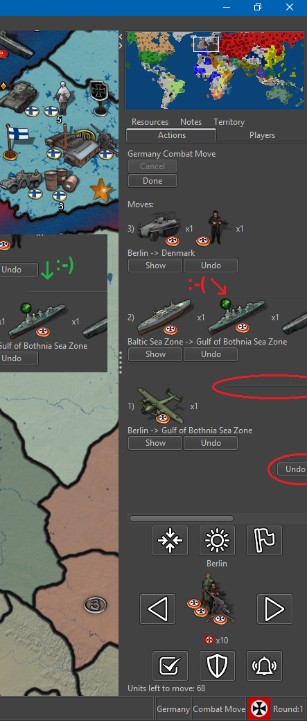
1. “undo all” button cut off
I noticed that the “undo all” button was being cut off. I would suggest this button be left aligned with everything else. I think it is aligned with the right side of the nice looking graphical horizontal lines.2. Horizontal line cut off
Related to 1, the nice looking graphical horizontal line that split up the individual movement info is also cut off. I would suggest it being in the center of visible side bar space.3. Horizontal line spacing
Also the graphical line should be placed between the movement info and not just (like it seems to me) after a linebreak after the “show” and “undo” buttons, with no space after the line itself.4. Air units unmoved after combat move?
I was surprised that air units that had been moved into enemy territory still counted as unmoved units. I know that they mostly and technically have movement left, but I think it is unnecessary to have them pop up during scrolling through units, since they have been moved into enemy territory and I would presume are exactly where the player wants them to be after combat move. Also even air units that has para-dropped units also show as unmoved/having movement left.During non-combat movement we kind of run into the same issue: Air units that have been moved out of enemy territory and are safe to land, still show as unmoved/having movement left, even though one could assume they have been moved all the way to the location where the player wants them. I would also here argue, that these units should not show as unmoved / having movement left.
I know that one can just press Skip when running into the two issues here, but I think we should make the gameplay experience convenient and try to avoid unnecessary time spending and button pressing.
5. Territory flashing / Flash line thickness
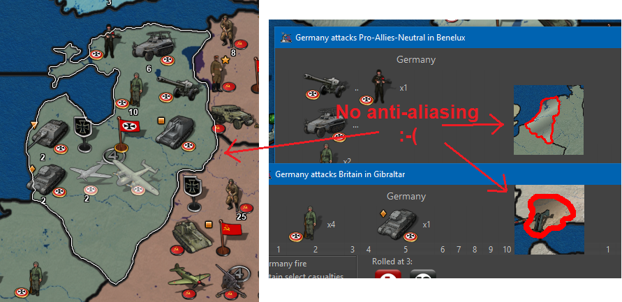
I noticed that scrolling through territories with unmoved units, the territories flash 2 times. It lasts like a second. Maybe this could be extended to like 3 or 4 times? And is it at all possible to thicken this flashing white outline and ultimately ad anti-aliasing? The outline looks a lot like the outline used when picking territories and other placed, but it would just be a bonus if the other uses of outlining also got a makeover by adding a bit thickness and anti-aliasing, bringing outlines up to the quality of the movement arrow
6. Picture after all units moved
I think it would be a nice touch if, when the last unit is moved and no territories have unmoved units, that no units are displayed by Next/Prev. Then there will be an assurance + no doubt about remaining unmoved units. I found it a bit distracting/annoying that the scroller kept showing the very last moved unit, even though it had been moved.8. Wake Up -> Alert
I have advocated for the "Wake-up" term and function. The function is essential. But now that the “Sleep” term is scraped for Station, I think wake up should also be changed, as wake up was an antonym to sleep. Could we not use the term “Alert”? Alert the Stationed units!!! They must be ready to move out again! I think the bell icon is pretty good also for “Alert”.
7. Buttons popup text
I think it would be best to have this popup text as short and telling as possible without displaying redundant info. Therefore I propose texts like this:
Press ‘M’ or click to see ‘Previous’ unmoved units.
(Notice the letter capitalization, as this is more distinct and this is how it looks at the keyboard.)
Press ‘Space’ or click to ‘Skip’ these unmoved units until next move phase.
(I realize that it can not state “next non-combat move phase” as this might not be in the map? Or?)
Press ‘S’ or click to ‘Station’ these unmoved units until manually moved or alerted.
Press ‘W’ or click to ‘Alert’ all skipped and stationed units on the map.
8. Button usage and layout
How many times did I use the buttons?Center:
FEW / but I also just pressed previous + next)
Highlight:
NONE (1 time just for testing)
Flags:
NONE (1 time just for testing)Right:
VERY MANY
Left:
FEW (but it is nice to have)Skip:
OFTEN
Station:
FEW
Wake up / Alert
VERY FEW (But it was essential!)To me the buttons “Center”, “Highlight” and “Flags” seem pretty redundant. I know that graphical-wise they look good
 but if every other player also never use these buttons, then maybe they should be removed entirely, if not just to fee up space. But of course we need confirmation of players not actually using these buttons. If we can remove two buttons, then it will leave room for a total rearrangement. Maybe something like this:
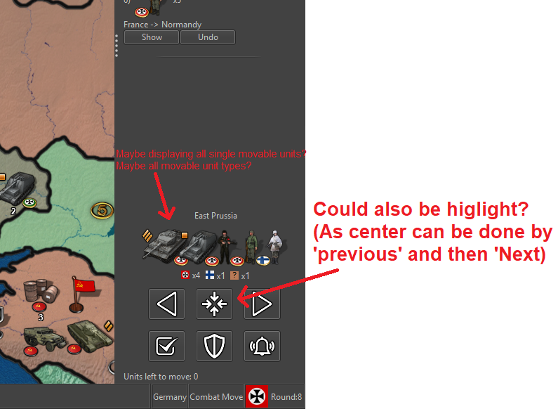
PS: I think the order of the buttons Skip, Station, Wake up/Alert?) is perfect. It seems to be the order of usage: Skip a lot, Station a few and seldomly wake-up/alert them again. And I like that the most clicking is done at the edge of the screen where the mouse cursor can't wander off

-
Also…
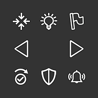
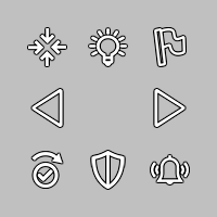
The icon for “skip” is OK, but I do not see that the piktogram really represents of the concept of “skipping” something. I have tried to make a new icon looking more like a skip (w. check mark). Here is a new version of the icon set. Is this skip looking better?
V5-Icons-37x37-NewSkip.zip
-
@Frostion Good idea. The fact that the skip not only skips but also moves to the next unit like when you click on the right arrow should be visualized. Probably that arrow should stay above the shield too, then.
-
@Frostion I like that last mockup. There's room as well where we could give individual unit counts maybe (top right). If there are too many units, then displaying a second/third row maybe is an option.
I wonder how it would look when we have a map like WaW where you may have 3 or 4 countries in one territory, with 3-5 different unit types each.
Second, I wonder if it's needed to display the units from other countries and not just for the current player.
Re: center button
For consideration, we could make the unit avatar image clickable itself, in which case we may not need the center button. I'd rather have a center button than players learn to hack it with left/right.
Highlight and flags
I'd agree the buttons don't need to be in the unit scroller, the original intent was for them to be elsewhere.
The original intent behind them is to avoid 'magic hotkeys'. There are a couple of UX principles at play here (coming from "The Design of Everyday Things", a great read and I highly recommend it):
- Usage of a UI should be available through visual inspection. IE: you should be able to know how to use something by just looking at it. For example, lego pieces, you can just look at them to know that they are stackable, or a bike, by looking at it you can tell where your butt is supposed to go and then the rest of your body.
In our case, we have global 'magic hotkeys' that violate this. There is nothing to tell you that there is a hotkey to highlight all and to toggle flags. This violates the principle above. While we do have some text buried in a help menu, we're still violating the usability principle.
So, if we go back and start with having a button, there is a second UX principle at play (that we jumped directly to before satisfying (1)):
- Allow power users shortcuts. Keyboards are an example of this, each key is labelled, you can hunt and peck, eventually users will touch type. Photoshop is another great example, new users spend a lot of time in the menus and then eventually learn hotkeys. Ultimately, hotkeys is the principle in action.
With all that said, basically we shouldn't have any hotkeys without some sort of UI icon to represent it, where users can hove over the icon to then learn the hotkey.
IT turns out as well we do not have very many global hotkeys. We have hotkeys for territory actions. With the above principles in mind, it becomes a bit more obvious that when hovering we probably should render a menu indicator of some sort, or give a right click menu that displays the territory options and their hotkeys.
In this feature, because I was adding additional global hotkeys, I added the buttons as part of the series so that we could solve this UX problem at the level of global hotkeys, AFAIK all "global" (active no matter where the mouse is) hotkeys have UI elements corresponding to them.
So.. If there is another home/location on the screen where we can move the 'flags' and 'highlight' all hotkeys, I'm all for it.
-
@LaFayette said in Screen centering/cycling around map UI idea:
So.. If there is another home/location on the screen where we can move the 'flags' and 'highlight' all hotkeys, I'm all for it.
My opinion is remove the flag button and any hotkey for it, leaving it as a menu option only.
I'm not a fan of the highlight, but that can stay.