Proposal: Always-shown "Purchased Units" panel
-
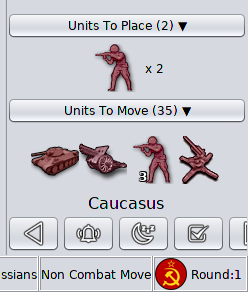
I'm thinking to remove the number on the placement collapsible panel:
It does not jive with the units to move number. One is a sum of the units in the panel, the other is the sum of units that can be moved. It would make more sense if they were both sums of the units in the panels. It does not seem to be that useful necessarily to sum the units to place and largely inconsistent.
-
I was just about to leave a suggestion here and found this.
I'm quite often opening the history just to see the purchase I made. It works, but is tedious.
A purchase panel would be great. Another idea is if you hover over one of your own factories, your purchase is shown somehow. Might become messy though. Think a discrete panel or button is better.
This has probably already been discussed, but just in case it hasn't. Besides, I don't see a function like that yet, so I take the opportunity to bump this.
-
@trulpen said in Proposal: Always-shown "Purchased Units" panel:
Besides, I don't see a function like that yet, so I take the opportunity to bump this.
It's available in the prerelease:
https://triplea-game.org/download/Don't click on the "download" buttons: Click on the "Download Pre-Release" link.
Also, it is not only for purchased units, but for every unit held in the inventory of the turn power (therefore, it is called "Units To Place").
-
Great to hear! Thanks!
-
@Cernel said in Proposal: Always-shown "Purchased Units" panel:
@trulpen said in Proposal: Always-shown "Purchased Units" panel:
Besides, I don't see a function like that yet, so I take the opportunity to bump this.
It's available in the prerelease:
https://triplea-game.org/download/Don't click on the "download" buttons: Click on the "Download Pre-Release" link.
Also, it is not only for purchased units, but for every unit held in the inventory of the turn power (therefore, it is called "Units To Place").
I updated the client to the pre-release version, but now I can't upload my present games. Is there a simple solution or do I have to reverse?
-
@trulpen said in Proposal: Always-shown "Purchased Units" panel:
I updated the client to the pre-release version, but now I can't upload my present games. Is there a simple solution or do I have to reverse?
Says: "Error: Incompatible engine versions. We are: 2.0.19904 Trying to load incompatible save game version: 1.9.0.0.13066 To download an older version of TripleA, please visit: https://triplea-game.org/old_downloads/ If this is not expected, please file a bug report and attach the error message above and the save game you are trying to load."
-
Just want to add that before I reinstalled the older version, I checked this new one out quickly. I love the new feature with the placements shown in the low right corner! Can't wait to be able to play with it! :thumbs_up:
-
@trulpen 1.9 savegames cannot be loaded in 2.0. You have to reinstall 1.9, if you overwited it while installing 2.0 (which you didn't have to).
Anyway, as you might have read in forum, is only matter of 1 or 2 weeks before 2.0 becomes the release...
-
Good to hear. So the strategy is finish all present games in 1.9, but start new ones in 2.0?
-
@trulpen Yeah, at this point I think starting in 2.0 should be safe, if, as I understand, the developers are most likely not breaking 2.0 compatibility any longer.
-
@Alexei-Svitkine you asked (I think in a PR perhaps) if the placement panel, during an opponents turn, should have the behavior of displaying placements in the action tab panel area or in the placement docklet.
IMO it would be okay for the units to be in the docklet. It's only significant AFAIK for the units to be in the action panel when they are actively being placed during 'your' turn.
-
@LaFayette said in Proposal: Always-shown "Purchased Units" panel:
@Alexei-Svitkine you asked (I think in a PR perhaps) if the placement panel, during an opponents turn, should have the behavior of displaying placements in the action tab panel area or in the placement docklet.
IMO it would be okay for the units to be in the docklet. It's only significant AFAIK for the units to be in the action panel when they are actively being placed during 'your' turn.
Right. I commented on the PR because I think the PR regressed that functionality. My implementation was working this way iirc (but was also working that way for the active player which I think was the part the PR was trying to change).
-
Indeed, having the 13066 behavior for the active player was the important part.
Hello! It looks like you're interested in this conversation, but you don't have an account yet.
Getting fed up of having to scroll through the same posts each visit? When you register for an account, you'll always come back to exactly where you were before, and choose to be notified of new replies (either via email, or push notification). You'll also be able to save bookmarks and upvote posts to show your appreciation to other community members.
With your input, this post could be even better 💗
Register Login