Ancient Empires: 222 BC
-
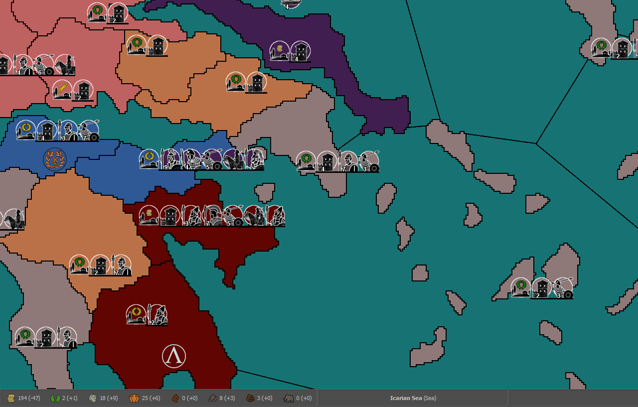
@Name Those white dots are likely island territories that can only be rendered with 1 pixel.
"A joyous heart sours with the burden of expectation"
Hepster -
@Hepps Most of them yes, but some are also parts of the coastline with one of their dimensions 1 pixel and the other 1 to 3-ish.
-
@Hepps This is why on some designs I over size Island territories so that they will be better rendered on the mini map rather than showing up as a single pixel. I like to call it "artistic discresion".
-
@Name If you open Civil War you will see it suffers from the same issue. If you look closely you will notice that the single pixels in white correspond to the corners of many the diamond shaped territories of the rail system. It is simply something you need to design around while you draw the map.
-
@Hepps Agree. Though usually having islands a bit larger on the main map is also beneficial as otherwise you get like 1 placement and they are easy to miss when looking at it.
-
@redrum Yes... agreed. Having more than only a few pixels to hit with your cursor on the main map is incredibly beneficial from a game-play standpoint.
-
@Name said in Ancient Empires: 222 BC:
@redrum smallMap.unit.size=1 fixed most of it, looks like it was the units extending into other territories/seas. Now I need to edit smallmap a bit (small white dots revealed theirselves at points), and I guess there's no way for perfect borders at this scale.
The problem of too big small map units outboarding their zones into nearby ones (which you can test always happens in the case the small map unit is being drawn into a zone to the right and bottom of its own one, never to the left or top) is actually doubled up by the fact (there is also a similar problem for units zoom customization for the user) that those minimap units are drawn from an approximation of the actual coordinates where the units are drawn on the actual map, which is not the centre of the units themselves, but their top-left corner. What follows, from this, is that if the dimension of the quadrangulum, showing the unit on the small map, relative to the dimensions of the small map itself are bigger than the ratio between the actual map's units dimensions and the actual map's dimensions, then the true centre of those quadrangula will be more and more out of place, shifting to the right and down.
This can, and should, only be fixed at the engine level, as the engine should place those quadrangula on the minimap having their centres the closest possible where the centres of the respective units on the actual map are, not just drawing them from the top-left point coordinates, irrispectively of relative dimensions.
Assuming such a fix at the engine level is not coming, the only way, for mapmakers, to restrict such a distortion within less than a single pixel, is to approssimate the dimensions of the quadrangula on the minimap, following this formula:
"small map unit size"=("small map size"*"units scale"*"units size")/"map size"
Both with "small map size" (you need to look at the actual size of the smallMap image) and "map size" (values in map.properties), you can take either the width or the height for both (assuming the width/height ratio is, to the pixel, the same for the actual map and the minimap, as it should). If you use the width, this should maximize the centring of the small map units with respect to X, instead to Y for the height. You can also use the area, to obtain a geometric average between both. You cannot really exactly precise both coordinates for the minimap, as, for doing so, you would need being able to define small map quadrangula that are not perfect squares. However, as long as the map you are using has the same width and height for all images, you are perfectly fine here (and you are almost perfectly fine anyways, unless the map features images that have a width and height ratio very far from 1).
For example, if you take the current dimensions of "the_pact_of_steel"
https://github.com/triplea-maps/the_pact_of_steel/blob/master/map/map.properties#L100this should be the "smallMap.unit.size", that the map should have, in order to have the centring of the small map units the closest to the position of the actual units on the map, at the default units zoom (doing it using the width for all sizes, as, anyways, the given units.width and units.height are the same, in this map):
smallMap.unit.size=(233*1*48)/3500=11184/3500=3.195...
Hence, the pact_of_steel map should better have this setting, in map.properties:
smallMap.unit.size=3Instead, it currently has no setting. This means that it is going with the default 4 pixels settings (at least this is what I believe it is going to be, but I'm not a developer). Thus the quadrangula on the small map, representing the units on the actual map, are going to be about half a pixel more to the right and down than they should be, but, since here we are splitting the pixel, this matter is hardly noticeable at all. However, if you look very close at the "Pact of Steel" game minimap, you may see that the fighter and infantry in Norway, at start game, are relatively closer to Sweden on the minimap than they are on the actual map.
To clarify the matter, here it is a 400% zoomed image of the default "Pact of Steel" game minimap at start game (small map unit size is 4):
Here it is a 400% zoomed image of the "Pact of Steel" game minimap at start game, except only setting the small map unit size at 2:
As you can see, they are both drawn from the same top-left corner, which, as I said, implies that, at 4 pixels, their actual centre is too much bottom-right with respect to the map's units, while, at 2 pixels, their actual centre is too much top-left, with respect to the same units.
That is why, assuming no developers will ever fix this matter on the program itself (that is the program having minimap unit centred with respect to what they are relatively representing, instead of centring their top-left corner regardless), I would suggest mapmakers taking care to set the closest value for "smallMap.unit.size" as what you would get by using the formula I provided here. That would be also good in that the minimap units will look the closest in dimensions to the relative size of the units they are representing on the map (likely something one may easily argue the engine should infer too (I assume it doesn't, but I don't actually know, nor I can look at it, since I'm not a developer)), as that also matters in case you want to have a similar empty space or overlap between units in the small map as you have for the same units in the actual map (you can see that in the second image I posted it is much easier to tell how many unit types there are in each territory, while in the default small map they overlap a lot, making hard telling the various squares apart).
-
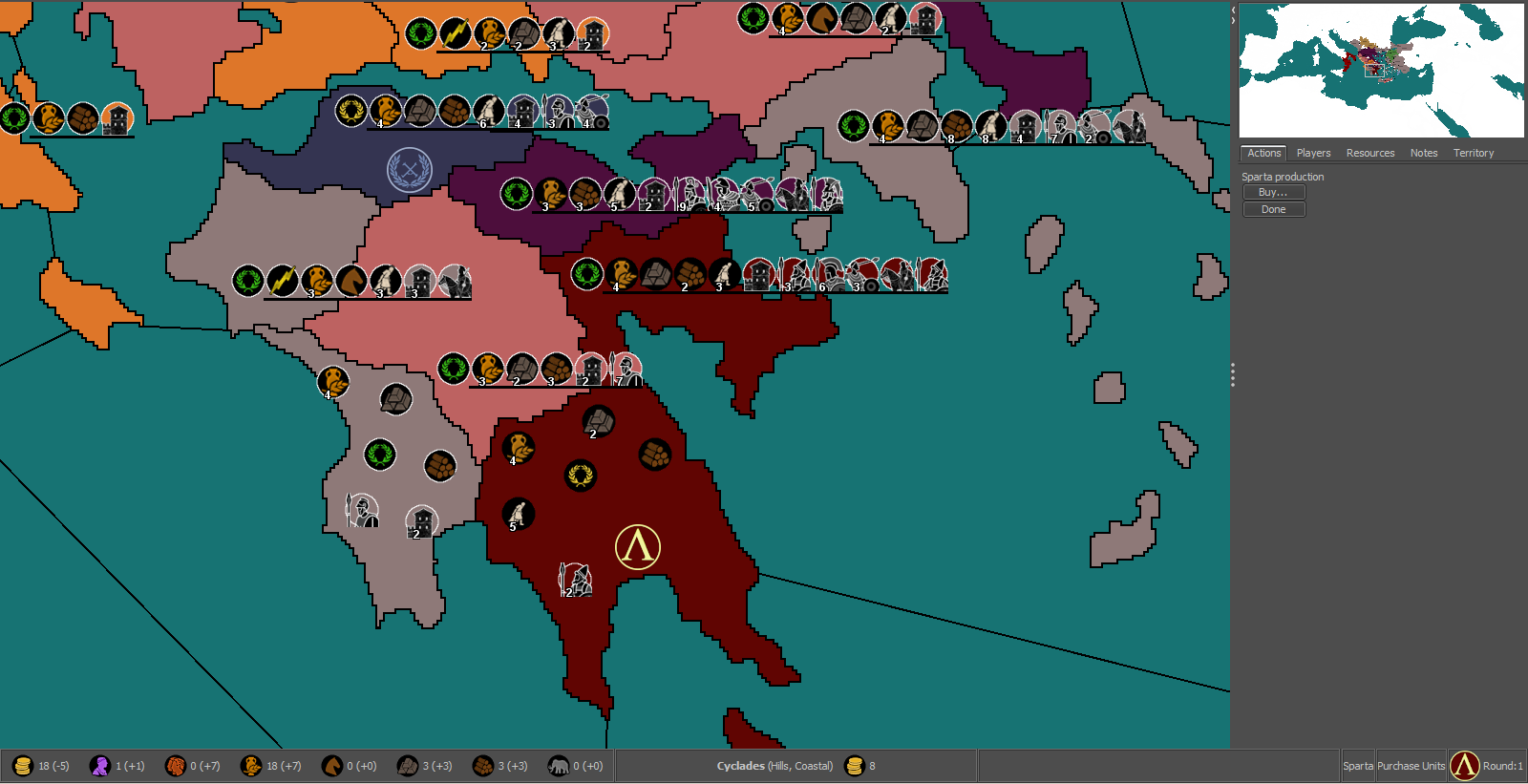
@Name The other thing I fogot to mention was that because in your test map all the territories only have 1 placement... all the extension bars of units will also muddy up the mini map.
-
@Hepps @Cernel @redrum
Thanks for the info, I'll take all that to account in due time. For now I want to pick the default unit size. This is 100% (I think it's too much, anything from 75% to 87.5% seems better).
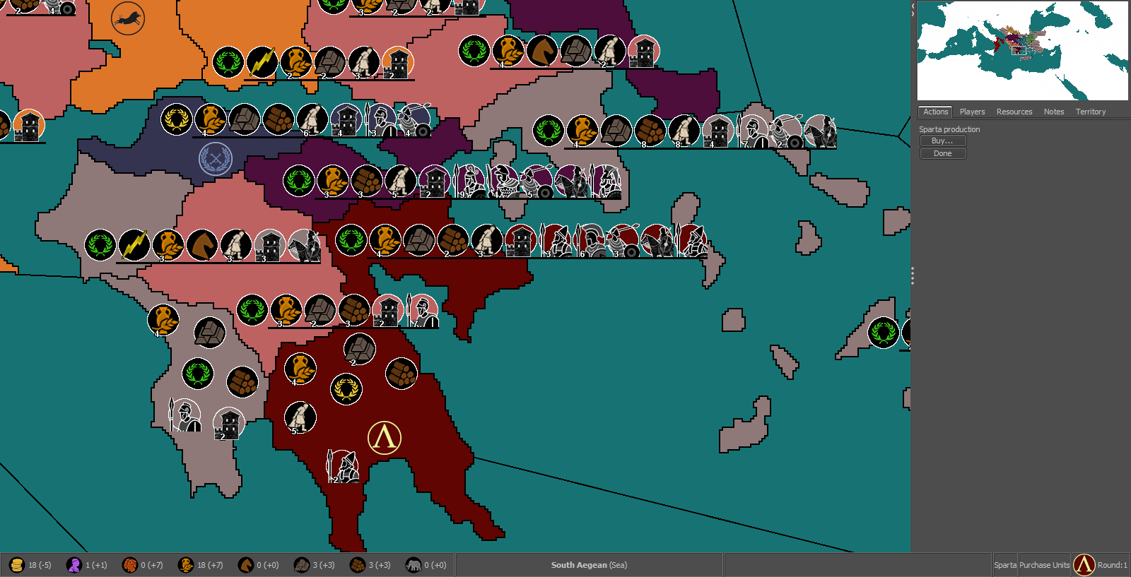
75% (Also notice the icons for Sparta, no white ring around the black circles, I think it looks better for the structures)
-
@Name My suggestion for any maps currently in development is looking good an a 4k. This means being generous with units and zones dimensions, as well as other elements.
-
@Cernel With that in mind, would 87.5% be a good middle ground? Because some territories will be small.
-
@Name 87.5% looks like it would be pretty good based on the examples thus far.
-
@Name If those are 48 per 48 pixels units image, you cannot really go below 100%, when you are on a 4k, unless it is huge, of course. For a rough reference, you can simply zoom the map at 50%, though a 4k will, of course, look better than that, thanks to the small detailing and no zooming approximations. However, it is your call. Something that is decent on a 4k is going to be arguably hardly playable on a full HD, due to getting only a small portion of the map on screen.
-
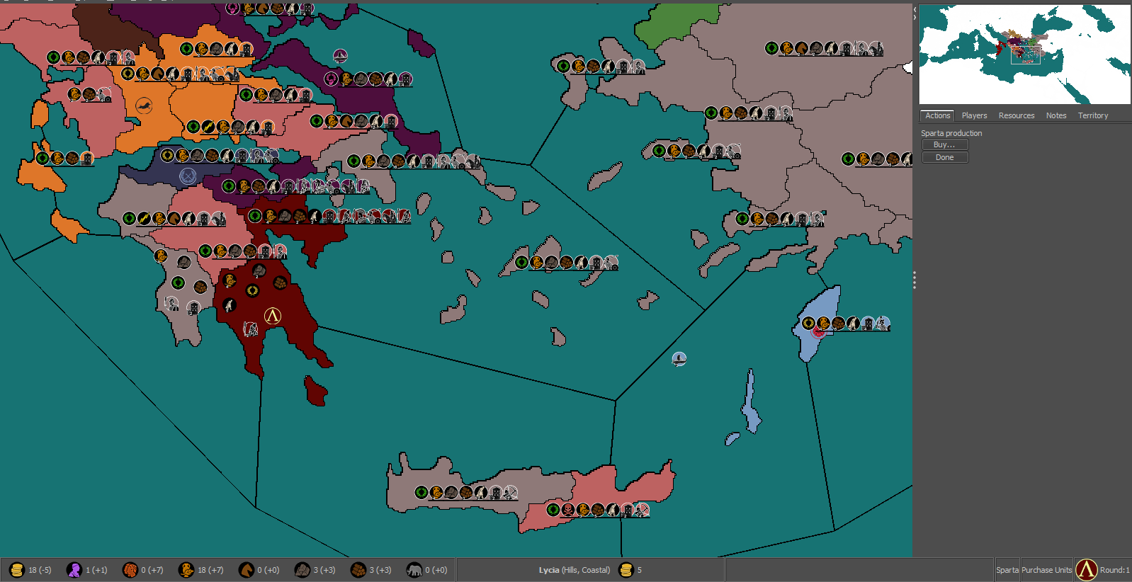
@Cernel This is 87.5% at 50% zoom.
-
@Name Go for 100%. Let people use that zoom. If you really want to, tell the players in notes that they should go zooming the map, and give your favourite zoom level. Also, the pre-release has a better zoom, thanks to @RoiEX. I don't know if you are using the stable or 2.0.
Of course, the matter should also be decided, or rather mostly be decided, on how much placements you are getting, as the bigger the units the less of them you can feasibly pack inside the same space.
I think those units at 100% are fine, but, then, you have to make the map as big as you feel it is giving a reasonable quantity of space for placements, unless you prefer going with overflow in all cases, with a single placement per territory only everywhere (that would allow you having a sequential listing, instead of something looking like a set, that may be more readable, though I'm not the fan of overflow lining myself).
-
@Cernel I guess 100% with careful use of placements (I won't go with straight lines) should be ok. Looks good at 75% zoom, not so much at 66% (I'm using the stable release).
-
@Name I would recommend scaling the units at 75% - 87% so you get more placements per territory and then leave the map display at 100%. Then you can recommend to people to use a different zoom while playing.
-
@Hepps To me that looks fine, even with default zoom (100%). Though I can see the value of viewing more of the map at once. But Cernel got me thinking about higher resolutions. Forcing people to smaller units in that case seems suboptimal. But I might not be getting everything right, this is one more new field of discussion for me.
-
@Name So as @Cernel mentions the ideal situation is you keep units at 100% though given your map size, I think you'll struggle with having adequate placements in many of the smaller territories. So unless you want to actually make the map larger, I'd agree with @Hepps that something around 75-87.5% is probably gonna be better.
Taking a look at some other existing maps might help. Many of them have honestly done a pretty poor job and Civil War is an example of one that is mechanically a great map but very difficult for many people to play as the units and territories are so small. On the other hand, TWW did a pretty good job around this as units and territories are a pretty good size and allowed for a good number of placements in most territories.
-
@redrum I'd like to enlarge the map, with focus on some aspects I neglected to a degree (placement space, line shape/size, island size and there's probably some other thing I'd come across after a lot of work:p). My main issue (and one of the reasons why I cut a bit of the south and east) is that it was getting laggy - almost unbearable - in the map editing utilities, even with 6GB allowed ram.
So if I don't go that way, and with the varied pros and cons discussed here, I'm not sure yet if it's going to be 87.5 or 100%. I think I could manage the later with extra units extending to the generally larger sea regions and using lines both to the left and right accordingly. Not matter what units won't be that small like in Civil War.
Whatever extra advice regarding the map, unit size and related issues is very welcome, before I go deeply into it.
Hello! It looks like you're interested in this conversation, but you don't have an account yet.
Getting fed up of having to scroll through the same posts each visit? When you register for an account, you'll always come back to exactly where you were before, and choose to be notified of new replies (either via email, or push notification). You'll also be able to save bookmarks and upvote posts to show your appreciation to other community members.
With your input, this post could be even better 💗
Register Login