Territory Tab / Always Showing Units on Hover
-
@Cernel said in Territory Tab / Always Showing Units on Hover:
(1) is an interesting idea. I think that might be a good fix in addition to making the territory tab and battle calc less needed for this purpose. I would wonder if the grid of overflow might cause overlapping that is just as bad a single overflow line and also if there would be a lot of complexity to solving that well (for example if we get 3 or 4 overflow lines, that might be worse in a densely packed area than each territory having a single one, hard to know without seeing it).
(2) Hiding units on the main map I think could cause more problems then we are helping. Cold War is a good example where units are packed, if you get into the low countries and half of units are hidden, I think that would take away from the board game feel of the game and could be generally frustrating.
If a map is not clearly showing units even when not having overflow lines, that's a problem with the map (for example, the old absurd placement in the circles of WAW before we updated it, though I still kept it maybe too packed), and the program should not care to address it.
I really disagree with this. From a map maker perspective, yes, from an engine perspective, no. The game engine needs to be able to deal with a variety of quality of maps. It's not acceptable for there to be a problem and the game engines response to be "oh well, the map needs to be done better". It's akin to manual transmissions on cars, and a driver has a problem operating the clutch, the response should not be "get an expert driver in there", the answer is automatic transmission.
That point of view also IMHO neglects the island case which is present on most any WWII map. When moving all units off of transports and you wind up clicking the SZ, it can look like they were offloaded when they were not.
-
@LaFayette said in Territory Tab / Always Showing Units on Hover:
(2) Hiding units on the main map I think could cause more problems then we are helping. Cold War is a good example where units are packed, if you get into the low countries and half of units are hidden, I think that would take away from the board game feel of the game and could be generally frustrating.
Alternatively, instead of 2, you can have that the overflow line will go to the other direction (left or right) if the default direction (that is right, unless differently specified in the "place" file) would overlap with a zone you are currently hovering (this has the minor issue that maps that don't wrap on X may have the overflow going out of view). Point 1 remains the same. This should cover all needs at this FR.
-
@LaFayette said in Territory Tab / Always Showing Units on Hover:
That point of view also IMHO neglects the island case which is present on most any WWII map. When moving all units off of transports and you wind up clicking the SZ, it can look like they were offloaded when they were not.
I'm not sure I understand what you mean, but little islands going in overflow would be covered by point 1 (just like anything having overflow).
If you mean that sometimes the placement on sea zones tend to overlap the islands, that is a problem with the mapmaking utilities, that just cannot see the presence of any islands at all, when generating placement coordinates in sea zones.
Also I'll let you know that, when offloading from hostile sea zones, the fact that in TripleA you move the units into the land territory is actually against the rules, because those units move into there only after clearing the sea zone (and, in case of Revised, Europe and Pacific, only as long as you don't call off the landing). What you should do is only plotting the movement, but those units remain in the same zone as their transports until after the sea zone is cleared, by rules.
-
@Cernel said in Territory Tab / Always Showing Units on Hover:
Point 1 remains the same. This should cover all needs at this FR.
I'm not sure if you grasp how much of a problem this is for non-veterans and the different cases where it is an issue. Said in another way, the problem is: assuming the worst possible map making, how can we update the game engine so that you can tell which units are in a territory without resorting to the battle calculator or territory tab?
I am approaching this from a game engine perspective as we have many maps that have issues and even some well built maps that can still have this problem. On another side, fixing this problem for every map and every future map is not as scalable (as nice as it would be to live in that world) and there is no reason to make the barrier to entry for map making any higher than it needs to be. A poorly made map should still be playable, even if not optimally made.
I'm not sure I understand what you mean, but little islands going in overflow would be covered by point 1 (just like anything having overflow).
The units are never even moved to the island.
- load transports
- move to a SZ next to an island (possibly hostile, possibly not)
- shift click to move all units at once from the SZ
- select the island (but misclick by a few pixels and click the SZ)
- the way the overflow on the SZ is rendered can make the units look like they are on the island when actually they are still in the SZ. Because all units were physically moved while shift clicking, the fact that they back in their original place can be very easy to miss. AFAIK veteran players learn to double check this by using territory tab and battle calc, but it is still not uncommon for units to be left on transprot.
Also I'll let you know that, when offloading from hostile sea zones, the fact that in TripleA you move the units into the land territory is actually against the rules,
@Cernel getting really off-topic here. File a problem report if this is something that needs to be fixed and the needed fixes and related problems can be discussed in their due course, otherwise please hold your peace.
-
I'll underscore just once the importance of creating problem reports. @Cernel you've reported at least 2 or 3 problems here, arguably they should be fixed. To get that done, we need them in the problem queue. Currently anything that needs to be fixed is in a queue that is probably a few months out. In a few months, we are simply not going to go back to various random forum discussions to pick up tasks, and new developers looking for 'starter issues' are not going to do that. The net result is:
- the problems are not going to get solved
- you'll have the impression that the problem has been reported when really only one (maybe) more, but only really one dev has been informed
- this adds overhead to individual dev's, we want work to go to the dev team, not individuals. This lets individuals take vacations, come and go, and not be a bottleneck
- it filibusters this thread, anyone coming along wanting to comment is going to see an amazing back and forth on other topics, they may not weigh in
- it adds overhead/time/effort for important questions related to the feature proposal. It's a bit of a pattern where we get pretty side-tracked that we can't come to a clear consensus about needed changes for weeks. This means any coding work has to wait that time, which is not a luxury we really have.
- create impression that we can just repeatedly get off-topic and start shouting about what we feel is the most pressing priority, going into a similar topic and pushing for our pet priorities is not effective for prioritization or even getting those priorities done.
TL;DR: stay on topic, if a topic inspires ideas about existing problems, please create the problem reports. If the topic inspires ideas about different but similar feature requests, please create those threads.
Perhaps the disconnect is @Cernel you're approaching this from a map making perspective and I from an engine perspective. I'd agree that better map making would solve this problem, but that is not a reality and meanwhile we have an actual problem that impacts new players quite badly.
-
My general feel is that the majority of maps and especially the less complex ones, I just look at the territory and see what and how many units I have (simple, intuitive, no real issue). The problem tends to be more on complex maps or maps with very small territories that you get lots of overflow bars and its hard to know what units are in each territory (WaW, CW, TWW, etc).
I'll use the territory tab some but often times it then scrolls as well when there are too many units so becomes less useful. So usually the battle calc is the ultimate solution as it displays most if not all units unless you really have a ton >20 then you have the scroll a bit but at least see total HP/power of the stack.
While there might be some solution to making what units are in a territory a little easier at a glance. Either way for most maps outside of revised, most players use the battle calc and making it more intuitive and easier to use is something we need to do as well.
-
@redrum indeed battle calc is the goto. It should not be though, it's a work around. The island offload situation is prevalent, not efficient to use battle calc or territory tab to just be sure units made it to the right location.
Again, veterans learn these tricks, new players struggle immensely
-
Should mention, fwiw, I observed a new player having a major problem with this on 1941 v3
-
@LaFayette Ya it is an acquired skill Lol. in 41v3
-
@prastle That's the point, the skill acquisition is a barrier. Essentially this person walked away because there was too much to learn to get 'good at the game', the fun part was locked away. This is someone that should be a TripleA player , but it's virtually an experts game right now and unless you're really a die-hard to get there, you're going to walk away before seeing how fun of a game it is.
IMHO we need to focus and solve these types of issues to acquire more players and remember that all players start out as novices and be careful not to examine these issues from the eyes of a veteran. This example player did not even know the battle calculator existed and was not ready to learn about it even, it was basic gameplay that they were still struggling with.
-
@LaFayette I agree we made an agreement the other day I will stick to it. Even tho I hate git
")
-
So I have tried to keep up with the quick and successive posts on this thread and I feel I may be able to help with some suggestions... please bear with me while I try to create some visuals to explain my idea's ... stay tuned.
-
Thanks @Hepps, I'm curious to see what you''ll come up with.
FWIW, I'm currently leaning towards having the unit scroller "selected territory" follow the mouse and stay in sync with the territory tab & territory display in the status bar.
These are the reasons I'm thinking about:
- I like the consistency this brings, the unit scroller hotkeys changes the territory in the status bar, having it be bidirectional seems consistent
- With unit counts, we get a good "quick view" of the units in a territory, pretty minimal update. Unit counts were intentionally left out for the old display, with the new updated line formation display it starts to make sense (notably you'll be able to see it!)
- If a person is using their mouse, they are either clicking for the next units in the scroller or are just making moves and are not using the scroller, either way the information in the scroller is likely "stale" and so updating it to follow the mouse makes it more useful.
- If there are too many unit types for the status bar, we'll probably have the same issue in the unit scroller, so we are no worse off
- It seems like a better economy of screen real-estate, the change is just adding unit counts and following the mouse and otherwise we are using a pre-existing feature on the window.
- It's easier in some ways than updating the status bar, less changes, no need for mini-unit icons to be rendered and/or handling the case where there are is an excessive number of units.
-
So here it is... and bear with me as I am trying to do this whilst encompassed in a gin fueled philosophical blanket insulated by the warmth of not seeing anyone but my wife for like 10 days... so if I seem delusional... well... if it smells like shit and feels like shit... might just be shit...
Now that being said... let's see if I am still making any sense at all...
So we can't reengineer the entire engine...without revisiting every map we have and changing them extensively... however what if...
We looked at our display problem (especially with territorial spacial problems) and addressed it in a manner that would make the fix much easier...
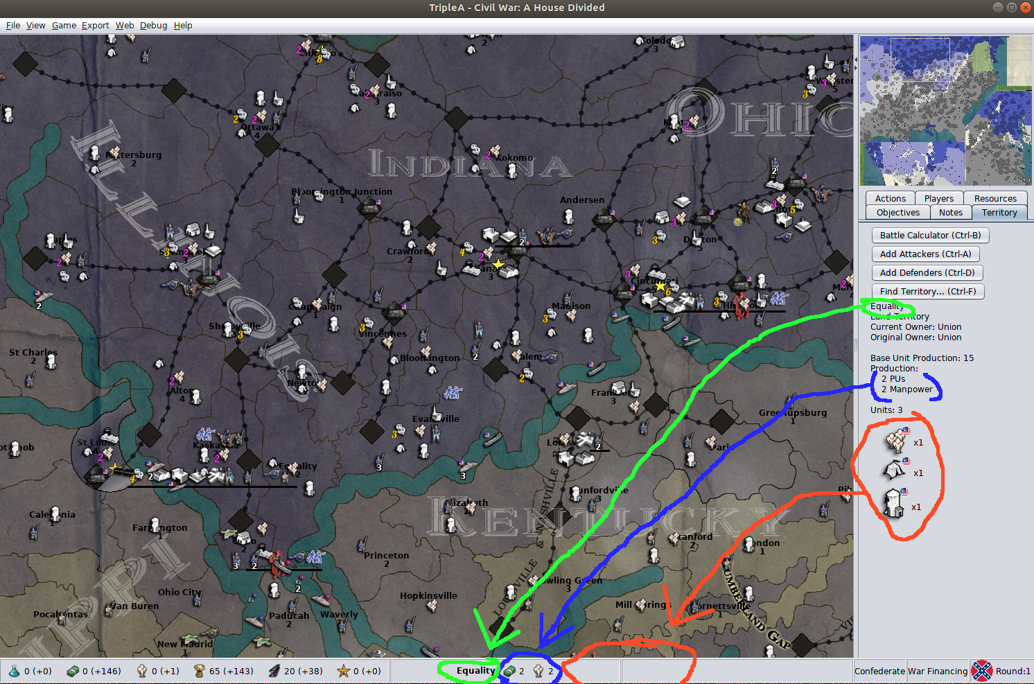
So... I chose Global as the example as it provides some great examples where there are limited placements in an otherwise generous map.
Lets look at Belgium...
So while overall the map provides exceptional ability to provide ample placements on the map, a territory like Belgium becomes an issue as it has 4 possibly 5 max.
Now, lets presume this territory had one more potential placement... before an extension line is used to bleed units into an adjoining territory...
What if we simply used that last placement... ie. the last placement a map maker had specifically detailed as the last placement for any given territory... and then added a MAP PROPERTY that defined any unit presence beyond the last placement would be substituted with a icon that defined that there are more units in the territory...
Then if you hover your cursor over the icon it would create a pop up window that shows you all the extra units that are contained within the territory.
This would mean that all we need to do is add the map property to every exisiting map... one line addition...
map.Surplus units in pop up
Then the engine would only need to have a generic icon added to its assets folder that is for the overflow...
Meaning that even the most spatially challenged maps... yes I'm looking at you WAW... would have a clear indicator of when the territory is severely over populated with units rather than just having huge swaths of the map cluttered with overflow lines that complicate the visual and clicking process.
"A joyous heart sours with the burden of expectation"
Hepster -
@Hepps I like the idea. You could also make it a game option instead of just a map property though so users can choose to have it or the existing overflow lines.
-
@redrum Yes... of course.
-
@Hepps This was what I pictured by writing at my second point:
@Cernel said in Territory Tab / Always Showing Units on Hover:
@LaFayette I'm thinking that:
-
Only when you are hovering your mouse on a zone that has an overflow line (the number of unit types in there, excluding hidden, is bigger than the place coordinates available), then an additional lower bar, above the regular one, appears, showing the units on a line and centred with the screen (this way, if the map has never any overflow lines (you are playing Feudal Japan), then you never see this feature).
-
Whenever hovering your mouse on a zone that is being overlapped by units from other zones on overflow lines, hide those overflow lines (maybe adding a "plus" symbol, to mean some units are temporarily not shown).
Basically your proposal here, except happening only if the overflow lines would go into the zone you are currently hovering.
-
-
@Hepps Perhaps there could be some problems:
- some maps, like WaW or Cold War, there might be many territories where you have to hover, we could be losing visibility of a lot of units
- having to hover could lose the "feel" for a board game (I'm really concerned about this, IMHO one of TripleA's stronger points is that it has a good board game feel)
- we could have some players unhappy if they fail to realize critical units were present. For example, I typically look around the map for "where is that bomber that has been running around". If I don't spot it, going through history is one way, but tedious, it woudl also be tedious to have to go through every expand item to find it
- we could be making the problem slightly worse in some ways, every time we could have shown a single unit rather than an expand, it'll be a net negative
- does not help with the island offload scenario. I literally watched a new player shift click their units to offload and then not realize they did not actually make it to the island. For that case, it has nothing to do with the expanded visualization but just not easy to tell which territory the units are on
- thinking of island case, where you might have one available spot, this could be really limiting to not show any units or just the one
-
@LaFayette When you have only 1 spot, you only show the "plus" symbol, as that one is placed in the last placement available, unless the zone has exactly the same number of unit types as the placement spots.
-
Yeah, that was understood @Cernel.
we could be making the problem slightly worse in some ways, every time we could have shown a single unit rather than an expand, it'll be a net negative
we could have some players unhappy if they fail to realize critical units were present
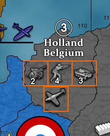
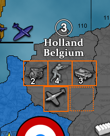
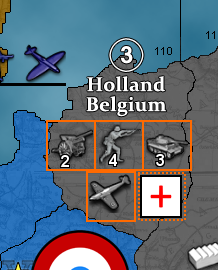
having to hover could lose the "feel" for a board gameHere's a screenshot that shows an example of this problem:
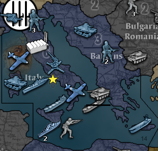
- It's not clear the italian tank is actually in italy and not an island.
- It's not very clear which fighter is which (the top left fighter is in italy, the bottom right one is the one on the SZ)
- there is only one unit drawn on extension, hiding that unit and another unit in italy would not really help. It still does not make it clear where the fighters are, or fix the tank.
- It could be worse if the plus sign is badly placed
- we could wind up with a lot of plus signs, could look ugly, and winds up hiding a lot of information (which adds a new problem - "I can't see all the units")
Hello! It looks like you're interested in this conversation, but you don't have an account yet.
Getting fed up of having to scroll through the same posts each visit? When you register for an account, you'll always come back to exactly where you were before, and choose to be notified of new replies (either via email, or push notification). You'll also be able to save bookmarks and upvote posts to show your appreciation to other community members.
With your input, this post could be even better 💗
Register Login