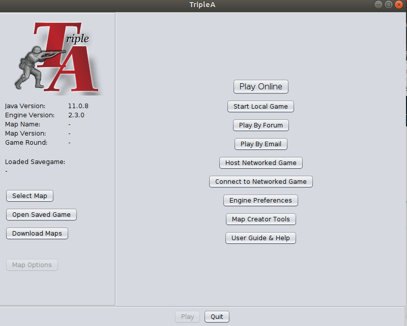
Main Screen Logo Needed
-
@MirkoBruner i think the darker background one looks better as well.
-
@ff03k64 I like it indeed. But I guess colours depends on the Engine Settings. I was just showing here only the two extremes of the spectrum! I will try to show the main screen according to all the Choices you have on the settings. Regards.
-
@MirkoBruner not a fan of that font its too modern. FYI the existing font was made to match the original icon from ages ago.
-
@ubernaut This one?
-
@MirkoBruner yes read this thread from the start it's only two pages
")
-
@ubernaut said in Main Screen Logo Needed:
e start it's only t
Ok. Done Read.
So basically @LaFayette is asking for a new logo and I get it.
You didd't propose a new one but just put a random warfare image in the background.
I kinda like it, but as someone stated is too realistic and almost completely unreadable. Too much information there in the dust and rubble of the ruins.Seems to me a new logo has not been presented apart from the one I did the other day and which I really like.
The Font is No Sans and easy readable even in smaller dimensions (website and Icons), I kept the Classic Red of Triple-A, the Soldier is still the main character of the logo and again the no sans font projects the platform towards the future.
The skewed back shadow gives it a touch of three-dimensionality which is cool.But again happy to try again and change font
The only problem is to retrive a good Image of the Infantryman shooting with the rifle.
Anyone can help?@ubernaut let me know if you have got anything and how you would like to proceed if you have ideas.
Regards,++Mi®koBruner
-
@MirkoBruner said in Main Screen Logo Needed:
I kinda like it, but as someone stated is too realistic and almost completely unreadable. Too much information there in the dust and rubble of the ruins.
yeah it was just a quick mockup to get the idea across if you saw my other replies i mention that.
Seems to me a new logo has not been presented apart from the one I did the other day and which I really like.
well the original need wasn't for something necessarily "new" the title was simply title screen logo needed i think there is value to retaining style unless there is a benefit to changing it brand recognition is important. at any rate we should try to avoid a "modern" look for this game it roots are ww2. i didn't really mock it up but if we did want to get fanciermy idea was to do old school electronics switch soemhtign like this:

"You should never have told me horses sleep standing up, it gave me a mental block." - Mister Ed
-
@MirkoBruner said in Main Screen Logo Needed:
The only problem is to retrive a good Image of the Infantryman shooting with the rifle.
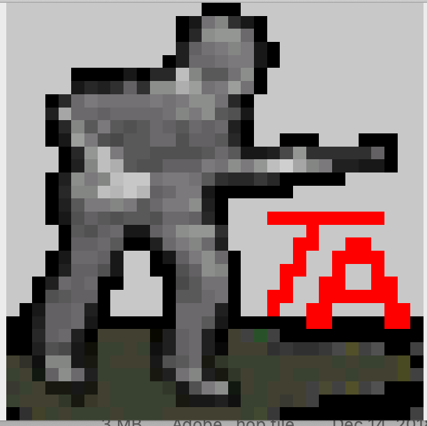
Anyone can help?regarding fritz i did not make it but here is the version I found when I did the new icon ages ago.
-
@ubernaut it seems to me that @LaFayette asked for a new logo if new isn't new then I don't understand. I think it is pretty obvious what he wanted.
Please state what a New Logo means.
The Brand Recognition is recognised, the infantryman is still there and that is the main character of the logo. Infantryman + TA.
What do you want recognise more than that?
A further Logotype has been introduced to give even better clarity for "Brand Recognition", so you have eventually the Infantryman, the TA and the Triple-A label.Again, what I did is neat, clean and cool, recognisable readable and not futuristic at all. Just a font with no sans.
I don't get the image of the old electronic and how you would implement that with Brand Recognition in mind.
And mostly, you... what have you got so far?Regards,
-
@MirkoBruner said in Main Screen Logo Needed:
@ubernaut it seems to me that @LaFayette asked for a new logo if new isn't new then I don't understand. I think it is pretty obvious what he wanted.
you are inserting the term "new" the title of this thread is "logo needed" the post is:
We could use volunteers to clean up & improve the upper left logo.
he was using a "new" logo bc he didn't have the high res version I had and didn't realize I had it or probably would have asked me for it earlier.
I'm not against something new but I think the existing typeface is more true to the original branding and I'm kind of if it ain't broke don't fix it kind of guy in general.
the panel is for if we want to go fancier with the start screen in general, not in regards to the logo itself and again just my idea.
"You should never have told me horses sleep standing up, it gave me a mental block." - Mister Ed
-
@ubernaut but the one that is up now is completely new or not? Who made it? You?
-
@MirkoBruner idk which one is in 2.5 in 2.4 they were still using the placeholder one.
-
@ubernaut said in Main Screen Logo Needed:
branding and I'm kind of if it a
Again, then. What is your proposal?
-
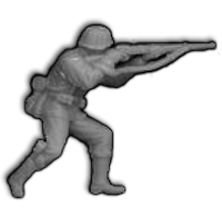
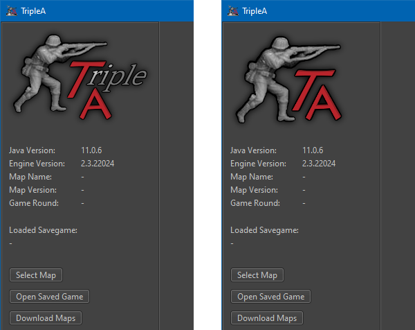
@MirkoBruner logo is good as is imo fritz's alpha channel needs a bit of cleaning up tho haven't had a chance to do that yet just noticed that issue within the last week.
in regards to the rest of the start screen i think that's up to the devs in terms of how fancy they want to get with it. putting just an image would obviously be easier to do but if they think it makes sense to get a bit more involved with it then i'd say we revamp to make it look like a ww2 control panel but again that's just me.
-
@ubernaut Quote "I'm not against something new but I think the existing typeface is more true to the original branding and I'm kind of if it ain't broke don't fix it kind of guy in general."....
So is it you who is in charge here? Do we have to ask your permission to implement things? Just to know, not questioning anything here.
The New logo is simply unreadable, misaligned, confused and poorly designed.
You bashed against the one i picked but here the font used is OLD, but not old as if WW2 style like, it simply out of fashion, not updated to the standards of today just ugly to say the least.. Who made it? A developer, programmer? Guess so.
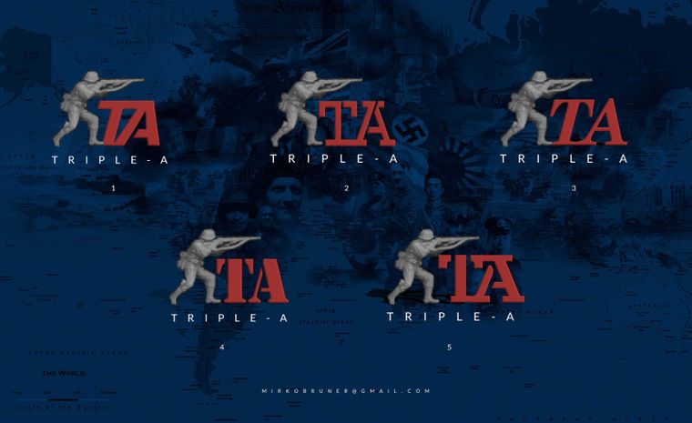
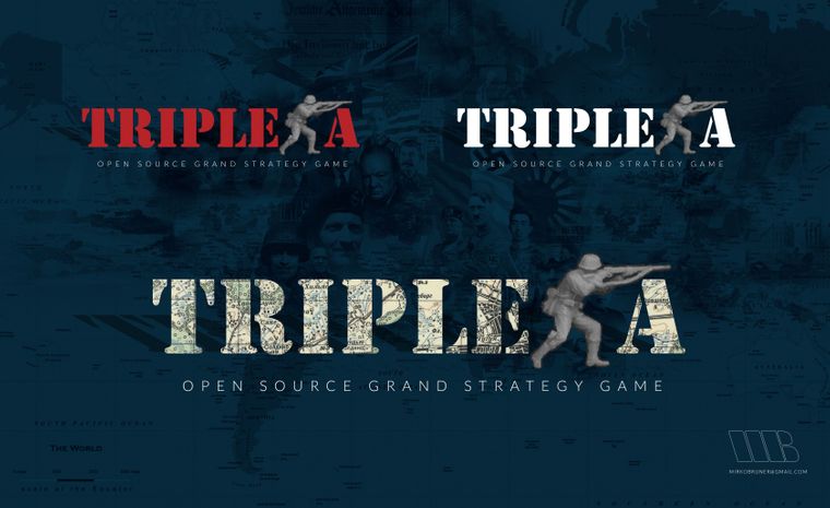
Just to say one, imagine and think of replacing that logo on the header of the forum. Impossible.Again, we could do better. I attach some tests done after your critics, still. The first i picked seems the most readable to and the more cool. Number 5 is really cool, the negative space of the logo defines an interesting pattern, but less readable.
Regards,
-
@MirkoBruner said in Main Screen Logo Needed:
So is it you who is in charge here? Do we have to ask your permission to implement things?
as I have said many times on this thread these are just my opinions.
The New logo is simply unreadable, misaligned, confused and poorly designed.
huh?
You bashed against the one i picked
i did not, I said the style of it was too modern for my personal taste.
but here the font used is OLD, but not old as if WW2 style like, it simply out of fashion, not updated to the standards of today just ugly to say the least.. Who made it? A developer, programmer? Guess so.
now that sounds like bashing
i already told you I made it you seem to be trying to pick a fight here. FYI, I am a designer by trade and it has been my source of income for many. many years.Again, we could do better. I attach some tests done after your critics, still. The first i picked seems the most readable to and the more cool. Number 5 is really cool, the negative space of the logo defines an interesting pattern, but less readable.
honestly, I don't think any of those typefaces are as clean as the existing thing and again don't think the existing thing is broken it is based on the original icon. also, not a fan of incorporating the name into the logomark personally makes it hard to read unless it's really big.
again since you haven't heard me before I will put it in caps this time, THESE ARE JUST MY OPINIONS. as you know this is an open-source project decisions are made by consensus which obviously isn't going to happen between just you and me.
i have tried to be welcoming and constructive with you but if we cannot improve the tone of this conversation then frankly i'm done with it.
-
When two designers meet..
Stay constructive and read positive intent into what the other is writing. Cycles & efforts spent (wasted) arguing is us failing.
I think we need to present all options for logos and then make a choice which one we want or want to spend more time improving.
Swapping in a new logo is very straight forward.
@MirkoBruner, out of the logos you presented, the 3rd and 4th were the most striking to me initially.
Does the logo design depend too much on the background we have? It seems like there are three scenarios:
- as-is, the grey, sometimes dark-grey dominant background
- a fill-image background (the one @ubernaut presented was white-dominant)
- the semi-translucent, IIRC, red dominant background @MirkoBruner presented
-
My bad, but I always want the best for everyone and I am no picking up a fight here.
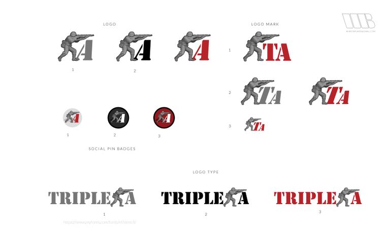
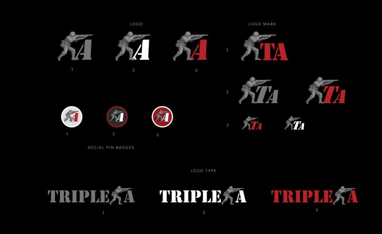
So my apologies. But If something is not good by a design point of view one must be able to say why it is or why it is not. Last but not least "tone" here on chats is never transmitted and in no case I wanted to be unfriendly.Possibilities are endless. One should develop: a black and white logo, interchangeable for black backgrounds and white backgrounds and then a coloured logo.
The big question is between a logo mark and a logo type or a combination of the two. Roughly I will explain it in the creativity I have attached here and tests I have made.
Does anyone has the image of the infantry man in a resolution big enough or do we have only the one @ubernaut posted here a coople of days ago?
Regards,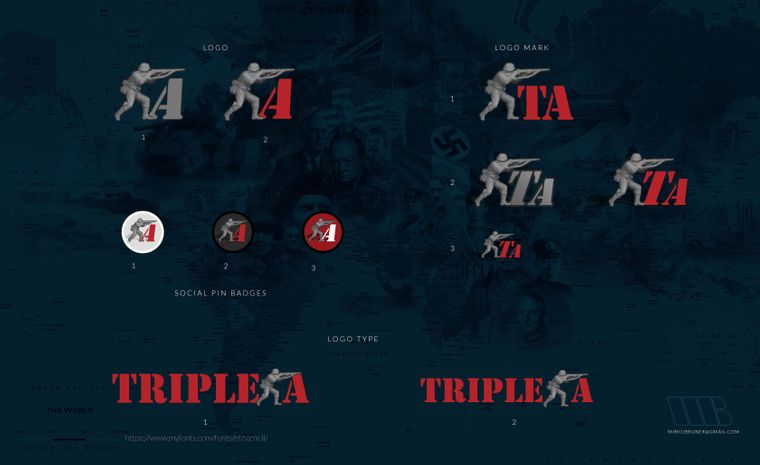
-
But If something is not good by a design point of view one must be able to say why it is or why it is not.
i like your mockups but i still personally feel as if our existing thing is better. so I have tried to state this before but the original icon depicted a battlefield with fritz in the foreground and the initials "TA" in the background. that original design was really well done (imo) and even shows persective despite the extremely limited resolution available (wasn't me btw). Again for reference:

when the capability for operating systems to have higher resolution icons including transparency we needed a new icon at that point in order to keep pace with this new level of available quality. this is when I entered the picture my intent wasn't to redesign what was already essentially a perfect design imo it was to simply remaster it. really the only thing i changed was adding the fighter in the background.
why do I say the existing design was perfect? by perfect i do not mean that there is no room for improvement, i mean that there is nothing wrong with it. It communicates exactly what the game is. even if you don't understand english you could look at it and guess what it was about.
again i like your designs and these are just my own opinions obviously, i just don't think they get the job done quite as well as what we have now in terms of communicating the idea of the game.
with any change we make to the branding, we must also pay a price in terms of brand recognition unless we are getting some benefit in exchange for that price it would be again, imo, a losing proposition.
@LaFayette i think you mentioned a concern about how the logo/icon compares versus various backgrounds. in fact the gamut of the current logo/icon is pretty balanced and if anything it probably shifts slightly darker not lighter:
also, the transparency works on both dark, light and mixed backgrounds:
anyway just thought i would try to address some of the questions about my opinions.
-
I am very impressed with the presented images, logos and menues by @MirkoBruner. Very professional look!
One thing is fore sure, and that is that his logos are 100 times better than what is in the prerelease at the moment.I am also conservative in regards to the logo, but if the logo of TripleA is to get an official new overhaul and look (at the website, forum, in the engine etc.), I think @MirkoBruner has some incredible ideas and skills.
Here are my proposed (more classical) versions, but I dont know if they are better than MirkoBruners.
Here are files to toy around with: TripleA-New-Logo.zip The above has shadows added.
Hello! It looks like you're interested in this conversation, but you don't have an account yet.
Getting fed up of having to scroll through the same posts each visit? When you register for an account, you'll always come back to exactly where you were before, and choose to be notified of new replies (either via email, or push notification). You'll also be able to save bookmarks and upvote posts to show your appreciation to other community members.
With your input, this post could be even better 💗
Register Login