Navigation

    TripleA Logo

    TripleA Forum

    • Register
    • Login
    • Search
    • TripleA Website
    • Categories
    • Recent
    • Popular
    • Users
    • Groups
    • Tags

    Purchase Window Size

    Map Making
    4
    9
    673
    Loading More Posts
    • Oldest to Newest
    • Newest to Oldest
    • Most Votes
    Reply
    • Reply as topic
    Log in to reply
    This topic has been deleted. Only users with topic management privileges can see it.
    • B
      beelee last edited by

      How do you adjust the size so all the units will show without scrolling ? One map is taller and the other wider. I'm pretty sure the taller will fit more units.

      ubernaut 1 Reply Last reply Reply Quote 1
      • ubernaut
        ubernaut Moderators @beelee last edited by

        @beelee i think it's automatic base don number of units i believe the engine tries to pick the two most median common denominators and set the rows/columns accordingly

        B 1 Reply Last reply Reply Quote 1
        • B
          beelee @ubernaut last edited by

          @ubernaut yea Idk why there different. Name length maybe ? I have 28 units fully visible with room for more here

          Screenshot from 2021-05-05 19-41-15.png

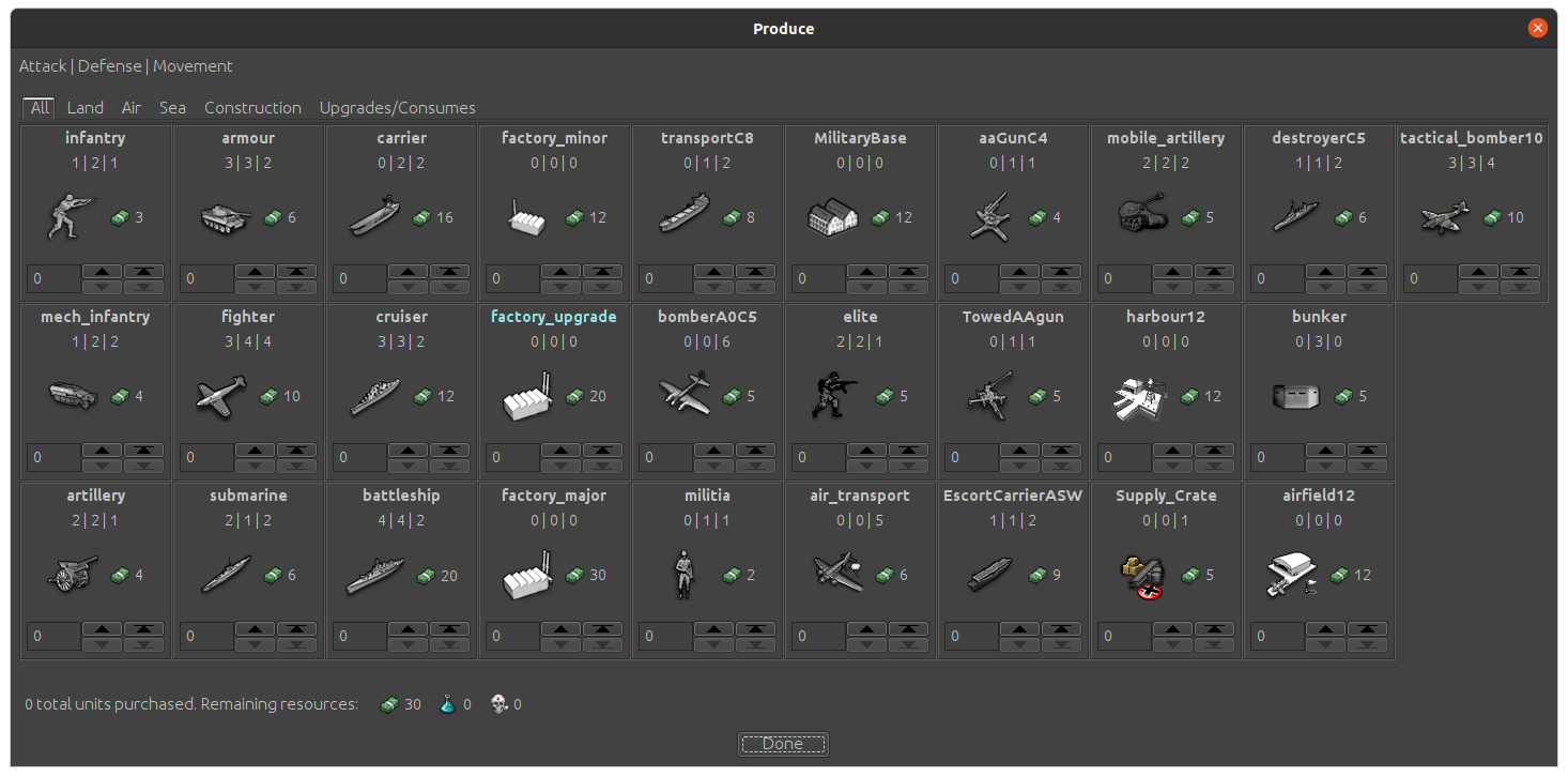
          and then this mod of same map with 28

          Screenshot from 2021-05-05 19-42-07.png

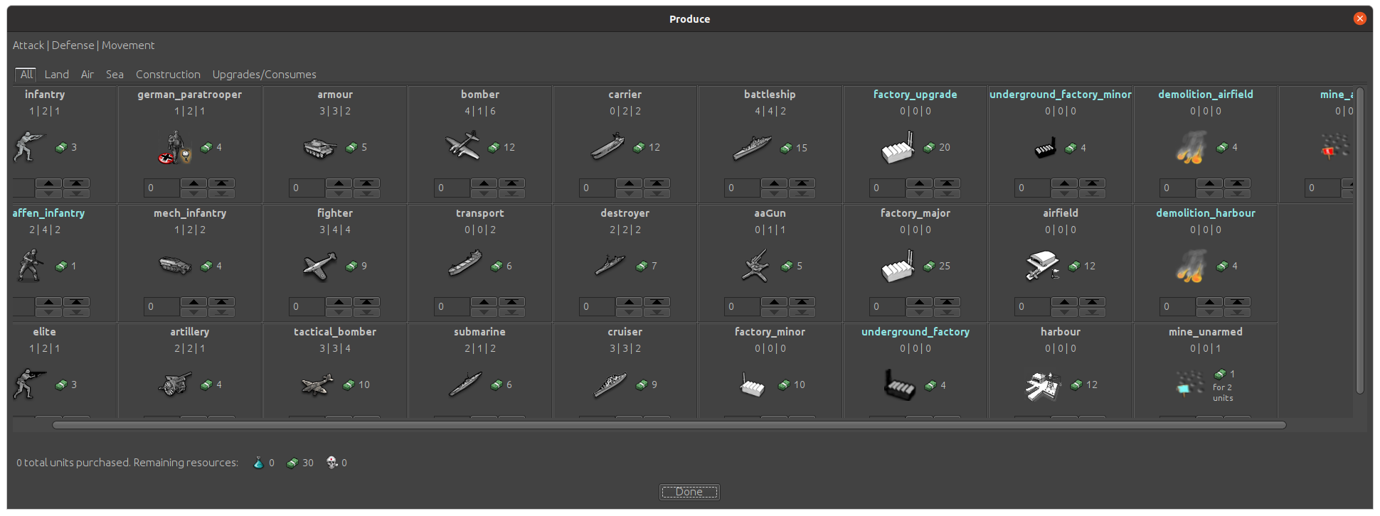
          It sure would be nice not having to scroll. I guess worst comes to worst I can reorganize with the least used unit, Factory Upgrade, but there's still some more to add. if I could make it like the edit screen I could get almost 42

          Screenshot from 2021-05-05 19-50-06.png

          At any rate thanks for the reply

          1 Reply Last reply Reply Quote 1
          • B
            beelee last edited by

            @RoiEX I know you were working on the UI a while back, so maybe you know if/how to change the size of the purchase window ?

            The post directly above has an example of two different sizes.

            Thanks

            RoiEX 1 Reply Last reply Reply Quote 0
            • RoiEX
              RoiEX Admin @beelee last edited by

              @beelee

              I don't know much about this specific UI code, but in general the scroll bars appear once a certain threshold is passed.
              From the screenshots I guess that the scrollbars appear because the unit names are to long.
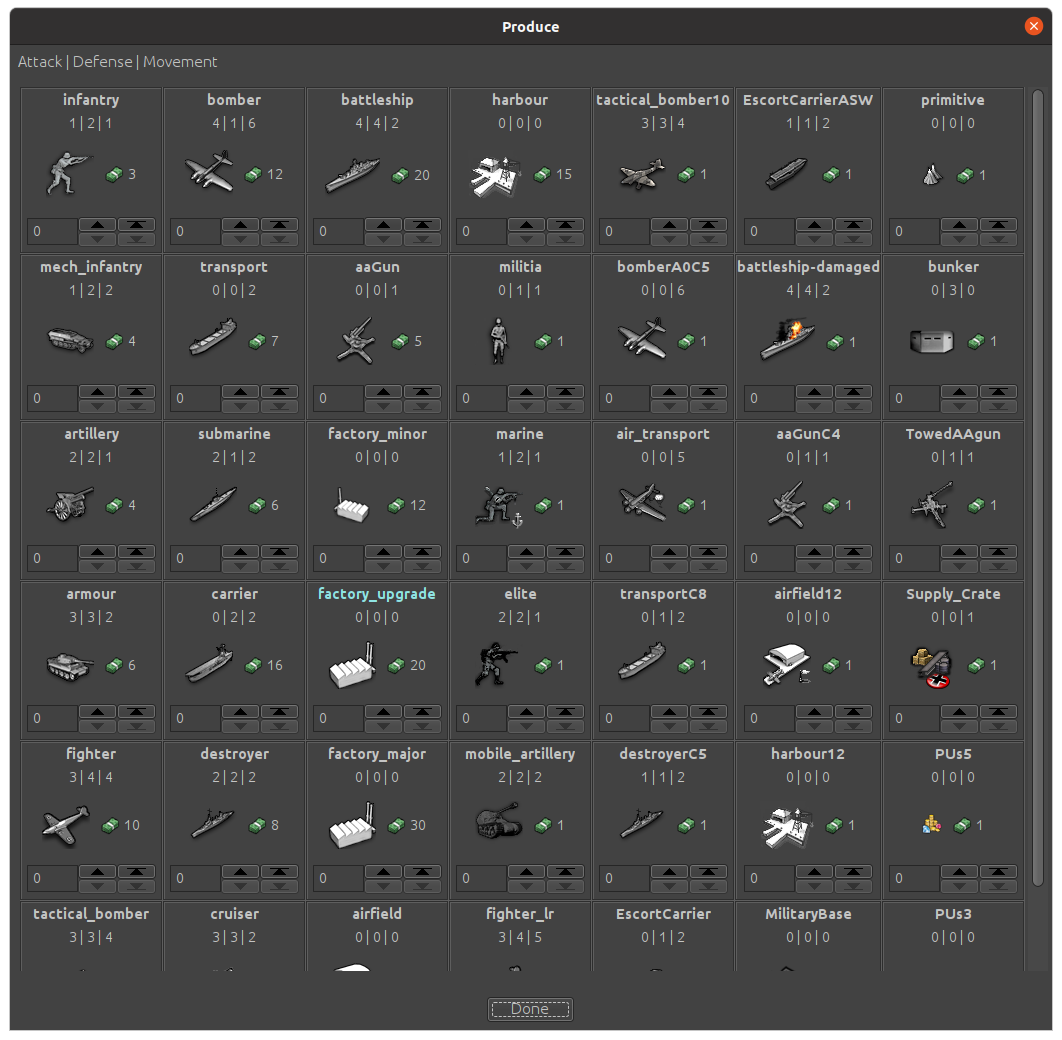
              Note how "underground_factory_minor" uses up the whole width of the Tile and all other tiles grow to have the same size. I think if you change the name of this unit to something shorter it will fit again.

              B 1 Reply Last reply Reply Quote 1
              • B
                beelee @RoiEX last edited by

                @roiex Thanks

                1 Reply Last reply Reply Quote 0
                • B
                  beelee last edited by

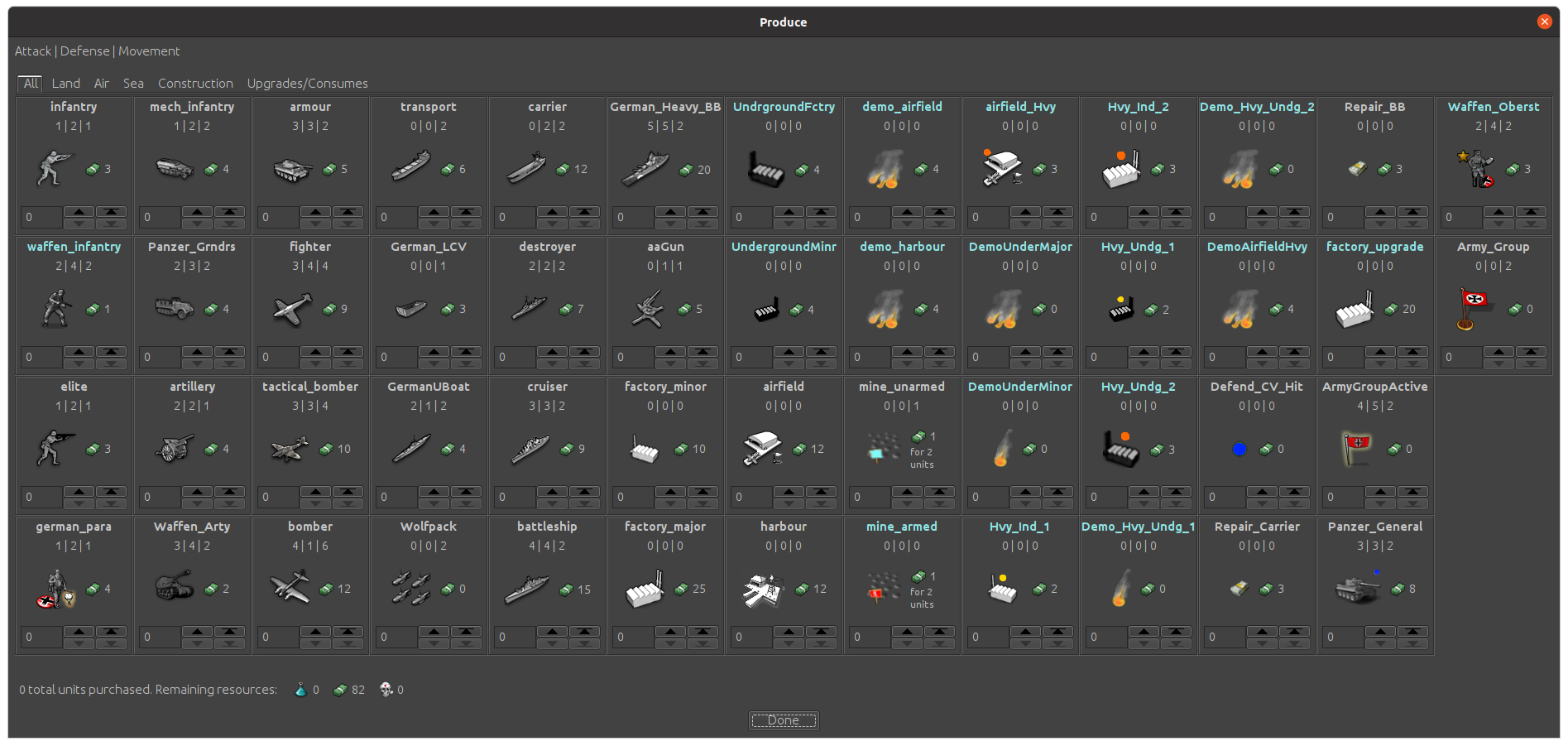
                  It looks as if you have a maximum name length of 15 characters, you can have up to "52' purchase selections. here we are at 50:

                  Screenshot from 2021-05-22 19-08-37.png

                  I dig it 😁

                  1 Reply Last reply Reply Quote 2
                  • B
                    butterw last edited by

                    The user can make use the Land/Air/Sea filter tabs if the map features more unit types.

                    Maybe it should be possible to override the default "All" units display to select an alternative starting tab ?

                    B 1 Reply Last reply Reply Quote 1
                    • B
                      beelee @butterw last edited by

                      @butterw Sweet ! I forgot all about that 🙂

                      Yea, we'll be a half dozen or so over by the time it's all said and done. Thanks for the heads up

                      1 Reply Last reply Reply Quote 0
                      • 1 / 1
                      • First post
                        Last post
                      Copyright © 2016-2018 TripleA-Devs | Powered by NodeBB Forums