Achievable improvements to the Triplea User Interface
-
@lafayette said in Achievable improvements to the Triplea User Interface:
We should only be careful about choosing carefully right click functionality. Right click and drag might be a nicer way to move the map. If so, then detecting a single right click vs a right click and drag could be problematic. Overall right click is underused, so ideally we'd design it to be used somehow. A context menu with more options than info might be good. For example, instead of requiring a player to know 'ctrl+b', we could have the battle calc for a territory be part of the right click. Right click might be well used for undoing of actions, so that is another thing to consider.
A contextual menu/info display on territory/zones seems like an interesting idea.
RIght click +/OR a keyboard key could be used (ex: MENU key). -
The current menus are a bit troublesome to work with because most items are added in a slightly different way. This makes modifications more difficult than they should be. I'm doing a mockup of the tripleaframe that should allow testing out changes easily (it will handle the menuBar and the splitPane initially).
I will be looking into making the menubar hideable (while retaining the hotkeys defined in menus) and will hopefully have a new dev build this week.
My approach is to set height of menubar to zero when hidden. The menus remain accessible with Alt+Mnemonic (F, V, G, etc.) or F10 (opens the _File menu on Windows) even if the menubar is not displayed.
When collapsed with CTRL+X, the sidepanel will be completely hidden, and will remember it's previous position. I'm adding a separate command to reset the sidepanel size. -
@butterw said in Achievable improvements to the Triplea User Interface:
A contextual menu/info display on territory/zones seems like an interesting idea.
RIght click +/OR a keyboard key could be used (ex: MENU key).yea it'd b nice to be able to activate the Territory tab and scroll without having to have the cursor up top and then moved over to it
-
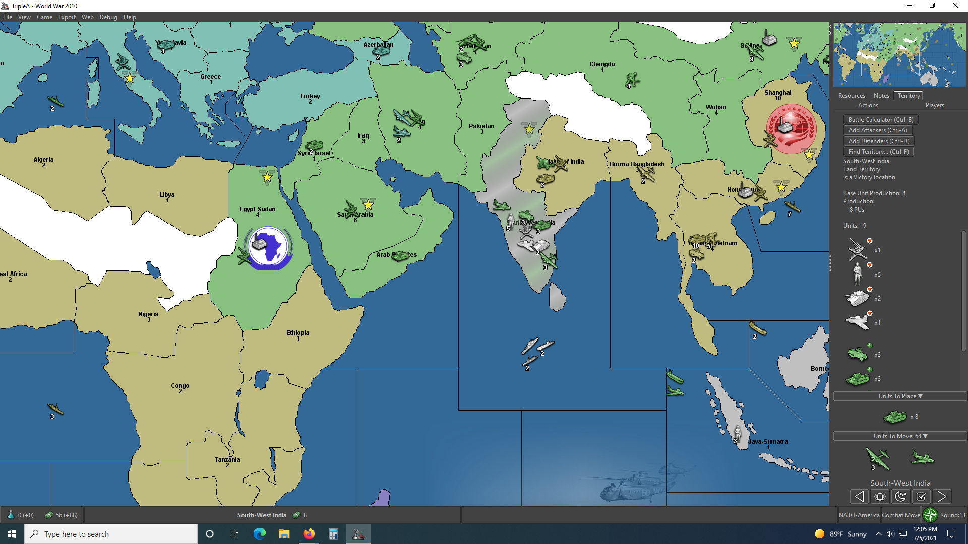
well I've not read through all 6 pages on this forum and I hope I'm not being redundant with this concern. When There are a lot of units in a territory, I click the territory tab to see the list of the units on the right of the screen. The list is too long for the window and there is a scroll bar, however after clicking the territory tab, then the map location, as I bring my mouse back to the scroll bar the territory tab window doesn't maintain focus on the territory I wanted info on. Instead it reacts to whatever map locations I hover over on my way back to the territory tab scroll bar making it useless. Is there something I'm doing incorrectly? I've tried the arrow keys, shift and cntl clicking etc. to no avail. Here is a screenshot if it helps anyone understand what I'm talking about. You can see that I can't see my bombers in the territory info tab and I can't find a way to get that scroll bar to work. Thanks
![alt text]
-
@pact_of_plastic
Yes its a common problem.
The current answer is to move the map territory next to the right hand Action/Players panel and then you scroll the units.This is one of the fixes under consideration.
-
If you click on the territory and hold down the click button, you can then move the mouse while holding click and the territory tab will not change. It's not an ideal UX, no.
-
@lafayette This is really a life hack, isn't it. I don't think you are ever supposed to left click but for selecting something.
Having anything you can click on inside the territory tab really doesn't make sense if I'm assuming correctly that the trick of holding the left mouse button while moving the cursor on there is not something intended. If it is, likely it should be documented in "Movement/Selection Help".
-
@lafayette said in Achievable improvements to the Triplea User Interface:
If you click on the territory and hold down the click button, you can then move the mouse while holding click and the territory tab will not change. It's not an ideal UX, no.
Well you learn something new ...
Yes that works as well. -
The standard delay for java tooltip is about 1s, whereas the tooltip on units only comes up after 2s. I would assume this extra delay is deliberate...
There probably should be an option to prevent unit tooltips from displaying on the map.
Unit tooltips are set to 2s in MapUnitTooltipManager.java, and are called from TripleaFrame.
I'm adding a "Show Tooltips on Map" option to the View Menu (the setting isn't persistent).
-
@lafayette said in Achievable improvements to the Triplea User Interface:
If you click on the territory and hold down the click button, you can then move the mouse while holding click and the territory tab will not change. It's not an ideal UX, no.
wow that works pretty good ! Wish i'd have known that years ago lol
-
@butterw I guess TripleA is a rare "game" not allowing the user to set the tooltip delay time. Still, having the option of not having tooltips at all might be good too.
-
@cernel
The map tooltip delay value might be easy to hack in the code.
Making a value configurable in the interface requires more work, and setting a value is more complex than just enabling/disabling, then there is the issue of whether it should be made persistent, etc.None of this actually requires great programming skills, but any such changes would need to be tested and proven to be beneficial to make it into the main game version. Feedback on development builds is very critical here.
The current configuration ui also wouldn't scale, meaning only the most important parameters can realistically be made configurable.
-
@butterw
From you have said I would drop the hover ability in favour of a right click.It can happen that I have a window application open over the top of TripleA and the hover pop-up, bleeds through and pops up over this window disrupting my work.
-
1080p fullscreen with hidden sidebar and menubar, window is undecorated.
-
@butterw
Looking very good!Just in case you have missed this, the History needs a H
")
-
@thedog said in Achievable improvements to the Triplea User Interface:
Just in case you have missed this, the History needs a H
I haven't looked into why but with the History and current game mode, the sidepanel tabs can actually get re-populated at 3 different places in the code.
If there is room keeping the special tab "History" in full probably makes sense. Same for Edit.For your tooltip bleed-through issues, you should Iconify the app rather than use Alt-Tab.
F11 will toggle (undecorated window) fullscreenMode.
It looks like it would be troublesome to change the decoration status of the TripleA frame at runtime, meaning full screen (undecorated frame) will need to be set before you the map is launched.
CTRL+F11 will allow to iconify triplea (in fullscreenMode). Modal OptionPane dialogs will need to be closed before iconifying as they get their own iconified entry.
CTRL+ALT (on key release) will toggle the menubar display.
It would be possible to always display the menubar when ALT is pressed, but this would cause a hidden menubar to display when ALT is used as a hotkey modifier, which seems undesireable. -
@butterw
Thanks for the advice and CTRL+ALT is fine. -
I haven't add time to do much progress. I still plan to post an updated dev version this month.
I will also be adding the status bar to my frame mockup and will upload the code for it. The flag and ressource PU icons can be used as command launchers.
The fullscreenMode option should be persistent, but can be changed at runtime with F11. In fullscreenMode, the window decoration is removed, this also causes the (map) gameName to not be immediately visible.
With the menubar displayed, it is possible to have a menuLabel to display info. The menu is also used to display hotkeys.
I've added the new commands to the Game Menu, however it would be better to move them to a new Window Menu.
Game Menu should be solely dedicated to Gameplay options IMO, and View Menu should only contain Map Display options.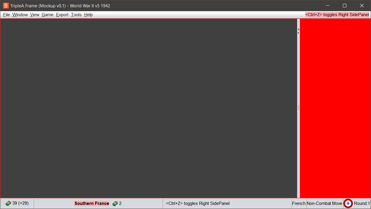 )
) -
I will be posting my ui mockup (see image in the previous post) at https://github.com/butterw/ui
To run it unzip the MenuSwing.zip file to your work directory
java -jar BFrame.jar
or
java MenuSwing.java (requires Java 11 JDK)the display (text, icons, etc) can be customized via the ui.properties file (this is a scalable approach for user parameters).
It uses the Nimbus look and feel. dpi scaling and the font can be customized.
the sidePanel is hidable (by clicking the player flag icon or via a user customizable hotkey), F11 toggles fullscreen mode (undecorated +maximized window). The menubar includes a status Label.The code is a lot easier to modify than the triplea code.
Hotkeys are in a single class.
The Menu is a single class (structure directly matches the displayed menu).v0.1 features:
File > Exit (Alt+F4)
Window Menu (Fullscreen F11, Iconify, toggle sidePanel, reset sidepanel, toggle menubar)
View > Map Zoom
Help > About -
The jar version v0.11 has now been uploaded:
https://github.com/butterw/ui/blob/main/code/MenuSwing.zipIt can be used for experimentation, ex: with the player flag icon size (24, 32, 48), which sets the size of the bottomBar.
Menus can be reorganised, ex: the File Menu entry could be removed.
I would expect to add the sidepanel layout.
Some different features will be added to the dev build (ex active hideable menu).
Unless there are issues with it (I haven't done much testing and only on Win10), I would expect to open a pull request to add fullscreenMode to the triplea v2.6.
Hello! It looks like you're interested in this conversation, but you don't have an account yet.
Getting fed up of having to scroll through the same posts each visit? When you register for an account, you'll always come back to exactly where you were before, and choose to be notified of new replies (either via email, or push notification). You'll also be able to save bookmarks and upvote posts to show your appreciation to other community members.
With your input, this post could be even better 💗
Register Login