Achievable improvements to the Triplea User Interface
-
Territory Tab - replace with the following;
When you hover over a Territory you could get a pop-up giving;- The current Territory Tab info, as now, Current, Original, A Capital, A Victory Location, Production details etc
o but the pop-up might be really big with the unit types listed for both allied/enemy, display as say 75% and over say 4 rows
o the current method is poor if there is more than say 6 unit types as it difficult to scroll the Right Hand Panel
It could also include;
- List the territoryEffects
o combatOffenseEffect
o combatDefenseEffect
o noBlitz
o unitsNotAllowed - Trigger info
- The current Territory Tab info, as now, Current, Original, A Capital, A Victory Location, Production details etc
-
Battle list panel
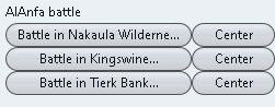
Above note the button [Center] is to the right
.
.
Placement panel
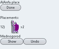
Above note the [Show] button is on the left.
For consistency the Center/Show button should be;
Both on the right or left, I prefer on the right
Both say the same Center/ShowBattle Screen suggested changes
the words [Battle in could be removed from every button, too reduce screen clutter and the word in put above the battles eg.
Faction battle in;The Button [Center] should be [Show] as on the edge of the map the battle will not center, but show the battle.
As mentioned before the x1 , x2, x3 etc units to place, could be displayed like on the main map with the number overlaid over the unit icon (where 1s are not shown but implied) and shown at say 75% size, too get more placements on a row.
-
@thedog
The unit count overlay is painted on top. This is more involved than just text in a label. In any case there will likely need to be some spacing between image icons, or the result will look squashed.
I will look into ways of making the unit display in the sidepanel a bit more compact. -
@thedog
The reason Battle is specified in the Battle List is because Air Battles are possible, These must be resolved before the regular battle.
A current issue is that the battles are in random order. I think Air battles should always be listed before the corresponding Battle. The word Battle could be removed from the button, as it doesn't provide any information. -
@butterw
I have been using 2.5.31-bu.jar, it is working very well.What are thoughts on
https://forums.triplea-game.org/topic/2798/achievable-improvements-to-the-triplea-user-interface/81?page=5and the next post.
Specifically the
- Technology panel
- Territory hover pop-up
as they are probably a lot of work?
-
@thedog
Even if the result is only a couple of lines of new code, most changes do require a fair bit of work.
An overhaul of the sidepanel/status bar is probably needed, but at this stage it is not very clear what it should be.
To make progress, I intend to build a (simplified) ui mockup of the tripleaFrame, which will make it easier to try out changes than with the full game app. -
Two nice to haves to save the player time;
- Right Click on a unit icon, invokes the unit hover pop-up.
- Right Click on a Territory, invokes the Territory hover pop-up.
-
- It's called a (right-click, pop-up) contextual menu.
What would be the content of menu ?
What would it enable that can't be achieved with the current ui ?- The territory quick navigation list would be a good addition, you should open a dedicated feature request post to discuss this. It would need to be saved per map per player, and the user would need to be able to manage the list (add or remove territories). It could contain the players capitals by default.
-
@butterw
I did not mean a menu pop-up, but when you hover over a unit and then get the current unit details, this same unit pop-up could be invoked with a right mouse click on the unit.This saves having to wait, say 2 seconds, for the pop-up to appear.
-
The Factory Scroller has been suggested before, but did have much support, but it was only for placement. Also the Development folder tends to get ignored, as its usually too deep for most readers.
https://forums.triplea-game.org/topic/2473/factory-scroller-for-placement-phase
I was hoping a hot key would just cycle round all factories, in any phase, so typically combat move, move and placement phases.
Then it would be dynamic and not require an input panel and a file per map, per player.
-
@thedog
I think adding a go to next factory action to the "Units to place" UnitScroller tab is what makes most sense in that case.
It would require figuring out what player unit types are factories. -
@butterw
There are basically two types of factory- Factory using xml <option name="isFactory" value="true"/>
- Producer <option name="canProduceUnits" value="true"/> <!-- allows a unit to be a factory, without all the other things that come with being a factory -->
The isFactory is common in all maps, but the Producer type is not common, I have used the Producer type in my Settlers: Fallen Empire.
You have used both of the above correctly when displaying maximum units that can be produced/bought on the Purchase panel.
-
@thedog One issue with the unitScroller is that it isn't displayed during the purchase phase and I think it is also useful to be able to view factories when planning production.
- I've added a mouse action on the round label/flag icon, which I have a bound to the hide the sidePanel (Ctrl-X) command. Hiding the sidePanel currently resets it to its starting size.
-The default map text font size has been increased from 12 to 24 (this setting is used when reset to default is used). I am also thinking about splitting in one font size for unit counts (default: 24) and another font size for territory/PUs/Convoy (default: 18) used in Maps like POS2.
- Having the tabs on a single line is a improvement IMO. It also makes finding the command/action tab much easier.
@thedog Status Bar: move to the top of the screen.
Moving the whole status bar to the top of the screen would not be practical, but the status label could be moved to the menubar. Maps with territory effects and multiple ressources are quite badly constrained currently, so it should be looked at.
It would of course be possible to remove the bottom bar if the contents were moved elsewhere. -
@butterw said in Achievable improvements to the Triplea User Interface:
@thedog One issue with the unitScroller is that it isn't displayed during the purchase phase and I think it is also useful to be able to view factories when planning production.
I agree, are you thinking of using the unitScroller as a factoryScroller in the purchase phase?
- I've added a mouse action on the round label/flag icon, which I have a bound to the hide the sidePanel (Ctrl-X) command. Hiding the sidePanel currently resets it to its starting size.
Is this the Flag bottom right of the screen?
-The default map text font size has been increased from 12 to 24 (this setting is used when reset to default is used). I am also thinking about splitting in one font size for unit counts (default: 24) and another font size for territory/PUs/Convoy (default: 18) used in Maps like POS2.
Is this so they occupy less space?
- Having the tabs on a single line is a improvement IMO. It also makes finding the command/action tab much easier.
Agreed
@thedog Status Bar: move to the top of the screen.
Moving the whole status bar to the top of the screen would not be practical, but the status label could be moved to the menubar. Maps with territory effects and multiple ressources are quite badly constrained currently, so it should be looked at.The right click Territory popup would solve the above?
It would of course be possible to remove the bottom bar if the contents were moved elsewhere.
Oooh yes it could, some of it could go into the right click on a Territory popup?
I think the far right of the status bar should stay where is, but put it inside the right hand panel -
@thedog
The standard delay for java tooltip is about 1s, whereas the tooltip on units only comes up after 2s. I would assume this extra delay is deliberate...There probably should be an option to prevent unit tooltips from displaying on the map.
-
@butterw
Or use a switch Hover or Right Click on a unit or territory to get their tooltip as I think you will always have the need to see the unit or territory detail. -
A lot of the issues with the territory detail is that the info display isn't optimized. It works OK as long as the map doesn't use too many special features (ex: 5 players, no terrain effects, PUs as single ressource, only basic units).
Optimizing (simplifying) the output (territory detail, tooltip) would make it much easier to fit the info on screen for complex maps. -
@butterw
Agreed.My current preference is for a right click on the territory over hover over a territory as its instant and no waiting around.
Here is a list of the info that could be displayed on the territory popup.
https://forums.triplea-game.org/topic/2798/achievable-improvements-to-the-triplea-user-interface/82 -
We should only be careful about choosing carefully right click functionality. Right click and drag might be a nicer way to move the map. If so, then detecting a single right click vs a right click and drag could be problematic. Overall right click is underused, so ideally we'd design it to be used somehow. A context menu with more options than info might be good. For example, instead of requiring a player to know 'ctrl+b', we could have the battle calc for a territory be part of the right click. Right click might be well used for undoing of actions, so that is another thing to consider.
-
@lafayette said in Achievable improvements to the Triplea User Interface:
We should only be careful about choosing carefully right click functionality. Right click and drag might be a nicer way to move the map. If so, then detecting a single right click vs a right click and drag could be problematic. Overall right click is underused, so ideally we'd design it to be used somehow. A context menu with more options than info might be good. For example, instead of requiring a player to know 'ctrl+b', we could have the battle calc for a territory be part of the right click. Right click might be well used for undoing of actions, so that is another thing to consider.
A contextual menu/info display on territory/zones seems like an interesting idea.
RIght click +/OR a keyboard key could be used (ex: MENU key).
Hello! It looks like you're interested in this conversation, but you don't have an account yet.
Getting fed up of having to scroll through the same posts each visit? When you register for an account, you'll always come back to exactly where you were before, and choose to be notified of new replies (either via email, or push notification). You'll also be able to save bookmarks and upvote posts to show your appreciation to other community members.
With your input, this post could be even better 💗
Register Login