Proposed Branding Change for TripleA - Your Vote is Needed!
-
there has been a discussion here about the home screen getting a visual upgrade:
https://forums.triplea-game.org/topic/2312/main-screen-logo-needed/
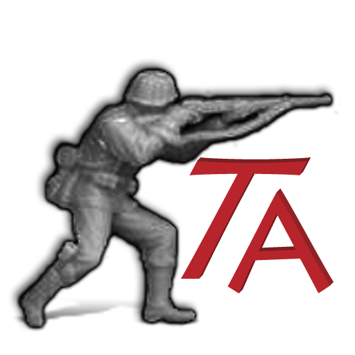
the discussion has turned into a discussion about the logo/icon for this app. the question is if we should change to one of several alternatives provided by @MirkoBruner :
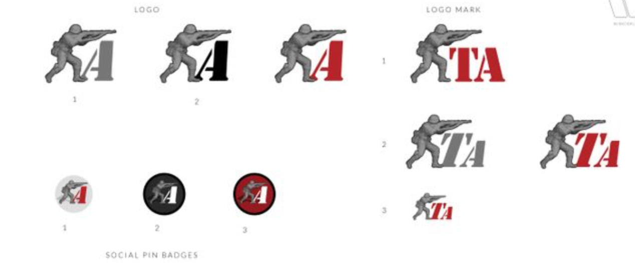
or stick with the version i did a number of years ago based on our original low res icon/logo
for reference and the folks that haven't been around long enough to remember the original it is this:
since we need a consensus here to move forward we would appreciate all of your replies and votes here.
")
Tanks!
-
@ubernaut i like the existing logo.
-
@ubernaut the different sizing makes it a bit hard to compare. Would you be able to shrink the proposed style to match the logo mark size?
-
@lafayette you mean shrink mine down? @MirkoBruner wanted all of his designs presented so i just screen grabbed what he submitted. gonna crash soon so any image editing would have to be tomorrow how much time do we have left in your window?
-
@ubernaut When I mentioned "3 days", it was an example. I don't know if I'll be able to do much for triplea this month and July I'm out of pocket : |
Shrinking yours down would be more comparable, blowing up an image would not do it justice. It's hard to get an apples to apples comparison with the different sizing.
-
@lafayette sorry i was under the impression we under a tight timeline based on the recent replies to the other thread.
my version was a bit rushed as well (as i have previously mentioned the alpha could use some clean up) but i figured based on the fact that these (his and mine) are really only different in one regard, text treatment.
i think it's safe to assume the main element (fritz) would be the same either way. i think it's not that hard to compare personally but then again maybe my eye is not a good standard candle.
")
if we really want to make this apple to apples i think we would need to make just two versions to choose from not 10 versions of the same thing versus one all at the same size.
in any event, i don't have his source files so yeah i guess if we have more time after all then there's no rush but i thought we were under the gun here.
"You should never have told me horses sleep standing up, it gave me a mental block." - Mister Ed
-
@MirkoBruner you want to pick one of your designs that you feel best represents your idea and send the full quality version i will update my post to make them similar size.
-
@silverbullet said in Proposed Branding Change for TripleA - Your Vote is Needed!:
@ubernaut i like the existing logo.
I like it too!
-
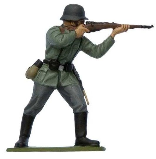
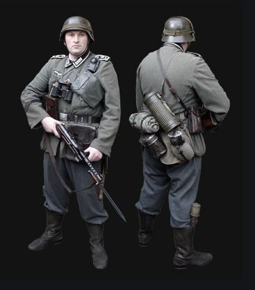
I would prefer the infantry icon being similar to wwi/wwii German infantry with a bit more realistic assault position. And no letters.
-
@ubernaut I wonder if we will need a simpler and newer thread that is completely apples to apples, maybe no commentary in the thread as well to avoid biasing. It's a fine line here to get feedback vs bike-shedding the subject to death.
-
@schulz i never made fritz not sure exactly where it came from only that it was made by someone involved in the project. personally if we want to improve fritz i would have no objections but i do think regardless it would be a separate question from the text treatment
-
@lafayette so we want to throw this vote out then? assuming that @MirkoBruner would be agreeable to this notion, whatever he considers the best example of his idea should the be the alternative. it should be 2 choices old versus proposed new.
the historical context is arguable i suppose (although also the well-established design concept of brand recognition) but it's also not apples to apples to compare 5 variations of the same basic design to one version that does not have variations precisely because it is not a "new idea" it is an evolution/remastering of the original branding.
-
Whatever is voted should be testable in TripleA (ex resolution: 256x256 image or 32x32).
-
@schulz said in Proposed Branding Change for TripleA - Your Vote is Needed!:
I would prefer the infantry icon being similar to wwi/wwii German infantry with a bit more realistic assault position. And no letters.
It's a german one cause helmet, granades and equipment... I think; maybe position could be change, but it´s in attacking at distance... Maybe could be in a better attack position.
-
@raville It lacks the iconic second curve of the German helmets and field green.
-
@schulz what is the source for this? is this what you are proposing? i like the realistic look but there might be an issue if this is someone else's art (unless of course, we have permission to open source it:), it looks like a photo of a painted figurine .
the other potential concern i would have with this one is the color. currently, fritz also represents the unit color of the german infantry unit being greyscale. not saying we shouldn't change it but it would be a slight move away from the visual representation of the game itself unless we desaturate this image. i have a feeling this would lose some detail if we desaturate.
-
@schulz said in Proposed Branding Change for TripleA - Your Vote is Needed!:
@raville It lacks the iconic second curve of the German helmets and field green.
I felt the iconic curve on helmet was a little hide in a camouflage ret, but granades in boots an equipment are German for sure; maybe is an Africa Korps or operation Barbarrosa unit... But could be just my imagination. Your figure is much clearer in Europe operations.
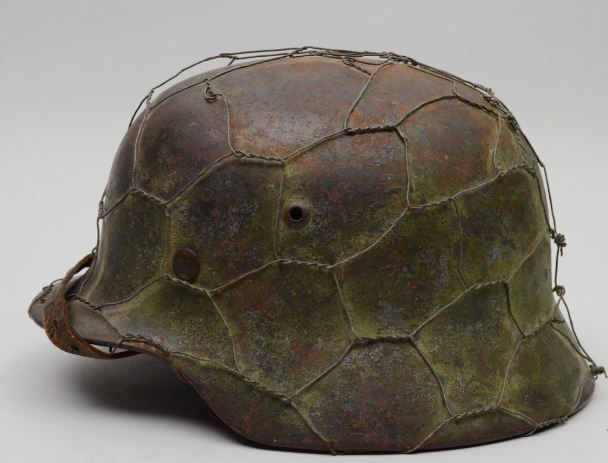
Granades on boots and rest of equipment;
-
@raville i dont want to start anything i was just wondering if we are being forced to change the logo or some of us just are tired of it or just want something newer and flashier? unless its a "great" new logo i am pleased with our current logo.
-
@silverbullet said in Proposed Branding Change for TripleA - Your Vote is Needed!:
@raville i dont want to start anything i was just wondering if we are being forced to change the logo or some of us just are tired of it or just want something newer and flashier? unless its a "great" new logo i am pleased with our current logo.
I completely agree with you, as I said before also like our current logo.
-
Of the suggestions provided, I'd prefer the current logo. If you're going to have lettering in the logo then it should represent the title of the game for easy reference. I'm also more partial to slick italic font as opposed to stylistic block fonts which have separate pieces. Reminds me of car decals and car decals only look good on cars imo. They're also harder to read.
Edit: While the "A" only logo might be representative of Axis and Allies, it doesn't really work without another "A" and I'm pretty sure we ran into legal trouble awhile back by having references to Axis and Allies.
Hello! It looks like you're interested in this conversation, but you don't have an account yet.
Getting fed up of having to scroll through the same posts each visit? When you register for an account, you'll always come back to exactly where you were before, and choose to be notified of new replies (either via email, or push notification). You'll also be able to save bookmarks and upvote posts to show your appreciation to other community members.
With your input, this post could be even better 💗
Register Login