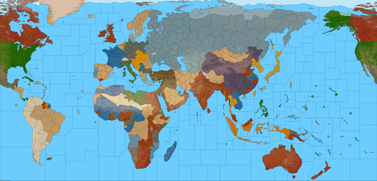
Proposed Map: Domination 1941
-
@schulz yea you'd have to adjust air costs as well. i should try and find Baron's pricing change. It's probably hiding somewhere in the A&A sites history.
He revamped the entire unit roster. I never tried it but looked promising. Being a math professor, he had everything crunched down to the nth lol
-
Yeah I always thought Baron's unit roster ideas for a total conversion had a lot of promise, or at least he always seemed to be putting in the legwork and crunching those numbers to really let you know where the price should land lol. If you can find it I'd be interested to see what he settled on in the end.
I'm kinda wishy washy with it myself, since there are so many potential unit interactions and so many different directions one could go, depending on how far you're willing to take it with changes and what the floor is going to be for the entry level hitpoint in whatever class/unit type.
To me changing the cost of individual units nation by nation would fall into that category of different rules for different player-nations, which I think makes things rather harder to parse. Particularly if the game aims to change many other things at the same time, like say the map itself or the production spread or the starting distribution of forces or the victory conditions or whatever else. Since A&A is already pretty complex for a boardgame when it comes to the units, I feel like that can become a pretty tall order. The situation I'd prefer to avoid is one where the new player has difficulty determining what the opponent's units can actually do, or has trouble figuring out the TUV at risk in any given exchange.
When the unit roster is universal, it's a lot easier to read the board at a glance and I think that helps, in the same way I prefer to see the PUs on the map rather than National Objective bonuses for trying to keep track of the income/economic game, I think I lean the same way when it comes to units. One of my frustrations with Iron War, and many tripleA games honestly, is when you first open the game and don't really have a clue what you're looking at or how the various forces measure up. It tasks the player with keeping track of not just their own situation, but every other faction's unique rules/unit-interactions as well, and sort of requires the player to be everyone and once. Like holding all that in mind at the same time, rather than just "pick a nation and go, since everyone plays the same" or where you can gauge what every one else has going on based on your own stuff hehe.
I'm not sure players typically learn how to play from the Unit Help notes, I'd wager they do it more from the purchase screen and playing out the opening turns, either vs the AI solo or in solitaire mode. So for that I think things work a bit better when you don't have a ton of wild cards in the mix. Like maybe one or two you can slide in, but if everything is tweaked that's a bit different. I also think transparency/universality with the units is part of the charm of A&A, compared to other games like Total War or Hearts of Iron that are more RTS 4X oriented rather than a boardgame based on miniatures and dice. You know, how in those games, the player almost never knows exactly how their forces stack up or what's going to affect the outcome, or what variables might be in play there distinguishing one faction's forces/armies from the next faction's. That stuff is fun in a different way there, and keeps ya guessing and save scumming I guess, but part of the reason I dig A&A is that it's a bit more straightforward and easier to see what's what, even if it's sorta gamey at bedrock hehe.
In fantasy variants using similar mechanics its a bit different, because I don't have any expectations going into it. You know if it's an Elephant or a Dragon or a Trebuchet, it's like OK whatever this all new anyway, but if it's Tanks and Fighters and Transports and such from a more familiar WW2 A&A type setting, I think they are more expectations going in and a greater desire for some touchstones and stuff to cling too.
-
ps.
@thedog said in Proposed Map: Domination 1941:
@black_elk
Ok just the TT text file, it saves you time.I will ask Google, then you if I'm unsure where a TT is.
Ok cool cause I didn't get terribly far hehe.
Here's a very quick example though of 40 pt font in case you did want to do a display option down the road, or if we get a display labels on/off type feature at some point.
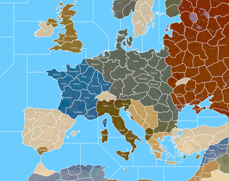
Immediately I was confronted with the dilemma of doing regional/provincial labels or more of a "pick one" metro and amp it up, or else to lean more Hollywood movie in the up naming conventions hehe. Since it's bound to be a bit arbitrary. But for some reason when I wrote them out, TTs with names like N. Italy, Italy, S. Italy etc didn't look terribly compelling. Then I tried it just picking a large metro designation that people would be more familiar with seemed not half bad, where the player can supply the et al and it's just kinda understood that something is highlighted. Like you can call it Brandenburg-Mecklenburg-Saxony or just Berlin and have it kinda like shorthand. Or then, when I say Hollywood movie, it's like take a spot like Picardy, I write Picardy and Flanders or Amien or whatever and it felt more WW1 all quiet somehow, whereas when I typed out Calais suddenly I drifted towards thoughts of Patton the movie or whatever hehe. So maybe that has a kind of appeal too, like focusing on that element at play in some TTs? Other spots like Normandy you gotta just call Normandy I figure, and not like Rouen or whatever, but it really is sorta like pick 1 out of half a dozen options for any given spot . So I don't know. Especially if we wanted the option for regional labels ovetop somehow, you know where it says UNITED KINGDOM, or FRANCE, or GERMANY, like that in all caps above the other stuff. There's definitely quite a few labels I think we could change from the 1914 map hehe. I'm sure it'll take a hot minute
Anyhow, like I said, just a quick example of serif font at that size. I did it pain white for simplicity. I indexed the image as well, and it seemed to hold up alright for that with the text and border blur. I put down a few different examples, of how one could ride the line, or abbreviate. You know like whether you want to write out Denmark or Corsica or clip with a period. I tried to go inside the TTs just to see what kind of display we'd have for characters at that size without switching the angle on the txt, just keeping it on the level. Another option for smaller islands or coastal territories would be text outside the TT like into the ocean field. Bung's sorta bounces between the two options, but at 40 pt you can fit a fair number of characters in most spots. I was able to write out Gibraltar inside the TT, so it must be at least a little bigger now right lol. Anyhow, we could probably do a separate label layer at some point if there's a way to get that to toggle differently from the relief details eventually, but I wasn't going to sweat it for the time being.
I definitely agree, keeping the names (whatever they end up being) in the status bar/hover over would be my preference for the gameplay. Not as busy visually with only the units showing, rather than units standing on top of the letters and all the rest hehe
-
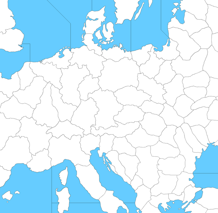
Heheh as soon as I started in with the sea zones I had to make a map correction, cause sz 1 didn't connect to 2 on the G40 map lol. Only the most obvious of goofs. Just updated the files for the correction
ps. I caught another bit of weirdness on my G40 in the South Atlantic. Just fixing that up now.
It's funny cause the G40 map has a near perfect boustrophedon pattern for the Sea Zones across the Pacific right until that skip from sz 52 to 53. Then it's like they forgot New Zealand and had to double back or something, instead of just continuing the count onto the Europe side, they cut back to the right. If they'd just done it a little differently they could have avoided that skip and maybe kept it going, but it's like they just gave up. And then when you get to the Europe side it starts skipping around all over lol.
Anyway, I followed the G40 count obviously. Here's how it looks with a quick SZ number key, just to clarify what's going there with the main zones.
https://www.dropbox.com/s/xjnfpt8wug33ncq/World_War_II_Global_1940_baseline_sz_labels.png?dl=0
-
@black_elk yea I always wondered why they did it the way they did lol You're going along and then it's like well where is it ?
-
@beelee No doubt! I think they could have done it in such a way that it at least only skipped over 1 or 2 tiles at most, instead of jumping far away. The skip from sz 81 Red Sea to sz 82 along the West African Coast was another surprising one. Like why not just carry the count from the Pacific side of the board to the Indian ocean and have the Europe map begin the count at the bottom right instead of the bottom left? Weird hehe. Part of me wanted to see if I could make it better, but fidelity to the G40 board seemed more important even though it the numbering there feels fairly arbitrary. Kinda raises the question of whether it's even worth keeping the numbers the same on the Dom map heheh, though I suppose people are used to the Global one by now.
I realized while trying to type stuff out in txt that it was actually pretty hard for me without the visual. Might be just the way my brain works, but I kept having to close out notepad to double check and kept missing things. So instead I just started label layer in GIMP. This seemed expedient because it saves out each entry as a separate layer, so when I finish I can just go down the list and control c/v to paste them into the txt doc one by one so I don't miss anything or screw myself with typing errors. Then I'll just alphabetize them like I did for Hepp's stuff so it's easier to follow.
I got this far earlier today... so probably a couple more days and I'll bang it out I'd guess. I have the sz labels saved out in another layer so I can do the alpha-numeric thing with those.
As I was going along, I had the thought that if the labels aren't actually displaying, there's really no need to have the names be all super short. Like we might as well include more information just to kind of even things out, cause with the hyphen you can read it like an "and" as well, and just gives on opportunity for more insight. Players will just refer to whatever we put first, or whatever name we list that is easiest to abbreviate or type out, so more options might be good. I was winging it a bit here, so if we come up with something more thematic or just with a better ring, I'm fully game. I mean we can change anything really in terms of the labelling, but I just wanted to get us a way to at least start referencing it more easily. I did use a few compass labels North South East West N S E W, I think Cen. or Cent. for 'central' could be a kind of catch all. Tried that in a few spots, like if it was more of a metro name to have it followed by something more regional that way.
Anyhow, I'll update it again when I get further along. I hit the pause button right quick after finishing up Europe and the USSR cause that took forever. Most of the stuff in China can follow Bungs, Pacific should be faster since I can just follow my old Domination labels or Hepster's labels, and it's not as oddball as some of the WW1 themed stuff that was going in Europe and like the Ottoman empire and such. Africa might take a sec cause there's a fair bit there also needs adjustment from the WW1 stuff. Least I got a good bite out of it handled though.
Here I saved out a quick image of where I'm at right now...
https://www.dropbox.com/s/l5ss19b5j2dw3yp/Domination_1941_baseline_labels.png?dl=0
-
BTW I think there is another huge benefit of having unit costs close to each other. It gives more reversibility. Losing a battleship or bomber because of a random dice will be less severe.
-
@black_elk
Its a boring task and you have to pace your self, its looking good.
-
@thedog :smiling_face_with_sunglasses:
-
Hehe right on. I meant to dive back in yesterday but got distracted by real life for a few. I'll chip away at it some more tonight probably for the labels. Meantime though I gave Germany another pass on the baseline to blob the TT lines there a bit by ditching some nodes. Just a seemed little busy with those lines compared to most the surrounding lines, so I tried to get rid of some of the jagged edges.
I went back to a few more regions around the main Berlin-Brandenburg tile. I could see a few ways to break it up with some more abstracted lines, but the advantage I see would be more adaptability for earlier/later timelines. Main areas that would throw a wrench for that are probably Eastern Germany, the Balkans, and Northern Italy, but with some shiftier lines I thought we might pull off something that could work for more alt scenarios. Maybe something a bit more like this?
Basically with a few smaller transit tiles as buffers between the main spots, but I think if we did the breaks a bit more like that, it'd be a little easier for someone to do WW1 or Cold War type scenario from the same map without really having to alter the baseline. You know like just reassigning different ownership to carve out a Poland or do a W. Germany/E. Germany thing for a cold war game, or reassembling an Austro Hungary from surrounding tiles for a WW1 scenario and the like. Since the Eastern front is pretty carved up, it seemed to balance a bit better visually to me that way. Not sure if that works you guys?
-
OK just about got the TT labels all wrapped up.
I made a number of adjustments to the baseline as I was going along, like too many things to list, but I tried to fix some stuff that was bugging me or which still felt off. Seems a bit better to me now. Hopefully the central Pacific will be a somewhat more engaging theater of operations hehe. I also tweaked Alaska a bit cause IL thought it was too compressed compared to Greenland or whatever, so I noodled that out a for a while just so I could say I did. Some other stuff I shifted here and there as well, but I think we're just about in Goldilocks territory now. I still need to finish with the sea zones and do the As and the Bs and such there, but least the TTs are nearly finished. That took forever lol. Like a proper hot minute for GIMP to save out an image, more like an hour actually, just to complete the layer for all the label entries, but there ya go...
https://www.dropbox.com/s/96mbs0smq6ylew8/Domination_1940_painted_labels.png?dl=0
Here it is previewed at 25% in Indexed color to get he filesize down. Shows how a 40pt font would display when scaled out to a quarter the size. For me it's borderline, but still fairly legible at a glance. Everything reads pretty clean at 50% which I figure is how many people would probably play. I did the borderlines in black for the label key here, so that the names would be easier to read. Labels in white so they'd pop a bit more.

I'll start typing em out in the txt file tomorrow once I finish all the Sea Zone stuff. I'm debating whether I want to type out designations for those beyond the numbers, cause that'll probably take a while lol, but might be nice for flare. I don't know, we'll see how much juice I have left in the tank tomorrow hehe.
I'd be amazed if there wasn't at least one or two typos, so I imagine I'll be going back to fix something somewhere when I transcribe them again in the txt file, but it felt pretty good just carrying it this far along on the all nighter haha.
Anyhow, let me know what you think!
Catch ya next round! -
@black_elk
Awesome work !I will check the spelling when I get the text file.
-
Right on! I found one already lol. I updated just now. I'm sure there's bound to be a few
Hopefully won't take too long to transcribe, just kinda tedious hehe. I'll do the sea zones first, cause I'm sure I'll notice something when laying those down.
I'm already thinking about making a WW1 themed 54px unit set, just to have it, cause I think the map could work for both periods. A Cold War game could probably build off the WW2 unit set for something more 1950s or 60s, just with more early jets and such probably, but for WW1 it'd be cool to see a Frostion style set for that.
Sadly the 1914 file I have is incomplete, as it lacks almost all of the units. I'm not sure if they were ever created? I seem to remember some posts that showed some Americans and Brits at one point, but Hepps only sent me the stuff for Germany. That might be enough to get started for a Central Powers upscale at least though. There's certainly a bunch of flags ready to go lol. Perhaps we can get some aces high action going with the biplanes and such if people are interested? But that's for another night. We'll get this WW2 one up off the ground first, and then do some rewind to blood and mud in the trenches somewhere down the line. It'd be a shame for the killer Cav unit not to trot it out eventually lol.
This is what I have left over at 48px... Though there's probably a fair bit in some of the other WW1 mods too that might be worth revisiting, like to do a tinted set similar to the one we got going for WW2. When I finish the current map I'll do a 1914 style paintjob just to see how the baseline holds up for that sort of vibe.
-
@black_elk
Yes, 1914 units, when you have finished the maps.
They are a good starting point.
-
For sure!
I did a quickie 1914-18 style paintjob. I thought something along these lines would make for a pretty nice presentation...
Since Russia needed a color change anyway, I made some other tweaks as well just to set it apart from the WW2 vibe. Something kept feeling off with the balance of the hues around the globe, like it was just too drab, until I decided to make the British red. Then everything sort of clicked for me again heheh.
After making the Brits red, I did the Italians in Green, Turks in Auburn, Russians in Blueish-White, and the Austro-Hungarians in Gold, which together seemed to give it a pretty nice sweep, or at least to my eye haha. I might go a little darker in value for the Russians if doing it up legit, but it seemed to have some charm. I'm sure I missed some stuff, and the colors are just for an impression, but this is what landed on...
https://www.dropbox.com/s/140ry8dw1epxb7j/Domination_1914-18_painted.png?dl=0
Anyway, project for another time, but I was pleased to see that it held up pretty well in terms of the tiles. We can still pretty much get the job done with what's already there, and would only need to change a few labels to fit the period and make it work. So I'm definitely going to have to make some painted soldiers for that one lol
ps. I still like the idea of a scenario set in 1900 as a jumping off point too, just for something that's more of a grab bag, or more open ended. Like I'm pretty sure the concept Hepps and Redrum were aiming for was one where the balance could tilt by sides, just by politicking in early rounds. Like trying to bring various Neutral powers into the fray, or again during the endgame with the Russian revolution stuff, to reset the balance. But I also think a cool idea would be a sort of what if set a little earlier, where smaller factions breaking for one team or the other might seem more plausible. The declaration of war phase in Global WW2 kinda throttles the gameplay a bit with delays, but with a lead-up to the Great War theme, I can see some interest for that if it was done in an entertaining way. Particularly with technology advances or other randomizers of that sort to mix it up. In a more PvP oriented scenario, I guess you'd want the action right away, but I think the slow build might work for a more AI Solo type game, since rounds just go a lot quicker that way. Like maybe it could start 1900 or 1901, Queen Victoria kicks the can and everyone starts raising eyebrows, but where you spend a dozen or so turns building to a powder keg that unfolds more towards the end of the game than at the start, so it becomes more like a climax crescendo than a scripted opener, if that makes sense. I just think that's a fun concept, building to 1914 over a decade, say like 10 rounds, with a couple "incidents" to keep people guessing when it's really going to crack off! That seems like it could be fun. But yeah, later on for that I guess, I still gotta do the Sea Zones lol
My thought for that was to just do the numbers/letter in the case of a split off the G40 Sea Zones. We can add descriptive labels later, but doing the key land tiles gave GIMP a near aneurism. I think it must move down the layers one at a time, and just eats ram like nothing hehe. I went with merge visible and crossed me fingers, managed to pull a transparent layer from that which loads a lot faster. So my plan was to add the SZ on top in a separate layer, just so it doesn't tax the laptop too hard. That's the plan at least
See ya on the next one
-
Ok finished adding in the Sea Zone stuff to the label key.
https://www.dropbox.com/s/vurkzr07u2lqx2o/Domination_1940_painted_labels_with_sz_key.png?dl=0
I used the one I had painted with the 1940 colors, but we can make a more impressive key for 1941 later on I figure, or in case I goofed anything, but least it should help for the follow along visual.
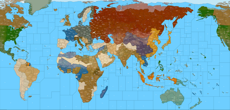
Baseline
https://www.dropbox.com/s/xnvwl23sf092dia/Domination_1941_baseline.png?dl=0I'll knock out the alphabetized txt file for all the tiles tomorrow.
See ya next round!
-
@black_elk said in Proposed Map: Domination 1941:
Ok finished adding in the Sea Zone stuff to the label key.
https://www.dropbox.com/s/vurkzr07u2lqx2o/Domination_1940_painted_labels_with_sz_key.png?dl=0
I used the one I had painted with the 1940 colors, but we can make a more impressive key for 1941 later on I figure, or in case I goofed anything, but least it should help for the follow along visual.
Baseline
https://www.dropbox.com/s/xnvwl23sf092dia/Domination_1941_baseline.png?dl=0I'll knock out the alphabetized txt file for all the tiles tomorrow.
See ya next round!
After WW2, the Togoland was split between the British and the French, most of it (and all the coastline) going to the French, so the "Togoland" you have should either be french or (better) merged with the "Porto Novo" territory into a single french territory of "Porto-Novo - Togoland" or just "Porto-Novo".
By the way, I would rather call the "Porto Novo" territory as "Dahomey" or "French Dahomey".
Moreover, I really don't like that you have things like "Tripoli" and "Tripolitania" or "Lagos" and "Nigeria" (among others). In the moment neither "Tripolitania" nor "Nigeria" are comprising their capital, I think they cannot be regarded as been the main part of the territory: it would be better to rename them "East Tripolitania" and "North Nigeria".
Are you sure you don't want to have a territory in between of Smolensk and Moscow?
-
-
There wasn't any province in Turkey called "Armenia" in 1940.
-
Samara was called "Kuybysev" in 1940s.
-
Astana was "Akmolinsk".
-
-
Sounds good! Thanks for the eyes! I'll go down the list there and make those adjustments. There were more than a few spots where I was ballparking what Hepster had written down and not feeling totally confident about it, cause he had so many metro designations in tiles that had obviously been expanded relative to their neighboring regions, usually to a pretty wild degree hehe. It'd be cool if I could find a solution in the labelling rather than having to redraw a ton if it can be handled with the NWSE method, or I can definitely collpase Togoland into a larger Dahomey, insert a tile between Smolensk and Moscow and such for anything that feels weird.
This is actually exactly what I was hoping for in making a key, cause it's just hard to guess sometimes, whereas with labels laid down it's easier to see like 'wait a sec, that's weird!' or doesn't quite fit the timeline haha. Hopefully we can clean it up so it doesn't raise too many eyebrows. Keep em coming if you notice anything else that stands out, I'll get it fixed up when I dive back in.
Thanks again for the assists! Catch you in a few!
ps. @cernel @Schulz Ok back at the house I'm looking at the map right now. Just made the Dahomey change and N. Nigeria etc.
For the Moscow tile, how about something like "Mozhaysk-Kaluga" inserted between Smolensk and Moscow? So sort of a nod to the rail links in that area, and also to serve as one of the "oh shit! enemy at the gates" type TTs if the Axis press in on the Soviet Capital.
-
Ok here it is with those suggested adjustments. Just let me know if you see anything else, and I'll start typing it up.
https://www.dropbox.com/s/vurkzr07u2lqx2o/Domination_1940_painted_labels_with_sz_key.png?dl=0
Indexed preview at 25%

Hello! It looks like you're interested in this conversation, but you don't have an account yet.
Getting fed up of having to scroll through the same posts each visit? When you register for an account, you'll always come back to exactly where you were before, and choose to be notified of new replies (either via email, or push notification). You'll also be able to save bookmarks and upvote posts to show your appreciation to other community members.
With your input, this post could be even better 💗
Register Login