💥 1941 Global Command Decision - Official Thread
-
@johnnycat said in
 1941 Global Command Decision - Official Thread:
FAST or HARD
And I am not talking about my Girl FriendBeen a long time since i had one but the last one wouldve wanted to play with both at the same time
")
Hmm ... I wonder if you can select different AI's for different Players. I think you can. Guess I could just try it
-
I have been using FastAI for this map, purely because it's faster. HardAI was taking too long to make it's moves, such that the game was basically unplayable for me that way. Like several minutes on G1 before the computer would even start the motions, and then each subsequent player/nation also just took way too long hehe.
It's probably just the sheer volume of TUV it has to calc to make it's moves, but the computer would also get snagged pretty hard during the movement phases as well. I think the game is just maybe too different from Revised to expect the HardAI to be particularly reliable at providing a challenge. Instead I think that's coming from the sort of handcrafted stuff that theDog has been tweaking to cajole the Computer into doing certain things round to round.
For me it would break the same way almost every time where HardAI would just withdraw instead of advancing, and then fail to threaten counter attacks. They just weren't pushing their fronts. My sense of HardAI is that it prioritizes conserving it's own TUV, whereas FastAI is almost entirely preoccupied with destroying the opponents TUV, even if that will result in a big trade on counter attack. It just doesn't look far enough ahead so it will advance, albeit somewhat recklessly, hence the need for continuous support via bonuses. I wouldn't say FastAI is better per se, just that it attacks more often than HardAI and seems to move around more frequently. It will still do weird stuff though that doesn't make a whole lot of sense to me in TUV trades sometimes. Lots of battles where the computer will go in pretty light, with just enough juice to kill the enemy units, but then failing to take the territory cause it only has air left or whatever. Things of that sort trip it up. FastAI and HardAI both sorta fail at developing their Production and moving units across the water. They'll non com a bunch of infantry around, but then kinda double back, or trap themselves behind unit caps (say with transport spams.) Works better when they're on already on the ground, than if they have to cross the water.
I think it's relatively simple as the player to force the Computer to pull away, just by amassing a very large force near the stack limit. I think the computer correctly calculates that it's odds of killing such a massive force like that are pretty trash, so it just pulls off most of the time. Where I get tripped up though, sometimes one of those naval HQs or rogue aircraft will sneak in for a stack wipe, but otherwise I tend to think it was probably my fault if I got nailed for going trying to split the odds by splitting the force. Still feels better to have one giant army than a bunch of smaller armies dancing around, cause with the big one I tend to win whereas if I split stuff up it just comes back to screw me. Like I honestly think there just might be too much TUV in play for all the extra calcs HardAI takes into account, or maybe it's the M3 distances (or moving the bombers around at m6-8) hard to say, but HardAI was just lagging too hard for a scenario like this in my view. I mean it's a Single Player game basically, so not really the same as waiting on a Human player, for me the benefits of FastAI for speed seemed to outweighed the HardAI for strategic depth. Roger I think was the first to suggest it might play better that way. I've just sorta assumed that the more recent changes or play patterns are based on what the computer is doing when controlled by FastAI. Downside though is that the engine seems to default to HardAI, so the defaults I think would lead players to choose that, unless it's pretty front and center.
For LL I can't speak to that unfortunately. I'm familiar enough in A&A where counting the pips is much more straight forward, but again, with so many novel unit interactions I'm not sure how it would hold up here. For example all the low hits at values and the +1, -1, which create most of the variability and unpredictability battle to battle, not sure how those would perform under LL. Especially at the units caps, which are often base 5-10-20 instead of base 6, making it somewhat harder to neatly divided forces for the auto-hits or remainder rolls when counting pips. Or the HQs edging out everything else when those bonuses are added together. Then again I've done zero testing under those conditions, so who knows, maybe it works somehow?
Glad to hear the graphic held up alright. I never tested them in-game and didn't spend too long on that, so you can probably consider them placeholders still, until something better comes along. Like when the game notes and such all come together for the HQs. It's relatively simple to do a graphics change if you want me to create a set that has those embellishments with the laurels, or some kind of color coding for the background gradient to make it clearer which are Air, Land, Sea or by nation/side for alts. I think there are additional graphics in one of those extra map folders I posted to drive or in the G40 package. To make switcheroos there, it's just going into the units folder and adjusting labels basically. Like if I want to switch a specific unit, say a Fighter, I'll just relabel the old one something like "Fighter_X" to make room for a new one, in order to play around with customizing it. Or similarly adding things like roundels or wing/nose tip colors for specialized tech units. I also sent a version of the map to Bill and Victory, where it's basically just a G40 grafted onto this larger map I think using the v3/Global ruleset, and tried to throw whatever graphics I had into that for riffs. It's not like a playable scenario currently or anything, but a repository for graphics stuff I had. I have the link saved somewhere I can probably dig it up. I think it has a name like Mega Map or Mega Elk or something? Beelee would probably remember. Sorry I've been way out the loop over the summer lol! For this 1941 one sorta whatever theDog likes most for the short calls there. I think it's looking pretty spiffy right now! Individual unit graphics are relatively easy to mod though, compared to stuff like spelling changes in the game xml for TTs or stuff drawn onto the map, which are a bit trickier hehe. Cool to see those cleaned up as well. Nice work!
-
heh heh yea it's Mega New Elk lol. Haven't been back there for a bit but Victory got a lot of placements done.
-
Right on! yeah that's the one hehe. I had forgotten falling down the BG3 rabbit hole. Anyhow for a point of ref that one is bare bones mapwise. Like just the basic templet using a G40-esque roster, but for random alt graphics should have a few if you want to play around in Photoshop or GIMP for units, or to experiment/tease out some LL type stuff, since just has the A&A ruleset there. Like to test out a GCD rule in isolation maybe. Not sure, I didn't have a plan really other than a place to store graphics hehe. One thing I have no clue how to do is music or sound fx. Usually I just play some kind of classic or film score playlist, but sound would be fun. For me though I'll still get strange audio lags, like when music or such will still play even after closing out a turn, or sometimes when quitting to the main menu. Like I basically have to close out of tripleA completely for some of the longer anthems in Iron War to stop playing in the background. But anyway that's maybe one arena that could still gobble up some megabytes. For the GCD we saved some serious space by not putting any relief over the ocean tiles, I think that trimmed down the map file size by almost half. Probably still some room to grow, but I know sound and gifs take up more real estate in the folder.
-
Does City Rail 3-tile movement stop working at times?
Attached is a game wherein Italy seems to all of a sudden not have the ability to have units move 3 from the city - am missing something?
City Rail Movement Italy not seem to work.tsvg
Thanks for any insight into this.
-
@black_elk I just re-read your comments about computer speed. I guess one of the reasons that I was confused is that my Mac processes AI Hard as fast as EASY. There really is not speed difference. But this Mac is a rather high-end one so perhaps the multiple CPUs scale well for TripleA.
But yea, if a computer is going to take more than a minute or so I too would choose the fast Mode.
FINALLY, have any of you thought to update this air unit thing. From that same game here is a bizarre situation that I see all too well in this game and wish was fixed.
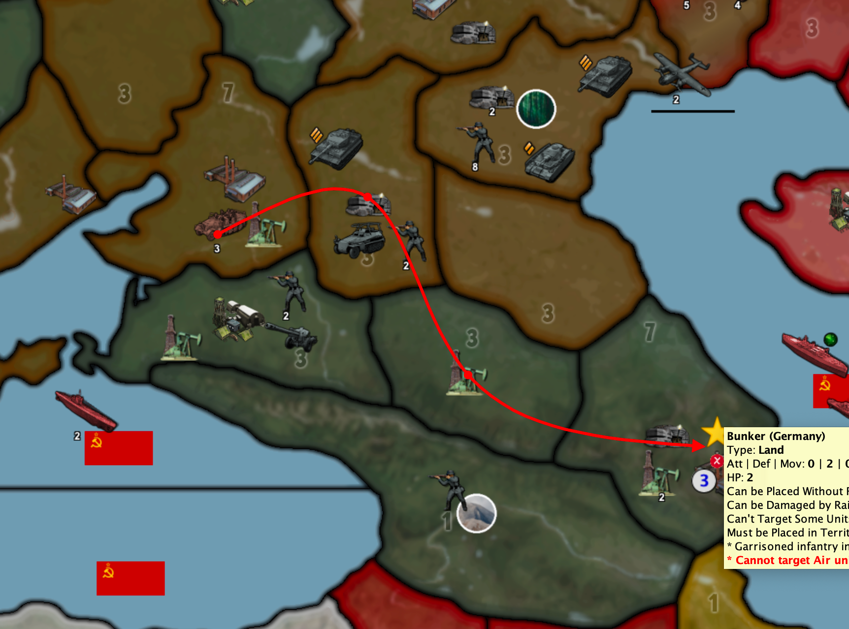
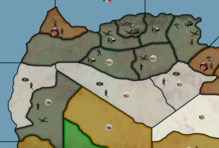
Check out Benghazi - first the Germans and now the Italians CANOT TAKE BACK THE TERRITORY and that makes zero sense. Planes are not that omnipotent - in every other such game the air units are forced to flea, or die, or whatever but no way they tie up the game map and territory ownership like they do in this game. I seriously feel this is a bug that needs be corrected/updated.
-
@johnnycat said in
1941 Global Command Decision - Official Thread:Does City Rail 3-tile movement stop working at times?
I do not know. What I did was enable edit mode and added a unit to the map, then selected that unit and removed. This seemed to make the engine reevaluate the territories and the halftracks were then able to move their 3 spaces.
@johnnycat said in
1941 Global Command Decision - Official Thread:Check out Benghazi - first the Germans and now the Italians CANOT TAKE BACK THE TERRITORY and that makes zero sense. Planes are not that omnipotent - in every other such game the air units are forced to flea, or die, or whatever but no way they tie up the game map and territory ownership like they do in this game. I seriously feel this is a bug that needs be corrected/updated.
As I have stated before, there is a known game ending bug when doing limited battle rounds. Because of this GCD has been designed so that territories do not change ownership until the end of the conquering players turn. To win the battle all defending units must be defeated. Until something is decided about what to do when only defending air units remain, and a fix is made, GCD will function the way it presently does.
P.S. Don't hold your breath for that fix.
Cheers...
-
-
@wc_sumpton
That is awesome!I guess the hard part now is getting it passed as a PR?
https://forums.triplea-game.org/tags/thedog
https://forums.triplea-game.org/topic/3741/curated-best-top-maps-triplea-guides -
@wc_sumpton Roger that. “Don’t hold my breath waiting for a fix” lol
Meanwhile I’ve found numerous ways to essentially cheat the game by sprinkling tiles with sole air units. These omnipotent air units secure the land better than bunkers.
But adding 2 bunkers and sole air units creates a super strong defensive position, however unrealistic heehee
Cheers
-
-
@johnnycat said in
1941 Global Command Decision - Official Thread:Meanwhile I’ve found numerous ways to essentially cheat the game by sprinkling tiles with sole air units. These omnipotent air units secure the land better than bunkers.
But adding 2 bunkers and sole air units creates a super strong defensive position, however unrealistic heeheeYou win some you lose some. Good catch!!
Cheers...
-
Question: Should this be the default, or handle as a game property?
I would say default, as most maps would want the smallest overflow possible, with mixed unit widths.
Its only a problem because GCD has mixed width units 54-98ish px units.
-
@JohnnyCat
Just a heads up, Thu-Fri next week I should be ready for an update
It has;
- USA Closed-Border with Neutrals has now been fixed, so will not attack Neutrals on rounds 1-4
- Manual text now uses Combined-Arms, was Blitzkrieg (Thanks Black Elk)
.
Tool-Tips have improved, now better color coded;- Red - Combat additions
- Orange - Warning or notification, usually to say what can be targeted or not
- Blue - Suppression (-1) off enemy attack or defence
- Green - Movement or transport
.
Plus some rebalancing -
@thedog Yes I have been working hard on my end - more play testing and putting together graphics for a new Examples of Play sections I wish to add to the manual.
Thank you for the update.
-
MORE BUGS - EXTREME BOUNDARY CONDITIONS
In addition to making examples of "normal play" for the new Examples of Play for the Guidebook, I continue to enjoy playing extreme scenarios just for fun but, more to the point, to see what I can break.
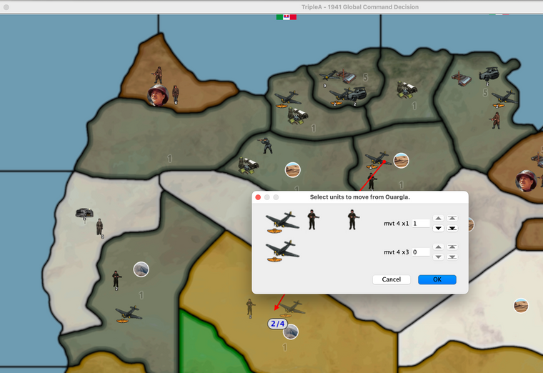
Here is a normal game that the Axis won but I decided to keep playing to test the extremes. Here is a move where the Germans want to use airborne to take a tile - they already took two others that turn no problem - but when they do, the game breaks.
I'm not sure who debugs this? @TheDog ?
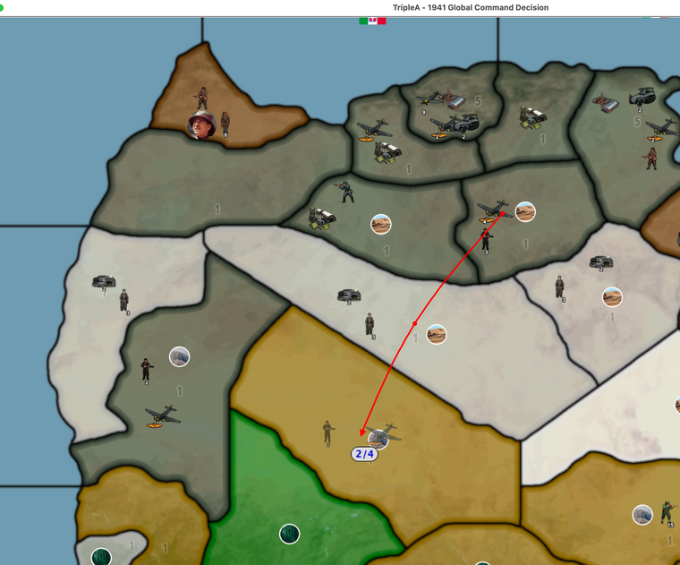
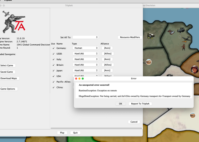
THANK YOU FOR TAKING A LOOK.
-Johnny
-
This looks like another save error, as the last move did not complete. The units are not pictured on the invaded territory.
Cheers...
-
@JohnnyCat
More coming changes this week.- Open-BorderAI has been removed and replaced with Closed-Border. Open-BorderAI was too complicated
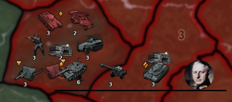
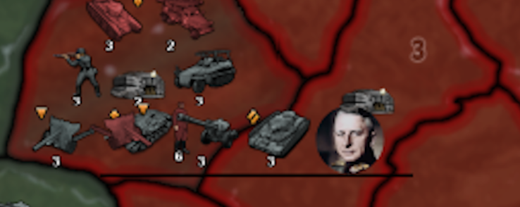
Here is the new page 4 showing the new Political relationships, look at the AI ONLY rows in the table below.
The in game screen shot below the table shows that Germany, USSR and Japan cannot invade Neutrals, but Italy can.
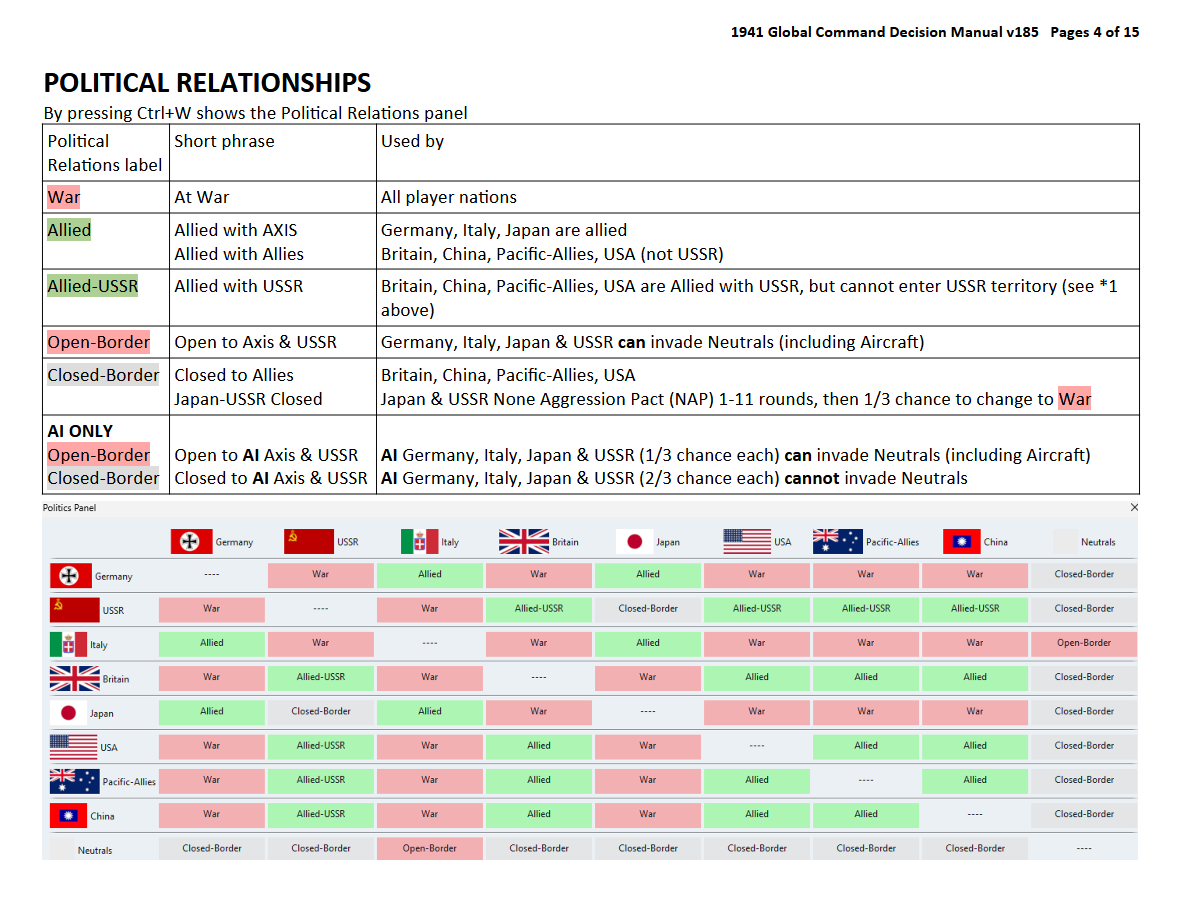
- Open-BorderAI has been removed and replaced with Closed-Border. Open-BorderAI was too complicated
-
@thedog OK so removing "the chance that countries CAN invade neutrals (including aircraft)" is really too bad as those neutrals can add significantly to the game possibilities. For me, the option to try new strategies with neutrals was one of the big draws that kept me playing.
Is not there a way to just let all countries invade equally ? For the sake of game play not realism, of course.
Or maybe make that simple situation where all neutrals are equally invade-able as an option in the game setup ???
-
@johnnycat
Its only the way the AI plays that has changed. The player has the same options as before.
Player Axis & USSR can invade neutrals as before.
Player Allied cannot invade neutrals as before.
Hello! It looks like you're interested in this conversation, but you don't have an account yet.
Getting fed up of having to scroll through the same posts each visit? When you register for an account, you'll always come back to exactly where you were before, and choose to be notified of new replies (either via email, or push notification). You'll also be able to save bookmarks and upvote posts to show your appreciation to other community members.
With your input, this post could be even better 💗
Register Login