💥 1941 Global Command Decision - Official Thread
-
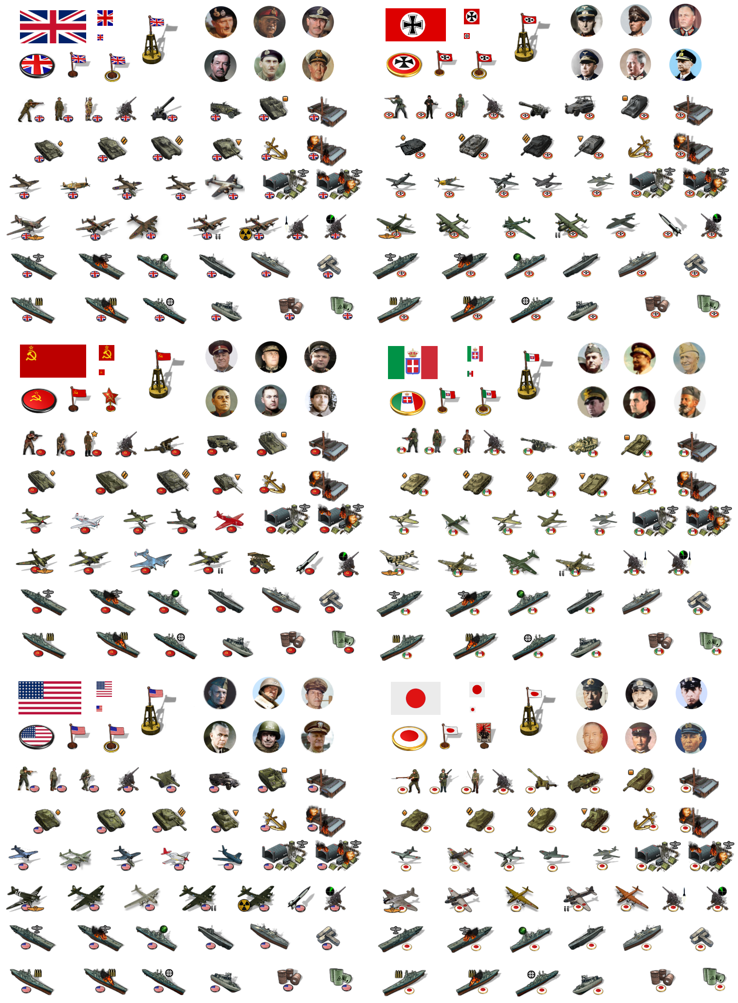
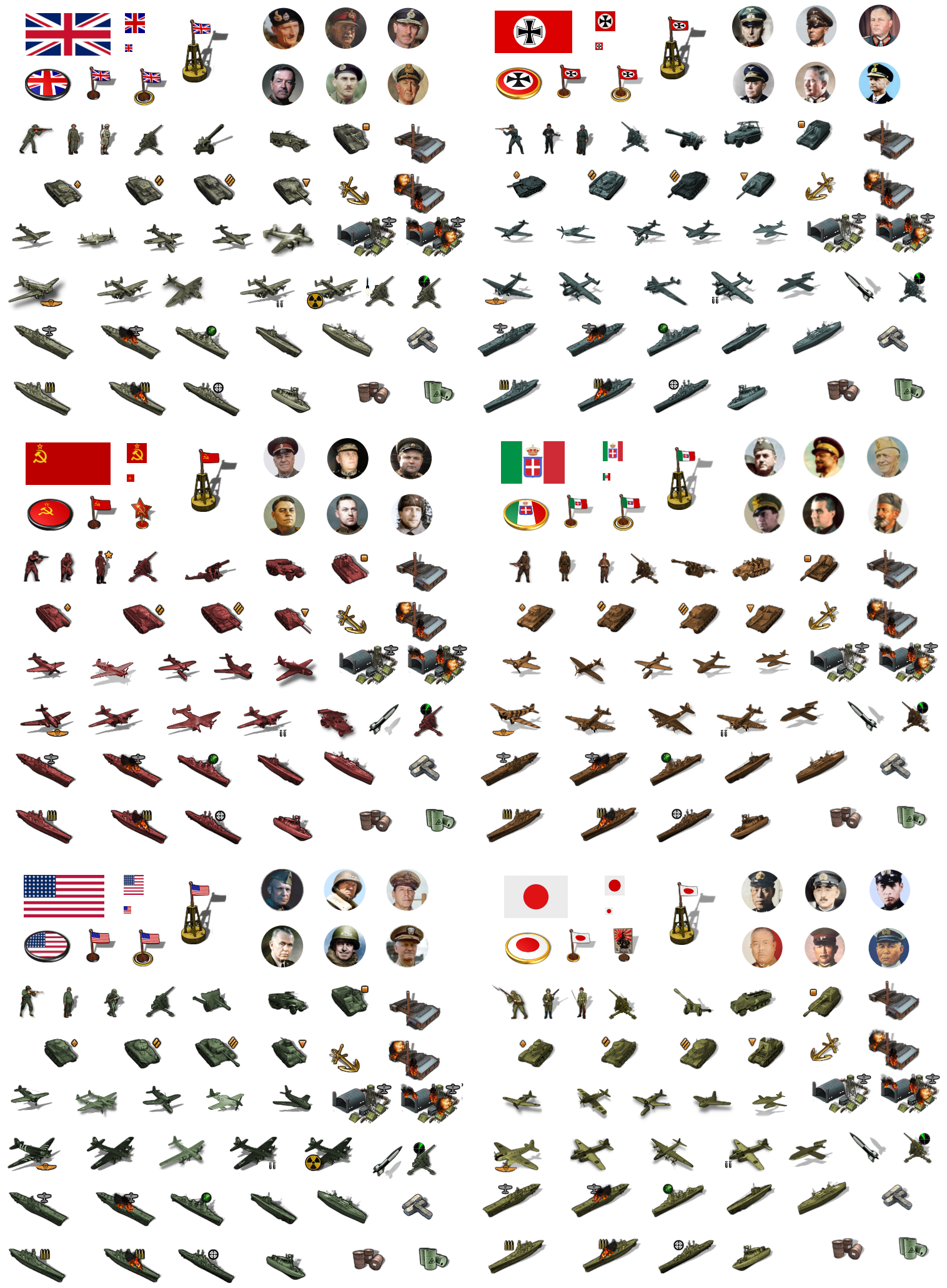
Ok I did the pick 6 for the Big 6 there. I tired to veer a bit more towards golden age Hollywood vibes, like out at the movies in terms of the selected dudes. Dipping into the B string a bit and trying to sorta avoid the political figureheads in favor a few randos that just sorta capture a certain look that felt cool. It's not a statement on the best generals or whatever, but just trying to give a spread that felt good. I figure for many people there might be like one or two faces they might recognize, but the others just becoming like generic commander dudes. People can go crazy with it all they like, but A&A style gaming isn't really Hearts of Iron, and there's kinda limited RP potential beyond what they player brings to the table. Still, I tried to nab a few heads that would be palatable, cribbing a few from the A&A Iron Blitz CD mentions but also just sorta looking for the right vibe.
My thought was that by putting em all together in sheets, it'd be easier for me to go in and remove the roundels or do a tint set or whatever, for people who don't want the national roundel. Just seems less insurmountable when it's not like 200 tiny images one at a time, but something I can get a glance on hehe.
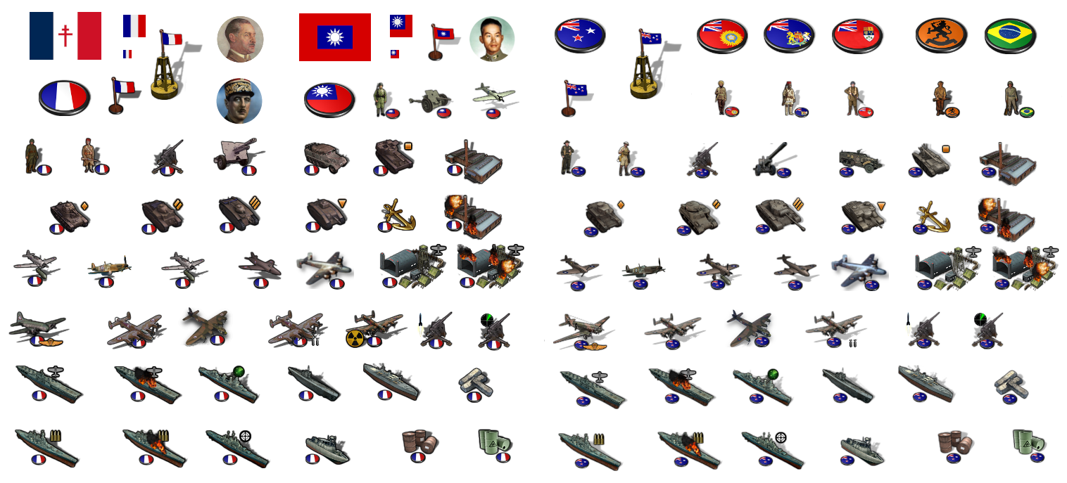
I'll do it for the minor nations like Anzac and France and China tomorrow. But least wanted to get us into like v3 territory there
")
-
@black_elk
Oooh shiny, Commander HQ units look the part
-
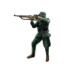
Tried my hand at making a slightly larger infantry unit. Not sure if it fits the bill?
I wanted something that looked a bit closer to that TripleA dude at the top of the screen lol

I'm about half way through removing all the roundels to create a sticker set that's easier to manipulate. Like for people who prefer to do a uniform tint and colorize by nation, or to flip the units.
-
@black_elk
Yes, a lot of the infantry are at ease, so the action pose does look better.Check your "chats".
-
Right on!
Here's a new German Infantry Unit...

He just needs a little more drop shadow to match the others. I'll probably have to paint it out for that. Frostion's drops are kinda tricky to replicate in GIMP, since he had em all in pretty deep perspective. There's probably a plug in or something for that, but I just wanted to get em cranked out, so I went with the default there, hard and fast lol.
I figure the other infantry type can be retained as a paratrooper or whatever hehe.
Here's the big 6 sans roundel....
And then below that is a quick color mask.
They could be colorized to any color really, but just to give an example. I went with the darkest shade of gray I could find for Germany that still had a kiss of color information. So sorta halfway between the boardgame black, and the gray/blue of older editions. For the others just tried to find something reminiscent of the gameboard, so USA is green, Brits are Khaki etc. Trying to make Japan orange like OOB they started to drift pretty close to Italy's brown, so I kept them more in the ochre range. We could spend a bit more time on the mask there and fine tuning the default shades for that, but I just went for something that would give a general vibe. Here's an example with the Germans in a slightly lighter shade of bluish-gray.... This one reminds me a bit more of Classic. I'm sure I could nitpick minute variations on shades of gray forever. We can fine tune it for the final, whatever peeps think makes for a good default.
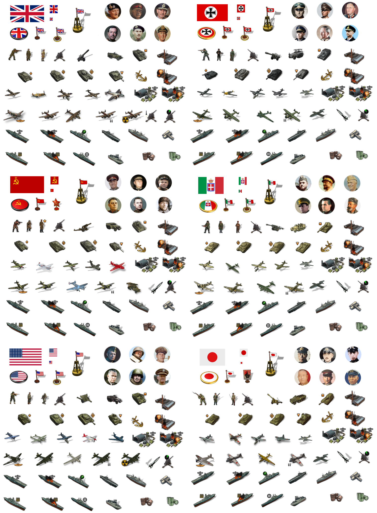
Here's the quick tint...
Basically I just wanted to see how far I could push it with German blue-gray to almost black. Players might prefer something more midrange, but I just thought it looked kinda cool. Reminiscent of the sculpts in the old box lol
Catch ya on the next round!
Elk
-
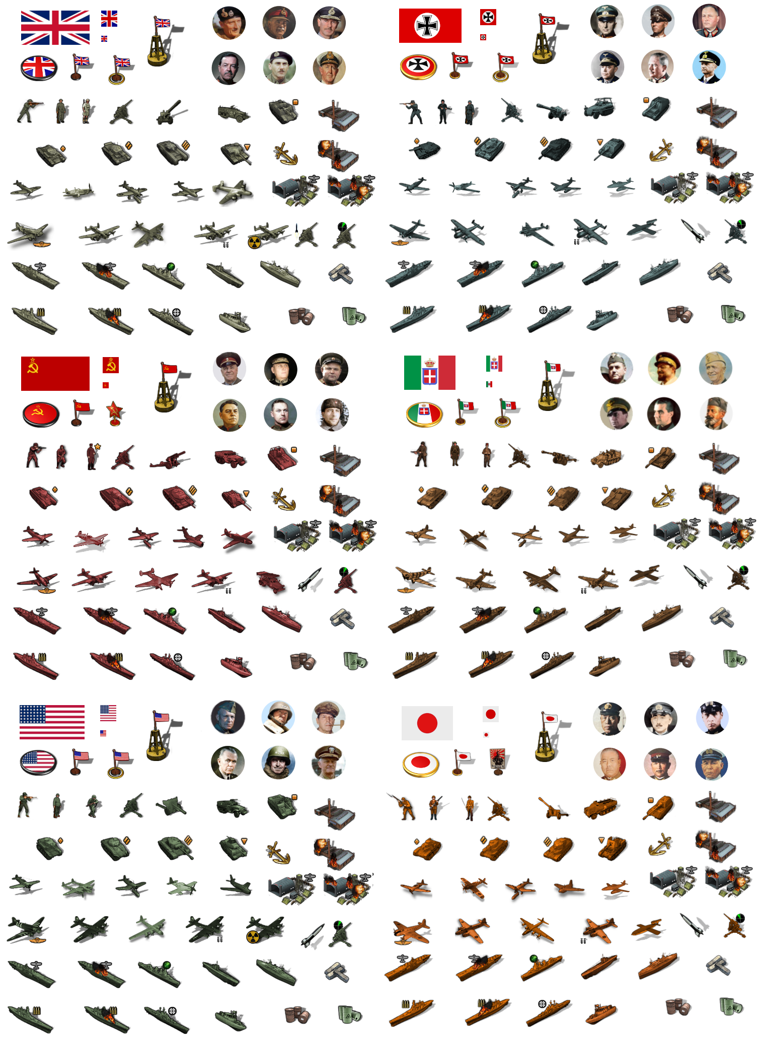
Made a quick dude for Japan. I just upscaled the current default so it would look a bit more familiar, then reworked and repainted it to try and fit the vibe of the others.

I did him here at 54px scale, but gave him the 68px frame to fit that long ass bayonet for the extra menace hehe
Here's an example of a tint where Japan is more in the orange hue range, for people who prefer a vibe more like the gameboard. Not sure which I prefer, there's only a few shades of orange that really register as distinct from the higher vibrancy browns, but this one almost works at a glance. I think we could play with it in the masking if I do it for each unit individually. They also register a bit differently against a colored background depending on the hue/vibrancy chosen for the ownership color. So depending on those choices we might want to punch up or down in the vibrancy, but just to give a general idea of the sorts of things we should be able to pull off.
-
Here's a quick dude for the Soviets... and the USA... and the British


I figure to just do one like that painted up for each of the main nations when I get the chance. Like the Japanese dude, I upscaled from our standard Soviet Inf graphic, and just gave him a quick paintjob to look decent at 54px. Hopefully this helps for familiarity with the units, and gets us that more the action-y pose for the main dudes. The others can serve as alts, or for other roles like conscripts or elites. Should help with the overall cohesion I'd think. Like if the Inf unit looks pretty much the same, I think players are maybe more likely to accept the other stuff with a nod right? hehe
ps. added the American up there too. I reworked him from the default though, because the default dude is running and holding his rifle in the off hand with no finger on the trigger, and that just didn't feel right to me lol. This seemed more appropriate somehow.
Pps. Ok there's a quick painted Brit to round out team Allies
-
Ok here's the dude for Italy

If that works for you guys we can start building out the G40 unit folders and Expansion units folders I think. I tried to make the new Infantry units slightly larger, so I'd probably downscale maybe 95% to get them matching the inf from the Frostion set, and just to make sure they don't clip if upscaled to 68 px high in the calc.
I'll try to clean stuff up when I pull the images back out, and would also like to try a more nuanced mask for the tints, where a bit more color shows through, mainly on the infantry and the fighter/bomber aircraft so the air roundels can show some color information there.
Trying to match the dropshadows for the infantry is kinda rough. He must have done it in illustrator or something rather than gimp, cause I haven't found a great solution. I tried to give the new infantry a similar shadow painted manually, but it doesn't look as good to me, I think perhaps because all Frostion's Infantry units are standing legs together with their arms shouldered, whereas the action pose all dude have their legs apart and are pointing their rifles. Our default units used a shadow halo rather than a drop so I went with that, but I tried to dial it back a bit so it wouldn't be as pronounced/dark. I think this works well enough, but then I've been staring at it for hours and am eager to move on lol. The only dropshadows that really bug me are the ones on the V2 rockets and the British artillery unit, since they really stand out to me. I was going to rework those so they're not as pronounced. For the alt infantry, I'd just keep the shadows as is, cause they look pretty good. To me it's almost as if like the New Infantry is in the spotlight and the others are sorta downstage or something, catching the sidelight. That's how I'm rationalizing it anyway heheh.
-
@black_elk
Im a minimalist kinda guy and the dropshadows can be dropped/removed for me. (yes I like puns )
)Especially the aircraft as the shadow is only relevant when taking off and landing.
Also it would look cleaner and be less work to match Frostions set, just my 2p.
-
Ok I'll do my best to remove what I can. It may take a little while longer. Frostions units are not at 100 percent opacity, so invariably the shadows blend into the images at the places where they come together. So sometimes removing the shadow means basically removing the image beneath. With no shadow at all the edges can also appear quite hard, so you kinda need something, but I'll admit the shadows have been a source of frustration.
The ships look fine to me and most of the mechanized units, but I agree it's a little weird with the aircraft. Doesn't feel as pronounced with the roundels in place, but when they're removed the shape of the shadows is more noticeable. I'll knock those back first and see how it feels tomorrow.
The shadows are a lot less noticeable when the units are on a background, so hopefully I don't have to noodle it too hard hehe. Maybe I can just knock the opacity down another 15% and not have to work on it forever lol.
-
@black_elk
Thanks! It will be easier on my eyes. -
@black_elk I really liked infantry images too. Maybe could you make the Japanese soldier pointing their gun straight left (rather than pointing upper-left corner) for consistency?
-
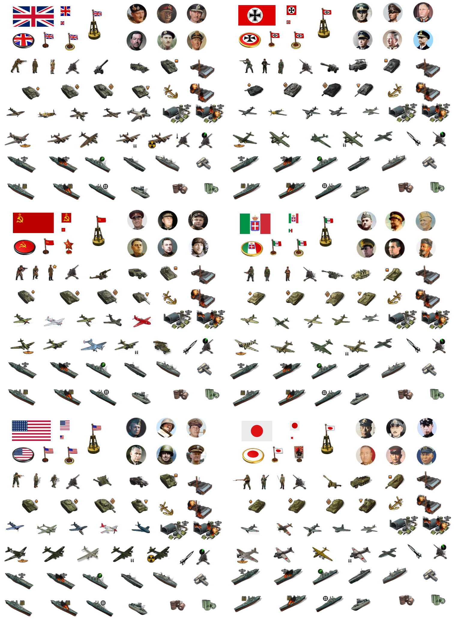
Ok that went a bit smoother than expected.
I was able to nix the shadows under the aircraft to give a more in flight look by dialing the opacity way down. I tried to keep just enough so the images wouldn't flatten but I think it looks a bit better.
I did another Japanese dude too with a more Banzai attack stance hehe

Here it is with the shadows clipped
-
@black_elk
Oh yeah, clean, sweet and petite!!! -
Right on! Here's a quick tint for that set...
I went a bit more muted for the vibrancy on the Axis side, and just a touch more vibrant for the Allies. It's a little hard to predict what will look best once they're out on the field, but this seemed like a decent place to start.
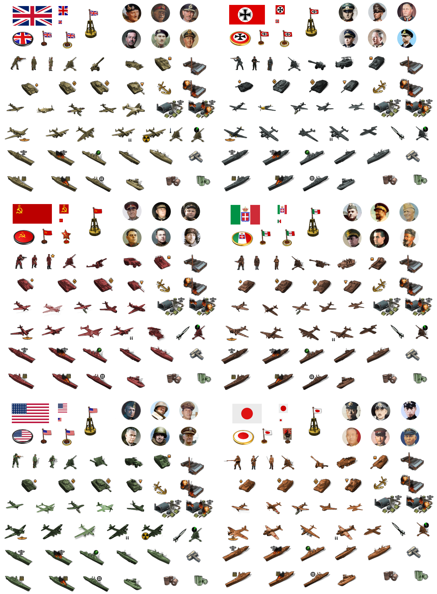
I think the only thing I'm missing for G40 is the Harbour unit. We have the anchor, but I figured we should probably make something that looks a bit more like a Base. For the tech stuff I think I have everything covered. Like basically I'll just use Frostion's V2 rocket or the radar symbol and do something like this I guess...?

Something along those lines anyway. We may need to shrink the Airbase unit a bit so it doesn't dwarf everything around it lol.
Other than that and the Harbour, I think I have everything for G40 covered except for long range jets for a couple nations. Probably I can just add the synthetic fuel icon to the German jet or something like that, since I have it down already as a placeholder. Sorta makes sense, like late game tech that got shared or whatever hehe.
ps. Actually the big ass airbases look pretty alright. I added the older roundels to the ABs to see how that would look. Seemed pretty cool.
For Harbours I'm going to combine the buoy flag and the anchor graphics, which looks pretty good as a combo.
Here is the tinted set upscaled to 150%. Looks ok to me for peeps who want the larger units. I'll do a quick example on the map when I get a chance.

Here's how that would present at scale...
I had a pretty thick borderline going in that map, I think it must have been 1px+3 with no antialiasing on that paintjob hehe, but it gives a quick impression.
I cropped that detail from the map at 16816 px. The boards show it resized in my browser but if you click in you can see how it'd look with the map display at 100% and units at 150%. I think one could probably push the units up to 200% if they wanted, for extra large units, but they might start to blur. Guess it just depends what players like. Ideally for G40 I'd think we should be able to get something similar to the display on Bung's map or in that ballpark. 125% still felt a bit on the tiny side to me, 150% felt like they'd be easier to grab with the cursor hehe.
I didn't have a VC star handy, so I just used the large oval roundel for that here. I think for the Sea Zones it would be cool to show a roundel or flag next to the sea zone number to indicate control. Maybe do the same on land with the flags by the TT name. When I get some time, I'll soften the shadow lines on the ships since they still feel a bit heavy.
-
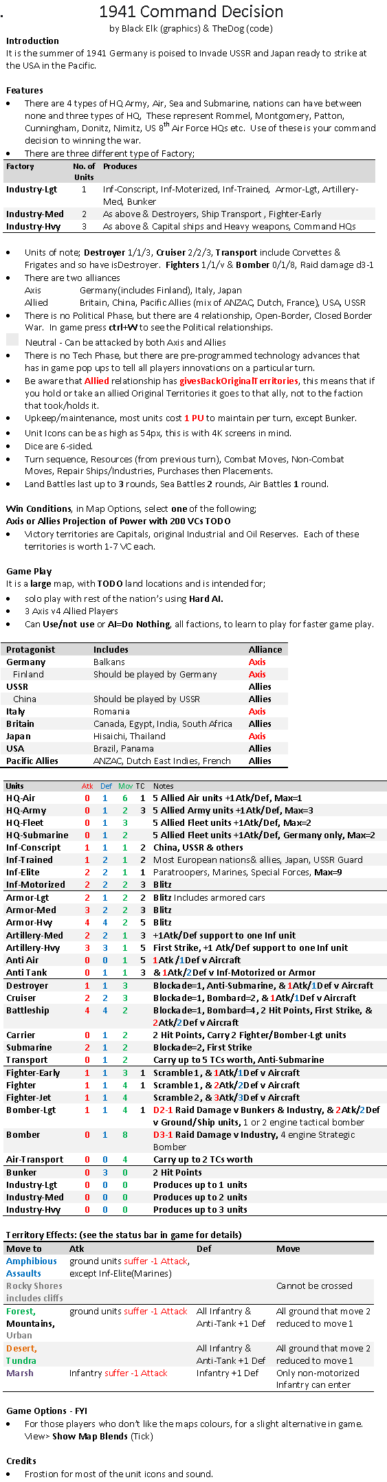
Below is the latest Game Notes that match the current code, just to give a direction to where 1941 Command Decision is going.
.
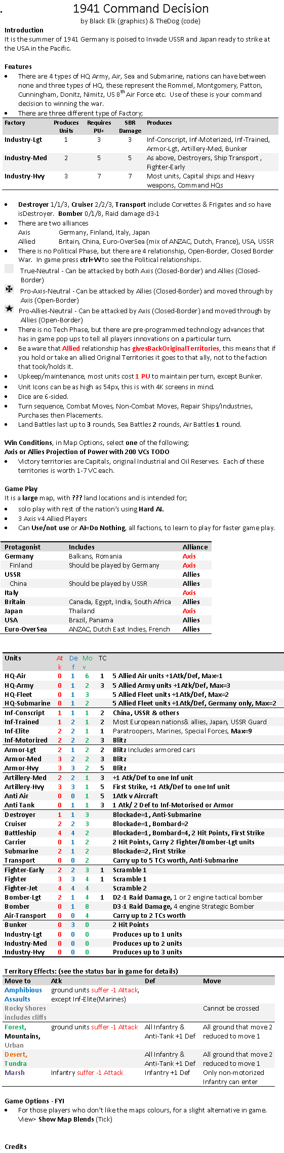
-
Below is the latest Game Notes that match the current code, just to give a direction to where 1941 Global Command Decision is going.
Note the Destroyer and Cruiser stats especially their move.
Also note the Fighter/aircraft stats
These are experimental, I hope they work as intended..
-
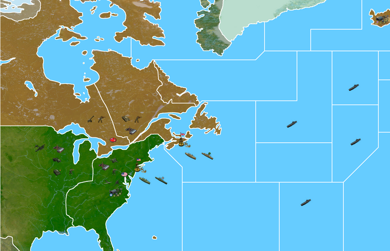
@Black_Elk @beelee
One step closer. Map is in TripleA, with some units.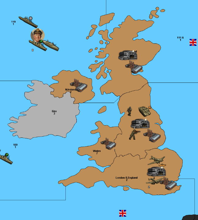
-
-
Hell yeah! Nice work!!!
