WWII Revised - Facelift
-
@cernel Well I haven't tried it yet so not 100% sure. But does it use all artwork (from all my new folders) if I make it a just a map skin?
I do know I can't fix game notes and make it a mapskin however, since that's in xml.
-
@general_zod Mapskins take only the xml code from the original map. Game notes are taken from the original map for the html code and from the mapskin for anything else (images, etc.). For example, a game like Total World War would get most game notes from the mapskin.
-
@general_zod said in WWII Revised - Facelift:
If @Hepps is ok with it, I would love to use his TWW units here as well
 . But most likely without the roundels. Also I will update the game notes to be very noob friendly, since this map likely draws many TripleA first timers which may be looking for Axis & Allies emulations.
Wasn't sure if I responded to this formally. But yes Zod feel free to reuse the TWW units. You will have to manually remove the roundels.
-
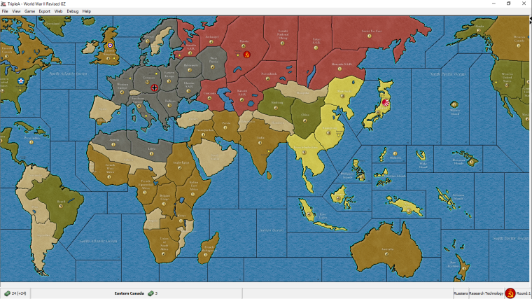
Here is what the final product looks like with map blends = ON. Next step is to figure out the GitHub uploading. And yes this will be just a map skin for the existing revised map, so it's not forced on anyone.
Unfortunately TripleA ignores some of my layers and it doesn't look as nice as it does in the graphics editor, but it still an improvement over original.


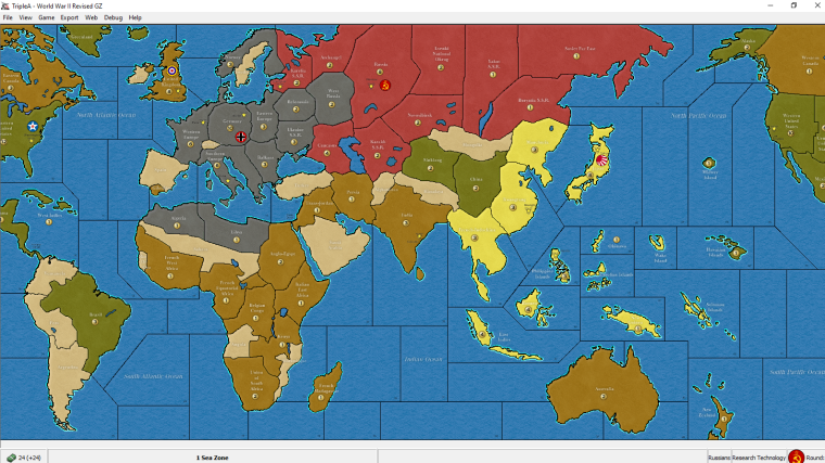
This one is with maps blend =off. A bit brighter version. -
@general_zod Looks good. Nice job.
-
@general_zod
Nice, I like that look now! -
@general_zod YUP! Great Stuff!
-
@general_zod Not a revised player, so an outsider here.
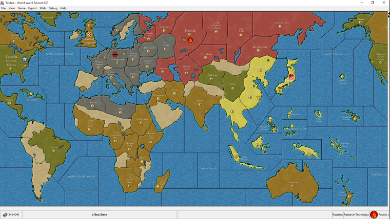
It looks nice to me and I think I would prefer it over the current original skin. It reminds me a bit of the WWII Classic skin. I prefer the version with blends on, but I tend to prefer having blends off as default, just for principle, as they feel like an additional option to me (also they are bugged in the moment you switch maps). Also nice to see Sicily and Iceland around (only for flavour, of course). I guess the repository admins will have to decide or find a way to decide whether this should be a mapskin or should replace the original.
From my side, I've a bunch of remarks:
- Yellow still feels a tad too bright and colourful to me, also relatively to the rest (already said this; not sure if nobody else feels the same).
- I would need the zoom 100% version to be clear on this, but the PUs images look blurred; maybe this is because you obtained them by enlarging existing smaller ones, like the ones of 270BC?
- I think all PUs images should stay on the respective territories, not the sea zones (I see two that are on the sea) (also for the territories having no production, in case someone makes a mod).
- Estonia is part of Karelia S.S.R., that is Russians, and that is historically uncorrect for the period (not the case in the current skin) (doesn't matter, of course).
- This is the same as in the current skin too, but I would prefer if European Turkey is part of Turkey (doesn't matter, of course).
- If the current skin is correct, I assume Mozambique should connect to 28 Sea Zone, even tho it doesn't matter for the original game (but it may matter for mods of it).
- If the current skin is correct, I assume Eire should not connect to 8 Sea Zone, even tho it doesn't matter for the original game (but it may matter for mods of it).
- For the border between 6 and 7 Sea Zone, I would have put it where the Strait of Dover is, as the original does.
- It would be better if the Rio De Oro name stays fully inside the territory (as the original does) (meaning having the territory a bit bigger, to fit its name).
- I would move the Gibraltar name so that the portion of it that cannot stay in the referenced territory is on the sea, rather than on another territory, albeit a neutral (as the original does, and also WWIIv3).
I know that most of these suggestions are late, as you have already made the details, but none of these points are really important; so just making a review on what are all minor and arguable details.
-
@cernel said in WWII Revised - Facelift:
From my side, I've a bunch of remarks:
- Yellow still feels a tad too bright and colourful to me, also relatively to the rest (already said this; not sure if nobody else feels the same).
I think this yellow is not to bright with blends=on. But give me the hex code for your suggestion and I will see how it looks.
- I would need the zoom 100% version to be clear on this, but the PUs images look blurred; maybe this is because you obtained them by enlarging existing smaller ones, like the ones of 270BC?
Yeah, they look normal at 100% zoom.
- I think all PUs images should stay on the respective territories, not the sea zones (I see two that are on the sea) (also for the territories having no production, in case someone makes a mod).
OK, I placed them all on land to be consistent.
- Estonia is part of Karelia S.S.R., that is Russians, and that is historically uncorrect for the period (not the case in the current skin) (doesn't matter, of course).
- This is the same as in the current skin too, but I would prefer if European Turkey is part of Turkey (doesn't matter, of course).
- If the current skin is correct, I assume Mozambique should connect to 28 Sea Zone, even tho it doesn't matter for the original game (but it may matter for mods of it).
- If the current skin is correct, I assume Eire should not connect to 8 Sea Zone, even tho it doesn't matter for the original game (but it may matter for mods of it).
- For the border between 6 and 7 Sea Zone, I would have put it where the Strait of Dover is, as the original does.
It's too late to make the changes above, would require a lot of work for not much gain. Modsters will have to fix those area themselves if they require it.
- It would be better if the Rio De Oro name stays fully inside the territory (as the original does) (meaning having the territory a bit bigger, to fit its name).
Fixed.
- I would move the Gibraltar name so that the portion of it that cannot stay in the referenced territory is on the sea, rather than on another territory, albeit a neutral (as the original does, and also WWIIv3).
Fixed. I made a few adjustments and resizing of territory names for the ones that didn't quite fit. (Gibraltar, switzerland, sweden, Mozambique, French madagascar, Afghanistan, rio de oro) Except islands, text would be tiny to fit those. Also increased size of names in capitals.
I know that most of these suggestions are late, as you have already made the details, but none of these points are really important; so just making a review on what are all minor and arguable details.

-
@general_zod Not easy to say, in the moment I cannot test it with the relief, but "d6c956" may do. But, again, nevermind if everyone else finds the current yellow just fine, as it doesn't look anyone else is saying anything about it.
-
@general_zod I'd keep the French Madagascar name as per previous version. While it is cool having names adapting to the territory, since all the other ones are horizontal, I wouldn't make 1 single exception to it.
-
Here is the link to the map skin for "WW2 Revised". I plan on uploading it to GITHUB as well.
https://www.sendspace.com/file/cl05jl
Some notes on map skin setup.
- Just place this zip file in the "username/triplea/downloadedmaps" folder. (You don't have to signup for sendspace account, just click on download link. You might have to close (x) the signup page before link becomes available.)
- The map skin will become available on the "View" menu. Select it here.
- If you get a checker board pattern, resize the map by at least 1% (zoom level)
- Place a checkmark next "Show Map Details" and "Show Map Blends" located on the "View" menu.
- Unzip the file to see some new units in addition to map skin. The "map" folder should be in the following location if unzipped correctly. (and remove zip file from the "downloadedmaps" folder)
C:\Users\username\triplea\downloadedMaps\world_war_ii_revised-map_skin_GZs_Deluxe_Edition-master\map
-
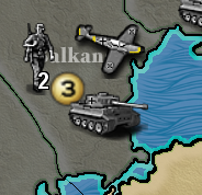
Here's some tweaked German units. I changed a few others unit types through out as well. But it's strange, it forces the files to be unzipped to see all of them.

-
@general_zod Look'n good. Contrast on the Inf might be a little high, but other than that I am digging the yellow colouration on the BF-109
-
@hepps Yeah, I saw a nice bf109 model with that paint scheme. I'm glad someone noticed it.
 As the infantry goes, he is glistening in the sun and sleeves rolled up ready to fight. The tiger is much nicer than original too, added the german cross and high lighted some areas so the tank pops a little.
These were little experiments to see what it takes to improve units. It's quite difficult to work on tiny scales where a few pixels is all I have to work with. But I learned a lot.
Too bad we don't have a vectored graphics for TripleA, then can do all kinds of stuff on any scale.