Taking your suggestions for a new UI
-
@general_zod This was how I was seeing it...
And as a comparison... the black shaded area is what is currently obscured.
-
@redrum said in Taking your suggestions for a new UI:
@hepps Can I have your children?
Not sure on the whole consumable bar concept though...
I realize that the consume bar is not a widely conceptualized idea at this point.... simply because resource consumption as part of the movement process is in so few games currently. But this is, at least in part, due to a series of inter-related factors...
-
Few games have it within the game because...
-
the few games which include it have not been worked on/refined to improve its implementation within the game because...
-
The lack of an easy way to track (visually) what you are "burning" through during moves... makes the games that have it included frustrating from a resource management perspective.... making it an undesirable feature (self fulfilling prophecy) which will all but guarantee...
-
Without developing a mechanism (Which under how I have proposed it, would create no additional clutter for games that do not have it) there is little to absolutely no chance of creating a game with fuel/consumption/maintenance integrated successfully.
-
-
@general_zod said in Taking your suggestions for a new UI:
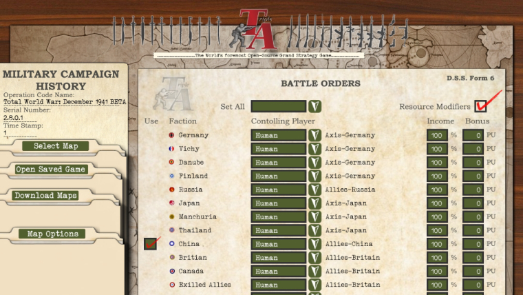
Also wondering, if the "Select Map", "Open Saved Game", "Download Maps" and "Map Options" buttons will be located somewhere else?
Actually all the information on that window is useful, would like to see the info in top left remain somewhere.
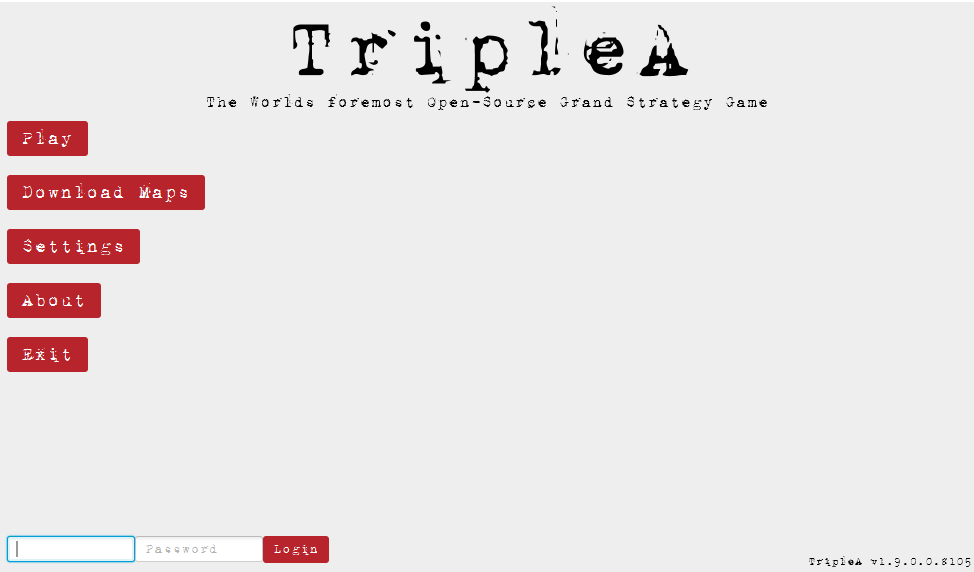
Sorry Zod I think I missed a bit of your comment here. Yes since this game launch screen is such a huge part of the game interface.... I am striving to change as little as possible other than the appearance.
Here is a mock up of the entire screen...
"A joyous heart sours with the burden of expectation"
Hepster -
Cool, yeah as the menu goes. I agree, we should keep all the functionality and information that the current version has, intact.
It's coming together nicely.
I must admit the in-game interface is much more exciting. Hopefully that project comes to fruition as well.
-
@general_zod Agree the prospect of finally giving the in-game interface a face lift really puts a cucumber in my pants...
Is it obvious I might have had some materials ready to go for that at the mere mention of it?
")
"A joyous heart sours with the burden of expectation"
Hepster -
@hepps lol, it's a wet dream come true.
")
-
@hepps First impression is that there is too much distracting detail / looks a bit messy. I would maybe try to blur / darken the main menu background behind the player selection window. If that's not enough, remove the icon and the "D.S.S. Form 6" (whatever that is supposed to mean). The visual style is awesome though.
"For the world is changing: I feel it in the water, I feel it in the earth, and I smell it in the air."
-
@hepps Hmm. And here I always thought all Canadians dreamed about Celine Dion not Jessica Biel... Though she's probably also the only famous Canadian I know. She's also a bit more in your age range though that might be less than optimal for carrying children...
-
@redrum Thus the request for 100 tries.
"A joyous heart sours with the burden of expectation"
Hepster -
@alkexr I wonder how much effect the "look and feel" will provide ? I know you can change it quite a bit right now. Maybe have some different camo colors or something ?
I like the way this site does it. I go with the "Darkly" as I don't like it too bright : )
-
@hepps Oh and my dislike of the resource bar is more on how I've seen maps potentially use fuel. If its something that you have a set amount per turn then I think a bar makes sense (I believe this is actually what Frostion ended up doing in Iron Wars). He essentially zeroes out any extra and you spend whatever you produce each turn. But most other maps have used it where you can stockpile and having a resource bar then doesn't really make sense to me as you don't have an "amount per turn".
TripleA Developer with a Passion for AI: https://forums.triplea-game.org/topic/105/ai-development-discussion-and-feedback
-
The sad part about all of this is how long this is going to take to implement

While the image is done "relatively quickly" I need to consider much more things when trying to re-create the design in actual code/FXML to keep the layout adaptable to different screen sizes and actually clickable, not to mention all the internal wiring of the code.
A nice UI that doesn't do anything is not that great either ^^
Anyways I appreciate the discussion here about how the UI should look like i.e. what exact components it should have in its final state, this takes off the burden from me to be responsible to make good UI decisions ^^ -
@roiex Now you have enough material for like a year worth of development already
")
-
@redrum Definitely seems like it ^^
But it's easier to re-create a pre-existent template than coming up with a template on your own and then creating it -
@roiex Well not to worry... you say your bored... I can keep you occupied for decades.
"A joyous heart sours with the burden of expectation"
Hepster -
@hepps gigglez
-
@hepps said in Taking your suggestions for a new UI:
@roiex Well not to worry... you say your bored... I can keep you occupied for decades.
lol I can already thank you for a few years I'm sure : )
-
@alkexr I Added the D.S.S. just for some flavour... it is...

I was trying to bring som WWII flare to the design since it is the bread and butter of our community. The form is a nod to some of the real forms used during WWII.
-
@redrum said in Taking your suggestions for a new UI:
@hepps Oh and my dislike of the resource bar is more on how I've seen maps potentially use fuel. If its something that you have a set amount per turn then I think a bar makes sense (I believe this is actually what Frostion ended up doing in Iron Wars). He essentially zeroes out any extra and you spend whatever you produce each turn. But most other maps have used it where you can stockpile and having a resource bar then doesn't really make sense to me as you don't have an "amount per turn".
Yes which builds on my point that of the few maps we have... few legitimate attempts have been made to integrate it properly or do any significant testing and change the set up.
A bar could work well with the right amount of leg work done.
If forecast the starting reserves.... do some math on potential production capacities and expenditures... then you can create a scale that works for the individual map.
If the map properties file allowed the map maker to define the total scale of the bar... (ie. 200 is the max.) and then be able to set the increments (25).
map.useConsumableresource=True
map.ConsumableTotal=200
map.consumableIncrement=25I this would achieve a really beneficial system. If I have a surplus beyond what has been deemed more then the high end need within a game then I would not need to worry.... the bar would be at max anyway. But if I am in the middle of a campaign and I need to see where I am at while I move... the bar would allow me much better control and visualizing while I doing my moves.
-
I agree real time tracking of some type is probably the biggest missing element when it comes to fuel. At a very minimum it should be displayed in real time in the current economy tab.
But if we are really considering the re-design in game interface, why not give it a designated space somewhere even if its only a single number. Although the meter has it's appeal too.
I would prefer the territory tab use most of the space in at bottom of display since we need a lot of space to display units without making it hard on the eyes. Also all the pertinent territory information must be listed there. Basically everything else should accommodate that space and work around it.
One more suggestion, functionality and player ergonomics should take priority in the design and aesthetics secondary. But if you can do both, great!
Hello! It looks like you're interested in this conversation, but you don't have an account yet.
Getting fed up of having to scroll through the same posts each visit? When you register for an account, you'll always come back to exactly where you were before, and choose to be notified of new replies (either via email, or push notification). You'll also be able to save bookmarks and upvote posts to show your appreciation to other community members.
With your input, this post could be even better 💗
Register Login