Taking your suggestions for a new UI
-
@Hepps
Ok so please don't laugh to hard. But here's my feeble attempt at graphics, to show you a component of what I was suggesting.The proportions are not right and maybe the minimap needs to be shifted else where or minimized so the entire bottom could serve as new territory tab. This is just to give you the feel of it.
Note, I also cut the top title bar and menu bar out as well as the bottom info section in attempt to gain more space. I guess menu could be a dropdown button somewhere?
Note: Just for reference, the map image is 1366x768 and unit images are 48x48. This should be close to what it would look like on a 15inch display, when this image is viewed at 100%.
-
@Hepps Btw, the national colors changes where just for my personal use, so I can see units a little better from zoomed at 50%. I'm not suggesting you change that.
I changed exiled just to not be to similar to Germans. And swapped Italians with neutrals.
-
@Hepps If the mini map stayed where it is, It might be enough space for most cases, any overflow can use a scroll bar, maybe? Also can jam a couple extra units in the rows.
Also, these 2 rows can be for any and all units, the suggestion to have specific rows for specific units isn't really practical.
-
@general_zod Personally I would prefer to keep all of the (more or less) fixed or permanently visible menu options in one area of the screen. Then have them reducible or expandable. Having the Chat/player turn box at the top then means it will always block yet another part of the screen while its open and visible (which would be pretty much always).
I also question the work-ability of being able to effectively present all of the written info in the Terr. window into a bar of text. I feel as though the the info currently displayed in the Terr. Tab would be better served being broken into 2 windows... One for Territory INFO. and one for UNITS.
Here is yet another version....
"A joyous heart sours with the burden of expectation"
Hepster -
@hepps looks great! Where is the National Objectives Tab
")
-
@hepps Yes, that sounds reasonable, looks great too!
I must admit, I was slacking on the territory information portion. I was thinking, more or less, an overview of that territory information, and then click for more details, kind of thing.
30 units displayed at once is awesome.
This is already a vast improvement. So I have no objections. I'd be thrilled to see this come to fruition as is.
-
The battle calculator itself needs an overhaul. I have a couple ideas for it. But maybe in a new topic?
-
@general_zod Probably best. Since there is a lot going through this thread already.
And since the BC is a much a question functionality as it is format... it probably justifies that we discuss that in detail in its own right.
-
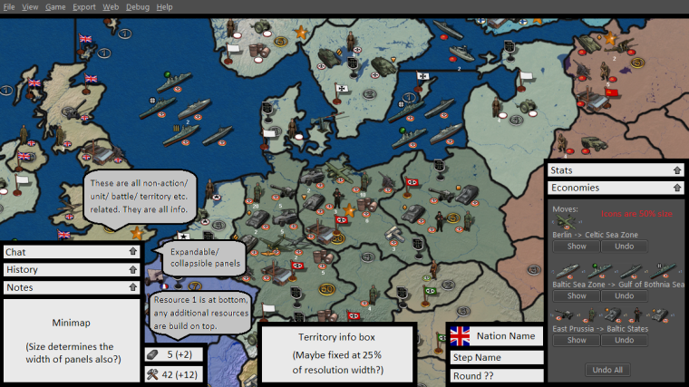
@hepps The territory info box is currently cluttered with
Units may change ownership
Captured by -> Ownership to
Britain -> Exiled Allies
Russia -> Exiled Allies
USA -> Exiled Allies
China -> Exiled Allies
Brazil -> Exiled Allies
Spain -> Exiled Allies
etc.Which is both an inefficient use of space and poor way of showing information to the player. Ideally you would want to say:
Exiled Allies take control of Allied units in this territory.
or (after elaborating in the game notes how Exiled Allies territories work) simply
Exiled Allies territory
Now this is a nice dream, but this is definitely not generalizable to all possible maps. That's why I'm arguing for per map html customizability. Something like
tooltip.territory.Low Countries = Owner: <b>$CURRENT_OWNER$</b><br/>Original Owner: Germany<br/>A territory of the Exiled AlliesNow there are several obvious problems with this exact syntax, but I would love to see something like this implemented.
-
@alkexr I agree. An improvement is certainly possible in terms of how the information is presented. Either way a box is still necessary for the information and that is what I am trying to cover in this thread.
The topic is certainly worthy of its own thread as a feature request.
-
We are starting to get a lot of different ideas floating around this thread outside of just the UI revamp that Roi/Hepps are working on. I'd suggest for any ideas folks feel strong about such as BC, territory info format, etc to create a separate thread articulating clearly what you'd propose as otherwise they will just get lost in this thread.
-
So I'm looking at the beta UI in 9464. Here's some feedback.
-
I think first and foremost the user interface must be very intuitive. And there should be no ambiguity anywhere in the interface, of what does what.
-
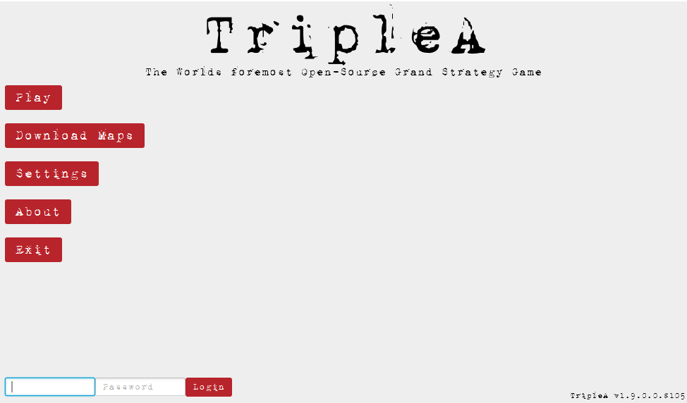
The old typewriter font is kind of weird. I suggest a more user friendly font.
-
The screen is way too big, it needs to be resized so there is not so much empty space. The proportions are simply way too large for what we need to display.
-
The map background in the play screen is not so hot. We surely can place something nicer there.
-
Need a minimize button too.
-
-
@General_Zod Yes, the design is not final yet once everything works we can easily reconsider how stuff needs to be layed out.
Fullscreen won't be permanent either, once the UI is working I'll introduce an option to choose default window sizes.
The details in the background need to be discussed with @Hepps though ^^ -
Unit Info Display :
Problems with current tooltip :
- Not available on all unit images in all panels
- Is a tooltip (limited duration & format restricted)
- Text is a horizontal string of properties and values, this inhibits finding the value you want before the tip disappears
Suggestions :
- Have all unit images be a class that has a hover trigger calling a function that displays a "Unit Info Panel"
- The unit info panel could be placed in the same location as the minimap when a unit is hovered (stays visible as long as the player hovers)
- Properties listed vertically with values shown on same line (the eye may then easily pick out the value one is looking for)
I find that when playing a new map, especially one with many new units and faction differences, that I have to keep the
Unit help panel open. But it is not accessible when some panels are open. It also requires much scrolling to find the unit one wants info on.Most common need is when I want to view foreign units in a territory. No tooltip on those images. If I open the territory panel, I get the list of unit images with tooltips, but as I move the mouse out of the territory, the list is lost.
-
Where can one find and try out this beta UI?
-
@frostion Latest pre-release then go to Engine Preferences > Testing > Use JavaFX UI.
-
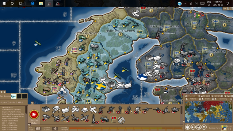
@RoiEX OK. I tested out the very limited version of a new UI. Am I right that there is no new UI that changes what you see in game? Only the menu? Anyway, here are my first impressions and ideas for a better UI:
Window/Full screen - It is OK that the menu and game can be played in full screen, BUT there should be an option on screen to go window mode if the user wanted it. It should already be seen in the main menu. Perhaps the window control buttons could show some iconic Maximize / Minimize / Close icons. I bet some people it will be very frustrating if forced to play in full screen mode, especially if they are working or doing other stuff while plaing tripleA.
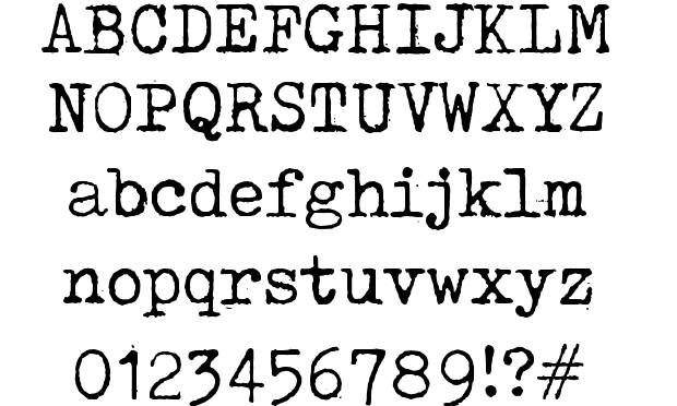
The Typewriter font – I agree with other feedback concerning the typewriter font. I am actually 100% for a typewriter style font, but the current one (also used at the website) is just too distorted and hard to read. It should be a bit cleaner, without being crystal clean of course. Maybe like this?:
The old folder graphics in the main menu – I like the idea of folders popping up or being highlighted when mouse-over, but it is strange that the green text-labels Play, Download Maps, Settings etc. do not follow the folder but stays put when the folder moves up and down. I would think the idea is that the labels are glued to the folder, right?
Maybe this could change for the better if everything over and under the mouse-overed folder got pushed away, like upwards and downwards? Then the folder the player is pointing on did not move. Just an idea.
The atmosphere of the main screen – I think there could be added a few things to enhance the atmosphere. I could imagine that the intire menu backbround was a brown wooden table. The menu folders were in the middle, and around it was maps, aerial spy photos, coffee cups and stains, guns and bullets, notebook and pencil etc.
Also there could be some menu ambient background sound (like office sounds or battlefield sounds) and there could be some sound effects when using the mouse in the menus. I found/edited some for you to try out: 0_1523117757571_NewUISounds.zip
Main menu and back button – When surfing around in the menus, especially the “back” button needs to be more intuitively found (right now it is in the bottom right corner). Maybe it just needs to be a part of the menu choices, like the last and bottom choice when inside a menu folder. If the back button is to continue in the bottom right corner of the screen, then it needs to be larger and more visible, but I think it is a better place to just display the TripleA version.
Logo at start menu – I like the big icons for join lobby, local game etc. But I am not a big fan of the red T&T logo (or what to call it). The idea of all the swords and rifle is interesting, but as the world war map background image and the ww icons all share a theme that does not include swords, rapiers, sabers etc. the logo should be pure World War. I would recommend just replacing the red T&T logo (not seen elsewhere with for example this logo until we have another:
https://forums.triplea-game.org/assets/uploads/files/1520009175366-4soldier_darkdropshad_text1.pngUI windows while playing - I would suggest that you keep the windows and popup in the game (this would also work fine along the option to resize the main menu and resize window while ingame). Also, keep the ability to close down/minimize windows temporary so that one might look at the map, evaluate what to do, and then return to the combat window, purchase screen etc. I think it will be very missed if one cannot look around the board while having to make important choices.
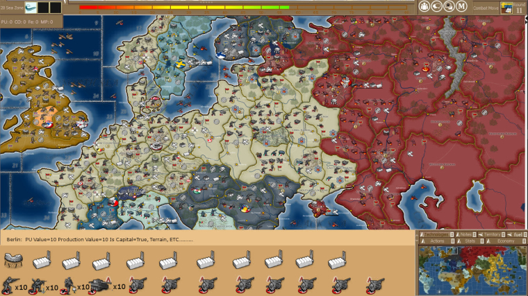
UI layout – I think that there are a lot of strategic and tactical games with good UI out there, and many have a lot in common. Note the placing of the minimap for example. I would think that there is a lot of knowledge and understanding that have lead to the designs of these UI, and that we should learn from them:
Sketch - I have done a sketch of what I invision the UI could be. It is not as pretty drawn as @Hepps, but I hope you get the picture. I hope that you will add my ideas to the tons of other ideas posted here
")
-
@Frostion Yes, the UI is still in a very early stage.
I'm planning to re-use the current game-UI to have at least a local Game working in a couple of weeks.
From there, we can improve the UI piece by piece to achieve something that doesn't look like it got a long legacy.
Thanks for your feedback, I agree
As a side note: I heard that JavaFX can be ported to mobile devices. (Can't make promises, but we want to keep that an option)
So we'd probably want to design the UI in a way that can be adobted by mobile devices with small screens as well.
So all the menus (not necessarily the way they are organised) should be easily downscalable. -
@RoiEX Sounds real nice!

Another suggestion: I don't know if anyone else has suggested it yet, but it would be sweet if the new UI could implement the much talked about and yet non-existing buttons for "Next unmoved unit", "Previous unmoved unit", "Alert" (sleep) etc.
I think an addition like that would bring the UI a step closer to the UIs of many commercial games, as well as bringing something new and useful to the new UI.
-
I know this has been discussed a lot before, and people have given their input for the graphics for these buttons, but are is my suggestions:
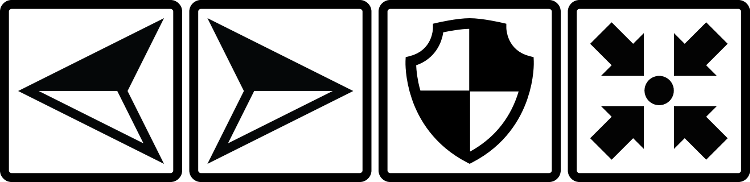
0_1524691875709_HiResGraphicsForButtons.zip
The buttons symbolize Previous unmoved unit / Next onmoved unit / Alert, sleep, dig in, skip or whatever / Center screen on the unit selected (if one has moved away on screen and want to find it again)
I think I have managed to make a universal look that would fit many kinds of maps. The buttons are kind of balanced in the way of being “filled” with equally same amount of black, so they feel like having the same “wheight”. I also think the symbols should be easily and intuitively understood. Anyone have thoughts on this?
Hello! It looks like you're interested in this conversation, but you don't have an account yet.
Getting fed up of having to scroll through the same posts each visit? When you register for an account, you'll always come back to exactly where you were before, and choose to be notified of new replies (either via email, or push notification). You'll also be able to save bookmarks and upvote posts to show your appreciation to other community members.
With your input, this post could be even better 💗
Register Login