Navigation

    TripleA Logo

    TripleA Forum

    • Register
    • Login
    • Search
    • TripleA Website
    • Categories
    • Recent
    • Popular
    • Users
    • Groups
    • Tags

    Fuel Enhancements

    Feature Requests & Ideas
    10
    234
    133738
    Loading More Posts
    • Oldest to Newest
    • Newest to Oldest
    • Most Votes
    Reply
    • Reply as topic
    Log in to reply
    This topic has been deleted. Only users with topic management privileges can see it.
    • prastle
      prastle Moderators Admin @redrum last edited by

      @redrum rofl btw i don't think i ever added bad words that's all you and @LaFayette or maybe @RoiEX

      1 Reply Last reply Reply Quote 1
      • B
        beelee last edited by

        @prastle guess it's chicken tonight LOL 🙂

        prastle 1 Reply Last reply Reply Quote 0
        • prastle
          prastle Moderators Admin @beelee last edited by

          @beelee 😉

          B 1 Reply Last reply Reply Quote 1
          • B
            beelee @prastle last edited by

            @prastle heh heh Hope you know it's all good brother : )

            1 Reply Last reply Reply Quote 1
            • General_Zod
              General_Zod Moderators @redrum last edited by

              @redrum The sausage police may come after ya.;)

              1 Reply Last reply Reply Quote 2
              • redrum
                redrum Admin last edited by redrum

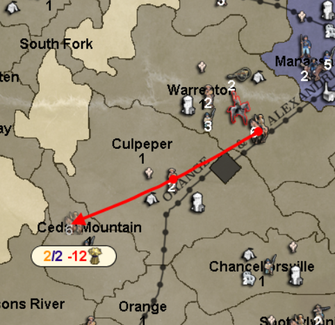
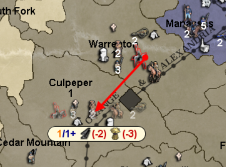
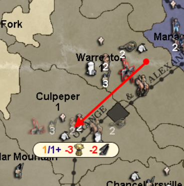
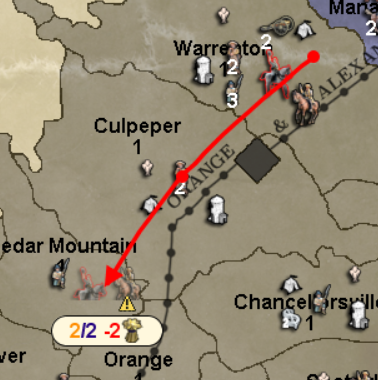
                Now that we've all had some time to think about @Hepps sausage... I think we can take a look at how movement/fuel canvas is shaping up.

                Multi-units with different fuels that can all make it:
                0_1519777254574_633466d6-502c-4c03-b397-26051d562f07-image.png

                Multi-units with different fuels where only some can make it:
                0_1519777299285_6c0c38ec-5f43-4948-9520-467b64abe63d-image.png

                Multi-units with different fuels where none can make it:
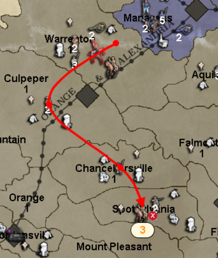
                0_1519777343943_d8f9a1dc-4859-4da0-84c1-3eda9e52257e-image.png

                Double digit fuel cost:
                0_1519777478236_c8b115ad-b1b2-4d2a-8ef6-75a8e8c7f1af-image.png

                General_Zod B 3 Replies Last reply Reply Quote 4
                • General_Zod
                  General_Zod Moderators @redrum last edited by

                  @redrum Awesome, great job!

                  1 Reply Last reply Reply Quote 0
                  • B
                    beelee @redrum last edited by

                    @redrum lol

                    1 Reply Last reply Reply Quote 0
                    • General_Zod
                      General_Zod Moderators @redrum last edited by General_Zod

                      @redrum

                      Regarding the changes on the info bar. It no longer displays "unit prod: #". Now it only displays "production: PUs #". Can we have both displayed?

                      I use different unit production from PUs value in my Big World 3 for pacific islands. I believe there are others that do this as well.

                      1 Reply Last reply Reply Quote 0
                      • redrum
                        redrum Admin last edited by

                        So for consistency with other areas, I decided its probably better to keep the resource symbol first then the quantity so here is the updated version:
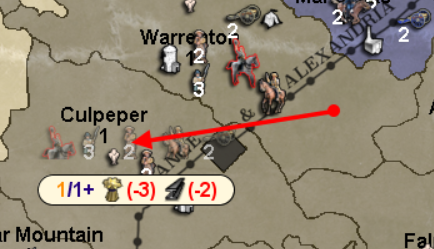
                        0_1519783117985_787e875f-2c69-407a-b3d7-22ae7abffffc-image.png

                        @General_Zod So I purposely decided to remove unit production from the bottom bar mostly because it seems to cause lots of noise on most maps with little or no value. There are some maps that set unit production to the same value for all territories so it becomes redundant. My feeling was that it belonged better in the territory tab with other less used information. I'm open to revisiting if the majority of folks would rather see it displayed in the bottom bar.

                        1 Reply Last reply Reply Quote 1
                        • redrum
                          redrum Admin last edited by

                          Couple of small adjustments and here is the PR: https://github.com/triplea-game/triplea/pull/3189

                          Before
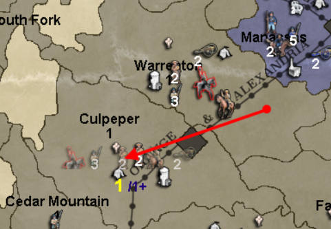
                          0_1519789759555_e30ddc74-9aa9-41e3-9db6-432c607b1147-image.png

                          After
                          0_1519789768969_6f8c7e2d-97d5-49b5-a94f-a9f4bc718003-image.png

                          ron-murhammer created this issue in triplea-game/triplea

                          closed Enhance Route Message With Background and Fuel Costs #3189

                          1 Reply Last reply Reply Quote 2
                          • Frostion
                            Frostion Admin last edited by

                            I would think it is best to have that movement canvas coloured in a clean grey color as in the first picture examples, not a creamy yellowish sandish coloring.

                            The reason for this is that any coloring of the canvas, might be in visual / stylish conflict with the specific map artwork or style. Also, I would say that grey might be the most neutral color that would go along with any engine UI. (Excluding black and white, as they are not as pleasant for the eyes.)

                            I think that the newest pictures look great, as the coloring is in line with the CW map. But we have to think of ALL maps.

                            redrum 1 Reply Last reply Reply Quote 1
                            • redrum
                              redrum Admin @Frostion last edited by redrum

                              @frostion I'm open to different canvas colors and will probably go with whatever the majority votes for. Here is a light gray version:
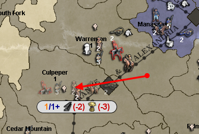
                              0_1519835528024_795e17ab-cc74-433d-b3cc-bea44019f25a-image.png

                              If anyone wants to suggest a specific color code, I'm glad to give it a try.

                              General_Zod 1 Reply Last reply Reply Quote 2
                              • General_Zod
                                General_Zod Moderators @redrum last edited by

                                @redrum

                                Maybe try the first number back to yellow if using a grey again.

                                redrum 1 Reply Last reply Reply Quote 0
                                • redrum
                                  redrum Admin @General_Zod last edited by

                                  @general_zod Yellow ends up being way too light to show on a light gray background as well.

                                  I made a few adjustments to colors and here is the latest:
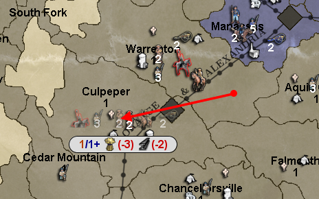
                                  0_1519843859399_cc142710-1594-4b84-b43e-d38f67d45487-image.png

                                  B 1 Reply Last reply Reply Quote 1
                                  • B
                                    beelee @redrum last edited by

                                    @redrum That looks pretty good

                                    1 Reply Last reply Reply Quote 0
                                    • Frostion
                                      Frostion Admin last edited by

                                      Let me just throw in new proposals:

                                      I have used @Hepps mockup and redrums screenshots as basis for these.
                                      I think the added arrow really help explain what info is being displayed, plus it is an eye catcher.
                                      I removed the blue, as the dash number is in essence a part of the same number in front of it.
                                      Lastly I removed the ( and ) as it seems redundant.
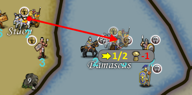
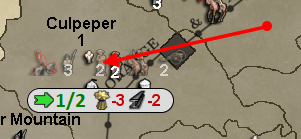
                                      0_1519855674500_Frostions-proposed.png
                                      0_1519855683534_Frostions-proposed2.png

                                      Thoughts?

                                      Hepps redrum 2 Replies Last reply Reply Quote 2
                                      • Hepps
                                        Hepps Moderators @Frostion last edited by

                                        @frostion I do like the arrow since as you say it keeps things consisent as far as icons. Also really like the numbers for movement the same colour. The yellow version is with the darker background would have to be my favorite.

                                        1 Reply Last reply Reply Quote 0
                                        • redrum
                                          redrum Admin @Frostion last edited by

                                          @frostion So for the initial iteration I'm going to leave as is but interesting suggestions. Thoughts:

                                          1. I'm kind of neutral on parens vs no parens.
                                          2. The red doesn't show up very well on the darker gray background but the yellow looks nice.
                                          3. I'd probably make the green a bit darker but like how the light gray example looks. The challenge would be that if you have a move beyond max movement and it only shows the green number that would seem to contradict the red X you get as green tends to indicate "go"/"success".
                                          1 Reply Last reply Reply Quote 1
                                          • redrum
                                            redrum Admin last edited by

                                            The latest changes have been merged and can be tested in the following pre-release: https://github.com/triplea-game/triplea/releases/tag/1.9.0.0.9464

                                            1 Reply Last reply Reply Quote 2
                                            • 1
                                            • 2
                                            • 7
                                            • 8
                                            • 9
                                            • 10
                                            • 11
                                            • 12
                                            • 9 / 12
                                            • First post
                                              Last post
                                            Copyright © 2016-2018 TripleA-Devs | Powered by NodeBB Forums