Fuel Enhancements
-
Suggestion 1 - Thoughts
I'm open to adjusting the ordering/layout of the various sections of the bottom bar as I haven't put much thought into yet just getting the functionality out there. I'd definitely vote against example 1 since I think CW and multi-resource maps would look weird with current player name before resources. I don't have a strong preference between what we have now and example 2 - right aligning the resource portion.Suggestion 2 - Thoughts
So probably not worth having a tooltip over each (+X) that just says "expected income" (no/little value IMO). What I'd like to eventually do is have a separate tooltip for the (+X) portion that shows the income breakdown (territory vs units vs NOs, etc).
Example tooltip (could discuss how much to break it down as well):
+45 from territories
+30 from units
+10 from NOs -
I like the centered resources. It both fysically and informationwise seperates the resource info from the territory and step/round info.
A: How about having the bottom bar a fixed hight of 32x32, so that too large pictures don’t expand the bar?
B: How about a description before the icons? Maybe text like “Resourses:”? Kind of like the “Round: 1” to the far left.
An issue I have noticed is that the displayed resources flicker / move side to side when the engine runs through different steps and players. Could you somehow fixate the separating bars between the Territory name info to the far left and the box that displays the centered icons? Or is this issue just a result of the icons loading and disappearing in milliseconds??
-
@frostion Thoughts:
A. We could have a fixed height though that would just cut off part of the resource images I think not sure that is better or worse. Honestly I don't think this is a big deal either way since map makers would quickly realize this and fix their image sizes (once we properly define the image sizes and where each is used
") ).
).B. I thought about that but felt like it didn't really add anything. Once you load the game up a few times and now that we have the income next to it, its seems really obvious that they are resource amounts/income.
I noticed the flickering as well though this is caused I believe primarily by 2 things:
- When the phase/round changes the phase name on the right changes width and causes the whole bar to resize. Might need to consider hard coding the width of the phase name to be the longest possible phase name.
- Resources are different from 1 player to another player using isDisplayedFor. This I think is ok since you are actually showing different resources then.
I didn't get a flicker when just the resource amounts change like if you move a unit that consumes fuel.
-
@redrum
A: You are right. But I can’t see any damaged in making it fixed, thereby forcing the mapmaker to shrink the pictures to a fitting size. But again, this is nothing that players would ever know ofB: You are right. And no other game I know of needs to spell out that “These small icons are your resourses.” LOL

Flickering: Yes flickering when a new set/combo of resources is displayed is OK. But it would be nice to have them fixed when going through steps/players who has the same set of resources. It’s kind of distracting as it is now.
-
@frostion said in Fuel Enhancements:
I like the centered resources
I agree for civil war map, for maps with just one, it seems out of place. My opinion is to right justify to keep consistent and looking good if we have 1 or many. If we can make the single resource type look good centered, I'd have no objection to it.
-
Alright so latest changes to add resource and territory effect icon support on bottom bar and purchase panel are submitted: https://github.com/triplea-game/triplea/pull/3118
Iron War before:
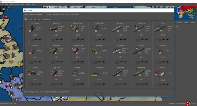
Iron War after:
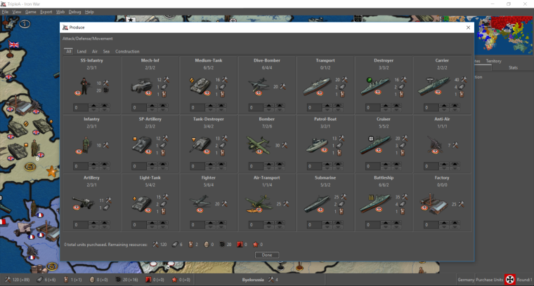
Iron War (always have icon then quantity):
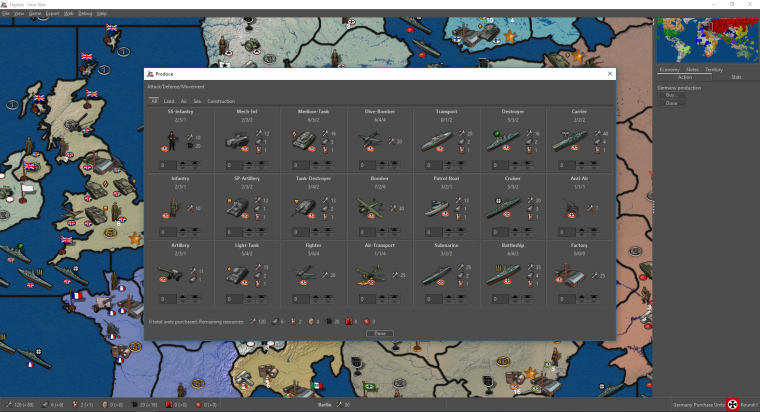
closed Add Resources and Territory Effects Icon Support #3118
-
Posted a third screenshot as it was pointed out its probably better to be consistent with always having resource icon then quantity. Any thoughts?
-
@redrum Definitely better. Looks great.
-
I posted a reply in the other thread
 Hope you find it.
( https://forums.triplea-game.org/topic/583/image-icons/111 ) -
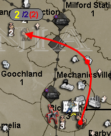
So the first take at looking at unit movement fuel consumption:
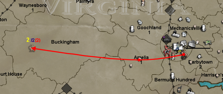
This is very similar to what @Frostion originally posted (https://github.com/triplea-game/triplea/issues/1310) except now that we have total resources displayed in the bottom bar, the red number instead shows how much fuel the given move is consuming as that should be more useful.
So given that you can potentially have multiple resources for fuel cost, the next step is to try to add resource images and multiple numbers. So that instead of just "(2)" you could have say "2<supply_image> 4<industry_image>".
Thoughts and feedback welcome.
closed Enhance Fuel Movement #1310
-
@redrum Great initiative!
One of the things I have noticed (especially given the example you used) is that while moving on maps with smaller territory sizes there is often a tendency to not be able to see or distinguish the information being presented due to the clutter of everything in the destination terr.
Example...
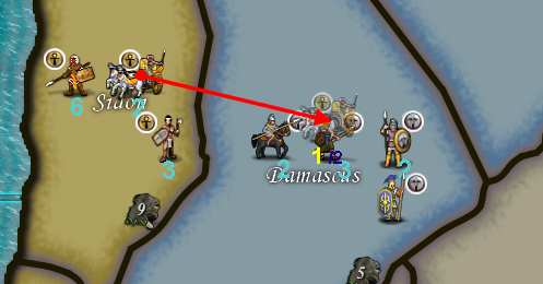
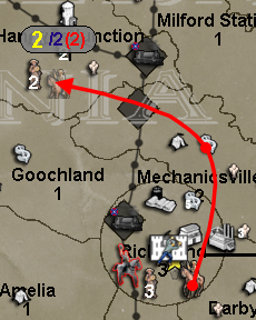
Now... and this has been mentioned before by members of our community.... is there the possibility to create a "canvass" onto which this information can be rendered?
Example...

-
@hepps @redrum
Having control over colors of numbers might be helpful. A map maker could chose colors that pop and or don't blend with backgrounds as much.As fuel number goes, the brackets seems like they not needed. Maybe just use the / to divide or a -. Although I understand the brackets imply minus too. The fuel image is weird too. Again different colors may work well instead of images . Just game notes would need to specify what colors are if changed from default or if multiple fuel resources are used.
Or a letter in place of image. eg 2/4/F1/F2 or 2/4-f1-f2 or 2/4/-f1/-f2
-
@general_zod Consistency from game to game is probably very desirable for the main components of gameplay.
If you start allowing map makers to start changing the colours of things like movement used, movement outstanding, fuel cost, unit quantities etc... it would probably lead to a great deal of issues for players trying to learn/play different maps if each individual map had its own hard coded presets.
Potentially adding this type of customization would be best executed by adding the other display categories to the "View Tab" in a game under the "Edit map Font and Color" window.
That way once a player set all the parameters it would be consistent game over game. The map maker could then make recommendations in the game notes specifying what he feels is the best settings based on the map design, while still allowing the player to decide what is preferable based on individual taste.
-
@hepps Yeah, that works too. As long as can choose colors for each number.
Btw, I do like your canvas idea, a semi transparent might be nice. But in addition to above.
-
-
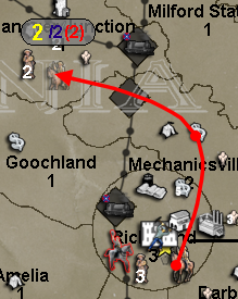
@redrum Not sure semi transparency is the way to go... just seems to add more muddiness. Since this would only during the movement itself I would recommend a solid background.
-
@hepps Yeah. From the samples I took, I would agree that solid looks the best.
Thoughts on colors, size, etc for either the "canvas" or movement/fuel numbers?
Other Suggestions:
- Probably better to always display the max movement number (the blue one). It seems that if you move further than your max then it disappears.
-
@redrum Yah, when you move beyond the units max range the blue number disappears and is replaced by am "X" icon which appears to have a fixed placement relative to the cursor location (down X pixels and right by x pixels) rather than relative to the location of the move number (yellow number) which continues to be displayed and who's placement is relative to the horizontal plain from where the unit originated (if you are moving above the original location of the unit the number is displayed above the transparent unit.... if you are moving below the original location of the unit the number is displayed below the transparent unit). Ideally that red X icon would be placed in lieu of the blue number... relative to the yellow number... rather than relative to the cursor location on the screen.
As far as colours.... I am indifferent. I have no issue with the current colour scheme.
-
That background gery was a great idea @Hepps , and really incredible that @redrum could just make it happen like that
I like the idea about the fuel(s) used are displayed as icons. And no transparency seems best. -
@frostion Who is this "gery" you speak of?
")
")