Navigation

    TripleA Logo

    TripleA Forum

    • Register
    • Login
    • Search
    • TripleA Website
    • Categories
    • Recent
    • Popular
    • Users
    • Groups
    • Tags

    Fuel Enhancements

    Feature Requests & Ideas
    10
    234
    134.5k
    Loading More Posts
    • Oldest to Newest
    • Newest to Oldest
    • Most Votes
    Reply
    • Reply as topic
    Log in to reply
    This topic has been deleted. Only users with topic management privileges can see it.
    • General_Zod
      General_Zod Moderators last edited by 27 Feb 2018, 20:47

      Yeah the solid canvas looks cool too. Also nicer with less stuff going on the canvas.

      So a thought on the fuel figures. So if you stuck on 1/2(#) format. (which is ok, except need space after the 2, imo) Maybe for more consistency and enhanced clarity. Add the minus - sign (and space). eg 1/2 (-#). To be consistent since we the use a (+#) sign in resource info bar.

      Hepps 1 Reply Last reply 27 Feb 2018, 20:49 Reply Quote 2
      • Hepps
        Hepps Moderators @General_Zod last edited by 27 Feb 2018, 20:49

        @general_zod Agree. If we are going to put a plus sign to indicate increases.... we should do the same for consumption and add a minus sign.

        Good call.

        1 Reply Last reply Reply Quote 2
        • Frostion
          Frostion Admin @Hepps last edited by 27 Feb 2018, 21:16

          @hepps
          Gery is an form of evil grey plankton:

          0_1519766137207_Plankton_PNG.png I thought you were inspired by this plankton when you made the GREY background 😉

          1 Reply Last reply Reply Quote 3
          • redrum
            redrum Admin last edited by redrum 27 Feb 2018, 21:31 27 Feb 2018, 21:27

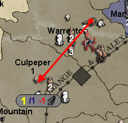
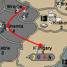
            The following are some examples. Any thoughts?
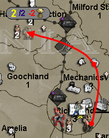
            0_1519766779006_18f719fa-b1c7-4034-b1d9-40df178a4edd-image.png

            0_1519766812452_23a9db15-12c3-4179-ac7e-1d084d06bd8e-image.png

            0_1519767096539_a92d236f-ee61-456b-a230-1f9ea2091433-image.png

            Hepps 1 Reply Last reply 27 Feb 2018, 21:32 Reply Quote 0
            • Hepps
              Hepps Moderators @redrum last edited by Hepps 27 Feb 2018, 21:33 27 Feb 2018, 21:32

              @redrum Thoughts? Yes I have many...

              If the strength of an ant could be scaled to a human sized genetically enhanced breed of mule-octopus hybrid.... that feeds on carbon dioxide for energy.... we could solve a lot of the worlds problems.

              redrum 1 Reply Last reply 27 Feb 2018, 21:37 Reply Quote 0
              • redrum
                redrum Admin @Hepps last edited by 27 Feb 2018, 21:37

                @hepps Guess I should have been more specific... Any useful thoughts related to the above images showing resource fuel costs during unit movement?

                Also here is a lighter gray canvas:
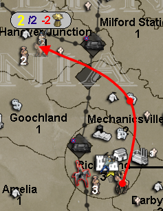
                0_1519767417743_f80ad6fb-63bb-4eff-b464-ee690f837c29-image.png

                1 Reply Last reply Reply Quote 1
                • Frostion
                  Frostion Admin last edited by Frostion 27 Feb 2018, 21:42 27 Feb 2018, 21:38

                  @redrum
                  I have always wondered why the movement info text is so pixilated? Its like the rest of the game uses antialiasing with text, just not the movement text.

                  How will this colored text on light grey background look if the player uses another UI theme than SubstanceGraphite?
                  And is the grey background made up by fixed or resizable images? Or how? I can se the grey background with thin black outline also looks pixilated and not smooth and antialiased.

                  EDIT: Lighter grey looks better, as the red number is more readable on lighter grey.
                  EDIT 2: But at the same time, the yellow number is now a little less readable 😕

                  Hepps redrum 2 Replies Last reply 27 Feb 2018, 21:47 Reply Quote 1
                  • Hepps
                    Hepps Moderators @Frostion last edited by 27 Feb 2018, 21:41

                    @frostion My intension when I suggested this was that the window generated would be part of the chosen UI rather than something we hard wire in as a graphic. I had just draw a box since.... well... I draw pretty pictures.... so that is what I do.

                    And YES!!!!! For love of all that is holy.... be done with all things pixelated!!!!

                    1 Reply Last reply Reply Quote 0
                    • redrum
                      redrum Admin @Frostion last edited by redrum 27 Feb 2018, 21:49 27 Feb 2018, 21:47

                      @frostion Fair point. I don't really see any reason not to turn anti-aliasing on and no clue why it wasn't already. At this moment, I'm hard coding the color and the background is just a generated shape (not an image) so it is resizable. Images can be used for the background but it could be challenging to scale the image properly for say multiple resources or when a move is invalid and only displays the yellow number.

                      And I agree that red appears poorly on the darker gray and yellow appears poorly on the lighter gray. Maybe something in between or change the text colors?

                      Here is anti-aliased lighter gray example:
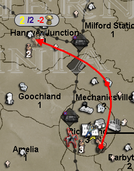
                      0_1519768010880_1acf6203-7280-4a3d-b240-259e3bec3f58-image.png

                      Hepps 1 Reply Last reply 27 Feb 2018, 21:50 Reply Quote 1
                      • Hepps
                        Hepps Moderators @redrum last edited by 27 Feb 2018, 21:50

                        @redrum Oh my f*@king lord... have I been looking at pixelated numbers for 10 years because some one didn't want to flip a switch?!?

                        redrum 1 Reply Last reply 27 Feb 2018, 21:51 Reply Quote 0
                        • redrum
                          redrum Admin @Hepps last edited by 27 Feb 2018, 21:51

                          @hepps More or less... yes. I never really thought about it but now that I turned it on, it makes a huge difference.

                          General_Zod 1 Reply Last reply 27 Feb 2018, 22:01 Reply Quote 1
                          • General_Zod
                            General_Zod Moderators @redrum last edited by General_Zod 27 Feb 2018, 22:07 27 Feb 2018, 22:01

                            @redrum

                            I'm in the no image camp at the moment, but everything else is great.

                            Actually I do have one other suggestion, in addition to the letter instead of image. How do you guys feel about all the figures being same size.

                            Also how does off white look as canvas color. That would be a color that almost never gets used as territory color?

                            Hepps 1 Reply Last reply 27 Feb 2018, 22:13 Reply Quote 1
                            • Hepps
                              Hepps Moderators @General_Zod last edited by 27 Feb 2018, 22:13

                              @general_zod Yes an off white would be ideal.

                              1 Reply Last reply Reply Quote 1
                              • redrum
                                redrum Admin last edited by 27 Feb 2018, 22:31

                                @General_Zod @Hepps We can try off white. Suggestion on what RGB values that would be? Pretty sure the yellow will be pretty much invisible though.

                                @General_Zod I can adjust all the text sizes to be the same and post that example.

                                Hepps 1 Reply Last reply 27 Feb 2018, 22:35 Reply Quote 1
                                • Hepps
                                  Hepps Moderators @redrum last edited by Hepps 27 Feb 2018, 22:36 27 Feb 2018, 22:35

                                  @redrum Well once you go to an off white design.... the idea of using Yellow might be a moot point.

                                  I have always felt that using colours common to nations is also not advisable.

                                  Orange might be a better choice since it is not commonly used in games as a national colour... as well as being in good contrast to off-white.

                                  1 Reply Last reply Reply Quote 0
                                  • redrum
                                    redrum Admin last edited by 27 Feb 2018, 22:42

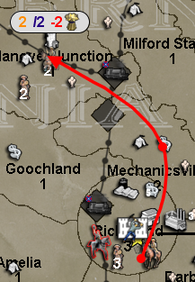
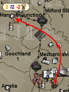
                                    Even lighter gray (not sure exactly what off white is considered) with a dark orange instead of yellow text:
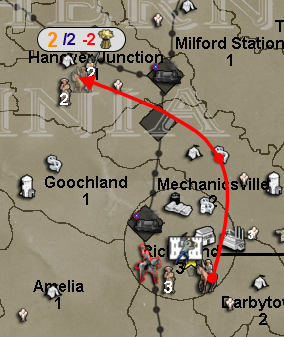
                                    0_1519771249479_18ac459d-68da-4a20-a0b5-a052709c4a51-image.png

                                    Same but with same size text:
                                    0_1519771347501_f6d0c1a2-34e8-4c8f-bc94-e68692fda9da-image.png

                                    General_Zod 1 Reply Last reply 27 Feb 2018, 22:44 Reply Quote 0
                                    • General_Zod
                                      General_Zod Moderators @redrum last edited by General_Zod 27 Feb 2018, 22:45 27 Feb 2018, 22:44

                                      @redrum Same size numbers look nice. 🙂

                                      Yeah the off white requires a color change in numbers. I guess grey is acceptable neutral color as well.

                                      1 Reply Last reply Reply Quote 1
                                      • redrum
                                        redrum Admin last edited by redrum 27 Feb 2018, 23:01 27 Feb 2018, 22:59

                                        With @Hepps magic off whitish color:
                                        0_1519772362527_2f65cb1c-8c05-4e50-9760-138743167b76-image.png

                                        And when you don't have enough movement (need to still work on shrinking canvas size):
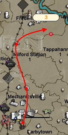
                                        0_1519772497938_cd14dd45-40ee-48e6-86f0-c4f3c2998163-image.png

                                        Hepps 1 Reply Last reply 27 Feb 2018, 23:01 Reply Quote 2
                                        • Hepps
                                          Hepps Moderators @redrum last edited by 27 Feb 2018, 23:01

                                          @redrum Every appendage I can raise.... is raised. 2 thumbs.... 2 big toes... and a sausage.

                                          redrum 1 Reply Last reply 27 Feb 2018, 23:05 Reply Quote 0
                                          • redrum
                                            redrum Admin @Hepps last edited by 27 Feb 2018, 23:05

                                            @hepps Please keep it PC, you don't want @prastle to add 'sausage' to his list of naughty words 🙂

                                            prastle General_Zod 2 Replies Last reply 27 Feb 2018, 23:44 Reply Quote 2
                                            • 1
                                            • 2
                                            • 6
                                            • 7
                                            • 8
                                            • 9
                                            • 10
                                            • 11
                                            • 12
                                            • 8 / 12
                                            141 out of 234
                                            • First post
                                              141/234
                                              Last post
                                            Copyright © 2016-2018 TripleA-Devs | Powered by NodeBB Forums