Image Icons


-
@frostion We had discussed making 3 image sizes for the resource folder. Small medium and large.... for exactly what you just mentioned.
-
@hepps @frostion Yeah, I'm thinking along the same lines that we need probably 3 different resource image sizes:
- Large (*_large.png) - used anywhere that the resource is used for unit images (purchase/place/etc), can be up to the size of the unit images
- Normal/Medium (*.png or *_medium.png) - used for resource bar either 24x24 or 32x32
- Small (*_small.png) - used for areas that is aligned with text like purchase costs 12x12
If we have general agreement on that then I can update the resource bar to pull *.png instead of *_large.png. And I'll probably just take the default images already included in TripleA and rename the 12x12 to *_small.png and duplicate the *_large.png to be both the *.png and *_large.png for now. Then we can modify these as we work through icons.
-
-
@redrum Just curious as to plan for the economy tab, since we have the info on bar. If we are keeping it, then maybe the "resource_small.png" can be used the in place of text. Similar to the tech sections flags on stats tab. But tooltip should work there if so.
-
@general_zod No hard plan but that would fall most likely into the "Small" category. Anywhere we have resource text today in theory could be replaced with small resource icons. I definitely think economy tab has value since you can see everyone's resources though many of the tabs on the right panel, I'd argue would be better as pop ups like diplomacy as the right panel should really just be actions IMO and the rest should be factored into other areas of the UI or into popups.
-
@redrum So the plan for a *_small.png, *_medium.png, *_large.png and just *.png but the unit sized one's are called 'large'. I think changing it that way causes more confusion down the road. Normal size IMOA would be called *.png and small 12x12, medium 24x24 and large 32x32 are use elsewhere.
But that's my 2 cents...
Cheers...
-
@wc_sumpton
But the 24x24 and 32x32 size pictures are the same. It is just that 24x24 looks to be a good size for the pictures used in the bar, but they could in theory be as large as 32 high without being too high for the bar. So there are just 3 sizes atm. -
@frostion Ok thank for the explain! Maybe I was reading to much into what was being typed!
<option name="question" value="All questions should be formatted in this manner to be understood better"/>
<option name="remark" value="You must be crazy!"/>Clearly understood...
Cheers...
-
So here are some initial takes with the purchase window using Civil War. Here is an interesting screenshot of HOI4 unit production for reference: https://i0.wp.com/www.matchstickeyes.com/wp-content/uploads/2016/08/HOI4-Spitfire-Production.jpg. My initial thoughts are 12x12 is really small and hard to distinguish but 24x24 might be too large. Might be interesting to see 16x16 or 20x20. I think it would be nice to get rid of the resource name if possible.
Small icon then quantity
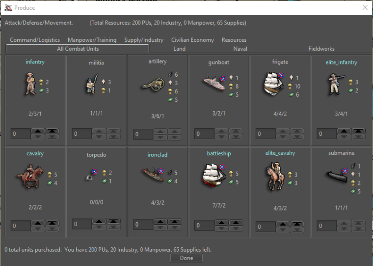
Quantity then small icon
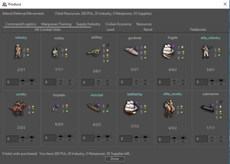
Quantity then name then small icon
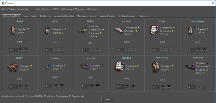
Quantity then medium icon w/ some additional space between unit and costs
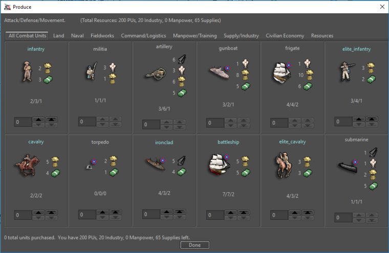
Votes and feedback welcome!
TripleA Developer with a Passion for AI: https://forums.triplea-game.org/topic/105/ai-development-discussion-and-feedback
-
@redrum medium but I'm old and blind
") Great job either way
Great job either way -
@redrum I like the one with the "quantity then medium icon". I'm with prastle on this, tiny ones would be difficult. (with tooltips for resources)
Although, a very close second choice is "quantity, name, small icon".
I don't think new player would enjoy if purchase appeared ambiguous.
-
I vote for the HOI window...
")
-
@heppsisuarus ya know he is a TripleA junkie when while on a holiday he still has to use his phone to check forum
-
@prastle I am an unabashed junkie. I feel neither remorse nor shame.... just feed the addiction.
-
@heppsisuarus But apparently can't remember his regular password...
-
@heppsisuarus hehe i will upvote a heppisaurus
sadly it doesn't tie to your alter ego -
Definitely medium.
I have some recommendations as to the overall presentation of all the info.... but alas I am a (relatively) far away from home and cannot draw the pictures that would otherwise be said by a thousand words.
-
I also say "Quantity then medium"
But could you you then please try to enlarge the quantity font 1 or 2 seizes so that they fit the picure size a bit more? (Absolutely not to a degree that makes a single resource cost line take up more vertical space.) (Edit: Maybe all the text in the entire window should be enlarged by 1 or 2) (Edit 2: Then you could perhaps remove the extra "space" you made between the unit and numbers, but we would have to see.)Also, I would already advocate for the bottom bar of the purchase screen to not remove the resource texts. I would recommend it be displayed as something similar to:
10 PUs
 , 5 Food
  , 7 Wood
or
10(PUs), 5 (Food), 7 (Wood)This is because I think that it may be good to have at least one place that reminds the player what the icons actually symbolize. We wouldn't like to have player in chats and forums beginning to call fuel "drums", PUs "cash", Food "Apples" or "Steaks" ... calling the resources what they see in the icons instead of the real definitions. I don't think explanations in the notes would be sufficient and we cant expect player to intentionally use the tooltips to investigate what the icons represent. I think the real resource definition should be repeatedly and visually printed into the player's mind.
(Be advised that I am not a psychologist ... But I still think that I got a point
 )
)Map maker of: Star Wars: Galactic War + Star Wars: Tatooine War + Caribbean Trade War + Dragon War + Age of Tribes + Star Trek: Dilithium War + Iron War + Iron War: Europe + Warcraft: War Heroes
-
@frostion That seems reasonable. The new players will have a reference without searching. Also I think the typical noob doesn't even know tool tips exist.
-
@frostion Yeah, I think leaving the resource text alongside the icon at the bottom of the purchase window makes sense. If I leave the "medium" size at 24x24 then yeah there is really no reason not to increase the quantity font size a bit. Though what I'd like to try 16x16 and 20x20 to see if those still look pretty good while saving a bit of vertical space.
If anyone wants to upload 16x16 and 20x20 versions of the Civil War resources that would save me a bit of time
TripleA Developer with a Passion for AI: https://forums.triplea-game.org/topic/105/ai-development-discussion-and-feedback
Hello! It looks like you're interested in this conversation, but you don't have an account yet.
Getting fed up of having to scroll through the same posts each visit? When you register for an account, you'll always come back to exactly where you were before, and choose to be notified of new replies (either via email, or push notification). You'll also be able to save bookmarks and upvote posts to show your appreciation to other community members.
With your input, this post could be even better 💗
Register Login