Image Icons


-
@redrum I understand his point now and can clarify. @Raville
New icons are great! in the older maps cept one thing. We need ability to turn off the movement indicator and/or make it a lot smaller. Other than that GREAT STUFF!
If we open a quarrel between past and present, we shall find that we have lost the future! Sir Winston Churchill
-
@raville said in Image Icons:
Great job you are doing, Congratulations! And my opinion: in new TA version .9480 there is some small circles that show moves (for me they are not good and bother in game), small black numbers as before didnt bother at all, maybe those circles are to much showing a movement allowed that isn't to important. Still I have some white windows (now in black) from Java when open a new map, How to correct them? Thanks and good job!
Small circles that show moves? You mean numbers?
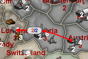
You mean the yellow and blue numbers, showing, respectively, the moves you are doing and the total moves available, when you select a unit and move the cursor on another territory?
That is exactly the same thing as already there in 1.8.0.9, and was made by Veqryn years ago.
Personally, I would definitely totally remove the blue one, showing up the max movement. I don't think anyone has a use for, or even read, it, ever, and, when you play a map, pretty much have to memorise what is the movement of each unit, already.
Probably mapmakers should be, then, able to set the colour for the remaining yellow one, in case the default colour might be a bad choice for the specific map. A switch off option in the menu can't hurt.
But I'm not sure this is what you mean?
-
@cernel download the new pre-release and play a map sigh...
-
@prastle @Raville Any particular reason why? I don't really see much harm in having the movement indicator a bit more visible even on older maps. It really isn't much larger than before just has a background. Do you have some screenshots that show it not looking good on older maps?
TripleA Developer with a Passion for AI: https://forums.triplea-game.org/topic/105/ai-development-discussion-and-feedback
-
"A joyous heart sours with the burden of expectation"
Hepster -
@redrum just join us in lobby
Zod vs Rav -
@hepps LOL. That is pretty awesome.
-
@redrum he is on An i don't care about "checkers maps" rant
")
-
@redrum To clarify maybe slightly smaller round and semi transparent might work quoting gen zod
-
I see. I don't know how to feel about it; would need to play some games to tell.
The upside is that the new version looks more refined than the old one, and a default coloured number may not be that good for all maps, but I can see this thing really going in the way of what you are looking at.
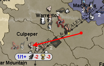
It may be better for that thing with the movement display to always stay on the arrow trail, instead of jumping up and down on the same abscissa; something like this:<--(X/Y)------------------
-
Just opened the pre-release, looked at the movement info a bit, clicked a few times left/right mouse button .... And got windows blue screen of death.
I still think the info should start with a 20x20 movement icon, and the orange/red combo is not good as they look nearly alike.
Here are some proposals:


Map maker of: Star Wars: Galactic War + Star Wars: Tatooine War + Caribbean Trade War + Dragon War + Age of Tribes + Star Trek: Dilithium War + Iron War + Iron War: Europe + Warcraft: War Heroes
-
@frostion off topic but please throw your five votes here
https://forums.triplea-game.org/topic/535/triplea-mod-council-vote-discussion
-
@frostion Well, a movement icon would make the thing even more refined, but at the price of exacerbating even more the issue of covering and hiding the board underneath, while adding nothing substantial, unless you have different symbols for accessible and inaccessible and, that way, it could at least substitute (thus allow removing) the current "cannot go there" symbol that displays only if the territory is unreachable.
I'm still thinking the solution would be assuring that thing being behind the unit, with respect to the direction you are moving to, which means either:
1- on the arrow trail, or
2- in between of the starting point (where you picked the unit) and the current position of the cursor, or
3- on the right of the unit if you are moving mostly to the left, on the left of the unit if you are moving mostly to the right, above the unit if you are moving mostly downwards, below the unit if you are moving mostly upwards.
I guess number 3 should be the easiest to implement, as it is related to the current behaviour. -
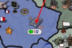
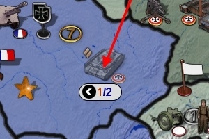
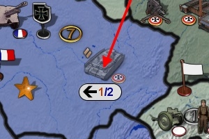
I'll add an image, just because:
current:
my suggestion:
Instead, if you are going down, it would be above the arrow point, etc..
-
I want to add that I clearly remember that about 5 years ago, when Veqryn added the movement display, I was initially a bit unhappy about having that additional hovering number buzzing around, and didn't like this addition, but now I think I appreciate the ability of cursoring around and getting told how much distance from the starting point I am, so I would not suggest totally removing it. Still, a menu option for going back to the times we didn't have this feature may be useful; not sure if I would tick it. Maybe a key for quick switching this setting, as well.
-
So was playing 9464 today, and observations were.
-
The gray canvas and oblong shape seems to block a lot on designation. I keep thinking semi transparent should work, maybe if it was like 75% transparent?
-
The oblong is very oversized when only one number is shown. Any chance the shape can be reduced when single number shown.
-
Yellow was a nicer color for first number. Maybe adjust canvas color to accommodate yellow again.
-
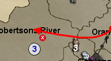
Cernels idea above is interesting, place the shape on path instead of at end.
-
-
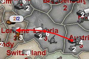
So decided to tweak the message size/color a bit. I've made both move numbers the same blue color, removed parens, and tightened up the padding:
Not Enough Moves
TripleA Developer with a Passion for AI: https://forums.triplea-game.org/topic/105/ai-development-discussion-and-feedback
-
@redrum Looks good.
-
Yes. This is great

-
@redrum
Much better. Nice job.
")
Hello! It looks like you're interested in this conversation, but you don't have an account yet.
Getting fed up of having to scroll through the same posts each visit? When you register for an account, you'll always come back to exactly where you were before, and choose to be notified of new replies (either via email, or push notification). You'll also be able to save bookmarks and upvote posts to show your appreciation to other community members.
With your input, this post could be even better 💗
Register Login