Image Icons


-
@frostion Yeah, after enhancing it, I had the same feeling. Gonna go ahead and just remove it as if play testing proves otherwise we can always add it back in easily.
-
Just got done with the next update and started a playtest. I'm pretty much assimilated to the new icons and movement indicator. I like it
")
Anyway, I have some "convoy zones" and was wondering if additional info could be added showing what they convoy.
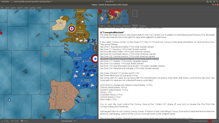
Idk if that would be a problem for maps that use a lot of different resources or not but it'd be cool if the highlighted part in the screenshot would show up to the right of the PU icon on the bottom bar.
Just a thought
Or maybe a convoy icon with the PU amount since TT names can be pretty long or multiple TTs
-
@redrum For the Oil, Manpower, Leadership, Food I prefer the second images, currently listed. Namely:


This one I don't actually think about leadership, looking at it:

It makes me think about the experience of the units; so maybe "Experience".
For example, in case you get "Experience" by destroying TUV, and use it to upgrade units.
Leadership, instead, makes me think about a fuel cost to move units. -
@beelee Things that involve multiple territories for certain income are more aligned to NOs rather than individual territory information. Otherwise if you have multiple NOs that involve 1 territory, it would get to complex to display at the bottom like that.
-
@redrum right on thanks
-
I like where your going with the new convoys/blockades in the Atlantic and else where. I'm looking at a something similar as an option for my Big World 3 map.
The main obstacle I see is that the submarine dynamic as it exists in most maps does not favor the subs. And the Germans and Italians most likely can not successfully operate a surface fleet in the Atlantic. Thus the Atlantic may not see much naval action if at all.
Are you giving subs anything to help overcome this potential problem?
-
@general_zod Thanks general
I'm using a HouseRule/Tech for subs. So, different than the 1 DD shuts down endless subs. Goes like:
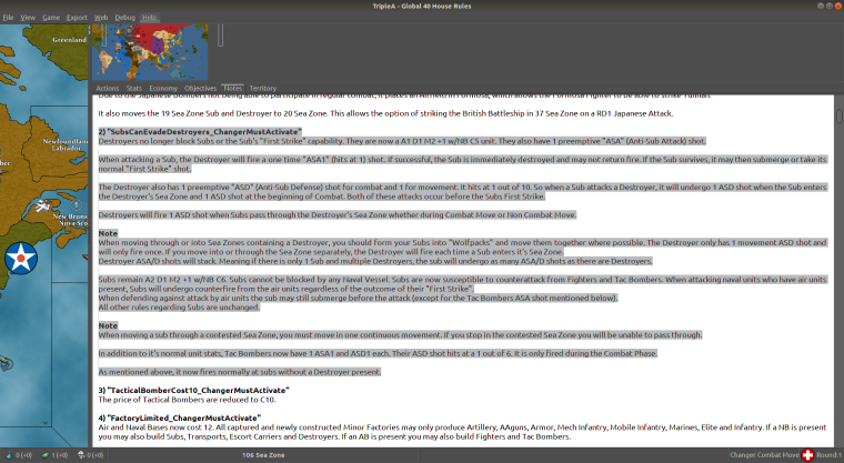
So far they seem to be working out pretty good. Biggest concern is an unbeatable sub spam. Think a person can find some sort of combination to make it work. I find it a lot more fun : )
Test games have a real "battle of the Atlantic" to them so far.
Pacific see's some mid late game pressure on Japan.Well...anyway : ) Back to testing
-
@beelee might try "TransportC8 D1 (already available) " if subs get out of Line. Seems ok so far though, ( U-Boats just took a beating as I type this ) but
"Those Boys been in Dry Dock too Long". : )
With a C5 DD it'd no longer be the Fodder Unit. Also, just noticed, if a DD is fired on in CM while going to another SZ, You cannot move through that zone in NCM due to it have been being in a "Combat Zone".Another boost for the DD : )
Oops ! Sorry just realized probably not the right spot for this : )
Hello! It looks like you're interested in this conversation, but you don't have an account yet.
Getting fed up of having to scroll through the same posts each visit? When you register for an account, you'll always come back to exactly where you were before, and choose to be notified of new replies (either via email, or push notification). You'll also be able to save bookmarks and upvote posts to show your appreciation to other community members.
With your input, this post could be even better 💗
Register Login