Image Icons


-
@hepps I'm open to testing it out with both 24x24 and 32x32 versions. You can actually do it right now with the latest pre-release. It shouldn't restrict image sizes.
TripleA Developer with a Passion for AI: https://forums.triplea-game.org/topic/105/ai-development-discussion-and-feedback
-
-
@redrum Oh I am already there.
")
-
-
@general_zod While I am a big proponent of saving space... the idea of shrinking the images means it would break every existing map in the repository. Every last map would have to have its flags redone.
that was why I was asking if we could use all of the available space we are already using.
-
@hepps I'm not proposing it be shrunk in the assets folder. Just wondering if a map can be customized with their own images and save space for the map itself.
-
Not sure exactly how the height of the bar is handled. You can try adding smaller or larger flags to see what happens.
-
I'm thinkin' IMOA... what little thought I have left. That the 24x24 look nice.
-
One more thought, ToolTips?
-
@wc_sumpton Already added tooltips to the resource icons.
-
@redrum Yu' my hero!
-
@redrum just checked out the new icon bar, looks cool. Nice job, however I see saved games don't work on it. Are you going to have two tripleas while you transition to the new one ?
-
@beelee Save games worked fine for me. If you have a save game that causes an error, please upload it.
-
@redrum here's what i get:
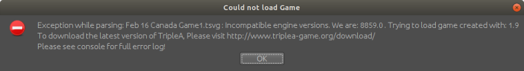
idk if a save will work because I haven't updated at git yet. I'd have to send the new xml as well
-
@beelee I think there was a pre-release build or 2 that had a versioning issue. Can you try downloading the latest pre-release now and re-load the save: https://github.com/triplea-game/triplea/releases/tag/1.9.0.0.8866
-
@redrum yea 8870 is working : )
-
I think it one of the most important aspects here is to keep some sort of artistic uniformity and style, so that one resource picture does not look cartoon-like and another one looks realistic. Hepps line of pictures are in my mind nice looking and a good standard starting point that could go along with WW maps as well as other themed maps from other eras and universes. Mapmakers can then choose to use other images if they want/need.
Another aspect is colors. I would say that most professional games try to keep the resource colors of the most used resources distinctive and different. Like Yellow Gold, Green Food (Apple), Brown Wood (Lumber) or a color scheme like Yellow Gold, Red Meat, Green Tre/Wood. I would say that TripleA should think about what the most used resourses are, maybe PUs, Tech-tokens, Fuel etc. should be kept distinctively different.
I would also advocate for 32x32 as max size. If pictures were larger, then they should at least not expand the bottom bar. This is kind of the way the unit pictures work in the battle window, which is fine imho. I also think it is fine with 32x32 flags that fill out the bar. Players are free to make the flags, and also the resource pictures with transparent outlines and space if they want. They could just make them somewhere between tiny and 32x32. Mapmakers should be able to have a bit larger pictures than 24x24 at least. I would also support if Hepps presented us with a new line of standard resource pictures that were in size between 24x24 and 32x32
")
-
This is fun and exciting!
Did a little tooling around....
This will be such a cool feature!!!
I agree with @Frostion that a simplified colour system would be ideal for the standardized resources we package with the engine. Of course each individual map maker can customize to suit their own tastes.... but keeping the "stock" images to a generally accepted standard is a great idea.
One thing we could consider is doing away with the silly little "x" before the first resource in the purchase window... I really don't think there is any question as to what the resource counts mean in there. The "x" just seems to be an unnecessary redundancy that occupies space.
-
@Frostion Agree. We should look to have a consistent style and size of the default icons. Identifying the most used and having them be somewhat distinct would also be nice.
@Hepps I was actually thinking of taking it a bit further than you did. I'm interested in if we move towards using resource icons everywhere to reduce the amount of text displayed how it would look. I think there are a number of games that always use resource icon and just the name in tooltips. I think that humans in general have an easier time identifying color/image vs text. I'd be interested in how it would look if just resource icons were used in the purchase window.
Default Resource Classes
- Primary: PUs, techTokens
- Secondary: SuicideAttackTokens, Fuel/Oil, Iron/Steel, Production/Industry, Manpower, Leadership, Supplies, Gold, Wood, Stone, Food
- Other: Rubber, Aluminum, Tungsten, Chromium, Coal, Uranium, Horses, Copper, Research, Culture, Faith
-
Maybe a forced change to only display resource icons during purchase (if the map folder even has its own resource icons available) is a bit drastic for some veteran players. Could it be an engine option? Like with the unit flags?
I agree with the removal of the "x" btw.
Hello! It looks like you're interested in this conversation, but you don't have an account yet.
Getting fed up of having to scroll through the same posts each visit? When you register for an account, you'll always come back to exactly where you were before, and choose to be notified of new replies (either via email, or push notification). You'll also be able to save bookmarks and upvote posts to show your appreciation to other community members.
With your input, this post could be even better 💗
Register Login