Image Icons


-
So was playing 9464 today, and observations were.
-
The gray canvas and oblong shape seems to block a lot on designation. I keep thinking semi transparent should work, maybe if it was like 75% transparent?
-
The oblong is very oversized when only one number is shown. Any chance the shape can be reduced when single number shown.
-
Yellow was a nicer color for first number. Maybe adjust canvas color to accommodate yellow again.
-
Cernels idea above is interesting, place the shape on path instead of at end.
-
-
So decided to tweak the message size/color a bit. I've made both move numbers the same blue color, removed parens, and tightened up the padding:
Not Enough Moves
TripleA Developer with a Passion for AI: https://forums.triplea-game.org/topic/105/ai-development-discussion-and-feedback
-
@redrum Looks good.
-
Yes. This is great

-
@redrum
Much better. Nice job.")
-
@redrum thumbs up!
-
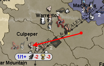
@redrum As I said, I personally would show only the movement, not the max movement available (so "1", instead of "1/1"), because, when I play a map, I've at least memorised the movement abilities of its units, so I surely don't have any use for that, but just my personal preference. Ask around. If you want to keep the max movement, maybe having it smaller, like it used to be. I think the suggestion of having a menu option for switching off this feature is anyway good, even if the feature itself is improved (in my opinion, almost all add-ons should be optable out).
-
@redrum Also, I'm not sure what the "+" after the "1/1" is for.
-
@cernel it shows the resources
-
@prastle Yes, I got that after the "+" those are the fuel costs, but I don't see why having the + itself. I guess the "+" is there for saying "plus the following resources fuel costs:", but I'm not sure. Anyways, in this case, I think it can be removed (it kind of looks saying that the unit has "1+" max movement).
-
@cernel correct
_+ this is used -
@Cernel The "+" is actually used to indicate that some of the selected units can move further. So for instance if you select an infantry and a tank to move then hover over an adjacent territory it'll show 1/1+ as the infantry can only move 1 but some of the other units (tank in this case) have additional movement. This is how its always been to my knowledge. I think it is helpful especially for new players and complex maps.
-
@redrum Ok, I would still remove the number after the "/" as well as the "/" itself and the eventual "+", as I don't think I've ever looked at them once (so you see I didn't even realize they already worked that way), but if you or most other people think otherwise, that's fine. I see your post is getting upvoted, not sure if that means your explanation is correct or the feature is appreciated.
-
@cernel For my part at least.... it was the later.
-
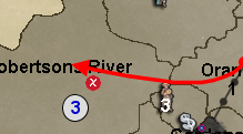
By the way, in case you have moved because of this matter, I believe it was better the territory name being lower left, as it is easier to find, and should really be the first thing you read.
So, I suggest bringing the territory name back in lower left, instead of current lower centre.Also, are you sure this should stay in Mapmaking? I guessed that section and Maps & Mods was for doing stuff to single maps, not to things that apply to several of them. I suggest moving this topic to Feature Requests.
-
@cernel I also grew very accustom to seeing territory name and info in the left. When I move battle calc windows around, it becomes bothersome since I usually place those under the chat bar, center/right orientated. And now can't see territory names.
Maybe someday, we will get a tab style method of minimizing, organizing and saving our various battle calc windows.
-
@general_zod Yah, it seems so obvious that the name and, then, the PUs value should be the very first things on the left (as it has always been), since this is how we read stuff, from left to right, that I can't believe the current disposition was wanted by anyone, but I guess it was.
-
@cernel @General_Zod This was an intentional change as from a UI perspective it makes more sense to anchor the resource amounts/income to the left than have it floating out in the middle. I understand that it may take some getting used to and that not all players will agree with the change but I do feel its a better overall UI layout. I do eventually want to take revamping the in-game UI much further and have most of the bottom bar information appear along a top bar as that is much more in-line with most other TBS games.
-
@redrum I agree with anchoring, and anything floating is bad, but why must it be two different things?
I would say nothing should float.
Just having the name, then the PUs, then the other resources from left to right, all "anchored".
Also having the other resources on the left then the name then the PUs I cannot get it.
Maybe what I'm saying is unfeasible for some reasons I can't see, but what seems natural to me is just having all anchored to the left. First the name, then the PUs, then the other resources.
Or you mean because the name can be long or short, so that means what is right to it then would be on different places? Well, I guess the space for the name can have a set minimum to be very unlikely to be exceeded by anything but overly long names.
Don't get me wrong, it was a nice surprise that now I see my silver ingot image instead of "PUs", but glancing at the name is much easier if it is in the corner.
Also, I strongly suggest avoiding displaying resources than no territories at all have. I've a bunch of utility resources, produced by no territories on the map, that would be better not having anywhere at bottom screen. I guess it should be easy to just check if a resource is present in no territory attachments and excluding it, if so. -
Or, if feasible, resources that are not part of the territory attachment are not displayed, while they are displayed, equal to "0 (+0)", if they are present in the territory attachment, but set equal to 0.
This way, the mapmaker can choose if having absent resources displayed equal to 0 or just skipped, by setting them equal to 0 in the territory attachment or not setting them at all.
How about this?
Really, it is not that strange that you may have a resouce that it is never produced by a territory (beside many strange ways to put resources in use, think also about the straight case of units that produce resources meant to be not primary), and that's just clutter, thus bad (it is sort of telling the player to expect to see that thing produced by some territory, while it is never so).
Hello! It looks like you're interested in this conversation, but you don't have an account yet.
Getting fed up of having to scroll through the same posts each visit? When you register for an account, you'll always come back to exactly where you were before, and choose to be notified of new replies (either via email, or push notification). You'll also be able to save bookmarks and upvote posts to show your appreciation to other community members.
With your input, this post could be even better 💗
Register Login