Alagaësia
-
So I found the issue with artwork not being available intermittently.
It depends on if the previous map was set to show map detail or not.
The map.hasRelief=true fixed it. Now the option is available all the time, even if it opens in plain mode.
Btw, @redrum, thank you no more silly zips needed to make small changes.

-
Found the boat issue.
This needs to be false since combat boats are also transports.
"Ignore Transport In Movement"
Or can add " isCombatTransport" value="true" to the unit attachment, but you have only 1 type of boat, so both ways will work.
-
@alkexr I am guessing since no reponses it's ok if we keep working on this map without your input?
-
I played the 4 player multi version again. I have more suggestions and a save game for ya.
This time Surda and Dwarves were played by one guy. Also added 1 wall + 2 humans to Cithri via edit. This takes away Empires easy r1 conquest of the territory. However they can take it if the are willing to sacrifice a dragon rider.
0_1523163497412_connection_lost_on_Apr_07_at_16_33.tsvg
The game was looking ok until a miscalc caused Sudra to lose Cithri on r3 and Varden allies conceded on r4.
So feedback from the allies and myself is that dragon riders are very cool. But there should be a limit or upkeep or both applied to empires ability to buy them. An alternate even cooler suggestion is to get them with random but short quests. Maybe something like purchase the dragon riders and they need to get to the territories with the eggs. At which time they get full powers of rider and dragon.
Example, Eragon must get Saphira's egg. Making them unique and unreplaceable might be cool.
-
Game notes are short but not so clear. Could use a rewrite.
-
Game notes incorrectly list dragon riders abilities.
-
Elves start with one dragon rider but can not buy any, is this accidental?
-
Cavalry should get blitz ability.
-
Should Surda build urgals?
-
Adjust dragon rider production so they can't be exploited early or easily.
Btw I made an alternate color scheme for the @prastle, he has trouble with certain colors. Take a look it, maybe just make it official.
link updated 05.27.2018
https://www.sendspace.com/file/ih90jk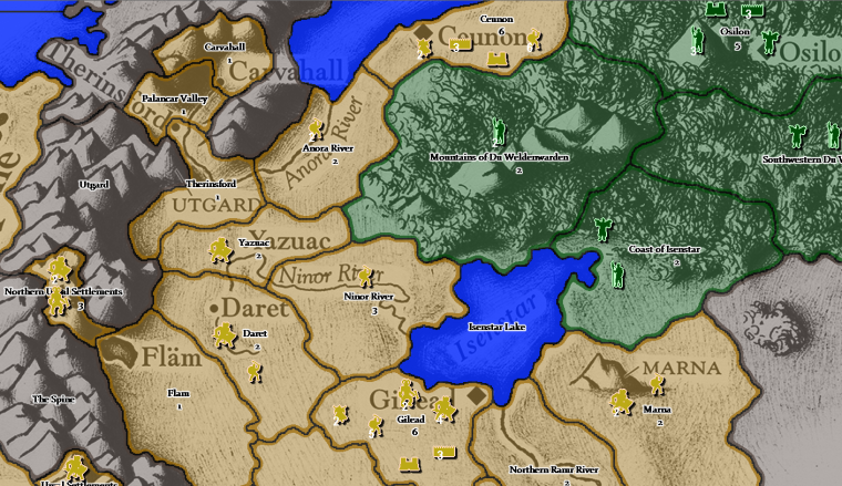
One last note, maybe the magic and tuff units can have a color coded highlight to help people identify what's what. Using white highlight for basic units, fluorescent green for toughness and fluorescent orange for magic users.
-
-
@prastle Sorry for that, it's not that I wasn't interested. It's just that due to recent events I've completely lost faith in humanity and the hope that people will ever stop making the same mistakes over and over again. So at the moment I don't feel overly motivated. Polish the map as you want, if you feel like.
-
@alkexr Sorry if I offended.
-
I'm sorry to hear that your going through some difficult stuff lately. I hope it's not too bad.
Ok I will tweak away on this map. The goal will just be a fast multi version that feels balanced and fun.
-
@general_zod Bright yellow is probably not a good choice, because it makes the units hard to distinguish and it may be tiresome to the eyes.
-
It didn't kill me. It made me stronger.
Okay so I will try to catch back up to speed.
First, I fixed @General_Zod 's boat and relief issue, as well as incorrect map notes for dragon riders. I will take a look at the rest later.Second, did you (as a collective) make progress with the map past what is in this thread? If not, I will jump right back into development, with the goal being to release an 1.0 in the official repository, after the rest of the feedback/balance issues have been adressed. This is first priority in my "TripleA project" right now.
-
@alkexr I did play another couple more games. In 4 player mode only. Even though half of those were really just 1v1 in 4 player mode.
-
Anyways it seems that balance is very close if we also place limitations on new dragon riders. Basically no new dragon riders for anyone, including as replacements for killed ones. This would basically be removing them completely from all production frontiers. (we just player enforced it)
-
Also added 1 wall + 2 humans to Cithri via edit. This takes away Empires easy r1 conquest of the territory. However they can take it if the are willing to sacrifice a dragon rider.
-
You would have to open up the Hadarack Desert to give more available strategies. But the current setup is cool for a fast map.
-
I preferred using the 4player mode even in 1v1 play because the asymmetry makes it more interesting. However others may like pure symmetry from an economic standpoint, for a 1v1.
-
-
New version (download from the same link in the first post). Changes:
- Territory names now use their original weird characters. Also fixed a misspelling.
- Sea territory names now have blue glow instead of white.
- Added game option to make dragon riders non-purchaseable.
- Dragon riders now cost 32 -> 42
- Elves can purchase dragon riders.
- Added game option to allow wall placement anywhere. This also limits the number of walls that can be placed in any territory each turn to 1.
- Added 2 humans and a wall to Cithrí to prevent round 1 conquest by the Empire.
- I don't think cavalry (or any unit on this map) should get blitz. In the presence of huge stacks you would just simply leave 1 fodder unit on each territory, which is not a significant loss if it dies, but it prevents the blitz of up to a zillion enemy cavalry. Some superblitz-like ability previously discussed on the forum might make sense. Until then I will only consider using blitz if a map has small enough stacks that the loss of a fodder unit might be significant.
- Urgals didn't really participate on either side of the conflict due to their general distrust toward humans (except in the battle of Farthen Dûr bound by the spells of Durza), but they are very iconic to the universe so I think they should be represented. The Urgals of Surda represent the tribe of Nar Garzhvog.
- The Hadarac Desert is as impassable as anything gets, Eragon never crossed it, not even on dragonback, only the edges. Opening it up would also expose parts of the map with only minimal amount of details.
Unresolved issues:
- Inadequate unit visibility
- Stack numbers visibility
- Incomplete and messy game notes
-
By blurring the relief map and tweaking colors a bit I managed to increase unit visibility, as well as stack number visibility (though light yellow-ish stack numbers work better than white on almost all maps imo).
Not yet downloadable. Parts of the map snapshot (whole image too large, can't upload):
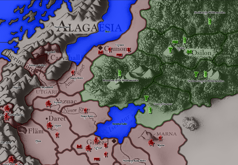
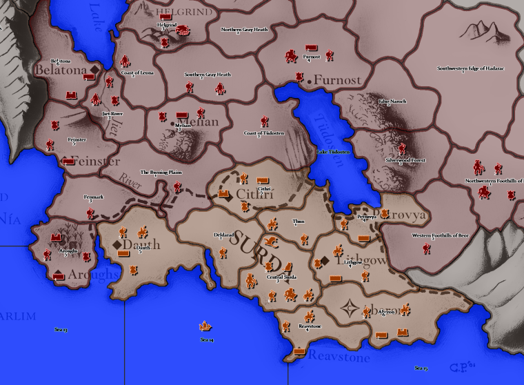
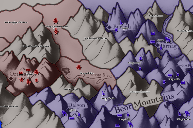
Also I noticed now that the last version broke compatibility, so if you have a game in progress, you should back up the old map version.
-
@alkexr It looks great!
 Units are very visible. But I can see that territory borders in forests and mountains combined with darker player colors can make the borders hard to see.
Maybe it is not really a problem when playing, I have not tried the map. If it is, maybe lighten the darker of the player colors a bit or make the player color border outline more clear in problematic areas?

-
@alkexr It looks like a clear improvement, especially for the elves, but I would also suggest pushing Surda a little bit more to the yellow (I'm not saying making them yellow, mind you), to set them apart from the guys up north.
-
The units pop more now but you sacrificed the nice brush stroke texture. We didn't have any issues with the identifying units on background just getting used to what abilities they had. I made one suggestion above that maybe give a different highlight/glow to help in that department. The only other issue was one of the guys that plays multis (@prastle) often had hard time with the colors them selves. He struggles with some colors. The color scheme I had made allowed him to play the map.
-
@general_zod Your sendspace link has expired.
-
Well, maybe it would be much more practical if I asked @prastle directly what colors he prefers. May I take a guess that it is the reddish Empire and the green Elves that causes the problem?
-
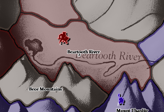
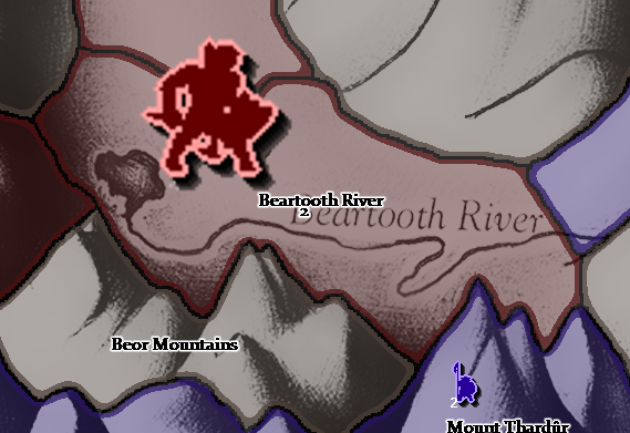
@alkexr For Prastle you simply have to make every unit 100 pixels by 100 pixels. :smiling_face_with_open_mouth_smiling_eyes:
Something like this.
Before...
Prasified...
-
@alkexr yes reds and greens are what I have troubles with or shades thereof.
-
@hepps giggles You are correct sir!