Map Maker Resources
-
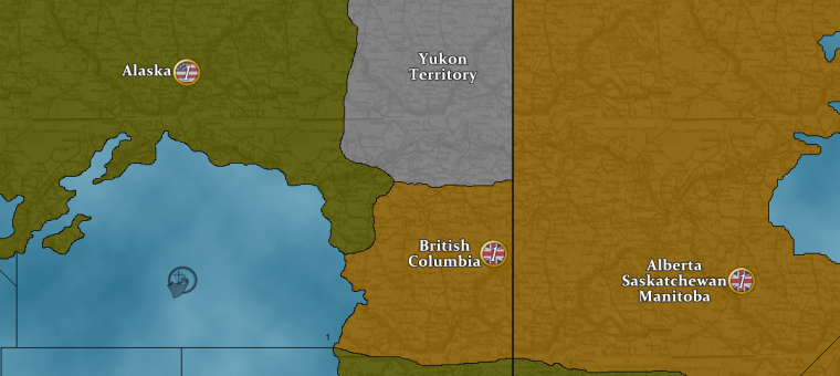
@beelee So went a bit of a different direction with it.
Thought we could create something fresh and new.
Let me know what you think...
-
@hepps Probably need a bit more contrast for the numbers.
-
@redrum Just a draft.
-
@hepps hey cool man ! Agree with redrum that the numbers need to stand out a bit more. Also would be cool to outline the original ones as well, for those that don't want to embrace change : ). People being conservative by nature : ) and all
-
@beelee Yes the numbers would be bolder and with a slightly stronger outline. Was more interested in whether you liked the concept.
For the PU markers themselves... you can have both in the folder... but you have to set a default set. So if you want the new ones... then you'd have them as a default. If a player wanted the old ones they'd have to unzip the game and edit the PU folder themselves.
So the decision comes down to whether you would want the new design as the default setting... or whether it is just a secondary optional set placed in the PU folder that every player would have to alter themselves to use.
-
@hepps right on. I'll probably just go with the original for the default but it's always nice to have options. Thanks for your time on this
-
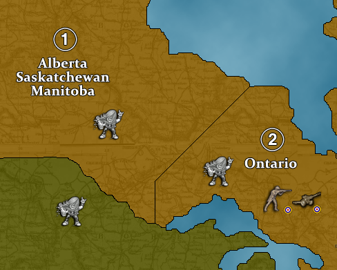
@beelee Here you go... Rock nation... though I am truly not sure Triple A is ready for this.



-
-
@beelee This is how I would do the PU markers. But it is a lot of work since I would have to do it for every territory on the entire map.
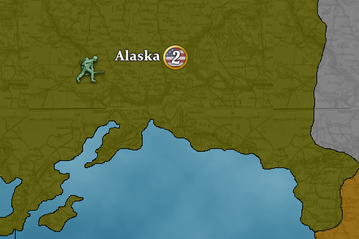
So the question really comes down to this... am I doing this for the actual map... or just a special "Beelee" private stock black label version?
Because truth be told I am not in for revising the entire map just for a fun private version. This map has so many visual issues I hardly feel motivated to change anything on it without addressing everything... and I really don't want to address everything.
-
@hepps yea thats cool. Just wanted the PU numbers to look like the way redrum did the unit numbers. Thought the new images would just replace the current ones in the PUs folder. So yea, will shelve this request : ). Getting ready to add "Rock On Heppster" image : )
Thanks again
-
@beelee Well here are the same PU images just with slightly more black outline.


Not sure whether this is what you were looking for.
-
@beelee Here is the the same darkened outline with a cream filled center...


-
@beelee And here is the same darkened numbers without any fill or ring


-
-
@beelee thanks for your time Hepps. I'll quit bugging on ya : )
-
@beelee he loves this! Its why he is a Sexcellent map maker!
-
@beelee No bug. Just let me know if one of those works or whether you were looking for something else. I have no issue with doing easy changes. Just the first style I was going for was far more in depth and only worth it if we were actually changing the official map.
-
@hepps right on. I'm gonna try th e black outline first. Should totally save the other ones. The more the merrier imo : ) Heh Heh Digging "Rock On Heppster" Image. brought tears to my eyes : )
-
@beelee said in Map Maker Resources:
@hepps awesome hepps ! Here's "Rock On Guy " :
Have tears in my eyes

Now what you need are Rocker units to invade the yuppy fortified positions.

-
@hepps i almost spotted ! LOFL
