Unit Icons Added By Conditions
-
@cernel TLDR? I've already implemented the initial proposal so if you have any slight variations then I can consider them but needs to be more concise.
-
@cernel Yes that's tldr. But from skimming through the first paragraphs I suppose you want complete unit image replacement.
But what if I want to have 10 different bonuses, each applicable to every unit - will you, then, create 1024 unit images for each unit, instead of 1 image per unit and 10 unit icons? (Exaggerated, but still.)
If the unit image is worth completely replacing, then it's also worth creating a new unit for that purpose.
I have multiple ideas that I could do with unit icons, and they are generally much easier to implement with unit icons than image replacement.
-
An alternative name choice for (map/unit_icons.properties).
(map/image_manipulation.properties)
-
A couple vague ideas so far as related to this feature, would be as follows. Specific details and examples are really undetermined at this point. I will just post here as they come to me.
Also @cernel has some interesting related ideas on flexibility of this feature, although he should point those out more concisely.
-
technology related (similar to hard coded techs)
-
experience related (would utilize unique units)
-
display unit (or non unit) image related (fog of war)
-
alternate name display for images related (alternate unit names displayed for images)
-
non unit image related (also manipulates non unit images such as resources, terrain, decorations, flags, etc..)
-
diplomatic/political image related
-
national objectives image related
-
risk style cards image related (any cards really, ideally as long as visible to only current players, however can be setup to be visible all time for non secretive version)
-
damaged unit related (sbr or combat damage)
-
unit stacks related
-
unit status as related movement, phases, presence and abilities related
-
-
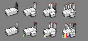
I decided to make an example of how this can be used pretty easily to change a unit based on conditions...
This is just a quick rendering of just how easily this can be used.

Seems to me that this feature can be used in a myriad of ways currently.
-
@redrum Do these suit your delicate sensitivities better?

-
PR merged. This can now be tested in the latest pre-release: https://github.com/triplea-game/triplea/releases/tag/1.9.0.0.10351
-
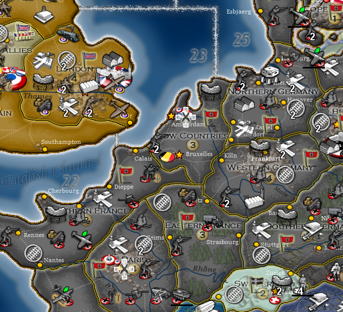
Example:

-

-
-
is there not a conflict between the the engine placement of unit player flags and these unit abilities/attributes? Are they not both placed in the upper right corner? And are there map.properties settings that can affect the placements? If not, maybe there should be.
Like a full set of options controlling the placement settings for stacked number text, damaged HP text, flag picture, these new unit abilities pictures etc. (I am aware of the all ready existing option to set stack number placement relative to unit picture)
-
@frostion Unit flags are bottom right aligned. Unit icons are top right aligned. But everything is also layered so unit flags are always on the top most layer. Essentially layers go "unit" -> "unit icons" -> "unit flag" -> "count/damage".
-
@redrum I think it would have a good value having an option to switch unit icons (I'd call them unit indicators or unit signage, as I said) off, in the "View" menu. In this case (the user being able to switch them off), it may also be good to allow mapmakers to disable this feature for the specific map (in map.properties), in case the icons/indicators/signals are essential to it (like different units distinguished only by a red dot).
-
@cernel For example, somebody could update WAW to have the red dots as icons/indicators (instead of part of the units images) and, if there would be an option, the user could decide if he wants to see red dots or not (since 2.0 red dots are not necessary, as the units are distinguishable without).
Even if the name remains icons, I'd call them "indicators" in such an option for the user (like a red dot or a green triangle I think it is more specifically an indicator).
-
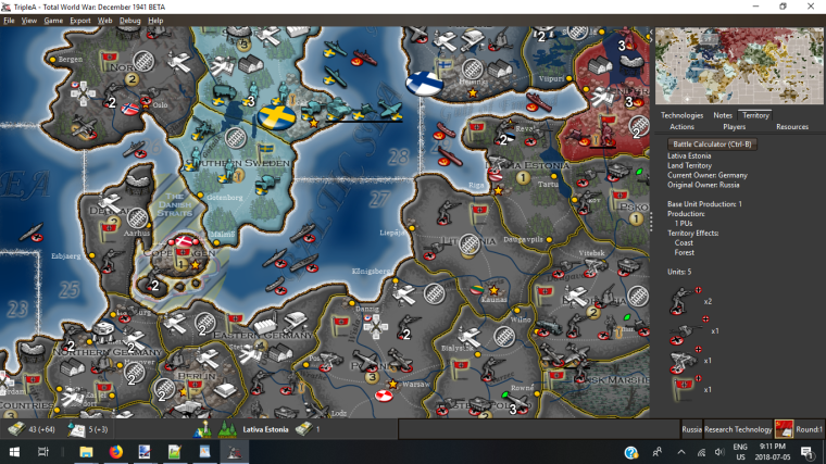
Its really funny what a little information can do. Am playing around with @CrazyG HoH map and @CrazyG got Crazy and added Techs. I been trying to help debug a few of those Tech and then I had @Hepps Red (attack bonus), Green (movement bonus) and Yellow (defense bonus) pie overlays, and WOW! Must say really changes everything when you can look at you opponents cannon and tell its attack got improved!
This is a really great idea!!
Thanks to all that contributed to it.
Cheers...
-
@wc_sumpton Yup... going to really take the mystery out of games with greater complexity.
In my soon to be released TWW with this included it is going to make a world of difference and make the game far more playable.
-
@wc_sumpton What no screen shot? Talk about being a tease!

-
@hepps
Ask and ye' shall receive :smiling_face_with_open_mouth_closed_eyes:

Cheers...
-
@Hepps
:upside-down_face: I used your techToken icon...Cheers...
-
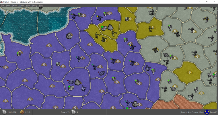
Going to try adding this to HoH.
@wc_sumpton
Would you mind sharing anything you've already done for this?
Hello! It looks like you're interested in this conversation, but you don't have an account yet.
Getting fed up of having to scroll through the same posts each visit? When you register for an account, you'll always come back to exactly where you were before, and choose to be notified of new replies (either via email, or push notification). You'll also be able to save bookmarks and upvote posts to show your appreciation to other community members.
With your input, this post could be even better 💗
Register Login