Drop: Substance UI "Look and Feel"?
-
If you don't like the dark grey or want to have black text, I would suggest to go for a silver colour, but not whiter than that.
https://en.wikipedia.org/wiki/Silver_(color)
#C0C0C0 -
Maybe a kind of Green soldier color (Dark Olive) or Green gray color could be more appropriated for war games: https://www.google.com.mx/search?q=green+soldier+color&tbm=isch&imgil=w8-cNrsmD8jqFM%253A%253B0F0KK7QoqofF2M%253Bhttps%25253A%25252F%25252Fwww.pinterest.jp%25252Fvesnavesna17%25252Fzeleno-maslina-olive-army-woodbine-avocado-green%25252F&source=iu&pf=m&fir=w8-cNrsmD8jqFM%253A%252C0F0KK7QoqofF2M%252C_&usg=__C27IQ3LdyDIC-2n5OM82LMUsYWA%3D&biw=1920&bih=934&ved=0ahUKEwjToL-39MrVAhWCORQKHTllBzwQyjcIMw&ei=l2WLWZP5MYLzULnKneAD#imgrc=SAOf0CitWoKk_M:&spf=1502307814783 it’s just a proposal!
-
@Cernel There are still lots of options. This thread is primarily about removing a portion of the themes (including what is now the default) as from a technology standpoint they are somewhat outdated and can cause issues from different users. So input on the 'new' default in the pre-release or other themes in the pre-release would be beneficial.
-
@redrum Ok got it. It is because the default is one of those that are obsolescent. Was not very clear, at least to me. I'll take a look relatively soon.
-
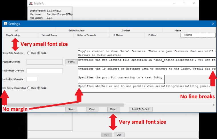
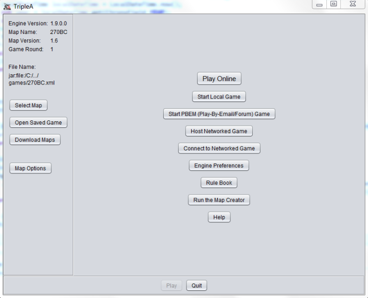
I have testes out the new default theme that was chosen automatically by TripleA_1.9.0.0.6112. First impression is that I don’t like it. I noticed some stuff maybe related to the themes, and I would like to show them here. Here is what I see:
-
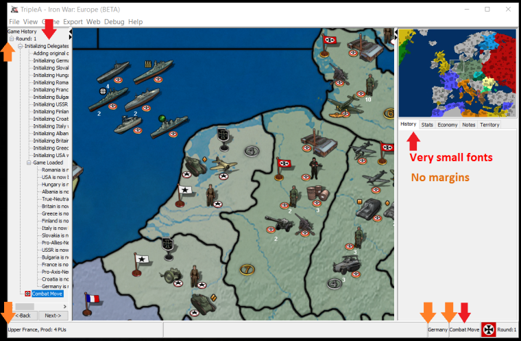
Maybe the light grey is OK for the menus, but it is definitely not fitting for ingame. I find the bright new color very distracting. When looking around, when shuffling menus and especially when looking at battle screens. Dark frames, screens and popup are much more to my liking and more pleasant to look at and work with. If it would be kept dark in game, then I would recommend that also menus were dark, for consistency and to keep that classic TripleA engine look that maybe makes this game distinct from every other program we all might work with.
-
I don’t know what the default theme I show here is named, but it was the one chosen when I started up the game for the first time. If Substance UI is removed, I would recommend a dark (as current default) version of “Metal Look and Feel”. It seems to be the theme with the least issues. Some of the other themes have strange scroll bars, tiny fonts, horrible looking buttons or are just archaic looking.
-
Overall I would recommend TripleA to only have one theme, with maybe a few color variations of this theme. Like just a dark, medium and bright version. Most other games do not have and do not need themes or menu color options, but as this is a multiplatform and kind of geeky game, it is maybe OK to have some customization. I would still recommend ONLY one theme as the devil is in the detail, and if there could be some visual improvement to menus, the changes would look good on everybody’s screens as everybody saw the same thing, maybe with just some dark, medium og bright variation.
-
Maybe this new theme(s) could be accompanied with an option for tiny, small, medium, large and extra large fonts? Like an option that changed ALL fonts sizes in the game via one option, and not demanding that one should type in font sizes. As it is possible to have an “Edit Map Font And Color” in game, I hope it could be possible to have a general option to adjust UI font sizes. I could imagne this usfull as some might play with 1024px screens and some maybe 4K.
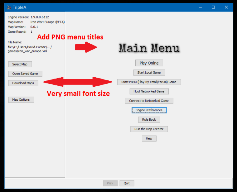
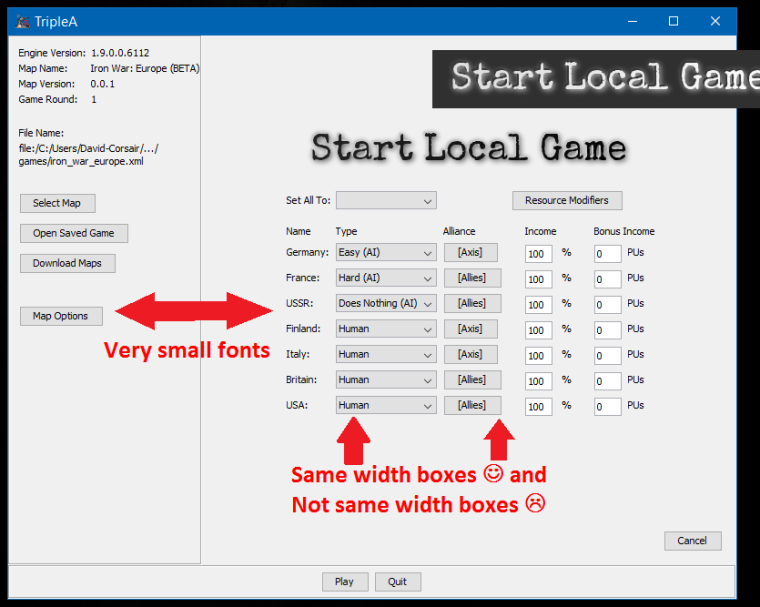
Here is some of the stuff I would like to see altered. I guess most is not related to themes. I would like to see added graphics to menus, and these PNG files are easy to make, like at cooltext.com:
NOTE: I am aware that not everyone sees the same things on screen, as we have different windows / OS versions and settings, so the below might look differently on other systems.
Map maker of: Star Wars: Galactic War + Star Wars: Tatooine War + Caribbean Trade War + Dragon War + Age of Tribes + Star Trek: Dilithium War + Iron War + Iron War: Europe + Warcraft: War Heroes
-
-
Sadly the new default theme is too bright for my eyes. I am used to work in a somehow dark environment, so this light grey is sort of painful.
In case you really want or need to get rid of the substance look and feel (personally I love the graphit scheme), please consider to offer a dark scheme as alternative.
-
@Frostion Lots of good feedback. And I definitely agree that the in-game panels are the biggest issue with the new light theme. They tend to draw attention from the map.
-
@redrum Is there an issue with creating a darker or more neutral theme?
-
@Hepps Currently, all the themes available are default themes (we didn't make or design them). Not sure that I know the answer on how much effort it would be to either create our own custom theme or modify one of the existing ones. I think the hope here is we can use one of the available ones that is maybe similar to the old default one that we'd like to retire.
-
@redrum So then am I to understand the existing themes are all bright?
-
@Hepps It does appear on the non-substance options are on the lighter side. I think the best solution here if we do want to move forward removing substance UI would be to customize the "Nimbus" theme to have darker colors as its probably the nicest looking (here is the default Nimbus that we could make darker):
@Frostion Did you try out the "Nimbus" theme?
@LaFayette Thoughts on a darker version of "Nimbus" as the default? If we are looking to replace this anyways does it make more sense to just leave substance L&F for now?
TripleA Developer with a Passion for AI: https://forums.triplea-game.org/topic/105/ai-development-discussion-and-feedback
-
@redrum That seems decent...if it could be darkened a little it seems like it would work.
-
@redrum The Nimbus theme would also look good if darkened (for the people wanting darkness
") I have no idea what kind of files the themes are made up of, but might it be as simple as to scan the files for hex colour codes? And then alter them? The light grey of this theme seems to be color #D6D9DF, if this is the right track.
I have no idea what kind of files the themes are made up of, but might it be as simple as to scan the files for hex colour codes? And then alter them? The light grey of this theme seems to be color #D6D9DF, if this is the right track.Anyway, the Nimbus theme has some strange looking scroll bars. You can see them if you go to the "select map" windows, and also in the bottom of the "view history" frame.
I think the Nimbus theme has wider scroll bars than the standard theme has been using and maybe all other themes too. I have seen you devs fix the minimum sizes of frames, alter margins, spacings etc. So fixing scroll bar widths would hopefully be possible. I would guess the Nimbus scroll bars are made to need a fixed width available, so that the scrolling button are fully displayed, and currently Triplea is not set to follow that width. As a side effect, if it got fixed/adjusted, then other themes might look weird. And then I would again suggest to aim for 1 Triplea theme, with a few colour options/variations.
-
@Frostion Here you go. Just as a concept.... I know everyone is going to want my Avatar as the back drop.
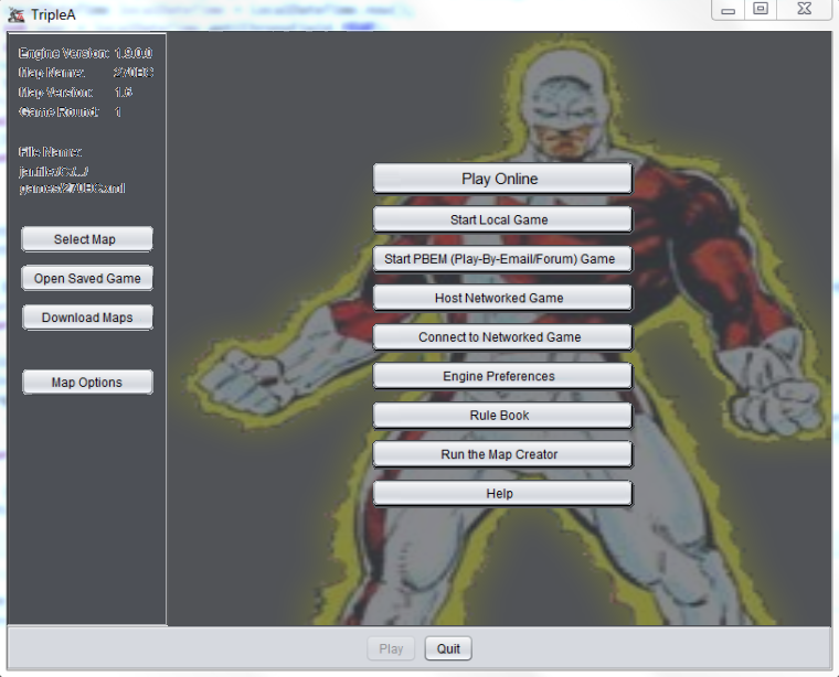
This was really more just about examining a darker background colour and having a buttons the same width.
"A joyous heart sours with the burden of expectation"
Hepster -
@Hepps Well, seems like most things are possible
 That's a great start.
Tell me if you need me to make some PNG files with menu titles like in my mock up pictures in my previous post. -
@Frostion I don't know if a typewriter font is necessarily the way to go since we want to emulate buttons.... But if we are creating Headings... I like the typewriter font and then do it on a paper background.
-
@Frostion said in Drop: Substance UI "Look and Feel"?:
I have testes out the new default theme that was chosen automatically by TripleA_1.9.0.0.6112.
What was that?
I've installed and started .6115 and the default I have is still the same SubstanceGraphiteLookAndFeel for me (or at least I guess it is the same as old, as it looks the same).
And if I click on Reset To Default, it goes to "SubstanceGraphiteLookAndFeel".
?
@redrum said in Drop: Substance UI "Look and Feel"?:
@Cernel There are still lots of options.
The options no substance I have are:
Metal
Nimbus
Motif
Windows
WindowsClassicSo, total 5, which would mean the default and 4 alternatives, Is this all? Not saying that are too few; just wondering I'm missing something, since you said "lots". Are the two windows available for whatever other systems too?
How can I know what is the new default if for me it is still the old?
-
@redrum Why metal is called metal? It is just almost pure white.
Anyways, as a matter of first impression, I dislike them all, or at least they look to me much worse than current.
If I must name a favourite, as a matter of first impression and colour, I would say the only bearable one is "Motif".
Anyway, that one is weird about the buttons and stuff (just try it yourself, I guess you'll see), but the main annoiance is that all the buttons and stuff are so very small. Also the politics screen looks very bad in that one.
So, at the end, all considered, I agree that "Nimbus" is the best all around.
Problem! When I click on the purchase screen in any games it opens the good one only after you close an initial empty pointless one. This happens both with "Motif" and "Nimbus". Do you or anybody else have this problem too (I guess not you)?
-
I actually like and approve that in the "Territory" tab the writings are so small. That minimises the space taken by stuff like "Current Owner: AustrianEmpire" and leaves more room to display the units.
So this is a thing that I prefer over current.
Also, the small text allows reducing the right bar more, as long as the minimap is small enough, allowing more room for the board, which is good too.
So, I'm personally in favour to the very small writings of the "Nimbus" theme.
Another thing is that the notes (Help/Game Notes) look better on white (it is customisable, like in the case of NWO and WAW, but most maps don't).So I think the two main problem of "Nimbus" are that purchase bug (anybody else?) and the fact that it is too bright, aside from the notes display and such, that it is fine being bright.
-
@Cernel I don't know what the white theme I tested and took some screen shots of was named. But I guess if you looked themes through you have seen it by now.
When I deinstalled a version TripleA_1.9.0.0.5somthing and installed TripleA_1.9.0.0.6112, then my theme was automatically changed to the white theme. I have never previously changed themes before, not even tried it out.
I have Also seen some weird stuff happening with buttons and windows in relation to changing themes.
Hello! It looks like you're interested in this conversation, but you don't have an account yet.
Getting fed up of having to scroll through the same posts each visit? When you register for an account, you'll always come back to exactly where you were before, and choose to be notified of new replies (either via email, or push notification). You'll also be able to save bookmarks and upvote posts to show your appreciation to other community members.
With your input, this post could be even better 💗
Register Login