Unit Scroller Issues & RFC on Changes
-
Problems
-
Space bar to skip turns out to have been a bad move. Space bar will take priority on any highlight button. So if you press ">" to go to the next unit, the 'next unit button' becomes highlighted. Pressing space bar again will activate the button again instead of skipping! Similar if you sleep a unit, then press space bar to skip the next unit, the sleep button is highlighted and space bar will then sleep the next unit.
-
Keyboard listeners look to continue to be a mess as a client to bot games and keyboard focus is constantly loss. This is just seemingly a problem and often the map has to be clicked to get focus back so that the hotkeys work. It's a bit unclear why a hotkey like 'F' tends to work most of the time but not the unit scroller keys.
-
Going to a next unit and skipping tends to really be the same thing often in practice.
-
Client games to bots have a bad ordering and clicking next and then previous does not always seem to line up and actually go back and forth between units.
Proposed Changes
- Remove the skip button
- Next button will proceed to the next unit & skip (skipped units are subtracted from the active unit count)
- Remove the previous button. If the next button skips units, then previous would skip over the skipped units and one would go to the back of the queue of units, which would seemingly be just as random as going to a next unit. For example, let's say we have unit ordering: A, B, C, D. If you are on A, and you go to next, then A is removed and we have B, C, D. Clicking previous would go to unit 'D' instead of 'A'! Since the user is none the wiser that 'C' was supposed to be next vs 'D', previous is not super meaningful.
TL;DR
- merging the skip button into the 'next' unit button
- removing the previous unit button
-
-
This PR is staged to make a number of these changes:
https://github.com/triplea-game/triplea/pull/8278
-
Looks good to me.
-
(I posted on the Github page concerning this, as I did not see this page on the forum. My concerns remain kind of the the same)
Just tried out a newer pre-release https://github.com/triplea-game/triplea/releases/tag/2.6.22447 (With the NEXT and PREVIOUS buttons removed) … and I am disturbed to say the least, even though the changes made to the Unit Scroller seem intentional, I see them as a step backwards in regards to developing the UI. So I pray for these changes to be reconsidered / modified.
A
With no “Next” and “Previous” in the scroller, it is not possible for players to scroll forward through the list of territories that are to be managed, past units, to later scroll backwards to revisit these same units. It makes it impossible to use the scroller to scroll through units / territories, only moving some units while scrolling through others, with the intention of later returning to scrolled-through/unmoved units.
I don’t know how “most players” use the scroller, but this is how I use it. I would really miss being able to scroll through units to get an overview before actual moving them.
I would actually say that the Next/Previous features of the scroller was the whole idea behind the scroller and the basic mechanic, with sleep and alert just being extra advanced features.Personally I actually wouldn’t mind a simplified Unit Scroller, but I would configure it like this:
PREVIOUS (Press “,” or click for Previous territory with unmoved units)
ALERT (Press “A” or click to Alert all unmoved units in all sleeping territories)
SLEEP (Press “S” or click to Sleep all unmoved units in this territory)
NEXT (Press “.” or click for Next territory with unmoved units)But I must say, that even though I don’t use Skip/Checkmark feature, I imagine that some players have already gotten used to it and actually would miss not being able to just skip specific units in the combat move round only.
Other issues that has followed with the update:
B
Also, for some reason, the scroller's collapsible bar now cuts unit pictures. Before, it was actually able to show unit pictures of different sizes, with no cutting. I think it is because the Scroller now wants to show non-movable units like factories and other infrastructure, even though they have no movement. So the height is maybe not different, but still messes up unit pictures.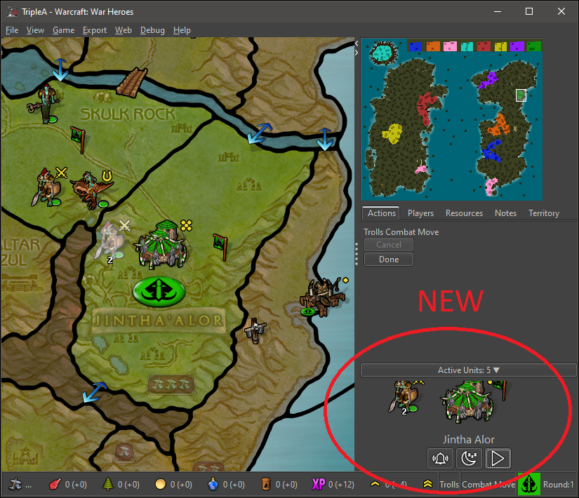
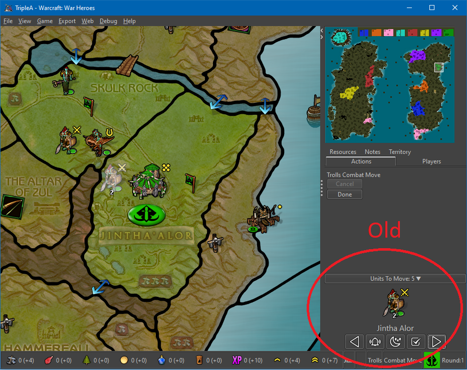
C
There is also an issue with the unit pictures becoming invisible if/when the player manually resizes the TripleA game window.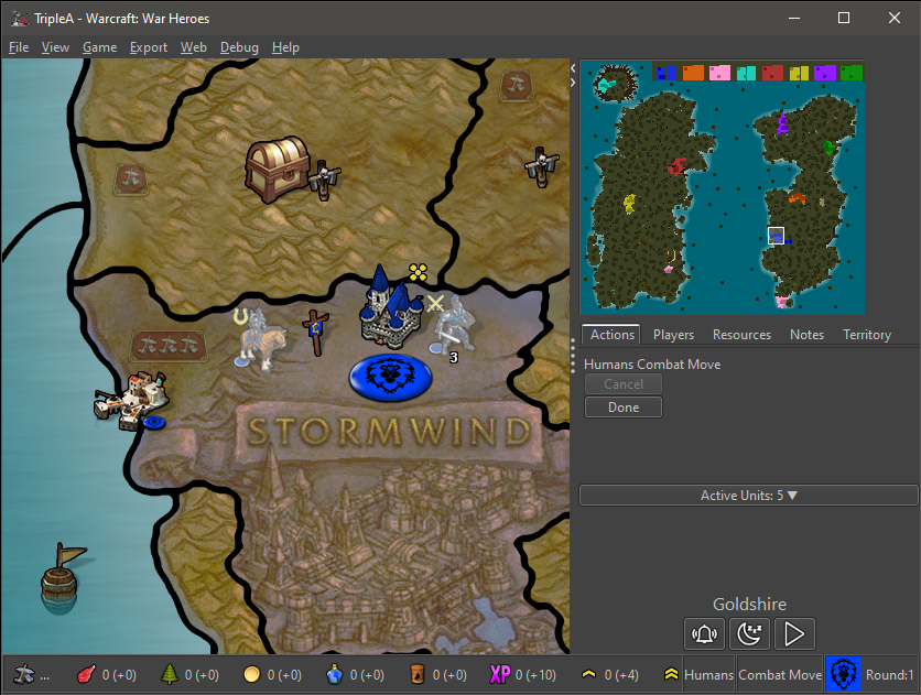
-
(C) we can discuss in the issue as that is maybe a defect.
The removal of skip was discussed in the OP. Perhaps not mentioned is that we need to spend more time working on multiplayer games, particularly with respect to hot keys. In MP games it looks like the chat text area grabs the keyboard focus (or somewhere), hence half the time it looks like any hotkeys are broken and it's not obvious (nor should it be necessary) that you need to click the map first. Beyond that, the focus remains on the last unit-scroller button as well, which is also why 'space-bar' is a bad 'skip' button. Last, the unit ordering did not seem to always be stable in multi-player games. The updates have to some extent reduced us to lowest common denominator of functionality.
-
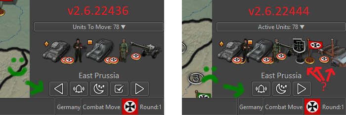
I also notice in the two images that
Old has menu tabs as;
Resources, Notes, Territory
Actions, PlayersNew has menu tabs as;
Resources, Notes, Territory, Actions, PlayersThis should have freed up more vertical space?
As a side note, the Notes tab is it needed? As it can be accessed from Help> Game Notes.
If its removed, on some maps it can make the main map screen bigger, by showing more of the map.
-
@TheDog 1 or 2 rows of tabs are just determined by the player manually adjusting the width of the right UI bar. Do this by left clicking the border between map and right bar.
The rigth bar has the minimum width of the minimap jpeg or png. Even if there was only one 1 tab, the right bar wouldn't change size.
-
Oh yeah, thanks.
Frostion just noticed your an Admin, well volunteered!
-
Any further thoughts on the 2.6 unit scroller?
After having used the unit scroller now quite extensively in 2.5, I'm finding the 'sleep' function to be rarely used. I typically will just scroll past those units without even bothering to sleep. This is particularly the case in multis, there are few units worth sleeping and the set of sleeped units disappears on game save, which means it's only valuable for a round or two anyways.
I wouldn't mind seeing the 'previous button' restored personally, though the inconsistent ordering was a problem. At the same time I'm not sure if it's even worth having (or is really needed).
Can anyone speak to how they are using the unit scroller chime in with how they are using it?
-
@LaFayette not 100% sure I'm answering the right question but with the new, 2.5 anyway, where it shows you what you purchased and what has movement, I close it to start as I find it distracting when moving and like the uncluttered space. I'll open it to see what I bought sometimes before making a move. I rarely use the movement left as it's kinda time consuming and I usually know what I've done but I've burned myself by not checking more than once.
I like the feature and use it but would prefer it defaults to close. If that's what you were asking about : )
-
I make my moves, then use the unit scroller to step through the units that I have missed/not moved.
I have never used the Sleep button.
Also I never used the previous button in the previous version. -
I'd like to try and get this ready to be shipped in 2.6. (cc/ @Frostion). Feedback submitted any later than a week or two from now will cause rework and likely will be too late (that's akin to moving furniture, someone comes in a week later and says "no, the couch should be there", then a new person 2 weeks later and says, "no, over there", meanwhile the couch has to be put somewhere).
A) Sleep Button
I think it turns out the 'sleep' button makes sense but is just not that useful. Specifically because:
-
- It's pretty easy to cycle through all units, typically there are not that many that would be put to sleep.
-
- Sleeping units are not persisted in save games.
\B) Next vs Previous & Skip
The unit scroller idea is largely taken from 'civ'. Civ has three concepts:
- 'F' to fortify (mostly equivalent to what we were calling 'sleep'),
- 'S' to 'sentry'
- 'space bar' to 'skip'
Civ has no concept to go back to the previous unit.
After using the unit scroller quite a bit in 2.5, I found:
- previous is just not useful. When selecting a next unit, either they are to be moved or skipped
- space bar colliding with the actively selected button (the last button used) creates a very glitchy seeming UX. See previous comment for more details. TL:DR, we must avoid key bindings to the space bar.
- In multiplayer games, the ordering of units was not deterministic, 'previous' did not always go to the previous unit.
I think it makes sense to therefore have 3 options with the following key-bindings:
- (s) skip
- (.) next
- (a) activate-all (AKA, unskip-all)
I am unsure whether 'activate-all' needs a key binding.
-
-
B ) Regarding the Next and Previous buttons:
The Civ unit cycler can surely give inspiration to Triple A, but in Civilization players have like 5-20 units to managed and move. Players have no problem maintaining an overview of the tactical situation. In World at War, in Iron War, in Total World War for example, it is totally different. There can be like 1000 movable units on the map.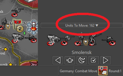
Players can have like 100+ units to move every turn, scattered over 50-75 territories worldwide. And I would say that every single TripleA unit movement a player does during his turn really affects many other of that same player’s movement decisions afterwards. With the players (sometimes) having 20 times more units to move than in Civilization, we are in a totally different league in regards to the complexity of unit movement and how struggle to keep track of every thing.
TripleAs need for a unit scroller is way different that Civ's, even though its most important function might be the same: To not forget any units. But with the huge amount of units to manage, the "Next" and "Previous" buttons are (as they are now) good tools to shuffle around the map and get that overview of all units to move, territories to keep in mind, threats to deal with etc. <-- This possibly BEFORE actually moving any units. Also, WHILE scrolling territories and moving SOME units is can be great to skip others and get back to them later, as the one might actually want to first move other units into place, before finally determining what to do with other units / temporarily skipped units.
I think that we have to keep in mind, that players have totally different playstyles and routines in regards of handling the TripleA UI. Some players use the shortcut keys constantly, others only click, buttons and menus. Some play simple maps like World War II Classic (with maybe no real need for a Unit Scroller), while others only have interest in huge complex maps (with a massive need for Unit Scrolling).
B2: Maybe the Unit Scroller should be worked on to address these differences in play style, maybe be made so it could be activated / deactivated in engine settings? Even better, maybe every single button (PREV / WAKE / SLEEP / SKIP / NEXT) should be individually chosen in setting to be displayed / not displayed? That would be a be a much better approach than to just removing buttons.
B3: Also, to address the issue of the current Unit Scroller seemingly scrolling randomly through the territories, in no logical order, maybe the scroller could be made to scroll on the basis of territory location / grid location starting at the top left 0,0? Or maybe scroll in alphabetical order? Whatever makes most sense.
A) Regarding “Sleep” option
There are many maps with many units that many players would like to put to “Sleep”. Again I think this is a matter of play style, preferred maps and how individual players use the UI and current scroller. I will refer to B2 as my answer. Make it customizable, Please don’t just remove the button.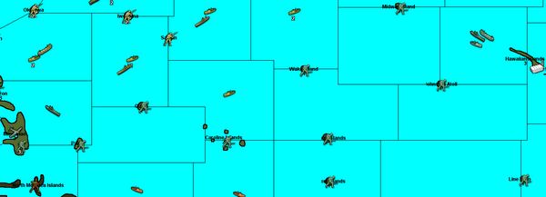
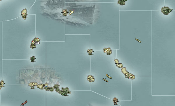
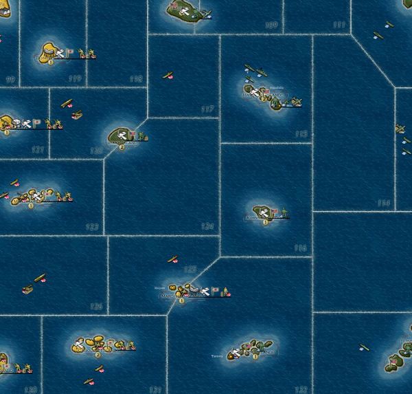
(Off topic, but Civilization's “Sleep” is not the same as “Fortify”. “Sleep” is what most units (workers, settlers, ships, mounted, armored, air units etc.) do when ordered to go inactive until waken, moved or attacked. “Fortify” can ONLY be done by foot soldiers and gives them a defensive stat bonus. It is like “digging in”. Since TripleA units do not get bonuses when ordered to go inactive, they would in Civ terms just “Sleep”, right up until they “Wake Up”. I’m glad TripleA v2.6.22436 at least still represents "Sleep" with a Moon and the shotcut “S”.)
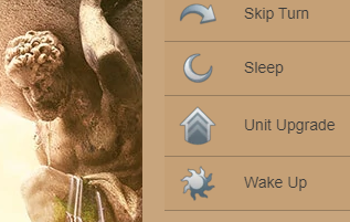
Final thoughts:
With all the above said, I am of course strongly advocating for the buttons to remain … not be removed. Or even better, made into optional buttons in a customizable unit scroller.PS: Why are units with no movement shown in the version where buttons are removed? This is also the case in the latest pre-release 2.6.22@dbde499ccc
-
@LaFayette It should be possible to shrink the right bar more. The minimum right bar should be settable per map (a way is having it determined by the wideness of the
smallMapimage) instead of being hardcoded.You can use my 270BC Wars map for testing.
-
@LaFayette If you are shrinking the right bar, remember you can remove the Notes tab.
-
@TheDog I don't think that is really related: even with the current minimum wideness, I think that is already too little for the tab (so you would widen the right bar anyway).
I agree that the notes feel a bit out of place as a tab, but I'm not sure about what is the better alternative, while the window one has a long history of issues for a gaming program with many other windows and prompts, mostly related to either hiding prompts or being hidden itself. For example (this issue is the same both for unit help and game notes):
https://github.com/triplea-game/triplea/issues/8607 -
@Frostion my perspective is informed from playing WaW, does that change your calculus? While '160' units to move is accurate, many of those could be in the same stack and effectively it's fewer.
If a person wants to cycle through all units one time before moving, couldn't they use the 'wake-all' functionality?
Is sleep used heavily in single-player games? In my experience vs AI, I would use it for a couple of AA, out of many units, it was kinda marginal. For multi-player, on WaW, it's kinda useless as a person rarely does more than 3-5 rounds.
-
Let's stay focused on the UX so that the scroller can be made better. I still see many players not realizing they can use it at all, or what it is, and then make the rookie mistake of neglecting to move a unit.
-
I'm still unsure about resurrecting the previous and next buttons. If a person really wants to cycle through all units before toggling them as moved, assuming sleep remains removed, why not cycle through all units once and then use alert-all to go back through them?
Can I get some more feedback on how exactly the previous button is useful as well. The ordering is not very deterministic, if you can see a unit on the same screen, then it seems that cycling is not super useful. On the other hand, if a unit is on the other side of the map, then previous also does not seem useful as well.
Please pay attention to exactly how you use this feature. IN which circumstances does everyone use the following?
- previous
- sleep
- wake-all
Really would appreciate as much feedback as possible here from those that have been using the unit scroller.
-
So far (on v2.5 release) I haven't really used the Move unit scroller (I keep it collapsed). One thing I noticed is that Aircraft which combat moved are not counted in Non-combat moves, I think it would make sense to offer a separate count for those, as they need to be rebased.
Non-combat move scroller display would show: "42 +6" if 6 air units combat moved, instead of just "42".
Hello! It looks like you're interested in this conversation, but you don't have an account yet.
Getting fed up of having to scroll through the same posts each visit? When you register for an account, you'll always come back to exactly where you were before, and choose to be notified of new replies (either via email, or push notification). You'll also be able to save bookmarks and upvote posts to show your appreciation to other community members.
With your input, this post could be even better 💗
Register Login