Main Screen Logo Needed
-
@ubernaut said in Main Screen Logo Needed:
since
So far consensus (organised by you the moderator) has been? 4 votes? Oh no 3 if we exclude yours. Is this serious?
-
@mirkobruner your paranoid conspiracy theory is baseless i have not organized anything and you're suggesting i should not get a vote?
i have tried to be welcoming and positive and stick strictly to the facts in our discussions about this topic as i know that people can be touchy when it comes to critique but honestly dude the way you keep trying to drag this discussion into the mud you are basically on my last nerve personally.
to borrow a phrase from you, maybe…
You simply don't like that nobody mentioned your designs. That's it.
-
@MirkoBruner , @ubernaut , please start working together and stop reading negative tone into everything the other says. Ya'll have built a house of cards here from a faulty basis. If you re-read from the start what the others have said, it's a bit clear that ya'll have been touchy and it got out of control from there. You both please need to be able to deliver more moderated constructive criticism and productive conversation for this to be net constructive. I don't want two talented designers fighting with each other and impeding your efforts and the efforts of others - it's not good for you, it's not good for the project.
-
I am put off from voting because of the agro, also Im not sure what the vote is.
I would like another thread with say images 1 to 5 numbered 1 to 5 for voting, so we vote for the one we like the best.
Please don't tell who's is who's as I don't want to know, as I have not followed this thread closely.
If we are voting for two images, then another thread please with numbered options.
-
Just gonna leave this here for @ubernaut and @MirkoBruner
https://www.youtube.com/watch?v=naleynXS7yo
Key & Peele - Text Message Confusion -
@lafayette @TheDog agreed, upon a return review of the entire thread it is clear to me at least, that there has been some unintended obfuscation and misunderstanding on both sides.
i think we are all looking for the same ultimate goal here so if we have to burn the existing vote and start over in a more agreeable fashion i have no objection. again i thought we were under the gun so that might have been a bit rushed.
")
-
@lafayette what is the status of this are we going to fix the logo/start screen for 2.6? it still looks the same in the latest prerelease.
-
@ubernaut At this rate it's looking more like a 2.7 project.
-
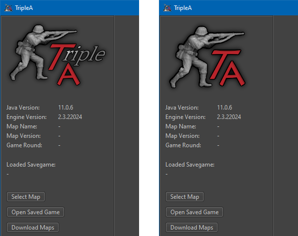
@lafayette aren't more or less finished with the logo part tho? the current one we can all agree is not as good as and dilutes our existing branding right?
-
It is very hard (for me at least) even to understand, at this point, what is the full set of proposed changes each of which is either decided or pending. Can someone make a full but concise summary of the current state of everything on topic here, listing the new and old items for every decided or pending change?
-
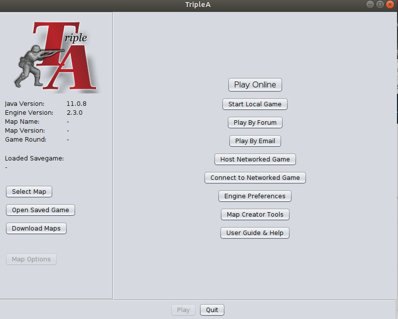
@cernel I would Think that the issue is mostly just to get rid of the current horrible amateurish looking Trible A logo at the main screen, the one with cropped shadow. And proposals are just solutions to that problem. Wether this means finding/changing the TripleA logo completely or just "fixing" a single image is obviously a debate.
Personally I would say that changing the basic logo of TripleA is a bigger deal and should wait for a time when/if the game gets a real facelift, aka UI or engine upgrade.
But I also think that the current image is unprofessional looking and screams "this is an amateurish game" rigth in the face of newcomers. Thats why I yet again throw my proposal back in the hat. That is to just use @ubernaut old image in an outlined version:
Here are files to toy around with: TripleA-New-Logo.zip The above has shadows added.
Map maker of: Star Wars: Galactic War + Star Wars: Tatooine War + Caribbean Trade War + Dragon War + Age of Tribes + Star Trek: Dilithium War + Iron War + Iron War: Europe + Warcraft: War Heroes
-
@mirkobruner Whereas I conceptually prefer the version that is now in use, so I just suggest polishing it (as it clearly needs to be), I'm thinking the second version you made is certainly not bad and can make use of the icon provided by @ubernaut.
I mean something like this:

-
@cernel That would look strange on a grey or dark coloured background. Also, a 2D version would provably fit far most of all the uses for the logo. If a 3D logo is chosen, several different size versions would have to supplement it. Most 3D affects get lost when shrunken down.
Map maker of: Star Wars: Galactic War + Star Wars: Tatooine War + Caribbean Trade War + Dragon War + Age of Tribes + Star Trek: Dilithium War + Iron War + Iron War: Europe + Warcraft: War Heroes
-
@frostion That is why I said "something" like this. We'd need @MirkoBruner to provide the original version (with no white background).
-
@cernel @Frostion yes, i am simply suggesting we swap out the current thing with our existing logo (your second example is what I'm suggesting, as it is our existing branding). if we want to re-open the discussion about the rebranding i think that should not be a blocker for simply swapping out the image in the meantime.
-
@frostion need left hand logo image on its own with transparent background.
-
@lafayette what size do you need?
-
@lafayette There is a zip file in my previous post. Does the link work? I think all the images are there. Otherwise ... i have no access to my PC for a couple days

-
@ubernaut said in Main Screen Logo Needed:
@lafayette aren't more or less finished with the logo part tho? the current one we can all agree is not as good as and dilutes our existing branding right?
As I said, I conceptually prefer the current one (which you are showing here) over what proposed at this topic so far. My suggestion (to anyone) is remaking it in a polished manner (not too pixellated, the main body of the figurine being neither blurred nor transparent and with no shadows cut). Also, I think it would be better for the figurine to be a bit bigger relatively to the rest: enlarging it by about 25%.
-
@frostion Sorry But I don't Understand what is needed here. I have all the files and I can provide anything you might be needing. Just state any request precisely. Too many posts, too many voices.. there is a big noise here. Just tell me what to do and I will gladly help.
Regards, to all.
Hello! It looks like you're interested in this conversation, but you don't have an account yet.
Getting fed up of having to scroll through the same posts each visit? When you register for an account, you'll always come back to exactly where you were before, and choose to be notified of new replies (either via email, or push notification). You'll also be able to save bookmarks and upvote posts to show your appreciation to other community members.
With your input, this post could be even better 💗
Register Login