World War II v3 update to master?
-
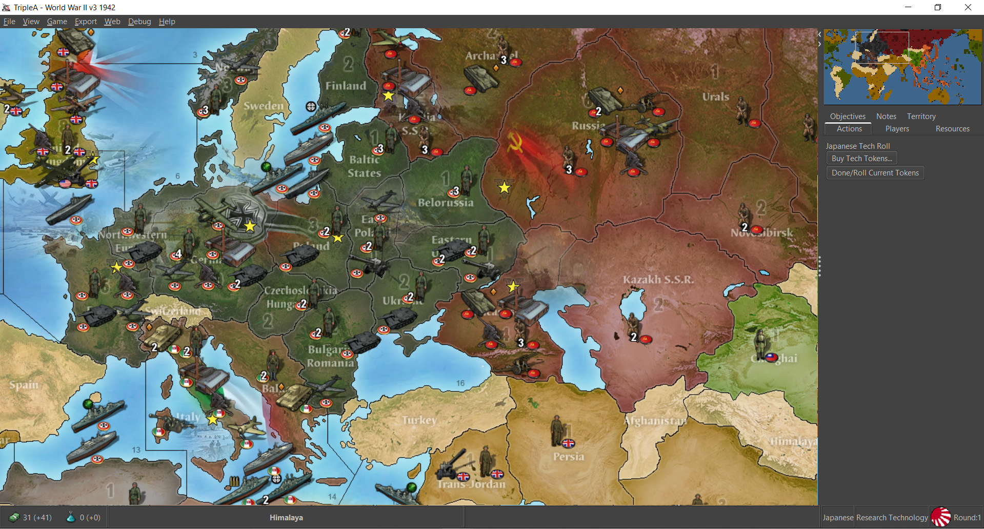
I've been playing with this one for v3 and I really like the look of the map. Would anyone care if v3 used these reliefs instead of the current default?
I think v3 could use some love, it was kinda the oddball stepchild for tripleA, but has a special place in the heart for me. I think it's like 15 mb combared to 8.7, but the map just looks a lot cleaner hehe.
https://www.axisandallies.org/forums/topic/29995/anniversary-edition-custom-mod-release-for-triplea
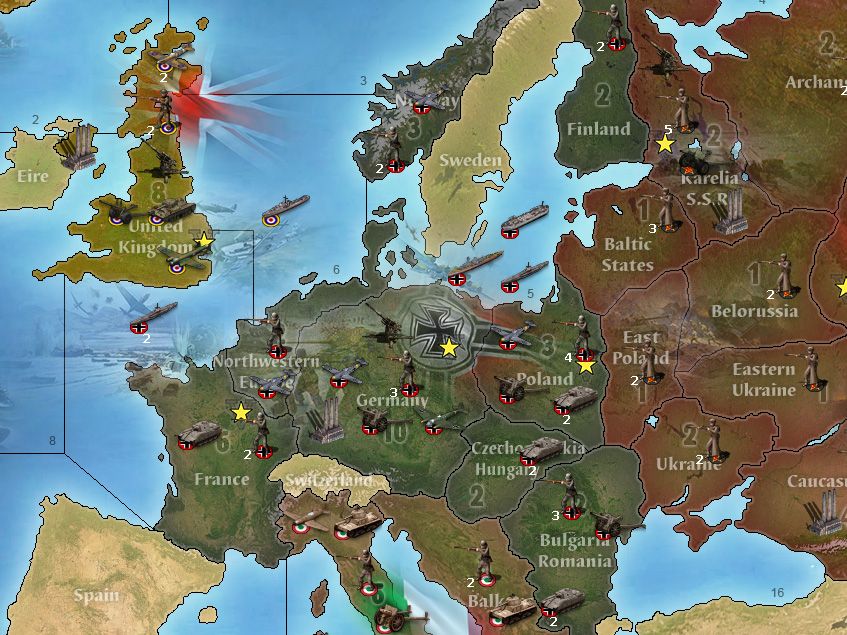
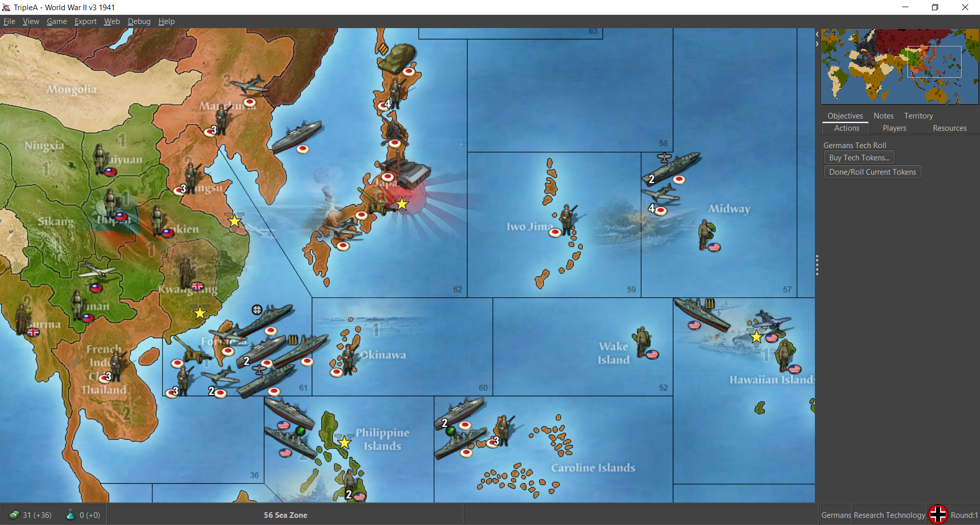
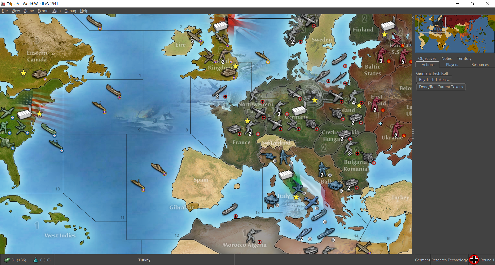
I had been playing with custom Iron War units for v3, and I think it's a fun change to see that kind of unit variety and just a different vibe. The WOPR map mod above with the slicker reliefs just looks rad to me. Here's an example of the current default v3 map w/ details using some Frostion units.
Here's the WOPR relief used in the same way.
Anyhow, I think the map's got some charm to it and would be cool to see a Legacy version like that. A topo-style map with national units for Global would also be cool. I got the Iron War units working for that with some substitutions to create a similar vibe for my own use, but don't have anything for the global map itself. I don't know if any are any topo reliefs floating around for 1940? but for v3 at least it would be nice, since dude already put them together for that one..

-
@black_elk i like it
")
-
@black_elk Some of the screenshots look almost like an entirely (and better) game! Back-porting these graphics & making them default seem like a good move.
-
@black_elk said in World War II v3 update to master?:
I've been playing with this one for v3 and I really like the look of the map. Would anyone care if v3 used these reliefs instead of the current default?
I think v3 could use some love, it was kinda the oddball stepchild for tripleA, but has a special place in the heart for me. I think it's like 15 mb combared to 8.7, but the map just looks a lot cleaner hehe.
https://www.axisandallies.org/forums/topic/29995/anniversary-edition-custom-mod-release-for-triplea
@black_elk I don't like seeing Panther tanks in a 1941 game. In 1941, the main German battle tank was the Panzer III, but I think the Panzer IV, even in its late long-gunned 1942 version, would be fine and even preferable if the Americans have Shermans instead of Lees. I wouldn't, however, use any munitions which were in widespread use only since 1943 or later unless it is for representing technology.
I think the map itself looks better, and the units' images look good but are questionable, mostly because they may reduce clarity, so my suggestion is to update the map as in the images I've quoted but leaving the current units' images (which I assume means updating the relief tiles only).
Then, I also suggest having two additional V3 map-skins: one with the current (then old) graphics and the other one with the new graphics comprising the new units' images. This should assure everyone can have what he or she prefers (once the current map-skin problems in the pre-release are fixed):
- the original skin for new details and old units' images.
- a map-skin for new details and new units' images.
- a map-skin for going back to old details and old units' images, for anyone disliking the changes.
-
@cernel Yeah I just yanked the biggest meaning looking tanks for impact there lol. I think the custom mod also uses a Panther model? The units there kinda remind me of like iron blitz with a little pixel crunch, but they've got flare. In Frostion's unit set there are a few other tanks that might be more appropriate to a 41 or 42 redux, since each nation I think has like 3 different types there all in the same art style. Or I don't know maybe done like physical boards sculpt collecting where maybe the later 42 version gets the beefier tanks if the player likes that look, or something along those lines. Units do seem a little simpler to switch on the fly, especially if there's already a file-set ready to go with the proper labelling or whatever, but for the map it would be nice to update I'd think. Couple skins for convenience would be cool. Those WOPR reliefs just a little easier on the eyes for me, and distinguishes it a bit from the other standard World War II maps.
I like the approach laid out there
Then, I also suggest having two additional V3 map-skins: one with the current (then old) graphics and the other one with the new graphics comprising the new units' images. This should assure everyone can have what he or she prefers (once the current map-skin problems in the pre-release are fixed):
- the original skin for new details and old units' images.
- a map-skin for new details and new units' images.
- a map-skin for going back to old details and old units' images, for anyone disliking the changes.
-
Is there a way to have a different set of images with map skins ? I thought it just pulled out of the units folder and that was what you got.
I'm not very knowledgeable about skins, but if you could have separate unit sets, would be way cool.
-
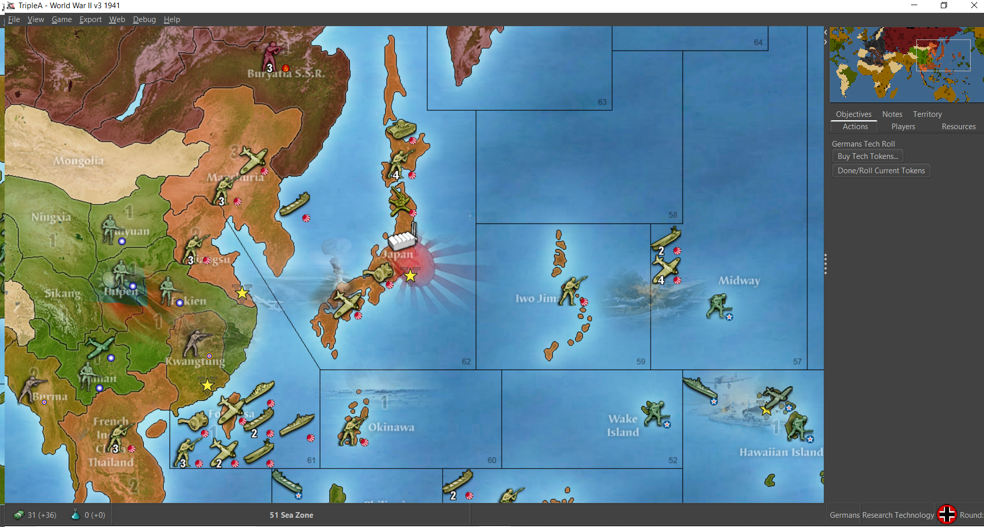
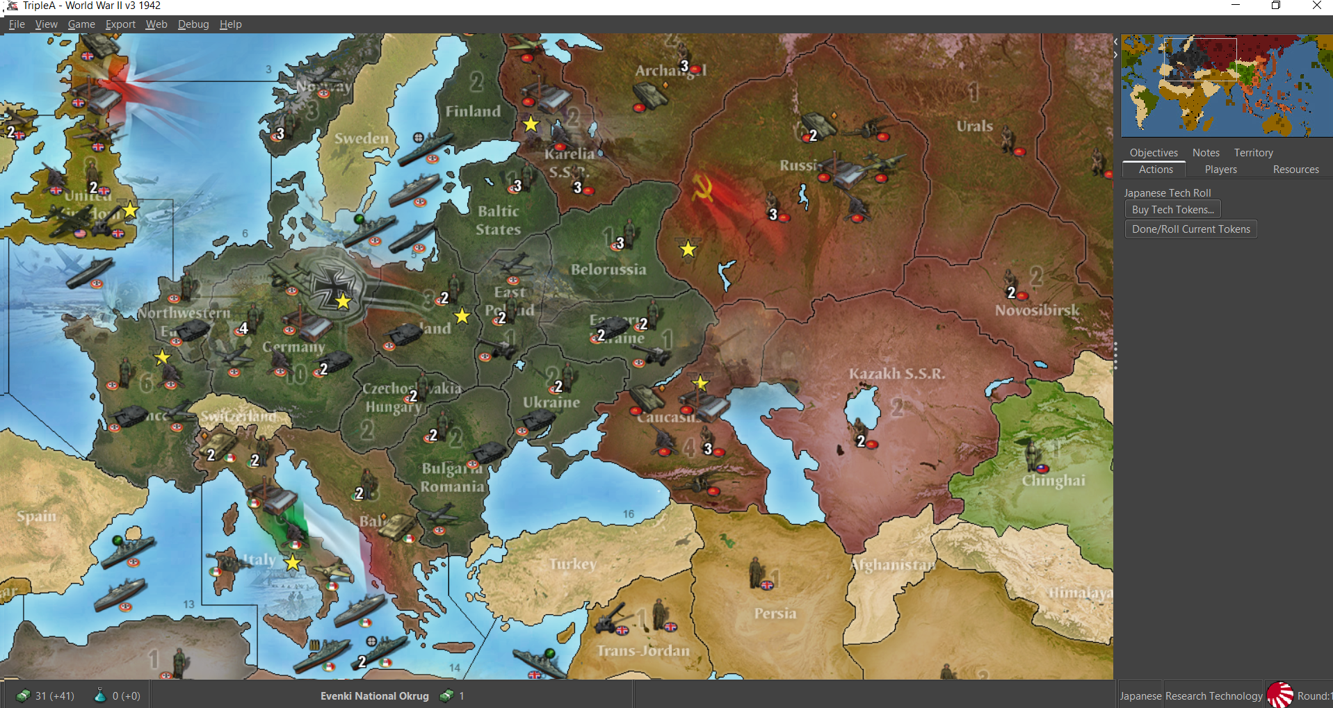
@beelee yeah its one of those things that kinda comes and goes for me, the skin feature. I remember using it before at one point. Just to cernels suggestion about staging it in, here's the same map reliefs but with the current default units. I turned the flag display to on/small just for parity with the other screens. Skill holds up pretty well I think, the relief I mean, for the overall read, though the Italians are blue there hehe
I'm partial to the iron war unit set myself, just cause they have a nice bold visual impression, pretty clean drop shadows and such, though I haven't heard from Frostion in a bit to ask if I could just pilfer em into v3 lol. But he might be cool with it? Anyhow it'd be nice to get something consistent for the units across the v3 to global too just for quick use, but I'm sure other mods like to build off the existing more generic units by color for consistency and such. I think that's a good idea to go default map relief first, then new units if desired, or an easy switch back to oldschool for both details/units if the player prefers the older look more.
-
@black_elk said in World War II v3 update to master?:
@cernel Yeah I just yanked the biggest meaning looking tanks for impact there lol. I think the custom mod also uses a Panther model?
What mod?
Both the current TripleA assets and the Iron War based skin you have shown have the Tiger I as the German tank. The Tiger I is bad too for a game starting in 1941 (and generally anyway, since only a very small fraction of German tanks were Tigers), but at least it saw combat in numbers a few months before the @Panther did. When @redrum and me updated World At War, I substituted the Tiger I (quite ridiculous for a game starting in 1939 and especially for a game featuring the Tiger II for the heavy tank unit) with the Panzer IV (still a touch anachronistic), for the Germans (I'm not sure if anybody noticed).
-
@cernel Yeah it looked like a beast for G, that sounds about right. I think it might have said that in the lead post in the notes but I glanced past, WOPR just called it a custom mod on aaorg, since it had some unit and soundwork as well there. Frostion's units that I borrowed had the tanks staged into light, medium and heavy also with the little insignia, the heavies only coming in after 43 I think. I almost used the black one just cause it reminded me of playing on the board lol


-
@black_elk said in World War II v3 update to master?:
@cernel Yeah it looked like a beast for G, that sounds about right. I think it might have said that in the lead post in the notes but I glanced past, WOPR just called it a custom mod on aaorg, since it had some unit and soundwork as well there. Frostion's units that I borrowed had the tanks staged into light, medium and heavy also with the little insignia, the heavies only coming in after 43 I think. I almost used the black one just cause it reminded me of playing on the board lol
The American level 3 tank is the Pershing, which fought only in 1945 and in small numbers. I would pick the level 2 tank for the Germans, which is a Panzer IV, even though that is not much better than a Panther, since I see that that model of Panzer IV is at least an "H", which began production in June 1943 (the most glaring feature being the Schürzen skirts, which were used only starting in 1943). The level 1 German tank is a Panzer I (though it looks like it only has the right-side machine-gun), which is not really a tank if we consider a tank has to mount an artillery piece.
-
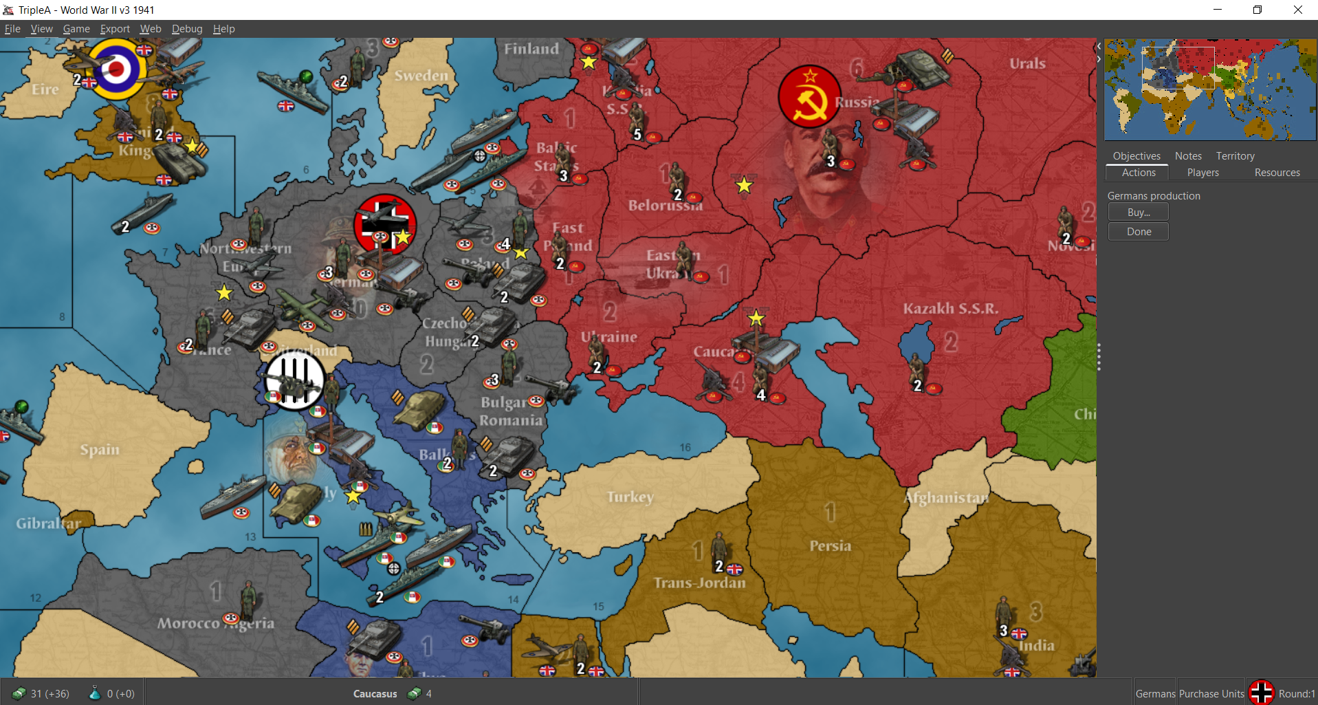
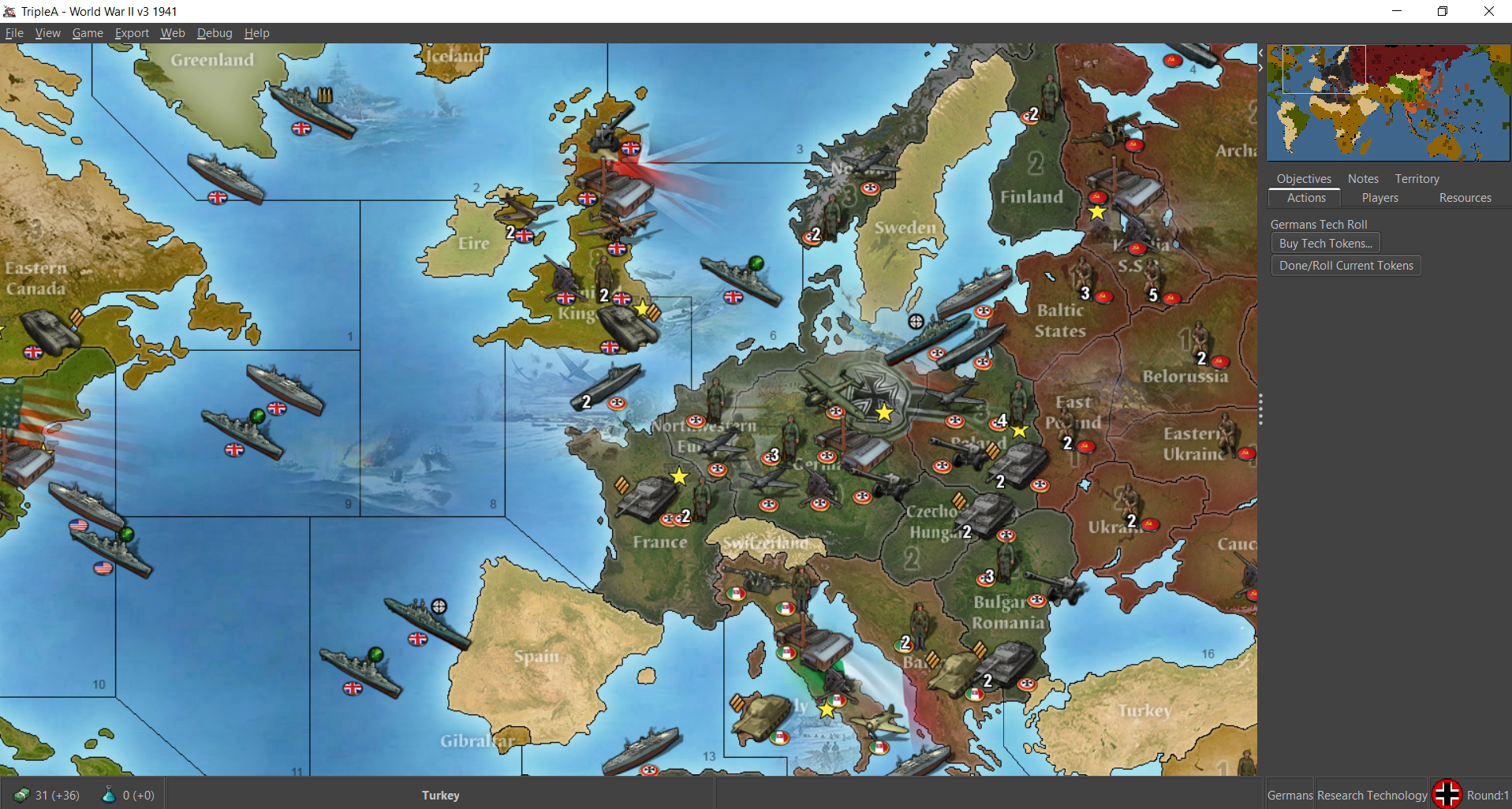
Also the details of the proposed new skin somewhat reduce clarity, in this case on territory ownership, but, as long as the current skin is kept downloadable as a map-skin, I still suggest adopting the details herein proposed in substitution of those of the current original skin for the map.
-
@cernel I'd definitely be game for even cooler looking tanks of any sort hehe. Sometimes it's hard for me to make out the detail, but I imagine maybe they're taken from illustrations or actual images of models and then just shrunk way down? Like losing some detail in the process there, but basically going from something like this (randomly off the web just now), to something that ends up more like this once it goes into the blender.... but spruced up with a dropshadow and a little national hokey puck heheh.


So maybe they get clipped when shrinking and losing some bits or something I'd guess hehe. Like it's almost more about just nabbing a good orientation probably, so it shrinks down decently without turning to fuzz. Or maybe punch up the contrast and other tricks till it reads alright in the ultra tiny.
Obviously Frostion did a better job than I could on a quicky, so I just used his that were ready to go, but it would be fun to have it thematically more 41/42 for a board with that startdate.
I agree that territory ownership can be a little muddled with the colors more muted from the reliefs, but sort of a trade off I'm willing to make there I think.
I've gone back and forth in preference, but one advantage of national styled units that aren't just default TT/Faction colors is that it allows the end user to edit the hex color of the faction in a game and still have it look alright, without really needing a new unit set. Or having to tint an existing color unit set to match, which can be involved. So that's kinda nice. Just in case someone like brown or green for a faction, whereas others might prefer blue and purple TTs, it's little easier to switch on the fly if the units have their own thing going on.
-
@black_elk heh heh me and my brother would be putting model glue on it about now to light it on fire lol maybe a firecracker to blow it up, we got in big trouble for that though

-
@beelee Haha the good old days! with a kaboom
Here's a quick screen of the same, but with a tank switcheroo. Little rough but gives an impression for what we might go for.
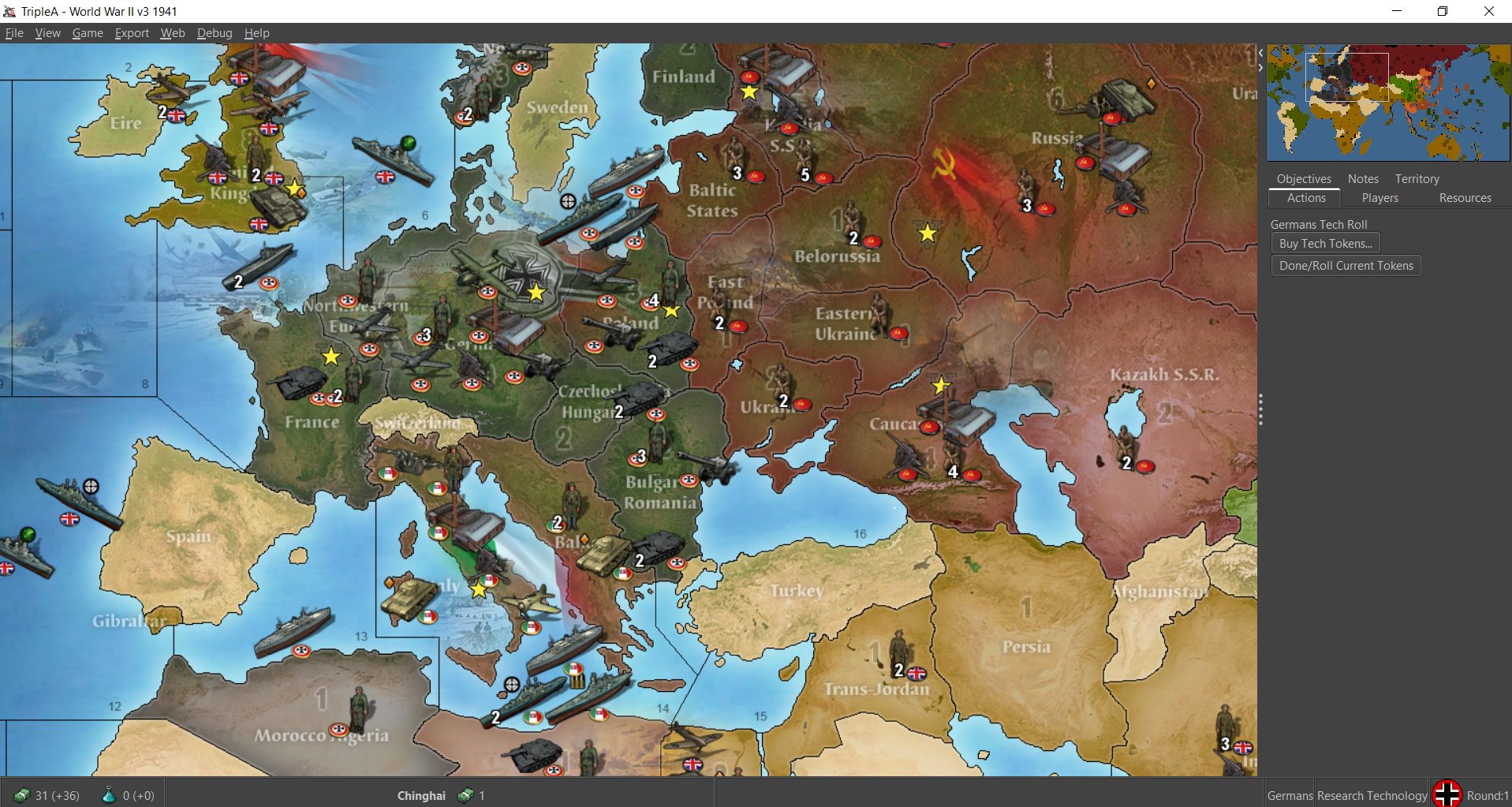
I think a little spit and polish we could get something that looked pretty nice. It would be cool though to have the units themed more towards the early side, I agree, so it fits more for 41/42.
Also cause it'd be cool to get a unit set that could be 'backloaded' for Global which is even a year earlier in the timeline 1940 than v3's 41/42 . Or at least have the starting stuff reflect that, and maybe have some alt unit images themed for later dates. Just to have a set was consistent or could be used for either v3 or Global would be nice. Early hardware vibe. That'd be cool
-
Oh also here's the big list from Krieghund about the various sculpts we saw on the physical board... I think the trend was more towards anachronism and the iconic over period specific. But also with the mix and max going on for the various releases. Like Japanese Panthers sometimes I guess if one was willing to spring for 41 hehe. I don't think we ever got a tank that wasn't a Tiger or Panther for G though. He must have really liked the look or something lol. Anyhow there may be others floating around, but this is what we've gotten cardboard and plastic style...
https://www.axisandallies.org/forums/topic/33671/list-of-sculpts
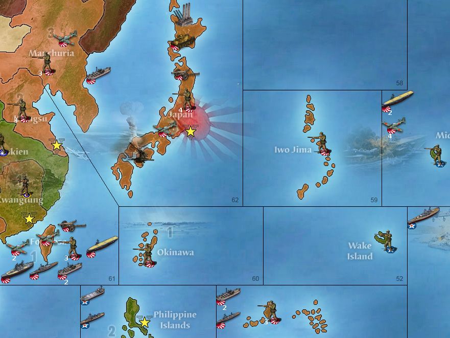
Might be a nice way to set the thing apart in another way by using the 40-41 equipment, for like fighters bombers and armour. Or it'd be badass if they could change as the game progressed too, but least for the outset having the 41 well covered would be cool. I liked Frostion's take on the naval game, where the images were sort of more generic but clearly denoted by type with the little symbol for destroyer, cruiser, battleship, or carrier to add clarity. I thought that stuff was a nice touch. His transports are nice and chunky so pretty easy for me to tell apart for the most part hehe.
-
@black_elk said in World War II v3 update to master?:
His transports are nice and chunky so pretty easy for me to tell apart for the most part hehe.
yea kinda look like cruise ships lol. Nah i like his stuff. Trprts seem a bit big to me though.
You can switch units purchase wise depending on game rd/date. Be harder and basically limited if you wanted to switch existing. Probably wouldn't want to do that anyway.
FNGs can drive the old stuff till it dies. lol
yea sorry : ) NFGs
-
@beelee for sure. I've been playing with them as an expedient, since they looked cool. WOPRs set works for both scenarios with the tech advances. Frostion's set had enough 'painted sculpts' to handle G40 as well though, so I got a test set working with those as the basis for now. Mainly just needs a couple tech advance icons and a sign off if he's game. Or there might be some unit images in the WOPR style for the TacBs and Mech for a more vintage pc game look that could expand to Global? Both art styles have a certain appeal to me, so might be cool to do one base set and an alt set. There are a lot of other units in the default folder, presumably for game variants that I wouldn't want to upend, so probably good to do as an add on or skin toggle type thing. But I like the vibe it creates. I enjoy the larger units. There is some trade off in the overlap to switch to larger sized sculpts, but for the most part I think it looks pretty good. Those units still seem nice and clean to me at 75% which I think is the important threshold. Does feel like a rather different game somehow. Was tooling around with 42 just to get some bombers going hahah.
At 100%
At 75%
Would also be cool to change the gamenotes to an image file rather than text to display some of that info more graphically. Right now the tech is listed first then objectives though the reverse might be better, since objectives come up more often. Stuff like that would be fun just to spruce it up a bit.
For his game Frostion had these little flags to reinforce territory ownership, changing the flags based on the owner of the TT. I thought that was a cool concept. Maybe do something like that for a visual if it's not clear enough from the changing relief colors?


His unit roundels are smaller versions of these... They were drawn onto the unit images there, which does look a little clearer to me than the usual roundel unit flags set to on/small or large. I think they may have been intended for capitals though not really used on the board for Iron War that I can recall. I like how they add a bit of depth and dimensionality to the units, though I dig the relief kinda subtle with just the banners fading at the capitals so I don't think second capital markers would really be necessary. Still they look cool too hehe. Anyhow he did some nice work all around I thought. Pretty top drawer stuff


Just keeping with the 42 flare there heheh
-
What exactly are we trying to achieve here?
- (1) Do we want to simply update WWIIv3 unit images?
- (2) Are we talking about updating the default unit images?
- (3) Are we talking about a new skin?
Overall the screenshots look a lot better than what we have. It's hard to not see these unit images as an overall improvement despite any other issues. Like, it's better than what we have in just about every way.
I'd suggest we do go with (2) on this and update the default unit images provided by the game engine.
-
(2) Would be my strong preference as well, but I wasn't sure how much traction there'd be for the idea. I was pushing a v3 update concept, mainly because it was the one World War II map that I actually had a hand in making, but I think the other standard games would probably benefit from some flare as well.
v3 was initially put together to coincide with the release of the physical board in 2008, and it seemed like a timely project back then, but of course tripleA went dark for a few years and it was basically abandoned until Veq and co put together a functional version of Global, revisiting the v3-v6 maps to be consistent with the overall look established for Global. I think in general the idea at the time was to distance tripleA in all respects from the physical boards, for a presentation that was somewhat more generic and less 'A&A centric', for lack of a better word. Though there are still some artifacts left over from the earlier iterations that carried through, most notably the familiar air service roundels for each player Nation. In that sense, a visual overhaul might help to differentiate the World War II games further. I didn't create the unit and flag images above though. They were taken from Frostion's Iron War game. I assume the artwork was created specifically for tripleA and that game, thus original, so I used them to give a visual impression showing what I think a really cool World War II map might look like hehe.
I like the v3 file that WOPR put together, as it's a full package and basically ready to go, but for the units it's missing some stuff to complete a full roster for Global. That's why I was tooling around with Frostions, since there were enough in there to get the larger spread with mech and tacs and such. I also liked the look of the factory unit. He used more pixels for his units, so instead of everything in a 54 pixel square, the tanks and aircraft are larger and the ships are just shy of 100 pixels. This creates some occasional foregrounding issues in the display just cause of how the centers were drawn initially probably, but with more room in the larger rectangle for units with more detail, I think it just creates a better overall look. The reliefs I think also give the map itself a sense of space or depth. Even though it's flat it takes on more of a 3d-ish physical character that I like, mainly cause it reminds me more of cardboard and painted plastic lol.
-
Couple other thoughts related to v3. First, it's out of print again, so anyone interested in playing this one is sort of out of luck, short of swooping something second hand from collectors I guess. That's kind of a bummer, cause there's really no intermediate board to scale up the gameplay or play pace between v5 and Global. I think v3 was a good go-between since it introduces most of the new rules and larger roster that was later adopted for global, still has tech advances too, but sadly the 2017 reissue didn't really update the rules. The AAguns or the cost for tanks and such, so there's a few throwback aspects there. Still it did introduce the concept of Objectives, and Italy, and China (which was itself pretty complicated, just judging from how many questions were addressed to it in the 2009 errata lol) new transports and production rules, so it's kinda nice to have something between v5 and Global, which is just way more complex and more rules intensive in pretty much every regard. Also just thinking of the errata, it did include the optional rules to close sz16, along with the escort intercept stuff, which would probably be nice to have highlighted as standard game options from the launch screen. I don't know how popular closing sz16 ever was, but the escort/intercept was clutch just cause bombers get so nutso hehe. It has the raids preceded by battles tickbox currently so that's cool, but not the sz16 one I don't think. Not sure how popular the map remains compared to the other World War IIs, but I like that the AI can sort of handle itself on this one. Like sure it doesn't track objectives or VCs, or always do the best with the push, but at least it raids and makes some moves. Still better than nothing for a trainer hehe
Hello! It looks like you're interested in this conversation, but you don't have an account yet.
Getting fed up of having to scroll through the same posts each visit? When you register for an account, you'll always come back to exactly where you were before, and choose to be notified of new replies (either via email, or push notification). You'll also be able to save bookmarks and upvote posts to show your appreciation to other community members.
With your input, this post could be even better 💗
Register Login