Image Icons
-
@redrum Those were just quick prototypes. The real work has only just begun.

-
Here is an early prototype....

-
@redrum
I made icons that will fit into all of my maps. Here is the entire collection for you to view and you can use them for other things if you like.The collection includes new versions of the Iron War and Dragon War icons. The new icons have slightly more black outline. Also there are some new icons like “Mana” and “XP”, some resources I might use in the future with future maps


-
If there isn't any other feedback or image suggestions then I'll be looking to upload the set defined in the first post of this thread to replace the base resource images in the engine later today.
-
New default resource icons have been added to the latest pre-release. Feel free to give it a spin and provide any feedback.
-
@redrum One test revealed a curious behavior...
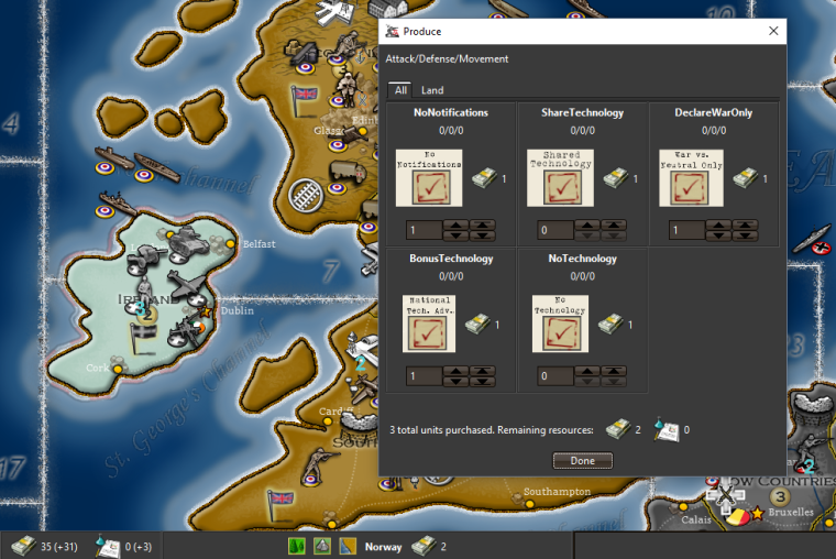
If a water territory is named anything other than XXXXSZ then the name will not appear in the bottom display bar.
-
@hepps Should already be fixed in the latest pre-release unless there is a second bug as @prastle beat you to it: https://github.com/triplea-game/triplea/issues/3168
-
@redrum Had to happen sooner or later... even a broken clock is right twice a day.

-
@hepps ROFL Your able to inspire me so well to improve

-
Just loving these improvements!

Working on implementing some of my re-worked terrain images then will be looking at updating again.
-
Great job you are doing, Congratulations! And my opinion: in new TA version .9480 there is some small circles that show moves (for me they are not good and bother in game), small black numbers as before didnt bother at all, maybe those circles are to much showing a movement allowed that isn't to important. Still I have some white windows (now in black) from Java when open a new map, How to correct them? Thanks and good job!
-
@raville Make sure to update all your existing maps if using the pre-release.
-
@hepps said in Image Icons:
Just loving these improvements!

Working on implementing some of my re-worked terrain images then will be looking at updating again.
I feel the default PUs image is too saturate and a bit distracting for what would be the main resource, to see about everywhere. I like the one Hepps used here better, but I don't like the yellow wrap, or whatever that is called.
I suggest having default this one (desaturated by 50%):

instead of this one:

? -
-
@raville said in Image Icons:
Great job you are doing, Congratulations! And my opinion: in new TA version .9480 there is some small circles that show moves (for me they are not good and bother in game), small black numbers as before didnt bother at all, maybe those circles are to much showing a movement allowed that isn't to important. Still I have some white windows (now in black) from Java when open a new map, How to correct them? Thanks and good job!
Small circles that show moves? You mean numbers?
You mean the yellow and blue numbers, showing, respectively, the moves you are doing and the total moves available, when you select a unit and move the cursor on another territory?
That is exactly the same thing as already there in 1.8.0.9, and was made by Veqryn years ago.
Personally, I would definitely totally remove the blue one, showing up the max movement. I don't think anyone has a use for, or even read, it, ever, and, when you play a map, pretty much have to memorise what is the movement of each unit, already.
Probably mapmakers should be, then, able to set the colour for the remaining yellow one, in case the default colour might be a bad choice for the specific map. A switch off option in the menu can't hurt.
But I'm not sure this is what you mean?
-
@cernel download the new pre-release and play a map sigh...
-
-
-
@redrum just join us in lobby
Zod vs Rav -
@hepps LOL. That is pretty awesome.
Hello! It looks like you're interested in this conversation, but you don't have an account yet.
Getting fed up of having to scroll through the same posts each visit? When you register for an account, you'll always come back to exactly where you were before, and choose to be notified of new replies (either via email, or push notification). You'll also be able to save bookmarks and upvote posts to show your appreciation to other community members.
With your input, this post could be even better 💗
Register Login


