Screen centering/cycling around map UI idea
-
@LaFayette But isn't the count the total units, while the units images in the scroller displaying a number of types of them? I don't think there is a way to tell if there are other units types than what I'm seeing, unless the total count is equal to the number of different unit images I'm seeing or I'm under the maximum types that can be displayed (and I know what that maximum is).
-
But isn't the count the total units
@Cernel , Yes
while the units images in the scroller displaying a number of types of them?
Yes, up to three different types are displayed. The question about sort is for which ordering to display them in and which ones to prefer to show vs not. There is not nearly enough space to show all types. While trying to make things narrow, the unit images were moved to be more squashed together to a maximum extent possible and still have it look okay.
I don't think there is a way to tell if there are other units types than what I'm seeing, unless the total count is equal to the number of different unit images
If equal, then you are seeing all the units. In part the unit count was there to make it more clear there can be more units than displayed. There is not enough space in the avatar area to actually see a thumbnail of each unit, the stacking of 3 units is meant to convey that there are more, it hopefully does not take someone very long to realize that if there 7 units and you see only 3 types out of 4, that there are more types. It's also not meant to be the authoritative source to see every individual unit in the stack either.
-
@LaFayette Then I don't think it will really matter what units images are being displayed. It can even be only one, I don't think it will make a difference, since you would refer to the board only anyways. I still think it would be more intuitive not to display any images if there are more unit types that the maximum that can be displayed in the scroller, as that at least will immediately tell you that if you are seeing anything at all there, that's it (for the types).
-
@Cernel In general I think this is how it works for informative lists. For example, currently, when in the automated tooltips you get the list of all units that can receive support either you get the full list or, if the list is deemed to be too long, you get nothing. That way, at least, if you have a list at all, you know that list is reliable. Of course, this can be done also by displaying somehow that the list have been truncated, and there is more, but I don't see much point in that.
-
I would think it would be relevant to at least have 1 of the 3 units displayed be the unit type most represented. Like if there were 5 medieval type units and "Swordsmen" were the most represented, then they should surely be display.
Plus the strongest (attack-wise) land unit should be displayed also, as this is probably a unit the player feels is important when moving.
And then the third spot could be reserved for:
Most expensive unit (PUs or "tuv")
Most represented air unit
Strongest air unit
Most represented land transport
Strongest landtransport.
Whatever unit in the territory, not already displayed, picked from the XML's unit list sorting order.Mapmakers would normally have a unit list starting with the weakest and cheapest units. Followed by units stronger, more expensive and more special.
PS: This feature shouldn't be rushed and don't expect everyone to give feedback asap. At least some of us are testing it out even though we have not given much feedback yet. But I am almost certain everyone has opinion, if they start using it. Speaking for my self, I already allways use it. So I would surely want to give some feedback when I got the the time and more experienced with it.
One thing I can already give feedback on is the new unplaced units display. It it OK if this information is shown throughout the players steps and other phases than placement. But when the player has his placement phase, I feel very annoyed having to look down in the buttom right corner of the screen to see what I still need to place. On this tab/during this step I would prefer unplaced unit be displayed where it used to, above already finished placements. The reason is, that unplaced units are during this step the most important info and player eyes would like it to be near minimap, "done" buttons. Anyone else have experiences, feelings and opinions on this?
-
@Frostion, for unit placement, this is the thread: (cc/ @Alexei-Svitkine )
https://forums.triplea-game.org/topic/1602/proposal-always-shown-purchased-units-panel/65
I've come to find the same. When placing, my eyes/attention are in the top right of the action panel, below the mini-map. It almost seems that the panel should move to be below the minimap on placement, or maybe disappear and go back to the old treatment. Regardless, let's move that topic to the right thread.
Re: rushing
We're trying to finalize 2.0 and get it out. Time has just more or less run out. But, it's not the end of the story, we can push compatible releases with updates and keep iterating.
Speaking for my self, I already allways use it.
Yay

I hope the feature will make live games go faster even and reduce mistakes. I can't mention how much time I've spent checking that I've moved everything, and double checking, and triple checking, before clicking 'done'. Even then, when you click 'done', you always wonder "did I forget to move something?" In close games, one or two mistakes are game-changing, not moving units is huge.Re: sort ordering
@Frostion those are some good ideas. Getting cost is a bit difficult, I'd rather avoid that if we can. Going by unit count makes sense. I don't know if it's then necessary to incorporate attack strength.
For example, we first pick the most numerous land unit. Then for third spot we pick the most numerous air unit. For the second spot, we look for the most numerous land unit that has a higher movement rate, if none, then we look for the second most numerous land unit with the same move rate, and if none, the most numerous air unit becomes the 2nd spot and 3rd is the second most numerous air unit.
-
@Frostion said in Screen centering/cycling around map UI idea:
One thing I can already give feedback on is the new unplaced units display. It it OK if this information is shown throughout the players steps and other phases than placement. But when the player has his placement phase, I feel very annoyed having to look down in the buttom right corner of the screen to see what I still need to place. On this tab/during this step I would prefer unplaced unit be displayed where it used to, above already finished placements. The reason is, that unplaced units are during this step the most important info and player eyes would like it to be near minimap, "done" buttons. Anyone else have experiences, feelings and opinions on this?
@Cernel said in Proposal: Always-shown "Purchased Units" panel:
I'm playing with the new stuff, and, sorry, but, maybe it's the abit, but I'm so irritated by the fact that the "Units to Place" during placement now is at the bottom. Previously, you would have seen the units left to place right at the top, and this felt much better. Now, each time I go to placement I feel like I have no units to place (and sometimes for a moment I wonder I didn't purchase anything), then I recall that now I have to look at the bottom, and then again upwards as the actions are made.
-
@LaFayette If you really want to display 3 units type when there are more than 3 (and, in this case, I suggest adding something to hint the players there are more types than what displayed), then I think you should display the units with the highest movement first; if the same movement, display the units with the highest attack value if during Combat Move or the units with the highest defence value if during Noncombat Move; if still the same, go by the order in the xml listing of them. Repeat this until all 3 places have been assigned to 3 different unit types.
-
I have now tested the latest version of pre-release (TripleA_2.0.16742_windows-64bit) and the unmoved unit scroller. I will now give my thoughts. I hope they make sense:
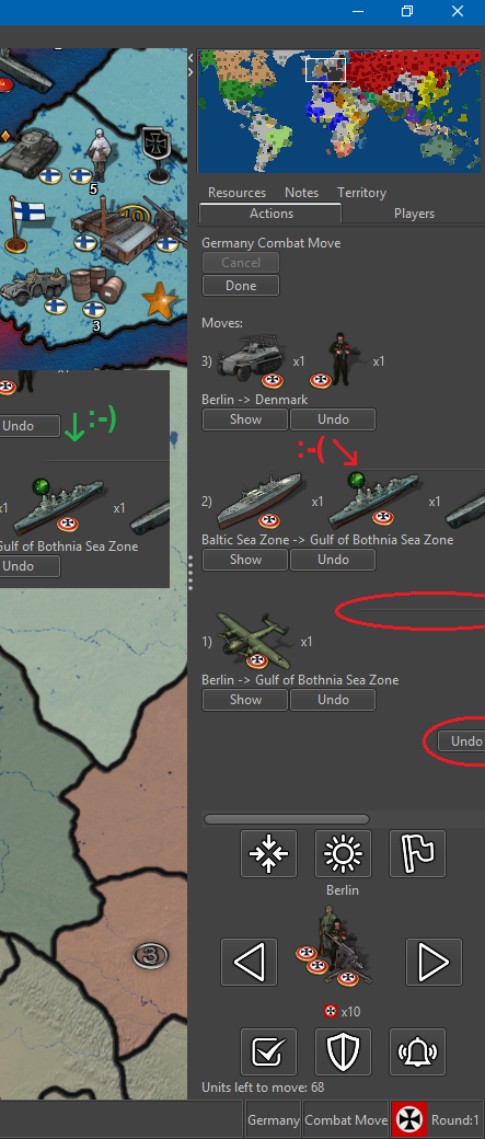
1. “undo all” button cut off
I noticed that the “undo all” button was being cut off. I would suggest this button be left aligned with everything else. I think it is aligned with the right side of the nice looking graphical horizontal lines.2. Horizontal line cut off
Related to 1, the nice looking graphical horizontal line that split up the individual movement info is also cut off. I would suggest it being in the center of visible side bar space.3. Horizontal line spacing
Also the graphical line should be placed between the movement info and not just (like it seems to me) after a linebreak after the “show” and “undo” buttons, with no space after the line itself.4. Air units unmoved after combat move?
I was surprised that air units that had been moved into enemy territory still counted as unmoved units. I know that they mostly and technically have movement left, but I think it is unnecessary to have them pop up during scrolling through units, since they have been moved into enemy territory and I would presume are exactly where the player wants them to be after combat move. Also even air units that has para-dropped units also show as unmoved/having movement left.During non-combat movement we kind of run into the same issue: Air units that have been moved out of enemy territory and are safe to land, still show as unmoved/having movement left, even though one could assume they have been moved all the way to the location where the player wants them. I would also here argue, that these units should not show as unmoved / having movement left.
I know that one can just press Skip when running into the two issues here, but I think we should make the gameplay experience convenient and try to avoid unnecessary time spending and button pressing.
5. Territory flashing / Flash line thickness
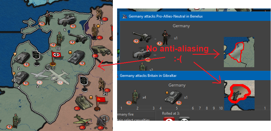
I noticed that scrolling through territories with unmoved units, the territories flash 2 times. It lasts like a second. Maybe this could be extended to like 3 or 4 times? And is it at all possible to thicken this flashing white outline and ultimately ad anti-aliasing? The outline looks a lot like the outline used when picking territories and other placed, but it would just be a bonus if the other uses of outlining also got a makeover by adding a bit thickness and anti-aliasing, bringing outlines up to the quality of the movement arrow")
6. Picture after all units moved
I think it would be a nice touch if, when the last unit is moved and no territories have unmoved units, that no units are displayed by Next/Prev. Then there will be an assurance + no doubt about remaining unmoved units. I found it a bit distracting/annoying that the scroller kept showing the very last moved unit, even though it had been moved.8. Wake Up -> Alert
I have advocated for the "Wake-up" term and function. The function is essential. But now that the “Sleep” term is scraped for Station, I think wake up should also be changed, as wake up was an antonym to sleep. Could we not use the term “Alert”? Alert the Stationed units!!! They must be ready to move out again! I think the bell icon is pretty good also for “Alert”.
7. Buttons popup text
I think it would be best to have this popup text as short and telling as possible without displaying redundant info. Therefore I propose texts like this: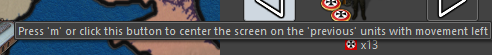
Press ‘M’ or click to see ‘Previous’ unmoved units.
(Notice the letter capitalization, as this is more distinct and this is how it looks at the keyboard.)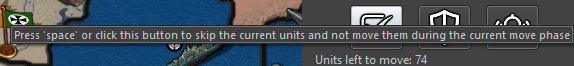
Press ‘Space’ or click to ‘Skip’ these unmoved units until next move phase.
(I realize that it can not state “next non-combat move phase” as this might not be in the map? Or?)
Press ‘S’ or click to ‘Station’ these unmoved units until manually moved or alerted.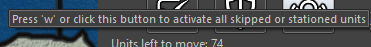
Press ‘W’ or click to ‘Alert’ all skipped and stationed units on the map.
8. Button usage and layout
How many times did I use the buttons?Center:
FEW / but I also just pressed previous + next)
Highlight:
NONE (1 time just for testing)
Flags:
NONE (1 time just for testing)Right:
VERY MANY
Left:
FEW (but it is nice to have)Skip:
OFTEN
Station:
FEW
Wake up / Alert
VERY FEW (But it was essential!)To me the buttons “Center”, “Highlight” and “Flags” seem pretty redundant. I know that graphical-wise they look good
") but if every other player also never use these buttons, then maybe they should be removed entirely, if not just to fee up space. But of course we need confirmation of players not actually using these buttons. If we can remove two buttons, then it will leave room for a total rearrangement. Maybe something like this:
but if every other player also never use these buttons, then maybe they should be removed entirely, if not just to fee up space. But of course we need confirmation of players not actually using these buttons. If we can remove two buttons, then it will leave room for a total rearrangement. Maybe something like this: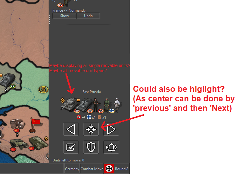
PS: I think the order of the buttons Skip, Station, Wake up/Alert?) is perfect. It seems to be the order of usage: Skip a lot, Station a few and seldomly wake-up/alert them again. And I like that the most clicking is done at the edge of the screen where the mouse cursor can't wander off
-
Also…
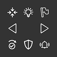
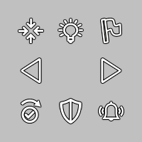
The icon for “skip” is OK, but I do not see that the piktogram really represents of the concept of “skipping” something. I have tried to make a new icon looking more like a skip (w. check mark). Here is a new version of the icon set. Is this skip looking better?
V5-Icons-37x37-NewSkip.zip
-
@Frostion Good idea. The fact that the skip not only skips but also moves to the next unit like when you click on the right arrow should be visualized. Probably that arrow should stay above the shield too, then.
-
@Frostion I like that last mockup. There's room as well where we could give individual unit counts maybe (top right). If there are too many units, then displaying a second/third row maybe is an option.
I wonder how it would look when we have a map like WaW where you may have 3 or 4 countries in one territory, with 3-5 different unit types each.
Second, I wonder if it's needed to display the units from other countries and not just for the current player.
Re: center button
For consideration, we could make the unit avatar image clickable itself, in which case we may not need the center button. I'd rather have a center button than players learn to hack it with left/right.
Highlight and flags
I'd agree the buttons don't need to be in the unit scroller, the original intent was for them to be elsewhere.
The original intent behind them is to avoid 'magic hotkeys'. There are a couple of UX principles at play here (coming from "The Design of Everyday Things", a great read and I highly recommend it):
- Usage of a UI should be available through visual inspection. IE: you should be able to know how to use something by just looking at it. For example, lego pieces, you can just look at them to know that they are stackable, or a bike, by looking at it you can tell where your butt is supposed to go and then the rest of your body.
In our case, we have global 'magic hotkeys' that violate this. There is nothing to tell you that there is a hotkey to highlight all and to toggle flags. This violates the principle above. While we do have some text buried in a help menu, we're still violating the usability principle.
So, if we go back and start with having a button, there is a second UX principle at play (that we jumped directly to before satisfying (1)):
- Allow power users shortcuts. Keyboards are an example of this, each key is labelled, you can hunt and peck, eventually users will touch type. Photoshop is another great example, new users spend a lot of time in the menus and then eventually learn hotkeys. Ultimately, hotkeys is the principle in action.
With all that said, basically we shouldn't have any hotkeys without some sort of UI icon to represent it, where users can hove over the icon to then learn the hotkey.
IT turns out as well we do not have very many global hotkeys. We have hotkeys for territory actions. With the above principles in mind, it becomes a bit more obvious that when hovering we probably should render a menu indicator of some sort, or give a right click menu that displays the territory options and their hotkeys.
In this feature, because I was adding additional global hotkeys, I added the buttons as part of the series so that we could solve this UX problem at the level of global hotkeys, AFAIK all "global" (active no matter where the mouse is) hotkeys have UI elements corresponding to them.
So.. If there is another home/location on the screen where we can move the 'flags' and 'highlight' all hotkeys, I'm all for it.
-
@LaFayette said in Screen centering/cycling around map UI idea:
So.. If there is another home/location on the screen where we can move the 'flags' and 'highlight' all hotkeys, I'm all for it.
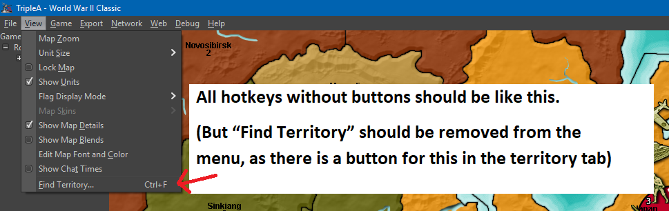
My opinion is remove the flag button and any hotkey for it, leaving it as a menu option only.
I'm not a fan of the highlight, but that can stay.
-
ok I clearly gave some "effort" Likes there

-
An updated thought on unit sorting. I'm tempted to go with something simple, am considering to just sort by unit movement.
-
@LaFayette said in Screen centering/cycling around map UI idea:
For consideration, we could make the unit avatar image clickable itself, in which case we may not need the center button. I'd rather have a center button than players learn to hack it with left/right.
I think if you make the units in the scroller clickable, that would be geat. Click unit = Center on territory and Highlight units on map. I think for players to really noticing this feature, the unit pictures in the scroller should auto-highlight when mouse-hovering over them.
The original intent behind them is to avoid 'magic hotkeys'.
I agree that hotkeys should not be secret/only for the enlightened. But, I don’t think it is neither practical nor realistic to have every single feature that has a hotkey represented by a graphical button. Best to leave some features just be in the drop down menus, with no UI graphical representation.
I would propose icons/buttons for every single most commonly used feature of the “new player” / casual gamer. (Here I go again, talking on behalf of new and casual gamers :-P) But seriously, experienced users will probably use hotkeys EVEN if there are buttons for the same things, casual gamers will not. Casual gamers will look for and use buttons, just like in other games than TripleA.
That’s why I would propose that drop down menus be reserved for advanced features, exit, save etc., not stuff needed while playing the game.
Stuff needed while playing should have buttons. Also, whatever has a button on the main screen or in the tabs, should be removed from the drop down menus, as to not flood the menu with duplicates.
Proposal:
Maybe buttons can be set in a height/width size flexible box under the Minimap. I think this location would be nice, intuitively and discrete. Minimaps in other games are almost always accompanied with icons/buttons for convenient and easy control.What do I think should be represented as buttons on the UI?
Based on my own game play + what I frequently go and pull from the menus + what I think would accommodate new players as well as advanced players, I have made these two mockups:
• Notes (Opens window with notes – Maybe notes should be removed from tabs and presented in window instead? But, I am not all sure about this one)
• Sound (on/off)
• Hotkey Help (Opens up a window informing about every single hotkey available)
• Flags (shuffles small, large and none)
• Roll Dice (open Roll Dice window. After rolling, result pops up for all players, if it is multiplayer)
• Unit Help (open Unit Help – Should be renamed Unit Information (and Ctrl+i))
• Politics Panel (open Politics window)
• History (shuffles history and “current game” mode)
• Battle Calculator (open Battle Calculator)I have tried to list these buttons in the order I think could be practical.
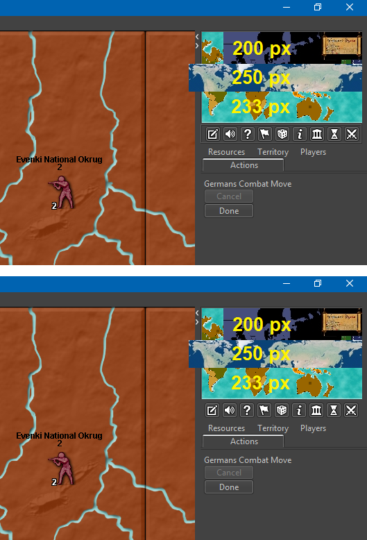
Buttons are filled with 16x16 icons, with NO spacing around them. I have placed the buttons in a box/frame as I imagine the box would look like if made just like the resources/territories/flag boxes in the bottom bar. I imagine that, if the minimap was as smaller than like 200 px wide, then the buttons would be pushed to become lined up in two rows. (Alternativly, maybe minimaps should just be set to auto size adjust to be minimum 233 px wide? If this is even a practical possibility. Or all minimaps just resized to be minimum 233 px wide or something in this range.)
MinimapHotkeyIcons.zipMap maker of: Star Wars: Galactic War + Star Wars: Tatooine War + Caribbean Trade War + Dragon War + Age of Tribes + Star Trek: Dilithium War + Iron War + Iron War: Europe + Warcraft: War Heroes
-
@Frostion I like the ideas. I'd have to think a bit more about which features get a button but you have a good list to start with. I'd also like to eventually swap the mini map to the bottom instead of the top of the right panel and then have your proposed buttons above them instead of below.
-
@Frostion the elements you suggested as buttons, would they also appear as menu items?
I agree that hotkeys should not be secret/only for the enlightened. But, I don’t think it is neither practical nor realistic to have every single feature that has a hotkey represented by a graphical button. Best to leave some features just be in the drop down menus, with no UI graphical representation.
But seriously, experienced users will probably use hotkeys EVEN if there are buttons for the same things, casual gamers will not. Casual gamers will look for and use buttons, just like in other games than TripleA.
I pretty much agree. Menu items are a good example, new users will browse through the menus to see what is available and they can also learn the hotkeys. Eventually users stop scrolling through the menus and they use the hotkeys directly.
It's the same thing with buttons, you discover the button on the UI, hovertext then tells you the hotkey, you can then stop clicking the button and use the hotkey. The buttons are not intended to be clicked in the long term, but as a way for users to know about the hotkeys and the actions behind those hotkeys.
Contrast that with the old pattern where we add the hotkey and add a line item in the movement help text.
-
@LaFayette said in Screen centering/cycling around map UI idea:
@Frostion the elements you suggested as buttons, would they also appear as menu items?
As I see it, the menu items would be unnecessary duplications. It should be enough to have info hovertext explaining the corresponding hotkeys. The menu items should be kept as minimal as possible, for simplicity.
new users will browse through the menus to see what is available and they can also learn the hotkeys. Eventually users stop scrolling through the menus and they use the hotkeys directly.
you discover the button on the UI, hovertext then tells you the hotkey, you can then stop clicking the button and use the hotkey. The buttons are not intended to be clicked in the long term, but as a way for users to know about the hotkeys.
Some players might do like that, but I don't think everybody. At least not me and my pals that I play LAN with.
Speaking for my self, I personally ONLY use "i", "Ctrl+B" and "Space" when available. I have begun using the unit scroller, but have no intention of using its hotkeys. If the UI buttons I presented were implemented, I don't think I would even use Ctrl+B anymore, as I would see it as more convenient to just press the UI battle calculator button. My usage of the menu items would probably be limited to mostly editing, but I consider the editing feature an advanced feature. I use it a lot as mapmaker to set up and test out stuff.
I don't know how normal my playstyle is, but I don't think it is that uncommon to stick with UI buttons. I acknowledge that TripleA might have many players using hotkeys, but that might be partly because of the previous/current lack of UI buttons. Players (that did not uninstall immediately after seeing the UI or give up on the game before even learning it) have adjusted to the cumbersome UI.
-
@Frostion said in Screen centering/cycling around map UI idea:
Speaking for my self, I personally ONLY use "i", "Ctrl+B" and "Space" when available. I have begun using the unit scroller, but have no intention of using its hotkeys. If the UI buttons I presented were implemented, I don't think I would even use Ctrl+B anymore, as I would see it as more convenient to just press the UI battle calculator button. My usage of the menu items would probably be limited to mostly editing, but I consider the editing feature an advanced feature. I use it a lot as mapmaker to set up and test out stuff.
I guess you are talking about the stable, as Ctrl+A and Ctrl+D are too good.
Also, the edit feature is a rather basic feature. Pretty much every regular player use it every now and then.
Hello! It looks like you're interested in this conversation, but you don't have an account yet.
Getting fed up of having to scroll through the same posts each visit? When you register for an account, you'll always come back to exactly where you were before, and choose to be notified of new replies (either via email, or push notification). You'll also be able to save bookmarks and upvote posts to show your appreciation to other community members.
With your input, this post could be even better 💗
Register Login