Screen centering/cycling around map UI idea
-
It's a rendering bug the scroller is taking up that much area, note the excessive vertical gaps:
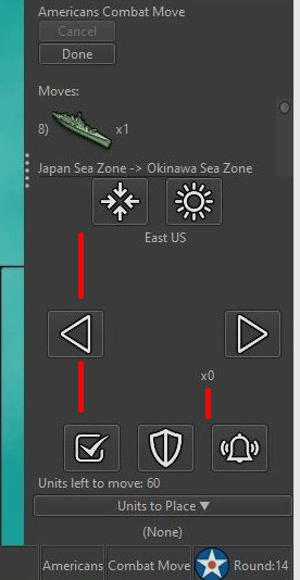
If you resize the right hand bar those gaps should collapse down as the area is re-rendered and takes up the right/intended amount of space. Creating a similar panel for unit scroller as the 'purchased-units' panel perhaps will help solve this by creating a fixed size area.
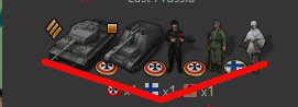
It's pretty convincing to have two rows of buttons and an area for the images. In theory it would not save space as there are two rows of buttons and a row for the image already. Though the aesthetic is certainly improved because we can space out the units in a very cool V-formation.
At this point I'm most curious about distinct unit image count limits and rendering of unit counts. Beyond that, there are a lot of 'must-do' items to get 2.0 finally ready (any QA work on it to test and find bugs is really solidly appreciated), that has been taking up most of my time.
-
@LaFayette V - formation what? You make about as much sense as Cernel (aka "mr. comma")
Anyways, I'm not even a coder yet I already told yous that there is a "height" and "width" setting number you can change for Icon sizes (I already said reduce the "height" size) or the whole palette the buttons are on should have a lower height because those Territory Scroller buttons are clearly way too big so that's the easy fix and any coder would tell you that ...
I'm sure a person that knows how to code will eventually show up here and repeat what I said
-
@LaFayette said in Screen centering/cycling around map UI idea:
Any thoughts what should happen when there are many unit types? Say if there are 15 different units, should they all be rendered and appear as a crowd, or cap at something like 7 or 9?
As many as the current wideness of the bar can display. I would not overlap, but I think they can overlap up to 50%, so almost twice as many can show with the same wideness. It's really not important, as you just look at the map to see the units, when it centres, not at the scroller, anyways, I believe.
-
@LaFayette
I would say display all units (every unit type that has movement left) as an experimental beginning. I would also say overlap if needed. Display like a big harmonica, with few units having the luxury of standing side by side, but many units are forced to be stacked like a deck of cards. Maybe later, if there is a need to show less, display the five to ten most numerous units, with the most dangerous/most valuable/units be placed to the left and having lesser units possibly overlap.Would it be possible to have units disappear from the territory scroller display and disappear "live" as they are moved? That would be a good feature indicating how done the current selected territory is.
Also, if the last "unit left to move" is moved, could it be possible to "grey out" all the buttons, indicating that the player is all done moving.
If there is a need, the info text "units left to move" could perhaps stay right above the top of two rows of buttons, between the unit pictures and buttons. Perhaps it could stay as a relatively discrete text also function as the only "space" between units pictures and buttons. Same goes for unplaced units collapsed bar (with "None" text removed to free more space) , but I think we should really test it out before we can judge it.
Map maker of: Star Wars: Galactic War + Star Wars: Tatooine War + Caribbean Trade War + Dragon War + Age of Tribes + Star Trek: Dilithium War + Iron War + Iron War: Europe + Warcraft: War Heroes
-
https://en.wikipedia.org/wiki/V_formation
Looking forward to that day when someone knowing how to code can show up to tell us how it's done

-
@Cernel said in Screen centering/cycling around map UI idea:
It's really not important, as you just look at the map to see the units, when it centres, not at the scroller, anyways, I believe.
I don't fully agree to that, cold war is a good example where the low countries get really crowded, having somewhere else to see what units are in a territory is useful. As noted, I've used the battle calculator just for that purpose to get units and their counts.
To another extent I don't fully disagree either too, hence displaying every single unit that is in a territory is not critical.
-
@Frostion said in Screen centering/cycling around map UI idea:
Maybe later, if there is a need to show less, display the five to ten most numerous units,
I'm positive that case will come soon, not accounting for extreme values is a bug. The joys of coding
 - that stuff needs to be handled. If there is no upper limit cut-off, then the units are just going to look crowded as many images will be rendered one top of another with very slight offsets.
There is stuff to do in the meantime, that decision perhaps will be best decided depending on what it looks like and how many unique images before it does, if it does, start to look bad.
Would it be possible to have units disappear from the territory scroller display "live" as they are moved? That would be a good feature indicating how done the current selected territory is.
I think that should already be the case. Whenever any unit is moved, the unit scroller is updated (that is the mechanism that decrements the 'units to move' count, it should update the unit images in the current territory as well)
Also, if the last "unit left to move" is moved, could it be possible to "grey out" all the buttons, indicating that the player is all done moving.
That is a good idea, any button that no longer does anything, may as well be disabled.
-
@LaFayette hahha you caught that eh? Cool because it was ez
I am surprised you don't have any time to learn how to code when you spend all your time making all those troll images

-
If it is a must, to choose between displaying all unit types or maximum number, I would say display all. It may be problematic to look at if there are like 15 unit types stacked like a harmonica, but still less problematic than if only 1/3 of unit types are allowed to show to the player.
Also take into account that units are disappearing from the row of displayed units as the player moves them, thinning out the row.
It would be pretty weird to see new unit types popping up on the row because they were not allowed to be shown before. Better to let the player slowly get an overview as the row thins out.Also, ofcours the small "number x flag" thing should be completely removed to free space. It does not really serve a function.
Map maker of: Star Wars: Galactic War + Star Wars: Tatooine War + Caribbean Trade War + Dragon War + Age of Tribes + Star Trek: Dilithium War + Iron War + Iron War: Europe + Warcraft: War Heroes
-
what happened to Black Elk - he made good posts
-
@Frostion said in Screen centering/cycling around map UI idea:
Also, ofcours the small "number x flag" thing should be completely removed to free space. It does not really serve a function.
The idea is to let you know (more or less fully) what is in the territory and can be moved. Maybe in the future that could be paired with a hotkey that selects all units and you can then move the mouse cursor to start moving those units. That would help locate the territory for you and you would not have to look at the source territory very much at all.
With that motivation stated, in keeping with a brutalist approach, I'm inclined to follow the suggestion and remove the small "number x flag" thing.
-
Can we just make this optional? I actually find the screen scroller an annoying waste of space. I would rather see more of the moves so I can undo more easily.
-
@RogerCooper the use-cases are certainly different. In multi-player games it's quite critical to know you moved everything (many games can become a contest of who makes the fewest mistakes rather than who played the better game).
Placed in a similar panel as the 'units-to-place' it would be collapsible.
-
@LaFayette said in Screen centering/cycling around map UI idea:
@RogerCooper the use-cases are certainly different. In multi-player games it's quite critical to know you moved everything (many games can become a contest of who makes the fewest mistakes rather than who played the better game).
Isn't that the entire point and has that not always been the case?
"Victory usually goes to the army who has better trained officers and men."
Sun Tzu -
This post is deleted! -
This post is deleted! -
This post is deleted! -
This post is deleted! -
This post is deleted! -
This post is deleted!
Hello! It looks like you're interested in this conversation, but you don't have an account yet.
Getting fed up of having to scroll through the same posts each visit? When you register for an account, you'll always come back to exactly where you were before, and choose to be notified of new replies (either via email, or push notification). You'll also be able to save bookmarks and upvote posts to show your appreciation to other community members.
With your input, this post could be even better 💗
Register Login