Screen centering/cycling around map UI idea
-
@Cernel @LaFayette I do also favour an order system when scrolling through territories. But I would be satisfied with a much simpler number/alphabetical system. -deleted-.
@all I sense a lack of feedback concerning playing experience with the scroller? Are people not playing with the pre-releases or is feedback just delivered at another place? I feel this feature is very useful, even though i see potential for improvement and have posted feedback.
-
@Frostion Virtually nobody uses the prerelease. I've been in the prerelease lobby for several tens of hours, maybe one hundred in total, in the last few weeks, never meeting anyone (beside the people with which I was playtesting on purpose), not even any developers.
I don't get your sea-then-land concept. I'm not really against it, but I wonder if you also mean not centring on the capital (likely land) initially? Because I don't think it would make sense centring on the capital (or capitals), then going with the sea, then coming back to non-capital lands.
-
@Cernel I guess you are right about starting at capital/land territory first, then sea. Makes sense. (But personally, the units I move first is the ones that go out to a boat and then go amphibious. But that would ofcours still make it a land territory start)
-
@Frostion I would actually suggest starting where the capitals are, land if the capitals are on land and sea if the capitals are on sea (I've never tested that though). It can go either ways if capitals are both in land and sea territories.
-
@Frostion said in Screen centering/cycling around map UI idea:
But personally, the units I move first is the ones that go out to a boat and then go amphibious. But that would ofcours still make it a land territory start)
That is just how the user interface works. I tend to think that sea borne operations always start in sea zones, also when the units are not already loaded, as I think it is the transport that loads the units into itself, rather than the units moving into it, except for the case of loading into allied (that I think it is not represented the right way in the rules themselves, but that would be a feature request). Of course, that would necessitate a user interface change that, for example, when you select a transport, offers you the possibility of loading units from nearby territories, so that you actually start the whole sea borne operation by clicking on the transport first (as I tend to believe would make more sense, especially now with the scroller centring).
-
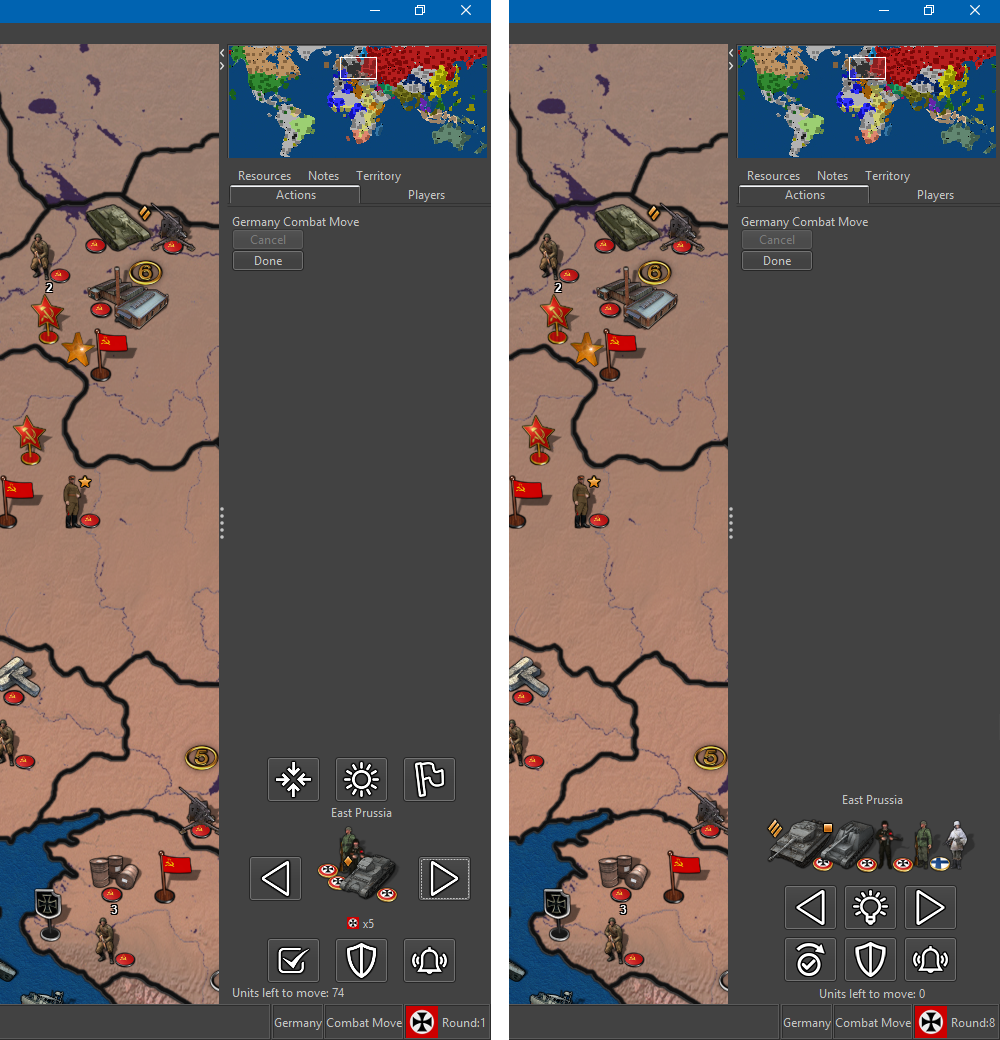
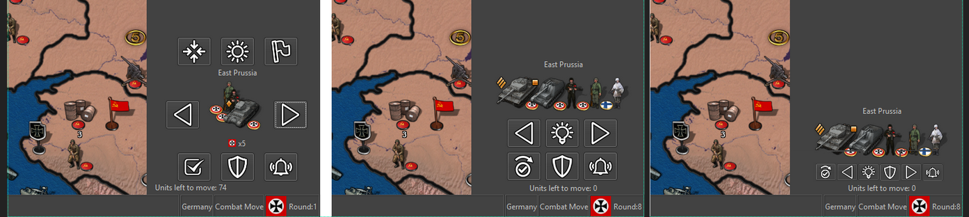
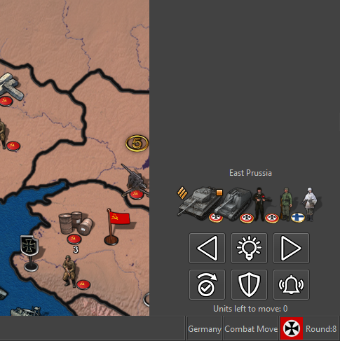
The start is capitol to avoid changing behavior too much. When a new player's turn starts, the game focuses on their capitol. My thoughts have been it would be best to make the 'next' territory to be an adjacent one to the last one that was previously selected. This way a 'theatre' operations can be the focus before moving to territories further away. I'll have to check if it's very feasible to get this any type of ordering without making things overly complex.
-
@LaFayette Yes. Keep it simple so that a player has a chance to anticipate what the order is. based on unit quantities waiting to be moved/big to small? Alphabetical? Scan/pan from left to right/top to down on the map? Anyway, I like that it starts in capital as it is the most important and most certainly always has a factory, even if it foes not always have unmoved units.
-
@Frostion said in Screen centering/cycling around map UI idea:
Anyway, I like that it starts in capital as it is the most important and most certainly always has a factory
No; for example, talking about maps in High Quality only, Americans in New World Order and Numidia in 270BC have no factory-like units in their capitals. And, of course, the games having capitals in impassable or unreachable territories, to hack a no capital behavior or work around AI limits (in these cases, the capital usually has also 0 production); for example Chinese in the two World War II v3 games (though being impassable doesn't exclude being able to use a factory; for example Tithonian in Jurassic). Remaining in High Quality only, the other map having capitals with no factory-like units in them was World At War before version 2.0, for Russians, British and Americans (this one an example of the unreachable capital territories hack).
Leaving High Quality, differently from the purely hacky World War II v3 example, there are even examples of capitals being in territories that are impassable, without production and without units at all (!), yet these territories are not just hacks, but actual part of the game; for example Others in A Song of Ice and Fire (triggers based). And there are capitals that have no other purpose than to make you jump about where you need to be, at start turn, War of the Relics comes to mind (at least I guess that's the reason, but that game is not the simplest, on the technical part). -
@Cernel The player's turn should keep starting out at the players capital (as it is now), as a way to let the player and everyone watching their screen know that this specific player has turn. I can't think of a good argument to stop this practice, no matter if a specific map has factories or unmoved units at capital or not. If there is indeed no capital, then it is ofcours another another story.
-
@Frostion Actually, I was just pointing out that it is not always true that capital territories have factories (or the like) in them.
I tend to agree on keeping pointing at the capital, though, when you have multiple capitals, it points at the one that is listed first in the game file (xml). I guess it is about time to think and decide what should be pointed at when you have no capitals.
-
I am actually finding this feature rather annoying. It takes up screen space which I would rather retain to see more actions which can then be undone. Unlike some other games, there is nothing unusual about unmoved units and no real need to cycle between them.
-
@RogerCooper said in Screen centering/cycling around map UI idea:
I am actually finding this feature rather annoying. It takes up screen space which I would rather retain to see more actions which can then be undone. Unlike some other games, there is nothing unusual about unmoved units and no real need to cycle between them.
I think the feature is useful enough to justify its encumbrance (though I use it almost only at end turn, just like I could already do with the cycle hotkey), but, as I said, I think everyone would be happy if you could hide it, preferably being hidden as default, but with a big button to show it, that also centres on the first given territory when you open. The only thing I would surely remove is that flag button. The centre button could be substituted by clicking on the units image, instead.
-
I agree that the feature takes up too much space. And I would guess that most players would find it a bit too much. However I also imagine the territory scroller be made more compact. A lot of players might get a better impression.
The current version might not be such a good ambassador and might not sell the concept that well.
Maybe it can be made into something like this (OLD / NEW design):
This is the icons used for buttons in the picture: v6-icons-37x37.zipEDIT: I also think it might be a good idea to combine a more compact territory scroller with an option to minimize it, more or less permanently. So players that use the scroller has it shown every time combat move starts, but players that chose to minimize it have it minimized until they open it up again. (?)
Map maker of: Star Wars: Galactic War + Star Wars: Tatooine War + Caribbean Trade War + Dragon War + Age of Tribes + Star Trek: Dilithium War + Iron War + Iron War: Europe + Warcraft: War Heroes
-
@Frostion said in Screen centering/cycling around map UI idea:
I agree that the feature takes up too much space. And I would guess that most players would find it a bit too much. However I also imagine the territory scroller be made more compact. A lot of players might get a better impression.
The current version might not be such a good ambassador and might not sell the concept that well.
Maybe it can be made into something like this (OLD / NEW design):
This is the icons used for buttons in the picture: v6-icons-37x37.zipEDIT: I also think it might be a good idea to combine a more compact territory scroller with an option to minimize it, more or less permanently. So players that use the scroller has it shown every time combat move starts, but players that chose to minimize it have it minimized until they open it up again. (?)
Having space between the buttons is good, so I would put the unit images in between of the first 3 buttons and the last 3 ones.
I think you should still say how many units you have left to move in the specific territory.
I don't understand what the Finns are doing there, since TripleA doesn't currently allow units of other players being moved (beside cargo).
This new disposition is compact enough that I believe you should, then, certainly reduce the minimum minimap wideness implied to 200 pixels (allowing for a narrower spacebar that current, if the smallMap is narrow enough).
Where is the centre button, or how is that done (I think it can be done by clicking on the units image).
-
@Frostion The idea of trying to condense down the area seems like a good direction to go with this.
One of the things I have noticed is the buttons for this feature are excessively large.
2nd thing is to have them more condensed rather than all around the units displayed.Here is a quick example...
-
@Hepps I can see the Idea and logic behind your suggestion, however I think that the button size you present is too small for comfort as well as quick and easy usage of the scroller. At least I just by looking at it think the buttons would be too small to easy and constantly click. But maybe this needs to be tested.
Another thing is, that if your mock up button layout was to become reality, then I would most difinatly prefer the arrow buttons be the far right and the far left buttons. -
@Frostion Was just a quick mock-up. I didn't scale anything or do any ordering of buttons as a polished design.
-
We've some new options for getting rid of icons:
- flags: now the menu is a simple radio button selection. We can bind the three actions from the menu: {no flags: ctrl+1, small flags: ctrl+2, large flags: ctrl+3}. With that, we can remove the "L" key listener. Given the hotkey will be indicated from within the menu options, we no longer need a button to tell players about the hotkey functionality.
(recall that previously in 1.9 the flag option in menu was a compound menu: one menu for one/off, and a second menu item for large or small flags. In 2.0 so far, this is updated to be a single menu with three radio buttons for off, small and large flags)
- unit highlight: if we move this to a menu, we can remove the button similarly:
- Make the unit highlight a toggle, on until you turn it off.
- As soon as the unit highlight is a menu option, we can show the hotkey from the menu listing
Recall the purpose of these two buttons is to give discoverability to the hotkeys. If the hotkeys are listed in the menu, we no longer need these two buttons.
Side-note, coming back to this for some time, the new 'skip unit' icon was not very clear to me when I first looked at it. I think the old 'check mark' perhaps is a stronger icon.
-
Also for consideration, place-units is always visible and has a button to hide the panel. I think it could make sense for the unit-scroller to be similar: always visible during move phases (regardless of which action tab is selected), and have a similar button to the placements panel to hide/show the panel.
-
I would really like to see this territory scroller be developed and optimized. It would be a shame if it was removed from pre-release/development because of a lack of development and/or because it is (for some players) more of an irritating feature at the moment than a UI and gameplay improvement. I think this feature is potentiality one of the bigger and most important improvements to TripleA that we have seen in a long time. It especially makes large maps with many units and territories more fun and playable.
I think we have seem some need for at least some basic changes. As the pictures show, there is a huge potential in reducing the used space of the scroller. At its current state, many find it annoyingly huge. I would say:- Stick to 6 buttons in to rows.
- Keep buttons relatively small
- Only have "unplaced units" show during placement (this info is not really more important or sort after than politics, unit info windows etc. These are currently opened via the top bar menu. An unplaced units window could potentiality show all nation's unplaced units?)
- Consider if the info "units left to move" is worth the space. I mean, if a game like Civilization can live without it when scrolling through units, Triple A could also. Maybe let it be pop-up info when hovering the arrows?
This should make the territory scroller much more compact.
Hello! It looks like you're interested in this conversation, but you don't have an account yet.
Getting fed up of having to scroll through the same posts each visit? When you register for an account, you'll always come back to exactly where you were before, and choose to be notified of new replies (either via email, or push notification). You'll also be able to save bookmarks and upvote posts to show your appreciation to other community members.
With your input, this post could be even better 💗
Register Login