Screen centering/cycling around map UI idea
-
what happened to Black Elk - he made good posts
-
@Frostion said in Screen centering/cycling around map UI idea:
Also, ofcours the small "number x flag" thing should be completely removed to free space. It does not really serve a function.
The idea is to let you know (more or less fully) what is in the territory and can be moved. Maybe in the future that could be paired with a hotkey that selects all units and you can then move the mouse cursor to start moving those units. That would help locate the territory for you and you would not have to look at the source territory very much at all.
With that motivation stated, in keeping with a brutalist approach, I'm inclined to follow the suggestion and remove the small "number x flag" thing.
-
Can we just make this optional? I actually find the screen scroller an annoying waste of space. I would rather see more of the moves so I can undo more easily.
-
@RogerCooper the use-cases are certainly different. In multi-player games it's quite critical to know you moved everything (many games can become a contest of who makes the fewest mistakes rather than who played the better game).
Placed in a similar panel as the 'units-to-place' it would be collapsible.
-
@LaFayette said in Screen centering/cycling around map UI idea:
@RogerCooper the use-cases are certainly different. In multi-player games it's quite critical to know you moved everything (many games can become a contest of who makes the fewest mistakes rather than who played the better game).
Isn't that the entire point and has that not always been the case?
")
"Victory usually goes to the army who has better trained officers and men."
Sun Tzu -
This post is deleted! -
This post is deleted! -
This post is deleted! -
This post is deleted! -
This post is deleted! -
This post is deleted! -
This post is deleted! -
This post is deleted! -
This post is deleted! -
This post is deleted! -
This post is deleted! -
This post is deleted! -
Getting back on topic, I want to emphasize the following intended plan (https://forums.triplea-game.org/post/30477)
Also for consideration, place-units is always visible and has a button to hide the panel. I think it could make sense for the unit-scroller to be similar: always visible during move phases (regardless of which action tab is selected), and have a similar button to the placements panel to hide/show the panel.
This would solve the issue where if a player does not want to use the unit scroller and have it take up room, they could collapse and hide it.
-
Some progress on this, couple preview screenshots below:
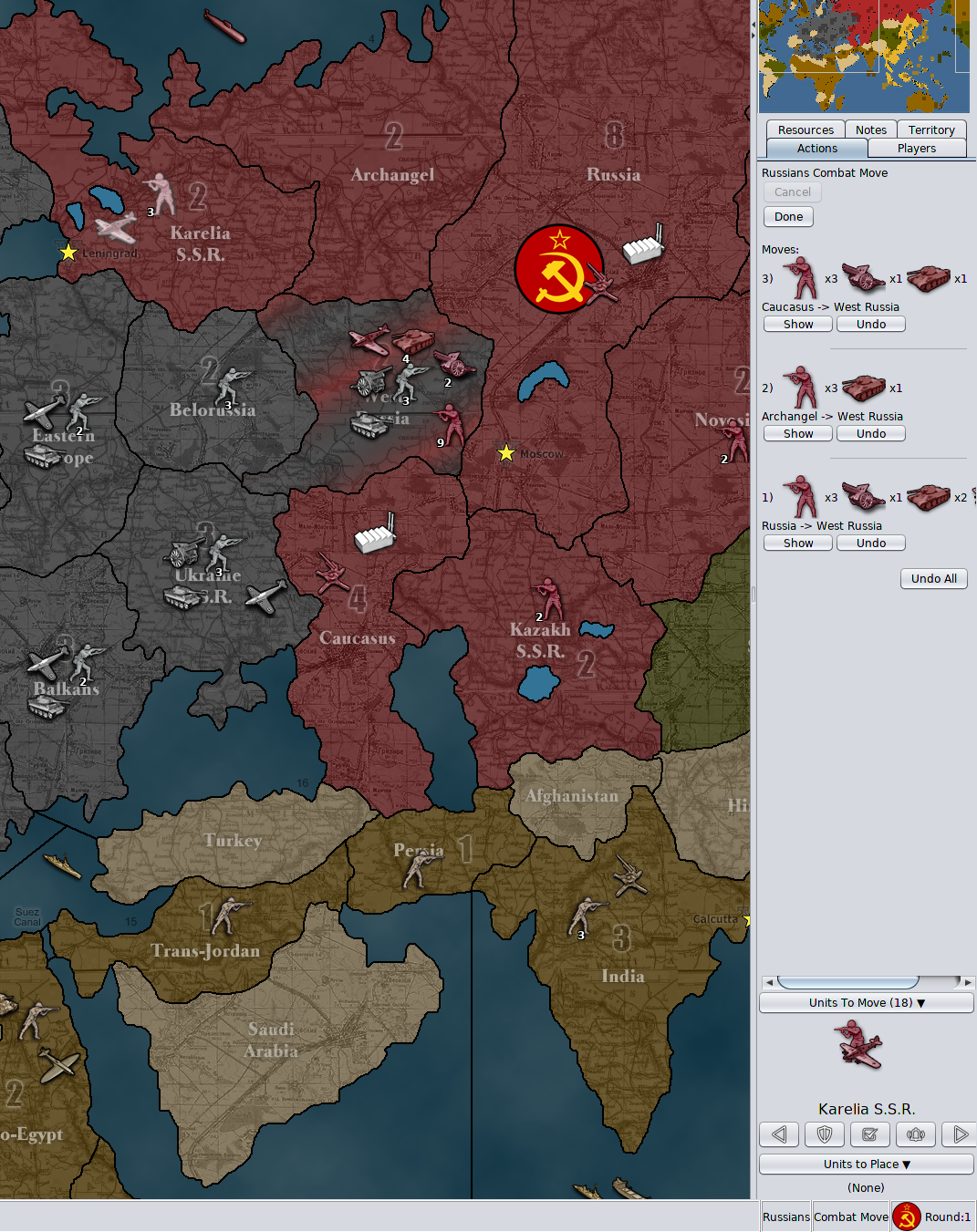
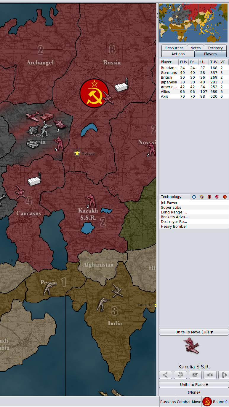
Changes being made:
- Removed the unit flag and unit count
- Removed the unit highlight button and center on units button
- Put buttons on same row
- Scaled/shrank button images to 20x20
- Decreased button horizontal gap spacing (now 2 pixels apart rather than 15)
- Fixed up layout so the component does not stretch to fill half of the vertical space of the action tab
- Put the component behind a collapse button, clicking the collapse button shows/hides the component
- Unit scroller is now always visible during combat and non-combat moves
- Made the territory text larger
- Moved the "units left to move count" to be part of the label for "Units To Move (#)"
- Moved the territory label to be below the units rather than above
Changes to make:
- change the rendering of the unit avatars to be in a 'v' formation instead of echelon formation
Stretch goals (if I wind up getting time and motivation, these changes I would like to make):
- Clicking the unit image will center, hovering over the unit image highlights the hovered units both on the game board and in the unit scroller
- Units to move will be computed as unmoved units rather than units with movement left. This is significant for fighters, they generally always have movement left in combat move, it's odd to have the scroller come back to them after they've been moved to combat.
I'll update this thread when this set of changes is live in the prerelease. The feedback given over this thread lead to these updates, it's looking so much better. I can't wait to see the extra space being used to render units side by side. Keep the good ideas coming and thanks.
-
This is the PR submitting the latest code changes mentioned above: https://github.com/triplea-game/triplea/pull/6117
Hello! It looks like you're interested in this conversation, but you don't have an account yet.
Getting fed up of having to scroll through the same posts each visit? When you register for an account, you'll always come back to exactly where you were before, and choose to be notified of new replies (either via email, or push notification). You'll also be able to save bookmarks and upvote posts to show your appreciation to other community members.
With your input, this post could be even better 💗
Register Login