Screen centering/cycling around map UI idea
-
This post is deleted! -
This post is deleted! -
This post is deleted! -
Getting back on topic, I want to emphasize the following intended plan (https://forums.triplea-game.org/post/30477)
Also for consideration, place-units is always visible and has a button to hide the panel. I think it could make sense for the unit-scroller to be similar: always visible during move phases (regardless of which action tab is selected), and have a similar button to the placements panel to hide/show the panel.
This would solve the issue where if a player does not want to use the unit scroller and have it take up room, they could collapse and hide it.
-
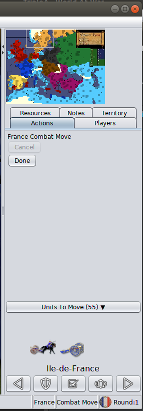
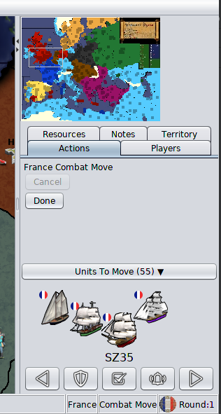
Some progress on this, couple preview screenshots below:
Changes being made:
- Removed the unit flag and unit count
- Removed the unit highlight button and center on units button
- Put buttons on same row
- Scaled/shrank button images to 20x20
- Decreased button horizontal gap spacing (now 2 pixels apart rather than 15)
- Fixed up layout so the component does not stretch to fill half of the vertical space of the action tab
- Put the component behind a collapse button, clicking the collapse button shows/hides the component
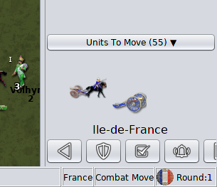
- Unit scroller is now always visible during combat and non-combat moves
- Made the territory text larger
- Moved the "units left to move count" to be part of the label for "Units To Move (#)"
- Moved the territory label to be below the units rather than above
Changes to make:
- change the rendering of the unit avatars to be in a 'v' formation instead of echelon formation
Stretch goals (if I wind up getting time and motivation, these changes I would like to make):
- Clicking the unit image will center, hovering over the unit image highlights the hovered units both on the game board and in the unit scroller
- Units to move will be computed as unmoved units rather than units with movement left. This is significant for fighters, they generally always have movement left in combat move, it's odd to have the scroller come back to them after they've been moved to combat.
I'll update this thread when this set of changes is live in the prerelease. The feedback given over this thread lead to these updates, it's looking so much better. I can't wait to see the extra space being used to render units side by side. Keep the good ideas coming and thanks.
-
This is the PR submitting the latest code changes mentioned above: https://github.com/triplea-game/triplea/pull/6117
-
@LaFayette
I just started testing this but immediate improvements. Really like the "collapse" option. High marks. Good work")

-
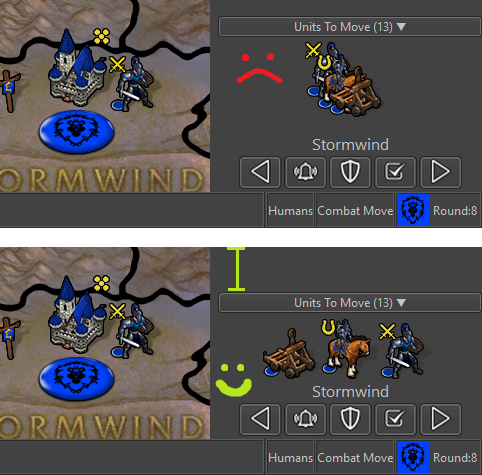
so a quick heads up. 18579 when I tried to do an "Undo" during placement everything froze. I got a screenshot
but nothing else. You can see "Undo" highlighted. I can't get out at all. Nothing kills it. Gotta split for an hour or so and I'll give it another go with more info. Was on a bot in the preLobby.
-
Nice to see some development of the territory scroller.
I will give some feedback on it, as I have used it extensively since it was available, and now I have been playing with this newer version.The buttons are too tiny for practical use. Try 25x25 pictures.
I measure the 5 buttons to be total 178 px wide on screen. They are not as easy to use as the much larger previous ones. I think you should consider (if you are using 20x20 mini pictures) to use 25x25 px pictures. 25% larger pictures would make a huge difference in regards to usability.The approximate total button width would be around 222-223 px and also still fit most maps with tiny minimaps. I can see that the prerelease has a 240 px minimum right bar width, so it would also fit nicely into this new minimum. Button pictures could maybe be as large as 26x26 px.
Rearrange buttons in accordance to amount of usage; right the most and left the least.
Based on my play, “Next” is most used, followed by “Check”, then “Station” then “Wake/Alarm” and previous is used the least. It would be convenient if the buttons were next to each other in that same order.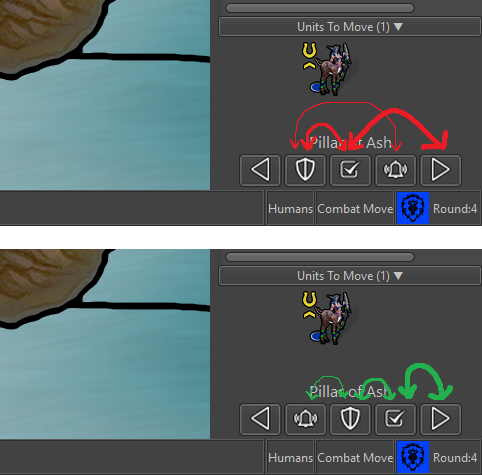
Line formation instead of V or Echelon formation.
I think it would both free up space and make the units waiting to be moved more visible. As I meantioned before, it could maybe be an harmonica type display, meaning that if there were more unit types than could be displayed, they would just overlap left to right.Also, the most valuable / strong units should stand at the back/at the left, as they would most likely also have bigger pictures or would be units not meant to be at front as cannon fodder.
Replace N (Next) and M (Previous) with . and , keys
It is unintuitive to scroll back with the M-key since M is placed to the right of N on the keyboard. On onscreen the buttons are reverse. Also the keys . and , on the keyboard are pretty fast for the player to spot and place fingers on when needed, more easy than the confusing N and M.Sleep / Wake up renamed to Stationed / Alarm
In regards to the “sleep” and “wake up” discussions and terms, I understand that we go for the term “station” for permanently inactivating units. Then I would say that “wake up” should also be replaced by something more fitting to stationed units. The A key and “Alarm” term would fit more stationed troops than W key and “wake” (wake = more fitting sleep). -
I suggest having the two left-right buttons below the unit images and the other three buttons above the unit images.
This would take out only some pixels of height space in the bar while allowing all of the following:
- Bigger buttons.
- Minimum wideness down to 200 pixels.
- Adding back the centre button between the left and right ones.
- Virtually remove the risk of misclicking any of the stay, station and reactivate buttons while spamming the right button (at most you might misclick the centre one).
I think ideal would be that the button resize depending on the current wideness of the right bar, by the way. If not that, then, resize the space between them.
-
I can see that the prerelease has a 240 px minimum right bar width
It might not just yet. On Napoleanic Wars, the right bar width is still determined by the size of the minimap. With larger buttons, the right hand most button is completely cut-off. 25x25 buttons do seem to look nicer, though it implies we would want to actually create that 240px minimimum to avoid buttons from being cut-off.
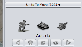
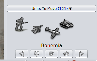
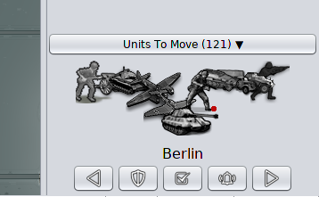
I took a number of snapshots trying out V-Formation or a simpler Line-Formation, please let me know what you think (a quick turnaround with a yay or nay is greatly appreciated):
Line Formation
Note, the "cluster" of German units is a worst-case, NWO with all available land units in a single territory:
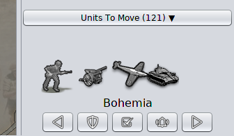
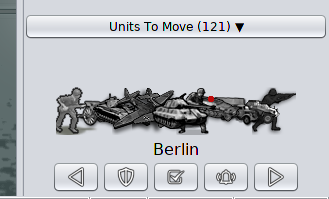
V Formation
Napoleanic Wars & Larger Buttons
In these pictures, I resized the buttons and the right hand bar to it's post-rendered minimum width after resizing.. Notably notice there is a lot of space to the right of the minimap. It's unavoidable if we have larger buttons. Given this is a worst-case map that we know of, it could be okay. We should also consider that the unit history and the 'undo' button are hard to see on Napoleanic wars, which makes it more worthwhile to add that minimum.
Line Formation
V-Formation
Button Ordering / Terminology
Watching a new player learn the game not long ago, the 'shield' was meaningless to them. The sleep term and icon I think are both clear, I'd like to go back to those.
The button re-ordering and key remapping both make sense.
-
Anyways, I have to say that, for example, when I switch to the "Notes" tab, I'm annoyed to see the "Units To Move" thing there. I definitely preferred it showing only if on the action tab (it also makes sense, as those are your remaining actions). I suggest going back to the previous behaviour of having it within the action tab only, if feasible.
-
Clicking the notes tab, the first problem is the width:
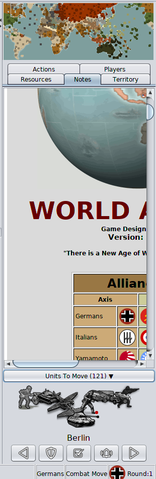
After fixing that by resizing, minimizing the units to move is one more, easier, click away. I don't think that is necessarily a major concern but a nuisance extra click.
I'm really most interested right now on a definitive answer for line vs V formation.
-
I suggest the minimum wideness of 240 pixels or whatever being removed when you minimize the Units To Move thing.
-
Secondary consideration for line formation is spacing. Four options:
- Even spacing to fit, eg:
__X__X__X__- Side by side spacing
____XXX____- Side-by-side with partial Overlap
(My ascii art skills are not quite up to par to draw this)
- Side-by-side unless there is not enough space, in which case go to equal spacing (which will result in overlap)
-
@LaFayette I think I favor the line but with a slight change to draw them with the left most unit on top instead of the center most. Not sure about spacing but my initial reaction is side by side as it'll look less like units are floating around and more cohesive.
-
wow this has come a long way! clutch! Nice work dudes
I've been banging away A&AO lately playing 1942 to death, but its getting a little bit tired. I don't know how many plans there are for improvements beyond what they currently got which is pretty limited. Certainly no unused unit scroller, no live play defender chosing casualties, no bidding, no movement orders issued by tile or anything even approaching edit mode.
The one thing they do have other than the brand name is an ELO type deal for ranked matching which is more popular than I'd have imagined. In terms of clicks, the only thing that feels slightly smoother there is the issuing of amphibious assault orders which is a one click to unload. But its hardly a worthwhile trade off. I'm kind of surprised at how many people are willing to accept pretty dramatic rules adjustments just because of branding. I'm really only there because people are playing gencon 1942, but as a platform it sort pales in comparison. Good to see things are still kicking around here
-
@Black_Elk said in Screen centering/cycling around map UI idea:
the only thing that feels slightly smoother there is the issuing of amphibious assault orders which is a one click to unload.
I like the fact that TripleA allows you to load 2 units and offload only 1 of them, if you so wish, as it makes sense (I guess there you cannot do this illegal move?).
-
Yeah pretty much, it forces full unload or no unload during amphibious. Its interesting to see what things were preserved by the book and what things were just thrown out the window hehe. Also kinda curious how quickly people have just adapted to whatever, even if it departs pretty markedly from the physical game.
I'm surprised actually how much time I've spent with it, given that 1942 isn't really my favorite map. But I guess it must have some kind of charm to it. Haven't seen anything on the level though, not with like cool screen centering features and suchEvery feature request I've seen is basically for something that already exists here. So not really sure what the draw would be, other than like just being on steam and having the official stamp of approval. It has kind of made me want to revisit map making a little though. I think we could come up with something using that map and playscale that would be more interesting than gencon, just adding a couple units or sticking a few new factories here and there. Will have to see how bored I get during this corona thing. Supposed to be sheltering in place in SF till what like end of may now? Too wild hope you all are finding ways to stay entertained
hehe -
A heads up that a significant update to the unit scroller is in-flight: https://github.com/triplea-game/triplea/pull/6129
Here is the change list:
- sort order to unit scroller units
- 25% larger unit scroller buttons
- re-orders unit scroller buttons
- improves button tooltips
- unit count added to unit scroller avatar images
- territory mouse listener, on territory enter unit scroller changes to that territory
- unit avatar rendering goodness, better vertical height to fit unit image size plus a little padding
- goes back to 'sleep' with moon icon, replaces 'station' terminology with shield icon
I think that might cover everything so far minus the change of the "left/right" hotkeys to
,and.
Hello! It looks like you're interested in this conversation, but you don't have an account yet.
Getting fed up of having to scroll through the same posts each visit? When you register for an account, you'll always come back to exactly where you were before, and choose to be notified of new replies (either via email, or push notification). You'll also be able to save bookmarks and upvote posts to show your appreciation to other community members.
With your input, this post could be even better 💗
Register Login