Screen centering/cycling around map UI idea
-
ok I clearly gave some "effort" Likes there

-
An updated thought on unit sorting. I'm tempted to go with something simple, am considering to just sort by unit movement.
-
@LaFayette said in Screen centering/cycling around map UI idea:
For consideration, we could make the unit avatar image clickable itself, in which case we may not need the center button. I'd rather have a center button than players learn to hack it with left/right.
I think if you make the units in the scroller clickable, that would be geat. Click unit = Center on territory and Highlight units on map. I think for players to really noticing this feature, the unit pictures in the scroller should auto-highlight when mouse-hovering over them.
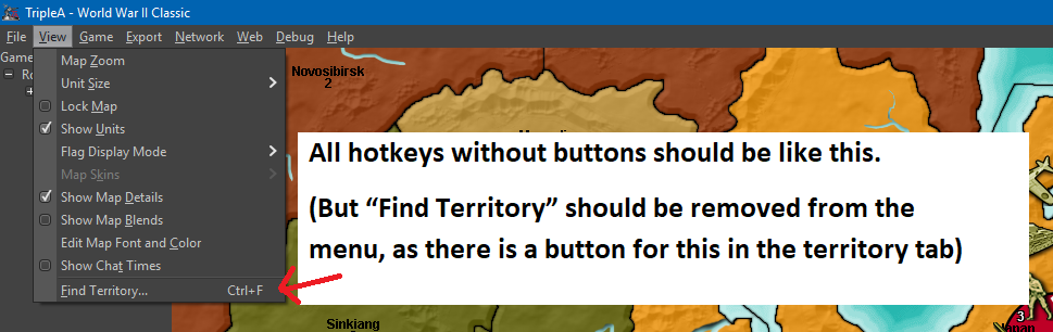
The original intent behind them is to avoid 'magic hotkeys'.
I agree that hotkeys should not be secret/only for the enlightened. But, I don’t think it is neither practical nor realistic to have every single feature that has a hotkey represented by a graphical button. Best to leave some features just be in the drop down menus, with no UI graphical representation.
I would propose icons/buttons for every single most commonly used feature of the “new player” / casual gamer. (Here I go again, talking on behalf of new and casual gamers :-P) But seriously, experienced users will probably use hotkeys EVEN if there are buttons for the same things, casual gamers will not. Casual gamers will look for and use buttons, just like in other games than TripleA.
That’s why I would propose that drop down menus be reserved for advanced features, exit, save etc., not stuff needed while playing the game.
Stuff needed while playing should have buttons. Also, whatever has a button on the main screen or in the tabs, should be removed from the drop down menus, as to not flood the menu with duplicates.
Proposal:
Maybe buttons can be set in a height/width size flexible box under the Minimap. I think this location would be nice, intuitively and discrete. Minimaps in other games are almost always accompanied with icons/buttons for convenient and easy control.What do I think should be represented as buttons on the UI?
Based on my own game play + what I frequently go and pull from the menus + what I think would accommodate new players as well as advanced players, I have made these two mockups:
• Notes (Opens window with notes – Maybe notes should be removed from tabs and presented in window instead? But, I am not all sure about this one)
• Sound (on/off)
• Hotkey Help (Opens up a window informing about every single hotkey available)
• Flags (shuffles small, large and none)
• Roll Dice (open Roll Dice window. After rolling, result pops up for all players, if it is multiplayer)
• Unit Help (open Unit Help – Should be renamed Unit Information (and Ctrl+i))
• Politics Panel (open Politics window)
• History (shuffles history and “current game” mode)
• Battle Calculator (open Battle Calculator)I have tried to list these buttons in the order I think could be practical.
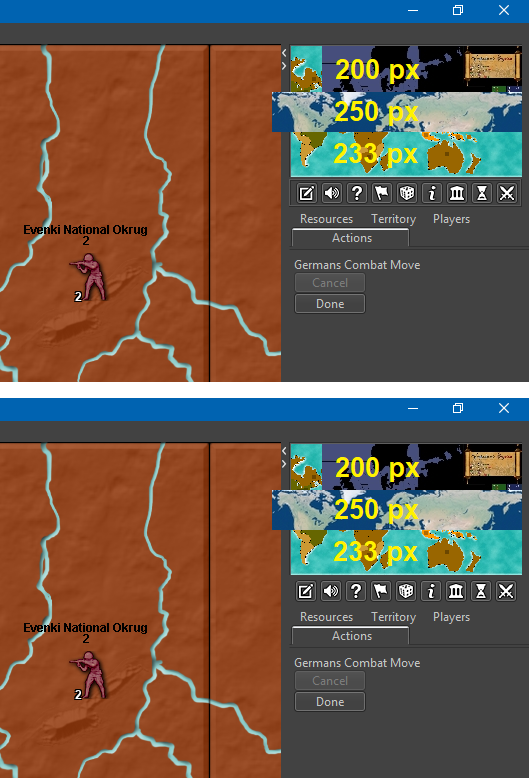
Buttons are filled with 16x16 icons, with NO spacing around them. I have placed the buttons in a box/frame as I imagine the box would look like if made just like the resources/territories/flag boxes in the bottom bar. I imagine that, if the minimap was as smaller than like 200 px wide, then the buttons would be pushed to become lined up in two rows. (Alternativly, maybe minimaps should just be set to auto size adjust to be minimum 233 px wide? If this is even a practical possibility. Or all minimaps just resized to be minimum 233 px wide or something in this range.)
MinimapHotkeyIcons.zipMap maker of: Star Wars: Galactic War + Star Wars: Tatooine War + Caribbean Trade War + Dragon War + Age of Tribes + Star Trek: Dilithium War + Iron War + Iron War: Europe + Warcraft: War Heroes
-
@Frostion I like the ideas. I'd have to think a bit more about which features get a button but you have a good list to start with. I'd also like to eventually swap the mini map to the bottom instead of the top of the right panel and then have your proposed buttons above them instead of below.
-
@Frostion the elements you suggested as buttons, would they also appear as menu items?
I agree that hotkeys should not be secret/only for the enlightened. But, I don’t think it is neither practical nor realistic to have every single feature that has a hotkey represented by a graphical button. Best to leave some features just be in the drop down menus, with no UI graphical representation.
But seriously, experienced users will probably use hotkeys EVEN if there are buttons for the same things, casual gamers will not. Casual gamers will look for and use buttons, just like in other games than TripleA.
I pretty much agree. Menu items are a good example, new users will browse through the menus to see what is available and they can also learn the hotkeys. Eventually users stop scrolling through the menus and they use the hotkeys directly.
It's the same thing with buttons, you discover the button on the UI, hovertext then tells you the hotkey, you can then stop clicking the button and use the hotkey. The buttons are not intended to be clicked in the long term, but as a way for users to know about the hotkeys and the actions behind those hotkeys.
Contrast that with the old pattern where we add the hotkey and add a line item in the movement help text.
-
@LaFayette said in Screen centering/cycling around map UI idea:
@Frostion the elements you suggested as buttons, would they also appear as menu items?
As I see it, the menu items would be unnecessary duplications. It should be enough to have info hovertext explaining the corresponding hotkeys. The menu items should be kept as minimal as possible, for simplicity.
new users will browse through the menus to see what is available and they can also learn the hotkeys. Eventually users stop scrolling through the menus and they use the hotkeys directly.
you discover the button on the UI, hovertext then tells you the hotkey, you can then stop clicking the button and use the hotkey. The buttons are not intended to be clicked in the long term, but as a way for users to know about the hotkeys.
Some players might do like that, but I don't think everybody. At least not me and my pals that I play LAN with.
Speaking for my self, I personally ONLY use "i", "Ctrl+B" and "Space" when available. I have begun using the unit scroller, but have no intention of using its hotkeys. If the UI buttons I presented were implemented, I don't think I would even use Ctrl+B anymore, as I would see it as more convenient to just press the UI battle calculator button. My usage of the menu items would probably be limited to mostly editing, but I consider the editing feature an advanced feature. I use it a lot as mapmaker to set up and test out stuff.
I don't know how normal my playstyle is, but I don't think it is that uncommon to stick with UI buttons. I acknowledge that TripleA might have many players using hotkeys, but that might be partly because of the previous/current lack of UI buttons. Players (that did not uninstall immediately after seeing the UI or give up on the game before even learning it) have adjusted to the cumbersome UI.
-
@Frostion said in Screen centering/cycling around map UI idea:
Speaking for my self, I personally ONLY use "i", "Ctrl+B" and "Space" when available. I have begun using the unit scroller, but have no intention of using its hotkeys. If the UI buttons I presented were implemented, I don't think I would even use Ctrl+B anymore, as I would see it as more convenient to just press the UI battle calculator button. My usage of the menu items would probably be limited to mostly editing, but I consider the editing feature an advanced feature. I use it a lot as mapmaker to set up and test out stuff.
I guess you are talking about the stable, as Ctrl+A and Ctrl+D are too good.
Also, the edit feature is a rather basic feature. Pretty much every regular player use it every now and then.
-
@Frostion said in Screen centering/cycling around map UI idea:
Buttons are filled with 16x16 icons, with NO spacing around them. I have placed the buttons in a box/frame as I imagine the box would look like if made just like the resources/territories/flag boxes in the bottom bar. I imagine that, if the minimap was as smaller than like 200 px wide, then the buttons would be pushed to become lined up in two rows. (Alternativly, maybe minimaps should just be set to auto size adjust to be minimum 233 px wide? If this is even a practical possibility. Or all minimaps just resized to be minimum 233 px wide or something in this range.)
MinimapHotkeyIcons.zipIf going for a specific minumum (which I certainly don't agree with, as it should be rather dependent on some variable items, like the units size specified in map.properties, since I can make a game with 32 pixels wide unit or a game with 256 pixels wide units, for example), it seems more logical to take 200 pixels as a minumum, as that is a round number and there are maps that have a smallMap of wideness in between of 233 and 200 pixels. 200 pixels may also be more than enough to visualize all information in the players tab.
-
@Cernel What does ctrl +D do ? I don't see it listed anywhere and it didn't do anything when I fired up the game ?
-
-
@Cernel About the edit feature, it is particularly common to edit moves that you anticipated (illegally) during Combat Move, then changed your mind (or the dice made you!), or editing units in and out during Place Units (substantially doing or un-doing movements during placement). For the games having Purchase Units before Combat Move, it is also common telling, during the latter, than you changed your mind about your buy, then editing what you said during Place Units.
Pretty much, it will take very little time for the common TripleA player to start using the edit function quite often, I'd say. About the next step after starting playing the game at all, with other persons, at least. There are some people around that prefer playing with no edits, as a matter of personal preference, but they are definitely a small minority, I tell you.
-
Good discussion, but a bit difficult as we're bring up many topics.
For minimap move, I opened this thread:I still really like the last mockup posted by @Frostion :
https://forums.triplea-game.org/post/29322- looks good
- has more space for more units
- unit images are not scrunched up
- we could have multiple rows of images, which would be cool to convey large armies
- we gain space to give counts for each unit type
To get there:
- flags button: flags used to be a combination of two settings in the menu. That means we could not really have a hotkey for it, the hotkey that was added turned it on/off. As a menu item, there is no problem with having the hotkey displayed in the menu and removing the UI button.
- Unit highlight, this is a heavily used feature at times, for others at other times not at all. I would prefer for this to be a UI button. We could though create a menu setting for this. For it to make more sense, I think we'd want it to be toggle on and toggle off, rather than activated for the 2 or 3 seconds and then auto-turns off.
- Unit center, we could make the unit images clickable, give them a roll-over effect maybe to make it clickable, or just not have a unit center button at all.
The above gets rid of a row of buttons, then it's a matter of rendering the avatar images differently, and we can perhaps get to the nicer UI treatment.
Some questions:
- any thoughts if the unit scroller should be similar to the place panel? IE: always visible with a button to collapse/expand the view
- if we have minimap rendered on the bottom of the action panel, should unit scroller be above the minimap, or should it be located at the top of the action panel (ie: top-right)?
-
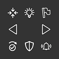
I added a few new icons to the collection:
History On/Off
Sound On/Off
Edit On/Off
AI Play Pause (Yes, I know this feature does not exist … yet") )
)
AI Play Continue


And here are the 37x37 territory scroller icons .... I hope they get used in the pre-releases
")
v5-icons-37x37-newskip.zip -
@Frostion said in Screen centering/cycling around map UI idea:
Also…
The icon for “skip” is OK, but I do not see that the piktogram really represents of the concept of “skipping” something. I have tried to make a new icon looking more like a skip (w. check mark). Here is a new version of the icon set. Is this skip looking better?
V5-Icons-37x37-NewSkip.zip
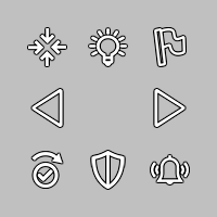
The light-bulb actually makes me think to something related to technology, as I think it is usually the symbol of having an idea.
I was thinking maybe going back to the sun, but without the sun, only the rays, to mean light emission without meaning sunshine.
Practically this or something like this (this one is not that good, as I just cut out the inner part):

-
The credits you can access via Help/About still mention the "Noun Project" for the Lantern and Flag buttons, as of 2.0.17017.
Regardless, I would avoid using images requiring crediting, as it feels strange that such a minor part of TripleA gets credited, so better limit all to public domain images. Just my suggestion, as I can see TripleA, by now, having an enormous credit list, if going that way in the past, and it is a liability having to update credits every time something is changed that might be referenced in them (easy missing it, keeping crediting inexistent items or wrongly crediting existent ones).
While I'm sure @Frostion intended the images he provided to be free from crediting, he didn't clearly did so, so maybe the forum itself would benefit from a declared policy that at least if you don't say otherwise whatever you post becomes public domain or something.
-
I think the best would be having the unmoved units scroller absent by default except a good sized, spacebar-like, button that allows you to have it appear, so that you would click on that when you want to use the scroller, and have more action bar space until them (or for all the phase, if you never use the scroller). Likely the scroller is just going to be used towards the end of your phase, mostly to double check you haven't missed anything. Of course, this would require @Frostion making yet another image for this button to show the scroller.
-
Also, once you have skipped or stationed all you can, the scroller should completely disappear, except only the activate button (I would call it "reactivate", rather). Or anyways, I don't think the current behaviour of keeping showing the last unit you skipped or stationed is good, as it doesn't clearly inform you have finished them all and it is inconsistent with the behaviour at any time beforehand.
-
Absent by default really implies it's a verification and not a 'main' way to work through units to be moved. I don't think that is as efficient or even that useful, as you would maybe pull it up before ending your turn to then check you have zero units left, and/or confirm that the units that have movement left are to be stationary. I suspect it may as well not exist in that case as most will probably not bring it up in favor of ending their turn, or if it's just a double check then it could add time to your turn by needlessly double checking units that should not move. The hope is that players will either use it initially to scroll through units, or players will make their main moves and then use 'n' to start scrolling through units, either skipping or moving them.
Having a component appear/disappear could be viewed as really inconsistent.
-
@LaFayette Clicking to show the scroller may be not merely an additional step. It may also apply the same effect as when you click on the centre button on the first showing territory given by the scroller. That would make actually more sense than starting using the arrows, as this way you don't centre on the first one initially. If the normal procedure would be to first click on the centre button once, then click on the right arrow or the skip, having the show button also centring would imply no additional clicks.
-
What is the order in which the zones are presented in the scroller. I cannot find a pattern. Is it just the territory list in the xml?
It would be good to know, and document, so that mapmakers may order their territory list (or whatever), to have the scroller order better taylored to what they believe are the charateristics of the map.
Or maybe the scroller itself should attempt to do that. In this case, here are my suggestions:
- If the power has units in capital land territories that belongs to it and it currently owns (both need to be true), start with the one having the lowest X centre coordinates, or the lowest Y ones, if the same X ones, an so on.
- Then centre on own units in land territories that it currently owns, start with the one having the lowest X centre coordinates, or the lowest Y ones, if the same X ones, an so on.
- Then centre on own units in land territories that are owned by powers not at war (archetype allied or neutral) with it, start with the one having the lowest X centre coordinates, or the lowest Y ones, if the same X ones, an so on.
- Then centre on own units in land territories that are owned by powers at war with it, start with the one having the lowest X centre coordinates, or the lowest Y ones, if the same X ones, an so on (this can happen with politics or limited combat rounds or stalemates between power 0 units or triggers).
- Then centre on own units in capital sea territories that belongs to it and it currently owns (both need to be true), start with the one having the lowest X centre coordinates, or the lowest Y ones, if the same X ones, an so on.
- Then centre on own units in sea territories that it currently owns, start with the one having the lowest X centre coordinates, or the lowest Y ones, if the same X ones, an so on.
- Then centre on own units in sea territories that are owned by powers not at war (archetype allied or neutral) with it, start with the one having the lowest X centre coordinates, or the lowest Y ones, if the same X ones, an so on (this is usually the case of an ex enemy owning your sea zone).
- Then centre on own units in sea territories that are owned by powers at war with it, start with the one having the lowest X centre coordinates, or the lowest Y ones, if the same X ones, an so on (very uncommon case).
- Then centre on own units (comprising any cargo) in any sea zones that are not territories, start with the one having the lowest X centre coordinates, or the lowest Y ones, if the same X ones, an so on.
I'm not sure if the case of capitals in sea territories should be considered, and I don't believe I've ever seen a map having sea capitals, nor I remember having tested this possibility, but I'd certainly add it anyways, so that the scroller won't become behaviourally obsolete if we would see sea capitals, at any point (until then, it will just be skipped).
This system is taylored for maps that do not wrap around (as that is the default (false) behaviour), but it should be good enough for maps that wrap on X, Y or both axis.
Hello! It looks like you're interested in this conversation, but you don't have an account yet.
Getting fed up of having to scroll through the same posts each visit? When you register for an account, you'll always come back to exactly where you were before, and choose to be notified of new replies (either via email, or push notification). You'll also be able to save bookmarks and upvote posts to show your appreciation to other community members.
With your input, this post could be even better 💗
Register Login