Main Screen Logo Needed
-
My bad, but I always want the best for everyone and I am no picking up a fight here.
So my apologies. But If something is not good by a design point of view one must be able to say why it is or why it is not. Last but not least "tone" here on chats is never transmitted and in no case I wanted to be unfriendly.Possibilities are endless. One should develop: a black and white logo, interchangeable for black backgrounds and white backgrounds and then a coloured logo.
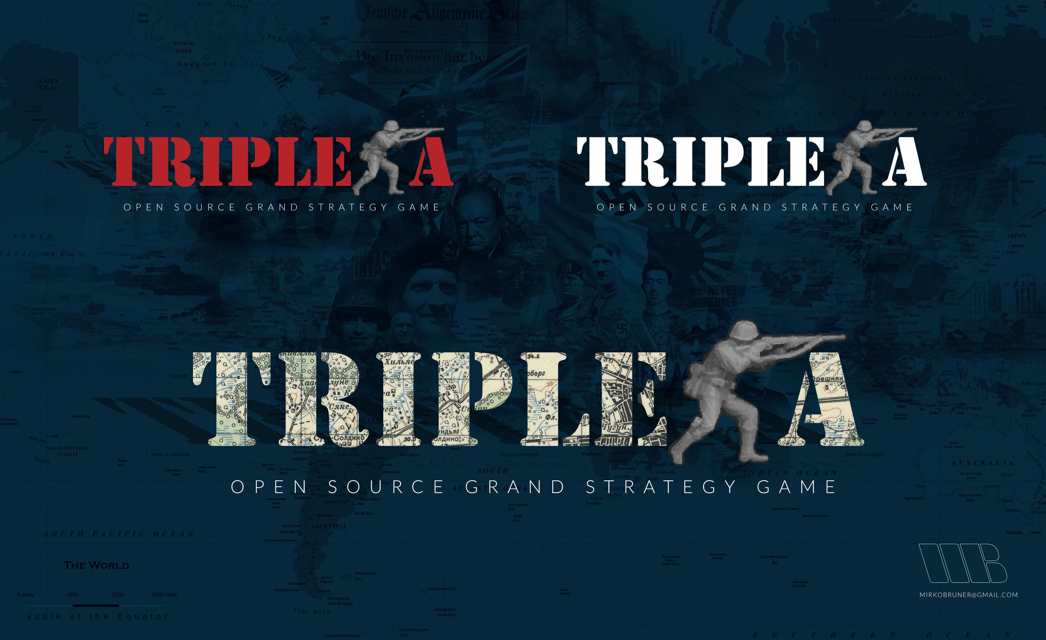
The big question is between a logo mark and a logo type or a combination of the two. Roughly I will explain it in the creativity I have attached here and tests I have made.
Does anyone has the image of the infantry man in a resolution big enough or do we have only the one @ubernaut posted here a coople of days ago?
Regards,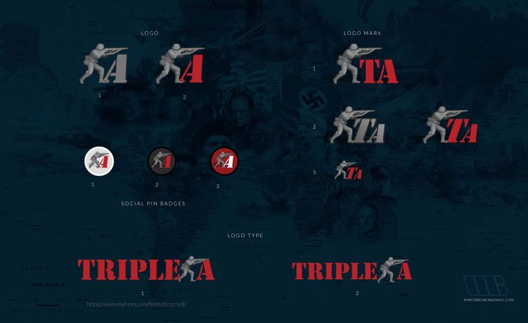
-
But If something is not good by a design point of view one must be able to say why it is or why it is not.
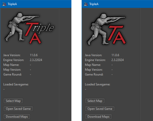
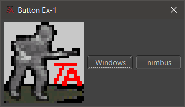
i like your mockups but i still personally feel as if our existing thing is better. so I have tried to state this before but the original icon depicted a battlefield with fritz in the foreground and the initials "TA" in the background. that original design was really well done (imo) and even shows persective despite the extremely limited resolution available (wasn't me btw). Again for reference:

when the capability for operating systems to have higher resolution icons including transparency we needed a new icon at that point in order to keep pace with this new level of available quality. this is when I entered the picture my intent wasn't to redesign what was already essentially a perfect design imo it was to simply remaster it. really the only thing i changed was adding the fighter in the background.
why do I say the existing design was perfect? by perfect i do not mean that there is no room for improvement, i mean that there is nothing wrong with it. It communicates exactly what the game is. even if you don't understand english you could look at it and guess what it was about.
again i like your designs and these are just my own opinions obviously, i just don't think they get the job done quite as well as what we have now in terms of communicating the idea of the game.
with any change we make to the branding, we must also pay a price in terms of brand recognition unless we are getting some benefit in exchange for that price it would be again, imo, a losing proposition.
@LaFayette i think you mentioned a concern about how the logo/icon compares versus various backgrounds. in fact the gamut of the current logo/icon is pretty balanced and if anything it probably shifts slightly darker not lighter:
also, the transparency works on both dark, light and mixed backgrounds:
anyway just thought i would try to address some of the questions about my opinions.
")
-
I am very impressed with the presented images, logos and menues by @MirkoBruner. Very professional look!
One thing is fore sure, and that is that his logos are 100 times better than what is in the prerelease at the moment.I am also conservative in regards to the logo, but if the logo of TripleA is to get an official new overhaul and look (at the website, forum, in the engine etc.), I think @MirkoBruner has some incredible ideas and skills.
Here are my proposed (more classical) versions, but I dont know if they are better than MirkoBruners.
Here are files to toy around with: TripleA-New-Logo.zip The above has shadows added.
-
The logo on mainscreen was added to 2.5. I would like to think that logo is better than nothing for the most part. To the trained eye that gets really bothered by the cut-off drop-shadow, I can see that being really annoying. Just as annoying as seeing an oxford comma misused =D
If/when the main screen is updated further, this thread will be useful, I do like the ideas and images presented.
-
@LaFayette i do think we are currently diluting our branding the way it is now.
when you say "cut off drop-shadow" are you referring to the outer glow he has around everything?
-
@LaFayette i do think we are currently diluting our branding the way it is now.
when you say "cut off drop-shadow" are you referring to the outer glow he has around everything?
-
Almost anything would be an improvement over the icon used currently (v2.5/pre2.6). The website image looks much better for instance, if the right size is chosen. The old school icon had more style.

Many of the proposals in this thread are also superior to the image currently displayed in the launcher (the aliased TA text in particular is quite ugly). Was there a downgrade from v2.3 ?
Artwork elements are also needed for a new
Help > About Tripleadialog. -
@butterw i believe when he made the build Lafayette didn't have access to a high-quality version and didn't know i was the one who remastered the OG icon years ago. supposedly an update is coming soon but there was no group decision on that one.

-
If ya'll can hit consensus and provide the updated logo image, it would be easy to incorporate it.
-
@lafayette
There isn't likely going to be consensus about logos.Possibly there are some cross-platform Java display issues on top of that. I'm using Windows10, 1080p, 125% dpi. The text size is readable but some images don't render well. They are likely upscaled causing the aliased text of logo to look ugly.
Another issue is the app icon.
Simply scaling down a 256x256 pixel image like currently doesn't work on Windows, the most useful icon size is 32x32, with sizes down to 16x16 sometimes used. A simplified/stylised version of the icon that can display well at lower resolutions is very much needed.
Most apps use a large version of their icon for their About window logo.EDIT:
Here's an example of a dialog with a small app-icon (with transparent background) based on TA text by Frostion:
-
@butterw @LaFayette i thought i uploaded the high-quality icon graphics without the ground do you not have that or is the consensus what we are missing?
-
@ubernaut looks like it is on page 1
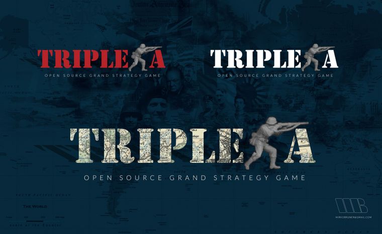
@MirkoBruner , would you be able to provide the bottom title as its own image with transparent background? https://forums.triplea-game.org/assets/uploads/files/1605039123046-logo_type_combination.jpg
With and without the sub-title would be helpful. I think the one without subtitle would be great for the website. I'm tempted to try and incorporate the one with subtitle into the game.
-
@lafayette Sure shot. Anywhere I can drop it? Email?
Regards, -
@lafayette um are we going to have a vote on this? because i really not a fan of that treatment. no offense @MirkoBruner but for the reasons i stated before which received no counter-argument i do not think we should be moving away from the existing basic branding.
-
Path of Assets
@ubernaut Having a vote wouldn't be the silliest thing.
I would add that just like for the flags used in maps, modding the program logo/icons is something anyone can do without the need for programming skills (output should be png).
The main logo is:
TripleA/assets/launch_screens/triplea-logo.png
it has transparent background and a resolution of 211x152 (this isn't a requirement though)The window icon currently used is:
org/triplea/swing/ta_icon.png (32x32)For the Windows desktop and taskbar icons you need a .ico file with multiple resolutions (16x16, 32x32, 48x48, 256x256 in 32bit).
-
As nice as a vote sounds, it's impractical due to time constraints and the delay to get a meaningful vote tally. Feedback is listened to and welcome, just needs to be constructive and somewhat timely.
@ubernaut what are your specific objections regarding using an updated website title?
-
@lafayette well i think we need to rely on consensus here no one person should be dictating the way forward for this project. not sure why we couldn't just make a poll post give it a week or two to see the results. i think the people who care most would almost be able to cast a vote in that time. i also think we could even give it more time seeing as our releases arent that frequent and we are really only talking about one asset/placement in this case as far as i know.
in regards to the "updated website title" you'll have to point to where that was brought up. not even sure what that means exactly. i thought we were just talking about the start-up screen.
"You should never have told me horses sleep standing up, it gave me a mental block." - Mister Ed
-
why vote when you can just dictate instead ?
-
@lafayette said in Main Screen Logo Needed:
vide the bottom title as its own image with transparent background? https://forums.triplea-game.org/assets/uploads/files/1605039123046-logo_type_combination.jpg


-
@ubernaut "i also think we could even give it more time seeing as our releases "
It's not about time between releases but more "I have time to work on this in the next 3 days, and then after probably not." Getting responses 3 months later just is not workable.
I'm just saying the people that are really concerned are already on this thread and should provide their feedback. If we want to do a poll that is for a couple of days, fine. Will everyone get a chance to give 100% feedback, probably not, and I don't want that open for months on end. Hopefully that makes sense in combination that such feedback needs to align with the available capacity to actually do the work.
Hello! It looks like you're interested in this conversation, but you don't have an account yet.
Getting fed up of having to scroll through the same posts each visit? When you register for an account, you'll always come back to exactly where you were before, and choose to be notified of new replies (either via email, or push notification). You'll also be able to save bookmarks and upvote posts to show your appreciation to other community members.
With your input, this post could be even better 💗
Register Login